The command option is there. It is combined on the Log tab since the log is what is being sent to the machine it makes sense to put it there I think. I don’t want to remove the buttons totally, but I just think they need a new home somewhere either to a separate popup window which might make more sense anyways. Or if I get the other controls consolidates it may free up enough room there for them.
I am planning to put helpful tool tips on most of the controls and also planning to make a printable page describing the keypad buttons in-depth for reference. Ant lastly planning on a couple of youtube video’s describing some cool options.
I am not that great at manual making, but I think with the help I’m planning on it should be enough. An actual manual, I may give away a license to someone interested in writing something like that? Any takers?
I would be glad to help write one up. It may take a team of us to play with it and coordinate with you to pull it off but it is definitely doable. In the end, I think it will help you sales if they have an easy reference. I know for me, that was one of the biggest reasons I bought the VCarve Pro software. Excellent videos, manual and forum support.
That UI looks confusing to me at first glance. If you are targeting SO3 and Nomad users it needs to look more like Carbide Motion. One thing they did a very good job with on Carbide Motion is a nice looking and intuitive UI.
Normally programmers are not “programmed” to see UI’s like most people so if you want this thing to pop so people don’t just click off of it when you try to sell it, I would recommend that you invest some $$ in having a UI designer develop the look and feel for you.
One thing that it seems no one does (and I don’t understand why) is just video tape newbies trying to use the program without your assistance and fix areas where they commonly get stuck. Engineers (me) and programmers tend to think everyone else will experience a design like we do but that’s rarely the case.
Looking forward to seeing what you release though. From what I’ve read here and there it should be worth a try.
I did a quick Google search for your app (IntelliG-Code) and there’s nothing I see… by the looks of your controls and samples there’s signs of obvious tool-pathing,G-Code handling and output viewing. From what I see here you’ve got a great looking app.
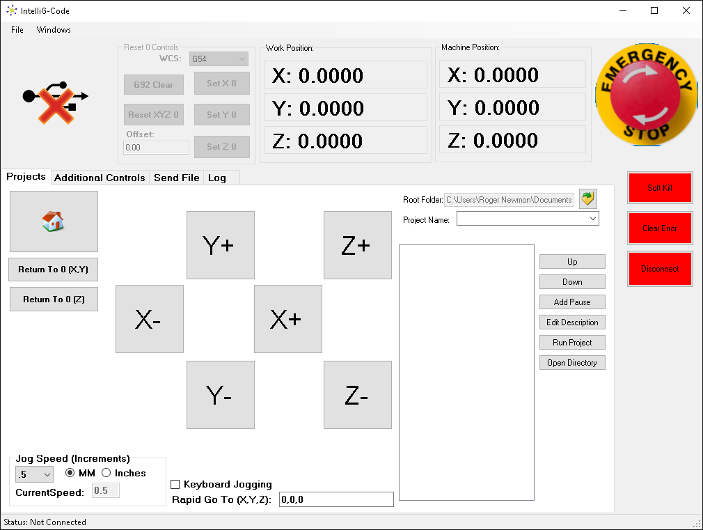
To your questions, I like the notion of seeing a standard button control for jogging which is the most intuitive method of implementation… I get keypad/midi/external means of secondary control, and IMHO you should preserve this fundamental operation of your UI.
Can you elaborate more on your project in general? Perhaps you have done so in an earlier thread? I’d like to understand more in regard to your overall scope and motivation.
Actually I am working with my brother whom manages huge software projects. The look is not as important as the “FLOW” of things. This is where people need the most work. I am trying to play with the flow and determine what goes where to make it most useful at the moment, pretty can come later. Right now I can see a few things I need to improve flow with, but honestly I never use the keyboard any more since I can do everything I need to do including probing and moving to various saved points and much more with the external keypad.
I knew this question about the movement buttons would cause some interesting remarks. But it’s an honest question, Why are we all stuck clicking when we could tap a button more effectively from further away from the screen? I think it’s the “I’m Used to it” attitude more then anything. If I took my program and machine to the mall and showed random people how to use a keypad, I bet they would never ask where the button to click on is in the app because it’s just that intuitive.
On the other hand I also understand everyone has a vice on the mouse and the computer itself which is hard to pry people from. I do plan to have the buttons, I’m just wondering how important they really are for flow to people. I have a wired usb keypad and a wireless one. Both work well and both are long enough away to be useful when operating the machine. The mouse is hugely inconvenient, even wireless because you can hardly see the screen and mouse on it at any distance from a 19" monitor which is larger then most laptops.
I’m considering making a much larger mouse pointer to compensate for this since so many people will still be stuck on the mouse until they realize it’s an un-needed device to move a machine from one position to another.
The “looks” are just as important as the the “flow” imo if the flow looks and feels confusing id most likely put this in the stack of other confusing software and rarely use it.
Google doesn’t have much in the line of looks but it flows well.
There are thousands of apps that look dumb but flow and work well. So I think your wrong about looks.
I do like looks and I am building nice looking icons to make buttons look nice but looks have absolutely nothing to do with function or flow or how much people will appreciate a “Utility” software.
Lets be honest, we all use windows calculator, google, chrome browsers, that stupid white mouse pointer that windows allows you to customize but few users ever do. I could go on and on about what things we use but have not changed their looks for many years, the point is the flow , usability are 90% more important then looks and functionality.
Good apps that just work flawlessly make more money then pretty ones that crash all the time.
I hope to have some nice looking icons also but it’s not a huge priority for me, it is after I have a 100% stable software is when it’s time to make it look pretty. Most important for me right this moment is flow. It’s working flawlessly at the moment but it needs some re-design for the correct flow I think.
Google is very simple and intuitive. I would argue that its much more difficult to design a UI that emphasizes only what is needed the most over one that tries to touch on everything. The Google page is minimalistic, modern looking and not busy at all. I think it looks great. That’s what people like. Google also has a lot of separate pages like shopping, patents, etc… that are easy to get to and offer detailed utility without cluttering up the main page that gets used 90+% of the time…
Have you observed newbies using your program without your input and integrated what they want or is it built on your personal intuitions?
Regarding movement buttons… I have a keypad and I use both the keypad and the UI movement controls. I know you don’t believe it but I don’t think your UI emphasizes the pieces that matter the most to most new users. The bottom 2/3rds of the screen is dedicated to things I would never use. I’m not sure what several of the settings/buttons are just by looking at them.
Hopefully that’s constructive feedback. The fact that you are putting something like this together is commendable. I hope it turns out to be a hit.
What you are talking about is FLOW exactly what I want feedback on, not looks.
Looks is the pretty little icons and colors and styles. That is what I wanted to hear about. I will embed the complex less used controls and clean up the GUI at this point. I was just throwing it out there so I could get some feedback on what controls are most important for the typical task!
I personally don’t use the mouse to jog. It is too hard to keep an eye on the mouse pointer while also looking at the work surface. I can use the cursor keys on the keyboard without looking at the keyboard.
Example why not to ditch the jog buttons under the assumption that you can “just use a joystick instead”:
I run software on a headless box at the mill (windows), and run it via remote desktop (Not). I’m ok with using the keypad to move things, and I understand the desire to take away the buttons, but the lack of context (ie. you can’t jog while sending a program) and you “just need to know” you can’t do that is not the best UI. Even if you don’t use the jog buttons on screen to do the jogging, they’re a good indicator of state (you can jog now: not grayed out, you can’t now: grayed out - it’s much more clear than a bit of text somewhere saying “JOG OK”)
The learning curve is kind of steep on this sort of thing to begin with. If you’re willing to spend the screen space on a big “glitzy” e-stop button, spending the space on basic usability should be pretty easy to justify.
I have been going back and forth with it as far as I can remember just starting the software.
Although many of us don’t need it, the reality is it’s a vice for everyone so I have come to terms wit that and envisioned some way to utilize it properly to make people happy.
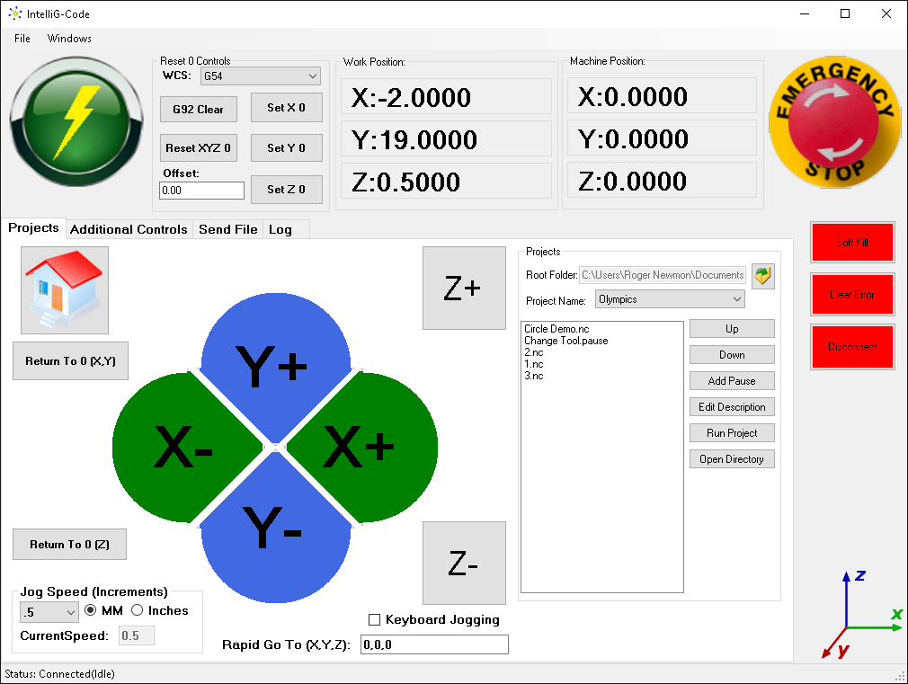
I think most people will appreciate the following screen:
I am planning to do a few even better though. Let me explain… This has been my vision all along but I want to make it simple enough yet complex enough to allow a beginner all the way through expert appreciate the software.
No you can not google the software yet, I bought a separate domain and plan on big things for that but it’s not completed just yet.
Now imagine this:
I make the buttons large enough for the tablets, but also have no requirement to actually use them.
I do something no one else has done and capture “USB” keypad commands separately preventing accidental typing in textbox fields! This is a secret recipe, it’s not an easy feat that’s probably why no one does it.
Still allow the normal windows keyboard / numberpad to type in the textboxes yet it too can control the machine when the numlock is off.
Allow super simple multi file projects with pauses and simple tool change sequences.
Square, Circle, Slot, Drill, and now the super awesome multi point cut options without ever drawing.
Circle Center finding and 2 point center finding.
Super easy “Save Points” allowing rapid positioning.
All Work Coordinate Systems are available for use and definitions.
Engraving centered text (Think circle center finder then centered text engraving… Candle lids anyone?)
Re-surface with 2 points (Lower left corner upper right corner… GO!!!)
Run other .gcode, .nc, .cnc and other files with tool change commands and re-positioning during tool changes.
No issues with re-connecting the machine and it going crazy yet, but that’s up for testing on other machines I think to be positive.
So many other things that just work it’s hard to explain or mention them all.
Did I mention it loads instantly and connects extremely fast?
Anyways, I figure I have like 4 full days to finish it, I have a full time job though so it may be more like 2 weekends. Plus time to setup installation software and then licensing things and finish the website.
Lots of work but it’s only me doing it at the moment. I’ll try to keep everyone posted.
The layout above I think is the most intuitive and simplistic at the moment and I think it’s starting to “FLOW” well.
Please PM me your email address for any “TRUE” testers and don’t bother replying if it’s going to be a stream of negative comments. I want constructive feedback from my testers, not naggers asking for features or things that are not even truly an issue.
Looks good! I’ve sketched up some similar things, and put one drawing up on the bCNC issues page.
Some suggestions:
Move the cloverleaf up.
Make the Z+/– button portions of a circle as well.
Make the two Z return buttons the same width as the Home button and align them.
Move the red buttons down, top align w/ the box, not the tab row and center under the E-stop button
Bottom box should be narrower and right align w/ the coordinate read-out box
Make the coordinate box deeper, so as to bottom align w/ the box to its left. Shift the coordinates down so as to align w/ the buttons in the box to the left. G rid of the boxes around the coordinates, visual clutter (omit needless lines)
Vertically center the two round buttons on the boxes in-between them.
Hope that everything dynamically resizes and that the spaces will adjust for different sizes / proportions of screens.
Wow Roger, looks like you have done a lot of good work. I’m interested to see the first production release. It seems like you have put a lot of thought into it. I noticed some issues in the video where it looked like things were not rounding off correctly, but I’m sure you’ll get those worked out.
One think I would like to see in a production version is some pre-loaded scripts for the Nomad for Tool measurements. Carbide Motion does this internally, and I wouldn’t want to give up that feature. It would also be nice to have some canned scripts for drilling out new waste boards for the Nomad and the SO3. Since it seems like your initial user base would be SO3 and Nomad users, adding in as many features for those users as you can would be a big selling point. You can always add additional scripts for other machines as your audience grows.
If you need a Nomad tester with very little experience, I’d be happy to fill that role so that you get feedback from a new user perspective.