Hello all, being trained as a graphic designer, I feel like I’ve been going down rabbit holes all morning learning about cnc and trying to figure out the best most efficient way to make phenolics, those lamacoid 2-color black/white or red/white signs. 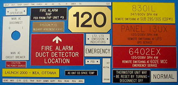 Ordered a glowforge laser which is how I’ve done them in the past, seems so simple on a laser but am not getting it for 4 more months, so got a shapeoko 3 to start early. Can I do both engraving the text and then beveling the edges with a single end mill and having to only send from Carbide Motion once?
Yes, Carbide Motion does V-engraving (which looks nicer) and will allow you to draw up anything and cut it to any depth which you might wish — you just have to either get two-layer/colour plastic such as these are made of, or cut things and then fill in the impression.
1 Like
Thanks! I hope this makes sense to someone. So sounds like I CAN do this without a tool change in one send? Am I just spinning my wheels in Carbide Create and need vcarve or meshcam? maybe I am just overthinking it, earlier was trying to bevel the sign prior to taking it into Carbide software, because I couldn’t figure out a way to only select the text and assign a depth, then only select the rectangle to assign the deeper beveled edge, in Carbide Create, was trying things like exporting it as a dxf vs. just saving as an svg from illustrator. I think I just need it to look like the one on the right in photo…when earlier I was trying to achieve the look in Illustrator (left) because of the selection issue. It will only let me select one thing at a time, like one letter, what am I missing!?
@tacomatomboy
Hi Casandra-
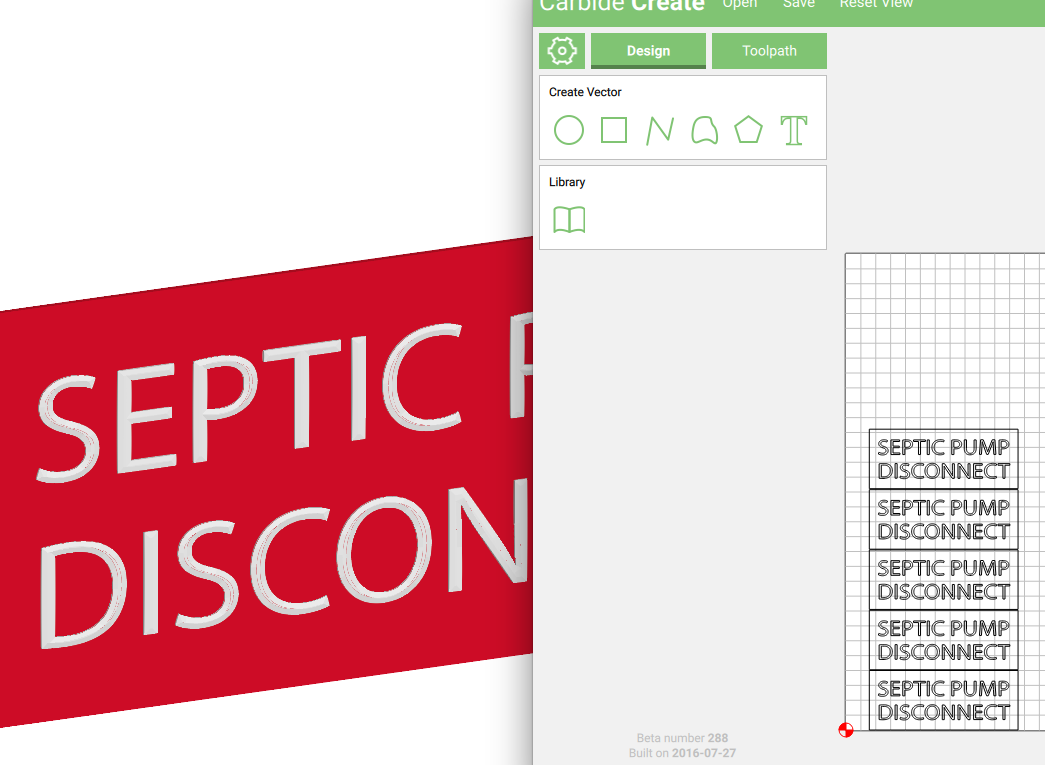
I Just ran a test with the V-bit cutter we carry in the Nomad with some Signage stock.
My Samples are 1" by 6" x .060" thick but I was able to test the beveled edge and Font with the single cutter.
Below you will find the results and the Carbide Create file for your reference.
Because I created the Text in CC, I was able to select it as 1 item.
If your importing an svg or dxf, you may have to select each letter (press cntrl to select multiple items)
Toolpath 7 is the smaller rectangles, and although I am using the V-bit cutter
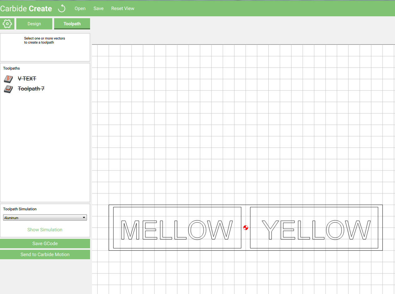

V-carving pass
Toolpath 7 cuts on the line to a depth of .059"
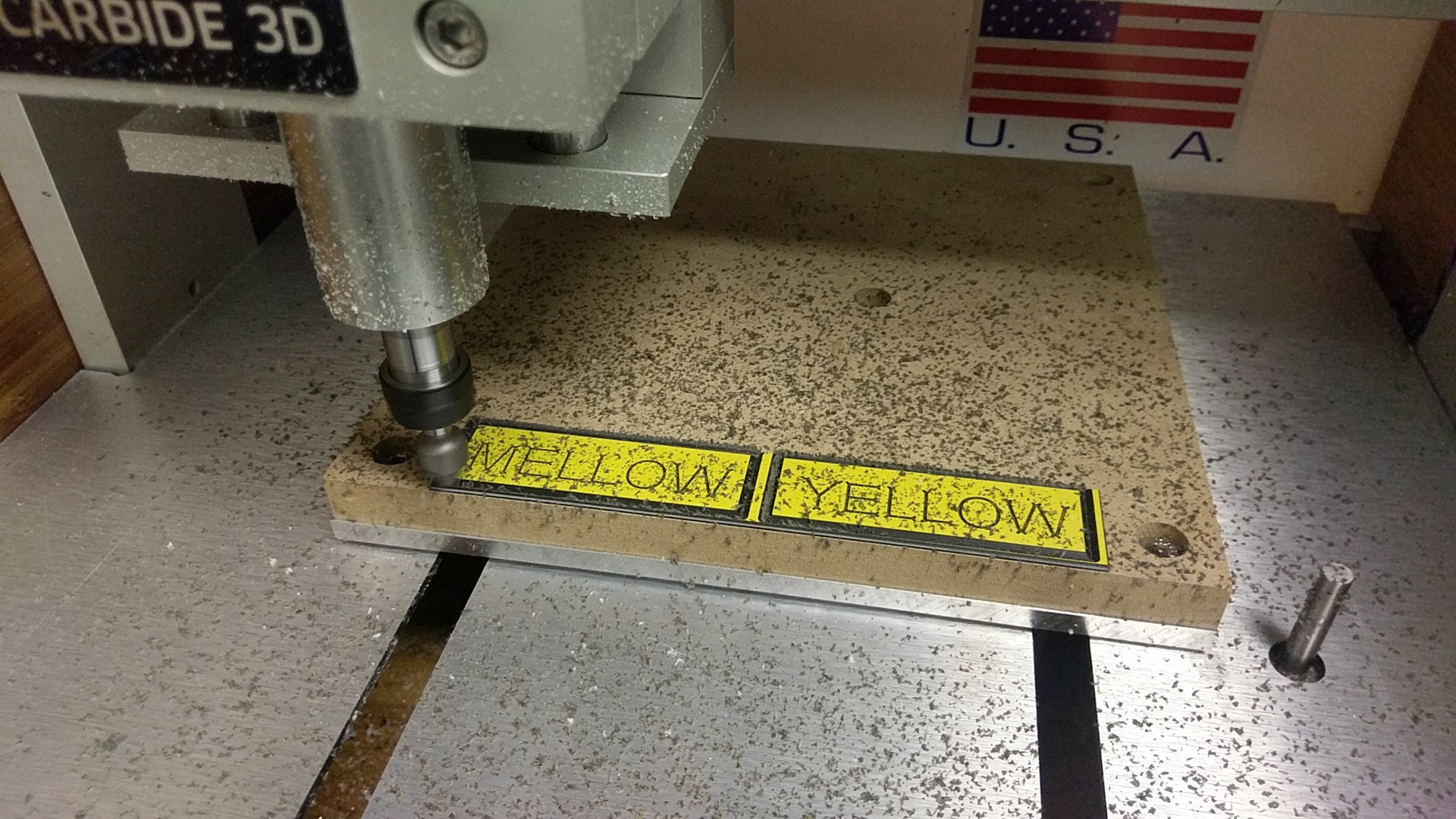
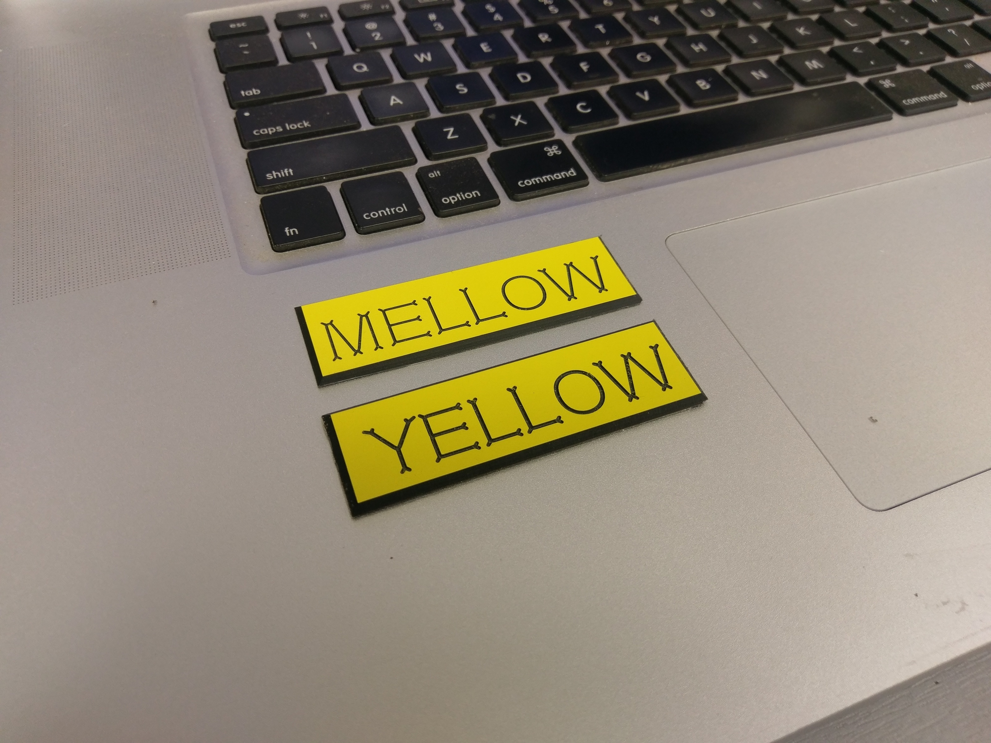
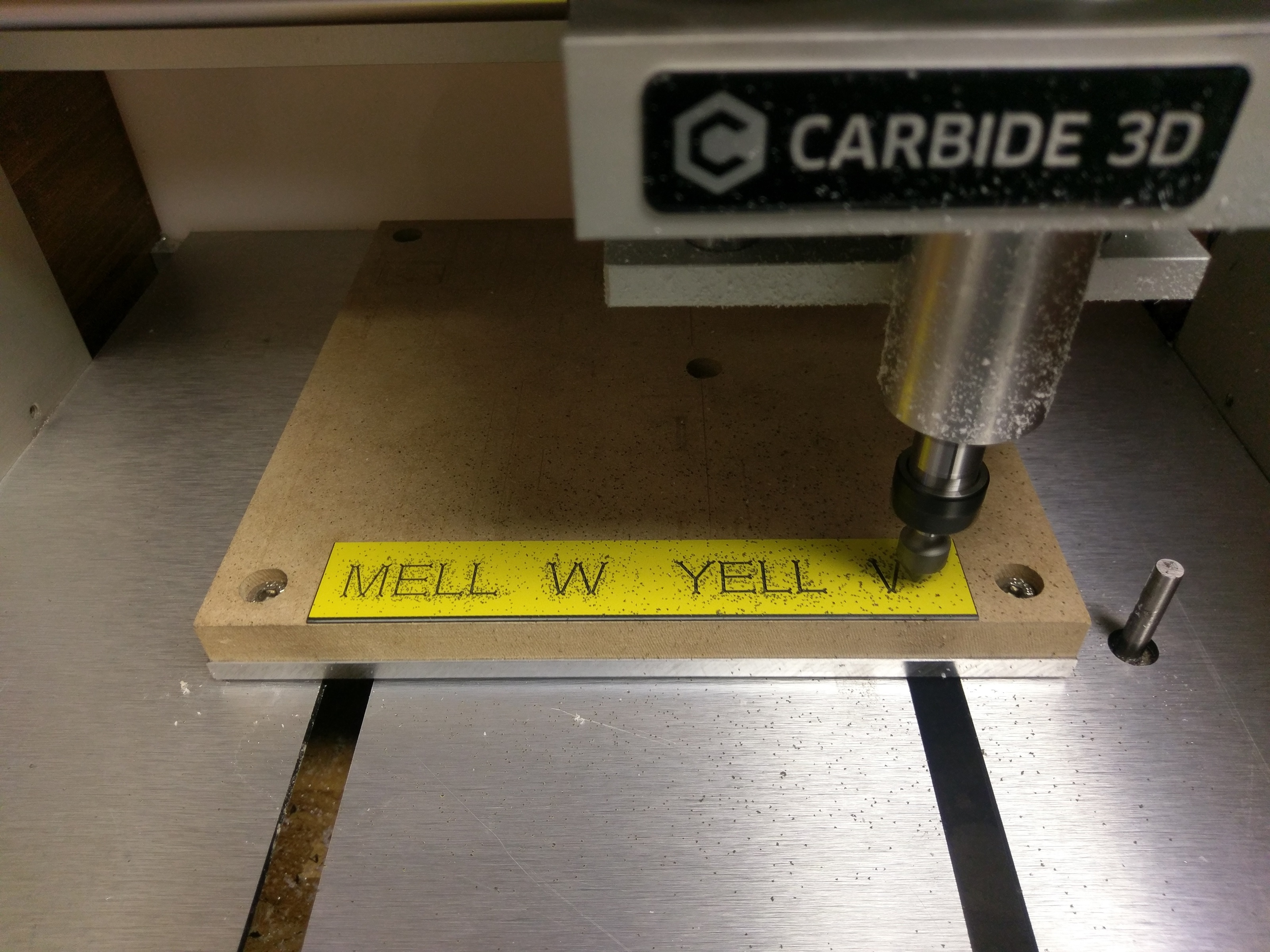
MELLOWyellowTEST.c2d (5.6 KB)
MELLOW YELLOW.egc (12.8 KB)
4 Likes
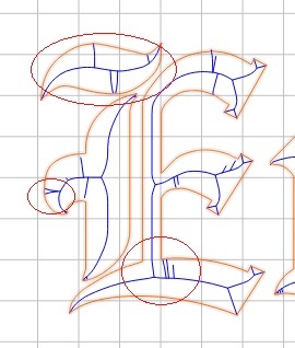
I’ve noticed when doing fonts similar to this on my XXL, that instead of getting crisp, square ends on the lettering, you get these bone-shaped ends. Why can’t you get nice squared edges? I’ve also noticed on wide, curved fonts that there are perpendicular cuts being applied by CC in the middle of the curve that just don’t make sense…is there a way to edit the vcarve paths?
It should be lifting out at the ends to make a crisp exit — is your depth set accurately and your belt tension okay?
What does the preview look like?
c.f., F-engrave
I don’t remember any of those details…I’ll have to recreate the issue later this week…got a project I have to get done by Monday. 
But the Old English font just seems whacked…but then again I did all the font work when I first got my XXL running and didn’t know much of anything, LOL
Be in touch later in the week with some definitive answers though.
Hey @ApolloCrowe, why did it make those little dog bone looking things on the ends of the letters? That doesn’t seem to be what your toolpath shows. Is that due to the v-carving? Can you avoid it, if you want to?
Probably caused by the serifs on Goudy’s Copperplate Gothic being exaggerated by the cutting:
https://www.linotype.com/1549209/copperplate-gothic-family.html
Thanks so helpful Apollo! We’re getting closer, we got some that are usable and working on getting more dialed in, playing with settings still, got the “bones” and ordered some different end mills. Switched to a mac a couple months ago, so to select multiple objects with ctrl-Click wasn’t working, but command-click was (doh) don’t know why I didn’t try that sooner.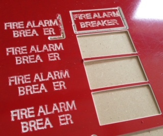
@MrHume
Good Point.
The Text layer toolpath was set to be a Vcarve style toolpath, that is why the letters have “dogbones” at the ends.
A pocket style toolpath for the Text layer would be a better choice for that font.
@tacomatomboy
Are you referring to the Feeds and Speeds chart here:
http://carbide3d.com/shapeoko/feedandspeed/
The outside cut with the V bit looks like it needs to travel faster and/or with a lower RPM.
1 Like
@appllocrowe I was just thinking I probably needed to try pocket next time and thanks for the tips!