No it isn’t.
@Able is on the money there. I’d issue a NDA even if we were shipping out a new end mill 
No it isn’t.
@Able is on the money there. I’d issue a NDA even if we were shipping out a new end mill
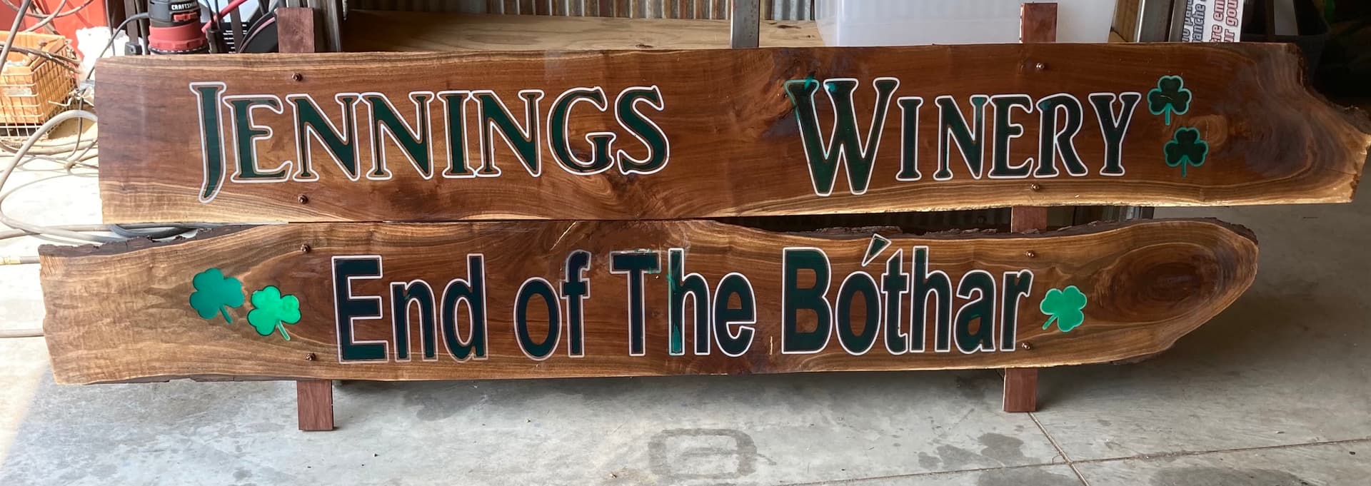
I just completed a sign for a local winery. The owner dropped two walnut boards off, both 1/2” x 11” x 84” and requested a sign be made. The boards were from the farm where the winery is being built. He never ask me if it were something I could even do! I have a Shapeoko 3 XXL. So I stole his jpeg logo off of his website and converted it to svg format. The letters converted fine but not the leprechaun ( it is an Irish-themed winery). So on the top board I was able to use the same font as they use on all their bottles and brochures, and the second I used the text function in Carbide Create and used Arial font. I calculated how to utilize my 33” cutting area on the machine to best fill a 7’ long sign. I identified the halfway point on the boards, then counted the letters and spaces that would reach the halfway point. I then did another file, flipped/rotated the remaining letters, flipped the board on the cutting table and carved out the remaining letters and design. I first did an outline of the letters with a 1/8 inch bit. This would be filled with white epoxy. I then pocketed out the letters and shamrocks which would be filled with green epoxy. Once all the epoxy was dry, I ran the boards through a planer until all was smooth. The boards were then treated with Watco danish oil, then when dry coated with a good exterior polyurethane. They plan to hang it on a barn at the entry to the winery. Bothar in Irish means road: ’ Meaning: Good Luck On Your Journey. As the word ‘bóthar’ in Irish means road and the verb ‘éirigh’ means to rise.’
Is there a significance to one letter (the d in End) having the counter highlighted in white, while the other letters w/ counters (o, e, B, ó, and a) not having a matching outline?
No significance. In creating the tool paths, the pocket was set to the wrong line and removed my inner 1/8” outline. With a project like this, you get one shot at it and being my first attempt at doing something outside of the normal Shapeoko box, it was definitely a learning experience!!
Ouch. Yeah, sometimes it’s hard to judge that sort of thing from the 3D preview.
It’s very nice though, and the letter differences give it an air of mystery
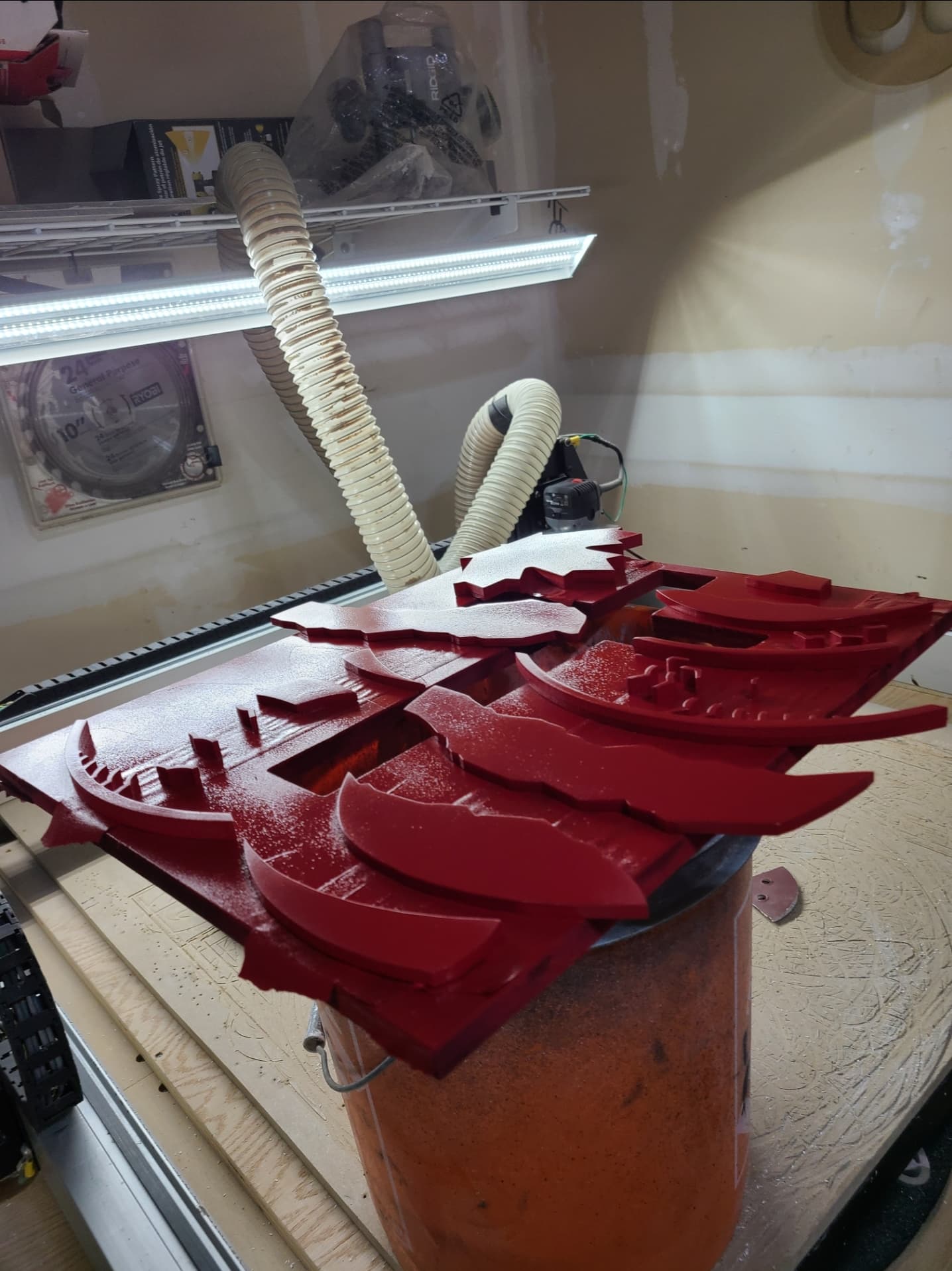
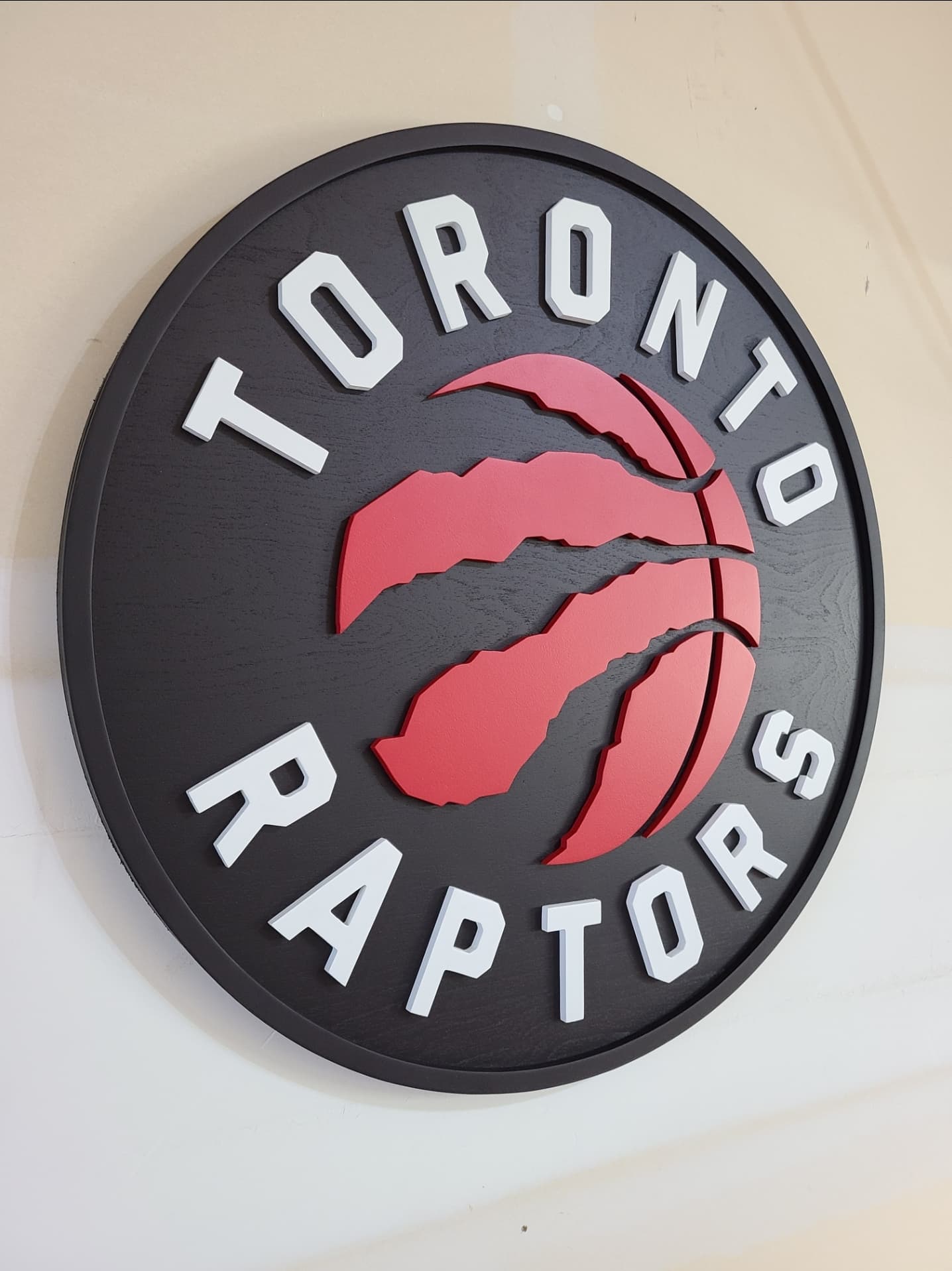
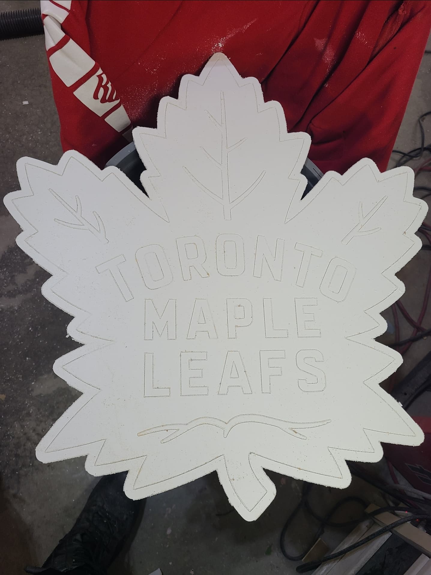
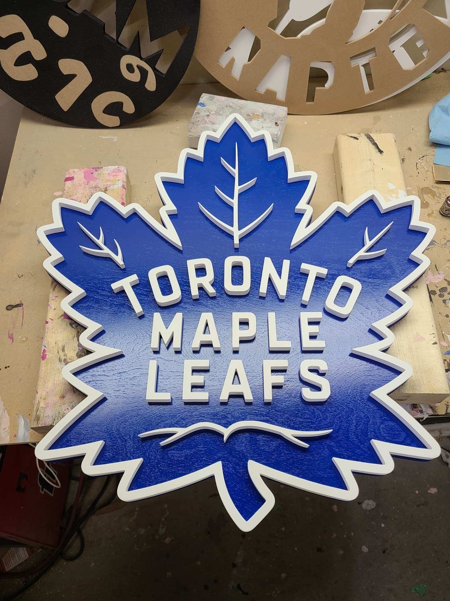
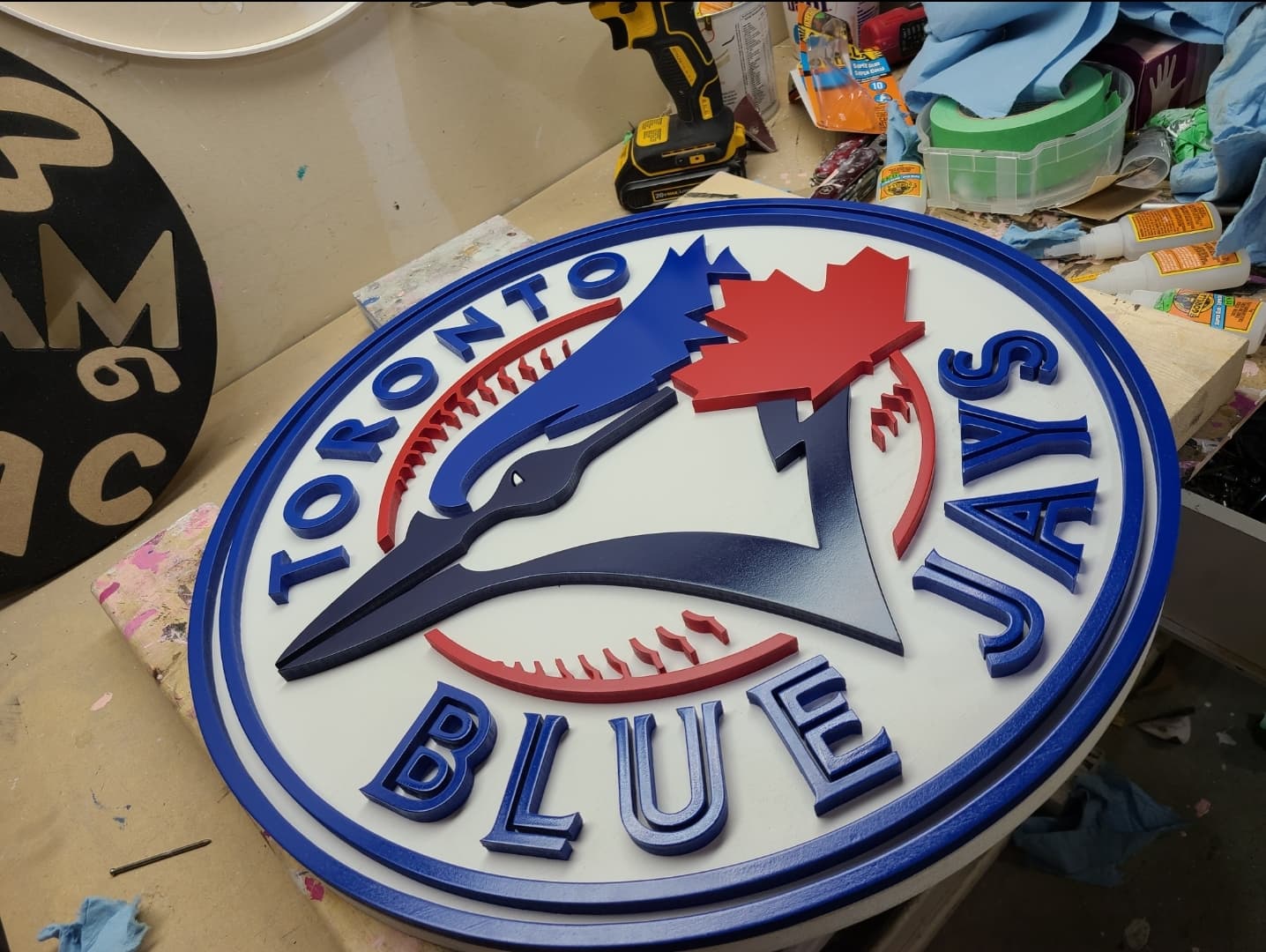
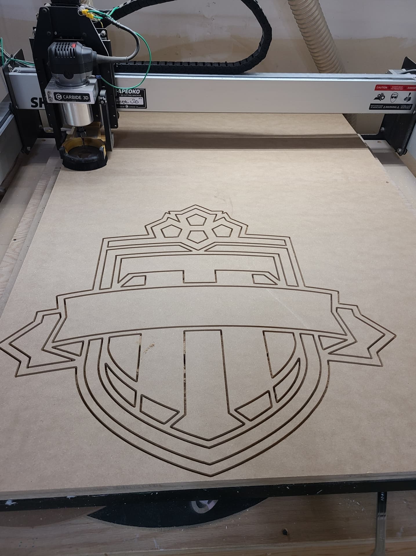
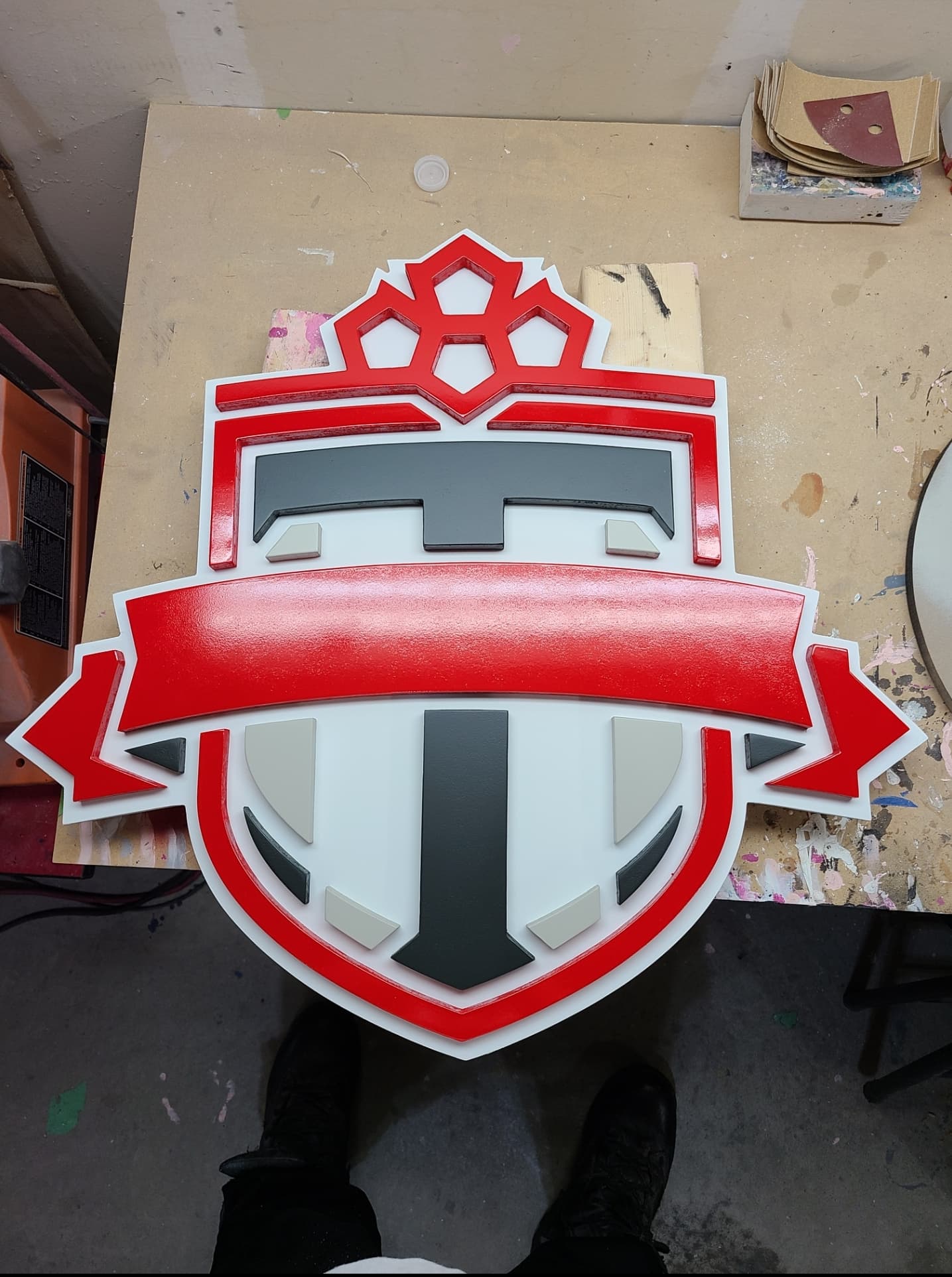
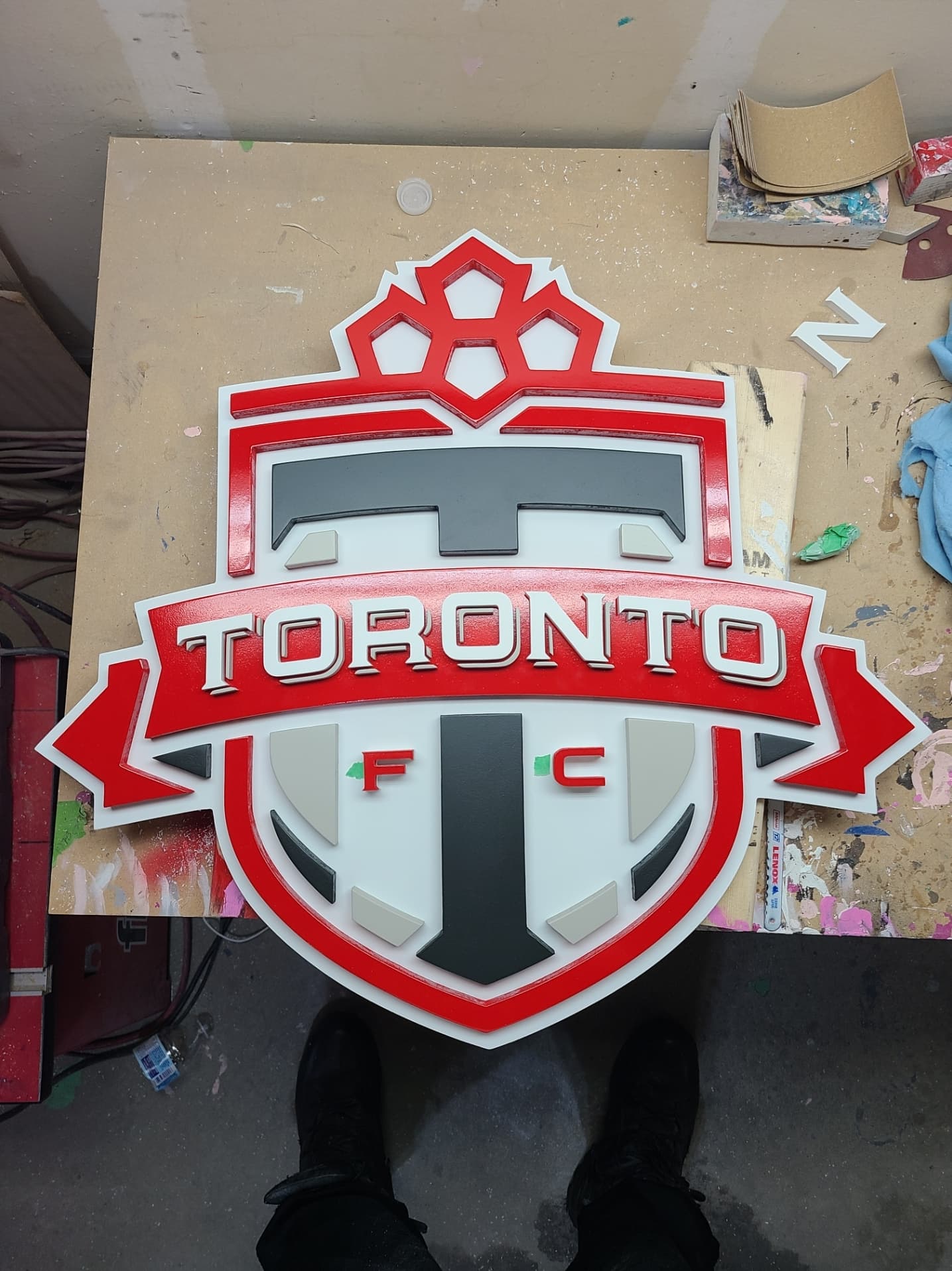
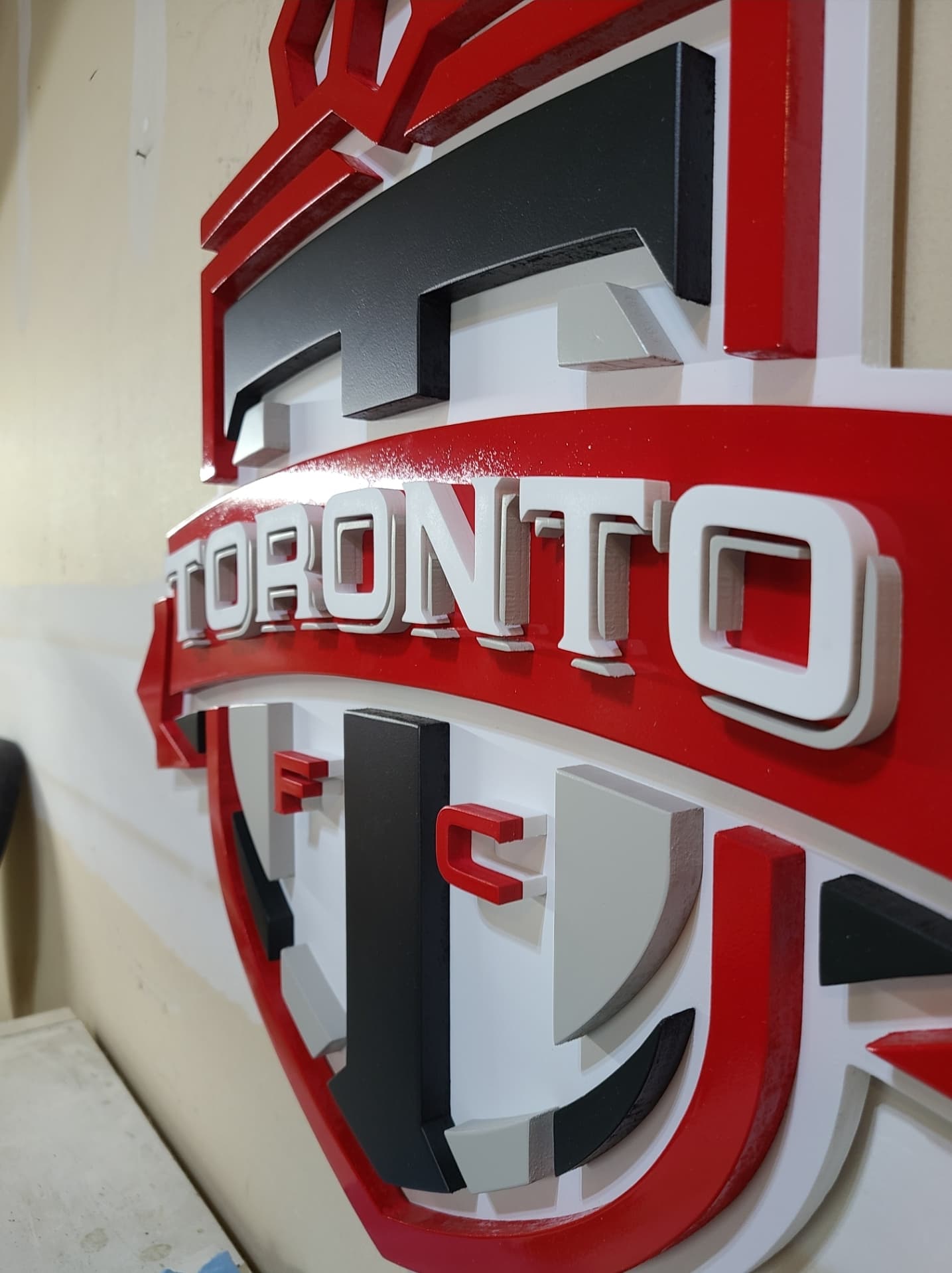
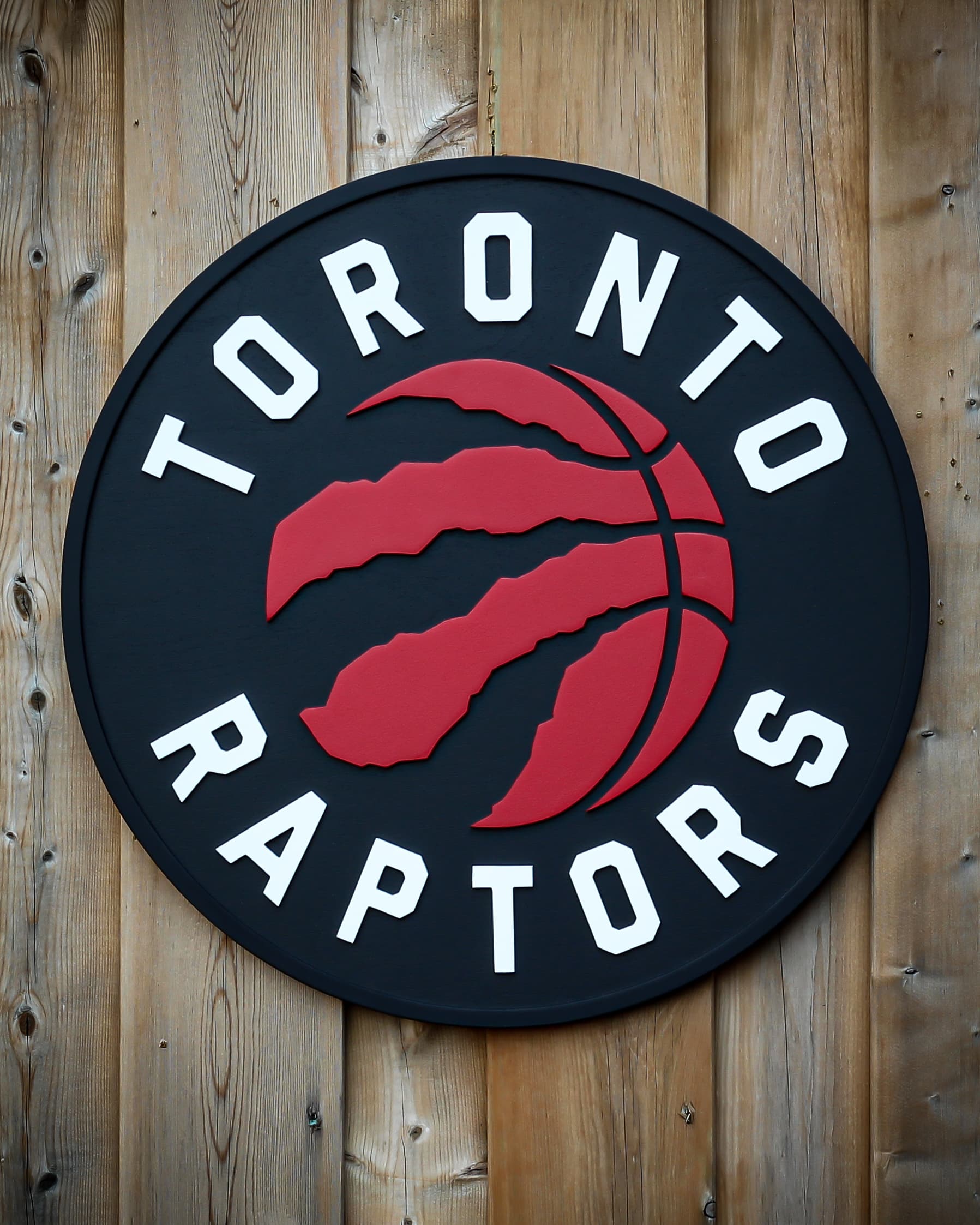
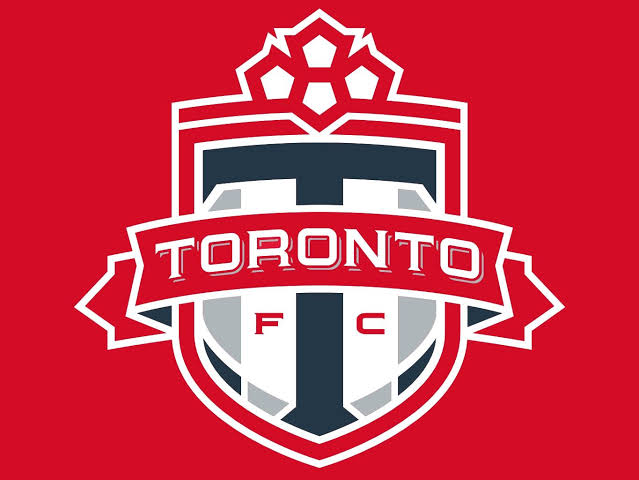
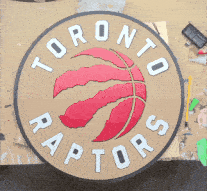
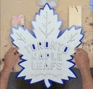
One of my family members owns a diner who asked me to make all 4 major Toronto sports team’s logos. That included the Raptors, Toronto FC, the Blue Jays, and the Maple leafs. It was a difficult task considering I had my customer orders to fulfill every week. But I took it on regardless.
I started with the Raptors logo since that seemed like the easiest. I used 1/4" thick hardboard for all the pieces that would be glued on a 1/2" painted birch plywood base. Hardboard is like mdf, with a little more density. It’s cheap here and seems to finish really well.
Once the base was painted black, I used the piece that I cutout all the lettering from as a template to glue all the pieces in the right place. It’s not allowing me to post a video so uploading this “gif” format as a video of the process. Sorry for the bad quality.
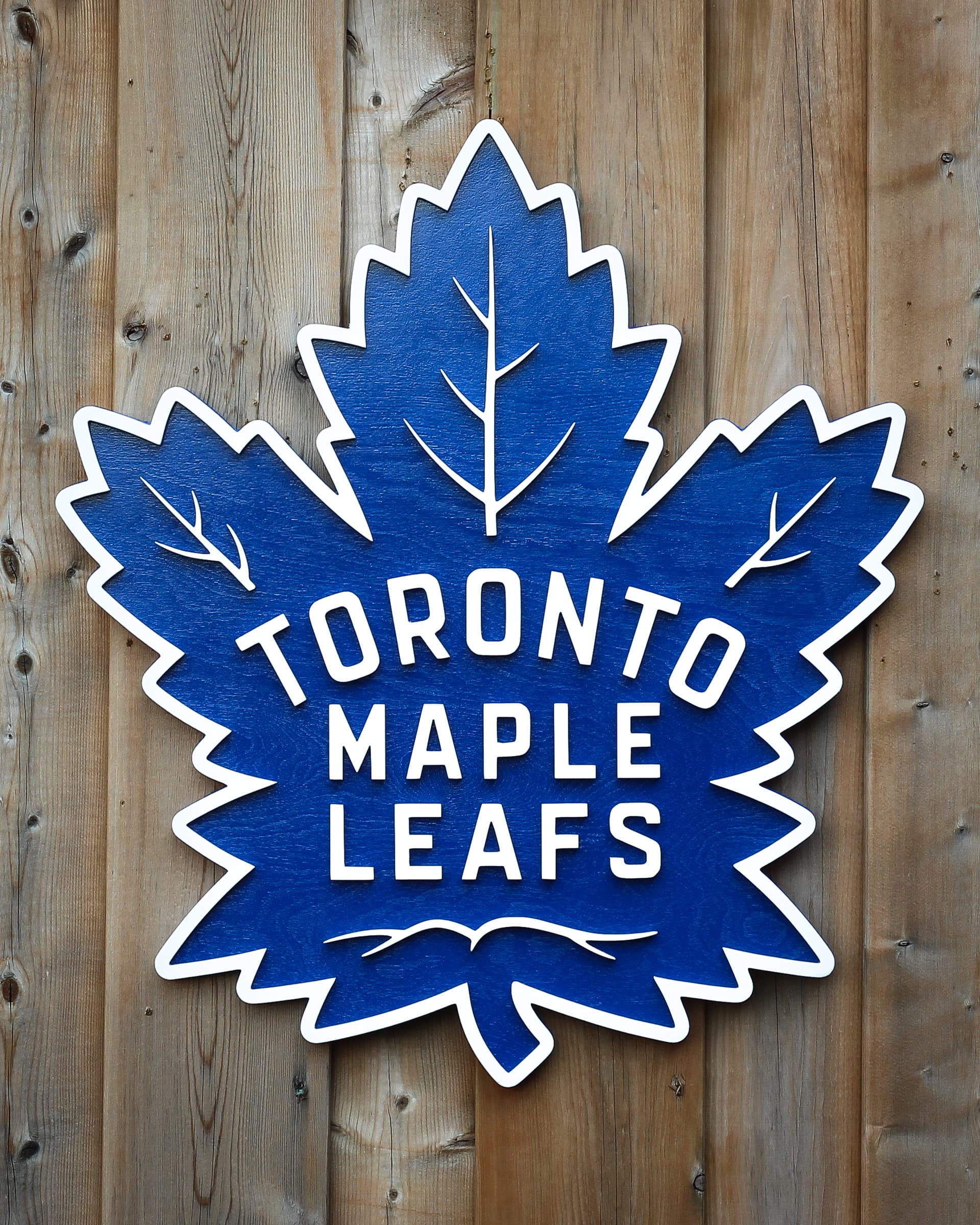
Then moved on to the Leafs logo. This was was cut entirely out of pvc since all the lettering and the border was white. PVC is my favorite material to cut since it requires minimal sanding and looks ultra white(also easily printable without primer)
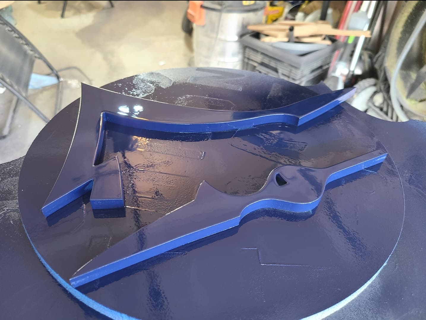
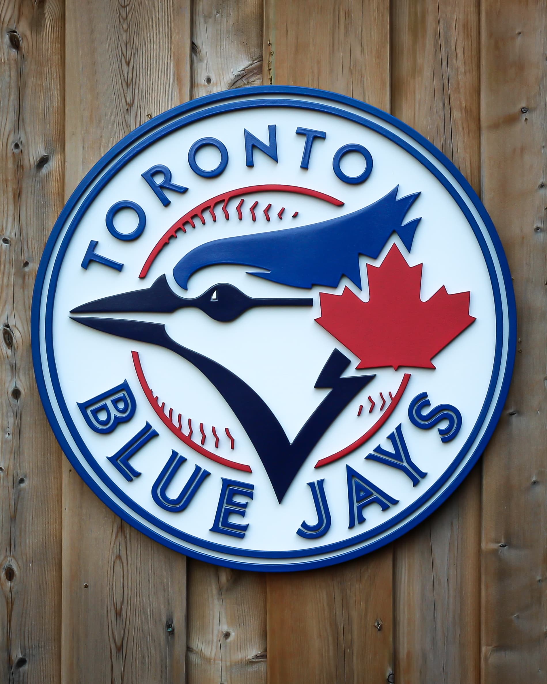
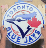
Blue Jays logo was next. Once again all parts but the base were cut out of pvc. This one took me more than an hour to glue.
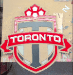
Last one was the TFC logo, I cut everything out of 1/2 mdf. Then used PVC for the lettering and shadow for the lettering. It had about 52 pieces to glue in total.
And that’s it. It was challenging but rewarding. I can’t wait to visit the diner to see them all displayed together. If you have read this far, I thank you for your time, and here are the final pics of this project.
My mistake was joining the letters and adding the paths to it as a group. When doing this, Carbide Create puts a path on the inside when you selected the outside path, or vice versa, when there are letters like “o” and “e.” If I had done each letter separately it would have worked ok. And I could have had a better view in simulation. Does that sound right?
Hey, it was gorilla glue super glue and rustoleum spray cans.
Nice work now if there was only a way to make Canadian teams perform as good as these signs look lol. I’m kidding I don’t follow any sports teams so I have zero clue about how any of them perform. My favorite TV comedy show is How I met Your Mother so every time I see Canada all I hear is Barney Stinson trash talking them even though he is part Canadian.
I like your gluing template that keeps everything aligned.
Lol thank you! Love that show as well!
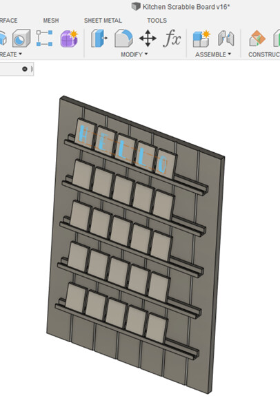
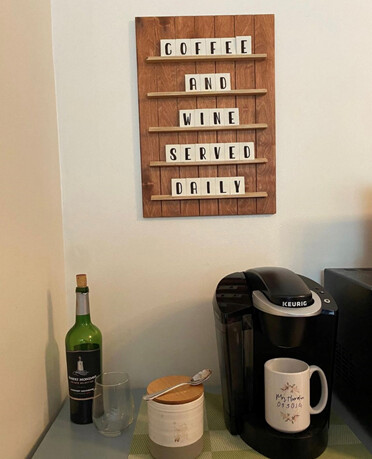
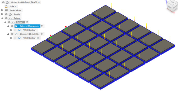
The wife and I made a simple and completely customizable sign for the kitchen/house! We’re pretty happy with how it turned out. Our hot-swappable Scrabble-esc Message Board:
.
Design
I started the design in Fusion to check spacing, looks and overall setup. I also threw in some test text to see how the letters would look on the tiles when assembled:
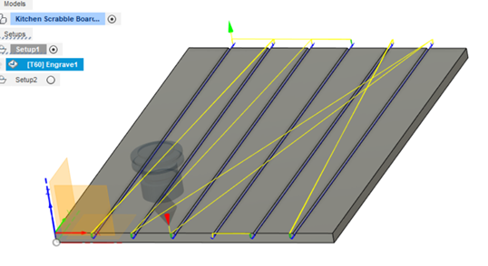
With the recent(?) popularity of the shiplap concepts floating around, it was determined that the feature should be included somehow. I decided to cut V-grooves on the back panel to give it that faux shiplap appearance. It certainly helped to give some added character to the simple sign!
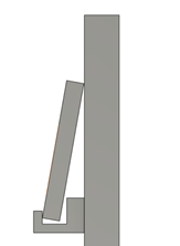
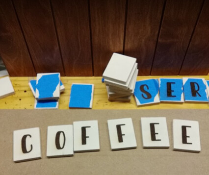
Once I had the general design, I manually checked the angle of the tile pieces when sitting on a “tile holder”. I adjusted the holder geometry until I arrived at what looked like a reasonable angle for the tile to sit, with a balance between legibility and resistance to tipping (for tipping example see the last “E” in COFFEE in the finished pic above, easy to push back into place):
.
CAM
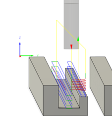
Once the piece designs were locked in, I moved on to the CAM:
For the Tile Holders,
18000rpm, 40ipm, 0.08” DOC with 2D pocket toolpath, and then 2D contour toolpath.
I batched them all out together with the nice Pattern option:
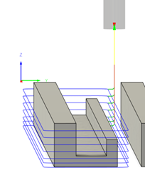
For the sign backing, the quick and dirty “shiplapping”….with the 60 deg V-bit (18000rpm, 40ipm):
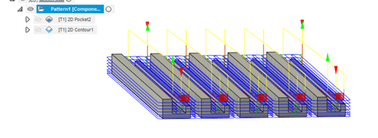
For the tiles themselves, the pattern feature certainly came in handy (yes I forgot to caliper the “1/4” MDF before I superglue/taped it down…adjustments made in the Cleanup CAM haha):
 18000rpm, 40ipm, 0.04 DOC
We wanted the tiles to have an old school cartoony look to them, so we picked the font Sunday Best” found on dafont.com.
.
Finishing:
The backing (1/2" birch plywood) was finished with a simple honey stain, followed by a lacquer seal coat. The tile holders (same birch ply), we liked the simplistic look of the birch plywood and so we kept it the bare wood color.
For the tiles themselves (1/4" MDF), we elected to paint each of the tiles white and then laser burn the letters. The reason we went this route was simply because…there were a lot of tiles and I didn’t feel like setting up a CAM profile to carve out each letter, and then hand paint the letters…. so laser to the rescue:
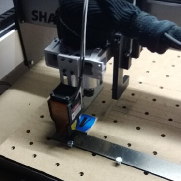 (square placed for low-profile zero reference point to place the tiles quickly)
 <–(blue tape used to mitigate overburn from laser)
.
Final pic again:

This was a fun project to knock out, with the added benefit of having a sign we can easily change for various seasons! We’re planning to utilize the back side of the tiles to be able to change the phrase while conserving tile numbers. At the very least, we’ll make it into a fun Xmas phrase later this year.
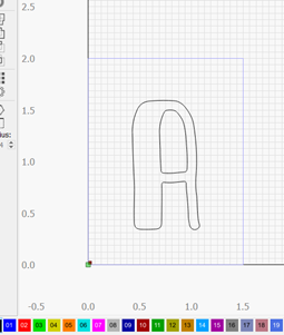
Design Files: here
Lightburn letter example, if anyone would like it (remove “.zip” in file name to open):
scrabble letter A.lbrn.zip (14.0 KB)
Comments and feedback welcome as always,
Kyle
When choosing feeds and speed in CC, what material did you treat this as?
Still pretty new to the community, and to my Shapeoko. Anyways here’s a sign I made for our shop that started out as a locker-room back in the 50’s. Made with an old MDF shelf, and then hand-painted.
Wyatt
just sofwood  sorry it took so long to answer back.
@GeneralSid What endmill did you use for the PVC in the Maple leafs sign. A 1/16"? Looks like almost no kerf.
No worries. Thanks for the response. Being a plastic material I could see where there is room to have some dedicated feeds and speeds but this is a pretty light and quick operation so there is plenty of margin for error.
Dang! Your sign looks amazing! I also like seeing how you showed the steps of making it!
Yes, 1/16th o flute upcut.
Steve - Happy to see the beautiful sign you did for your buddy. It’s all about sharing. Ironically enough, I too own a Kitfox Speedster plane that I built in Georgia and you sign has inspired me to make for a good friend that also has a Kitfox. Nice long flight to Oshkosh??? Done it myself a few times.