These were designed using Inkscape and g-code created with MakerCam (I downloaded the standalone flash program and the MakerCam program and run it locally now). BUT! I do use Vectric V-Carve Desktop for some stuff now, and the CamBam single line fonts sit on my computer as do all of the other fonts, so I can use them in both programs.
The single line fonts are designed so that the cutter follows a single path of the letter in one direction, then reverses and “backtracks” keeping to the original path it followed going forward. You treat it the same as any other font.
Heres a message I sent someone a bit ago. I am at work and don’t have time to edit it, but it shows why I like using Inkscape for the single line fonts. It shows very closely how they would look when cut.
The first thing you need to do is when you are making a smaller board is to ensure that the players can actually get their fingers between the pegs when the pegs are next to each other. I will usually buy the pegs I want to use first and then space the holes at different distances to find the minimum spacing for my fat fingers. I buy my pegs from http://www.petespegs.com/ but it recently (year or two ago) changed hands, and the prices went up (shocking, I know) but there is still a good selection of metal pegs.
I use either the standard 1/8" pegs or the 5/64" pegs for my small boards. I had some custom ones made for my super small boards that look like #4, but are for 5/64" holes.
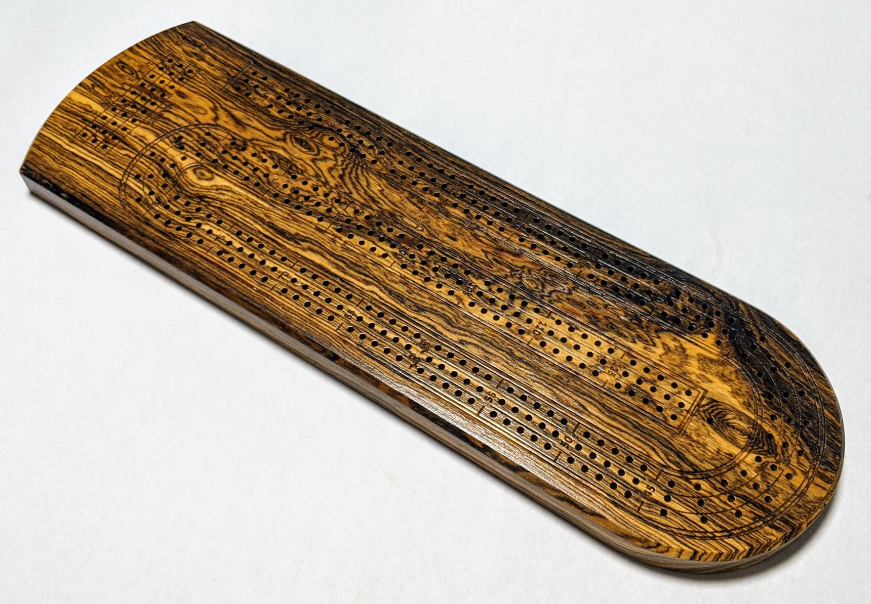
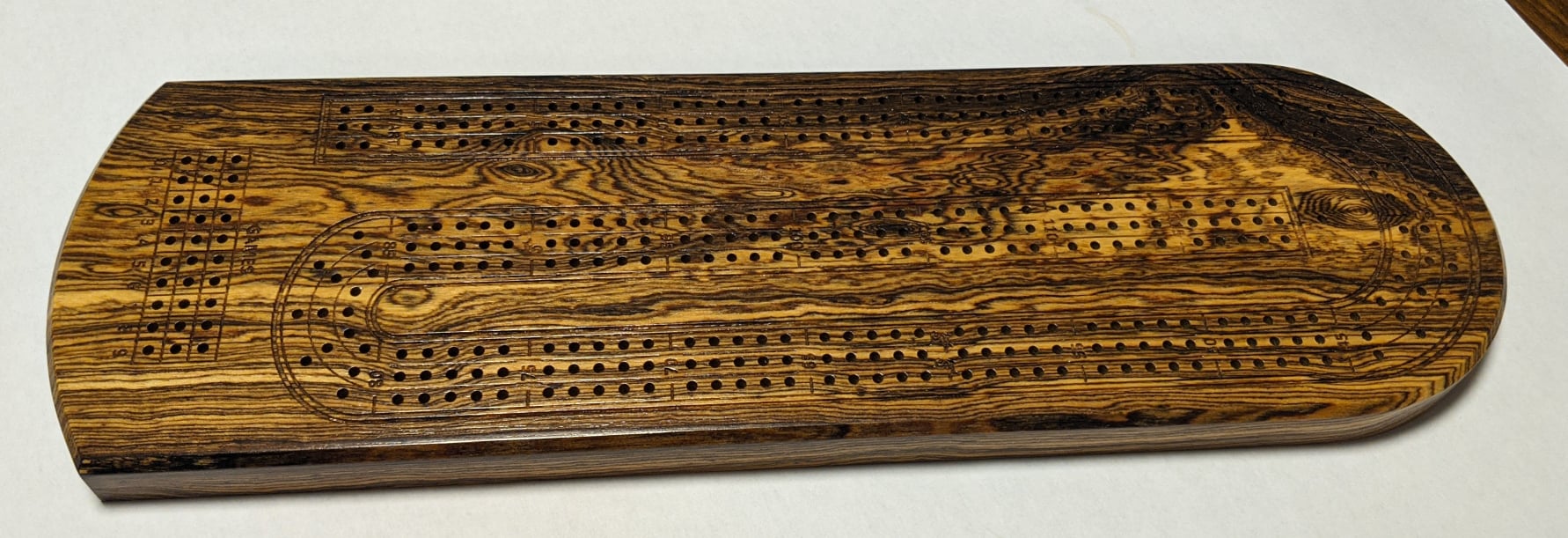
For the detail lines around my boards, and the numbers, I tried using V-bits, but I just did not like the look of the engraving. I love using V-bits for other things, but for lines, I prefer to use straight end mills. I buy 95% of my bits from drillman1 on ebay, and I have not been disappointed yet. I use 0.0236", 0.0177", 0.0150" and 0.0120" end mills for the lines and details on my cribbage boards.
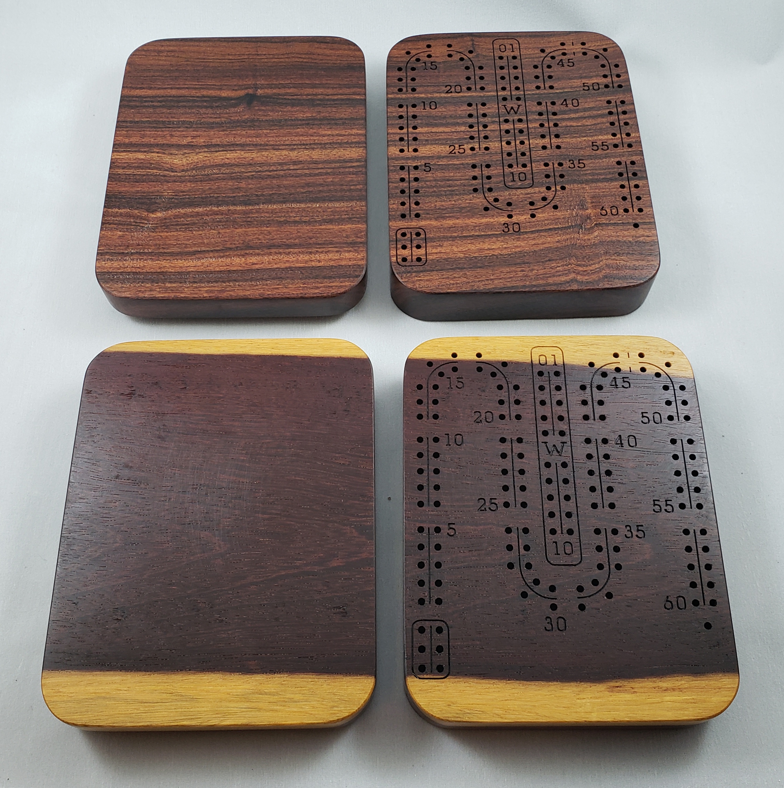
This board is made with the 5/64" (0.0781") drill bits and an 0.0150" end mill from drillman1.
This board uses an 0.0236" end mill because the numbers are a bit larger and the thinner lines didn’t look right. It is difficult to get your machine to track exactly perfectly, so I would recommend using a single line font (CamBam single line fonts are my favorite, and they are free) and get an end mill that looks right for the size of your font. Another thing that is great about Inkscape is you can set the line width to see what each font will look like when cut with a specific end mill width.
Here’s an example: 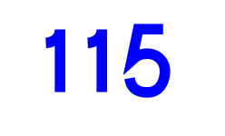
This is how the default line display settings look when you use the single line fonts. Sharp corners, nothing is rounded, but if we go in and tweak the settings, we can get a really close approximation of how things will look when cut with your machine.
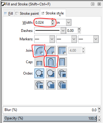
You set the [Width] to your end mill diameter, se the [Join] to this selection and the [Cap] to this one and you get this:
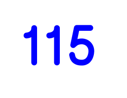
A much more realistic looking view of what your machine will actually cut. Now, you can mess around with cutter diameters to find one that looks best for the size of the font you want.
Here’s the font with an 0.0120" diameter:
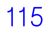
I think it is too thin for the size, so I would go back up to a larger diameter end mill.