(Well, I should say the big project other than a bunch of other client work, and renovating my garage, which is another story)
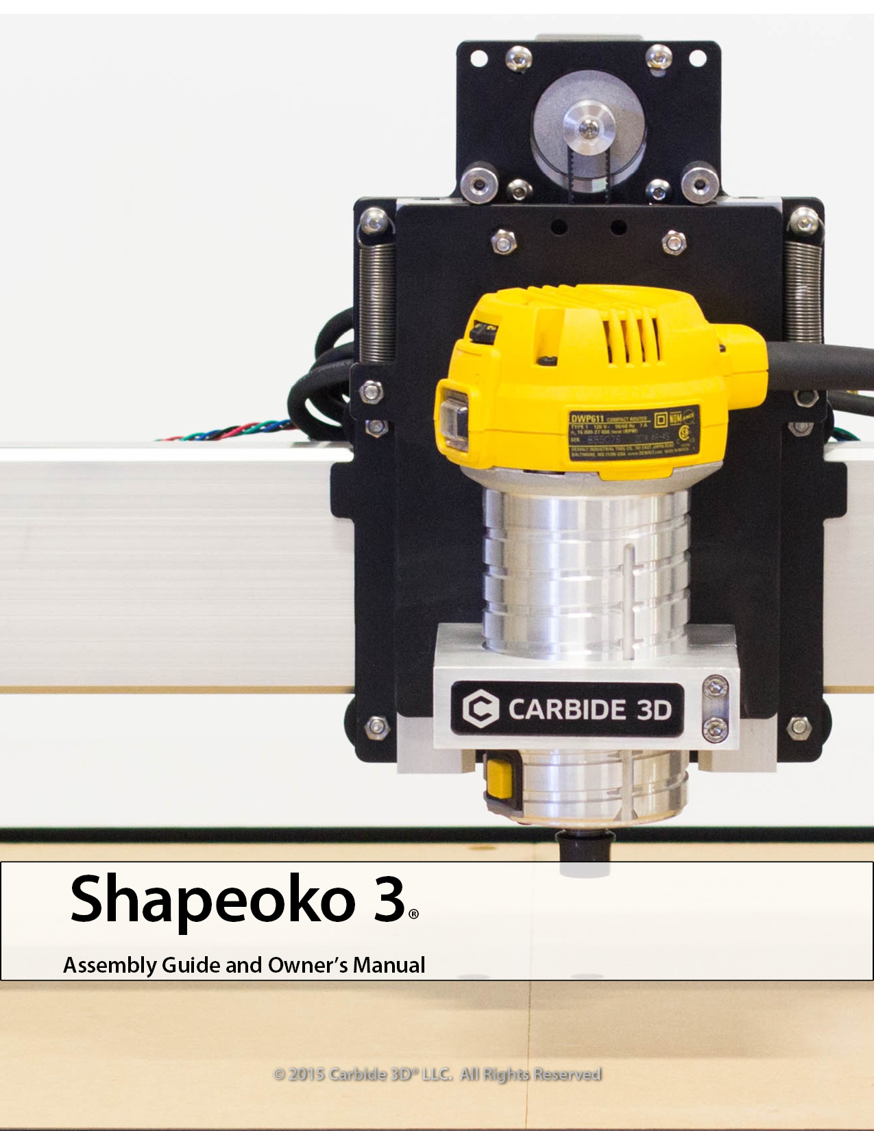
Carbide3D contracted with me to write and illustrate the Shapeoko3 assembly manual, based on some other graphic work of mine that they had seen previously—so I was very appreciative of the opportunity to do it. While it took considerably longer than they (and I) would have liked to produce, I wanted to make sure it was top-notch and that I also produced it within the constraints of the agreement I had with them, while also respecting my other clients too.
For you fellow Nomad owners, be glad you don’t have to assemble anything but for you So3 folks who are awaiting your pre-order or visitors who are sitting on the fence about it, check out the manual and look forward to how straightforward the process is—Edward really did a good job with the machine design, making sure that he “trimmed the fat” on the assembly process so it’d be a straightforward endeavor you can complete in a Saturday. I hope I’ve managed to do that justice with the manual!
(If I sound strident in this, it’s ’cause I’ve pointed out a lot of this previously, and Edward hasn’t explained why my criticism isn’t valid — also a lot of these were pointed out in the Shapeoko Forum thread: http://www.shapeoko.com/forum/viewtopic.php?f=37&t=5975 )
it’s in RGB mode, and this may be a dis-service to anyone printing on a CMYK inkjet, which in some circumstances will result in a rich black being printed using more ink — the background is thus as well which will use up a lot of ink if a person prints it — if professionally printed, the printer will either complain, or have registration issues, or you’ll hit the ink limit — similarly the logo and illustration seem to be in RGB mode
why bother with hyphenation on pg. iii? (or anywhere in the manual for that matter)
none of the links on page iii are live — why not?
equal space above and below heads is amateurish, and confusing — there can never be too much space above a head, but it’s confusing to the reader if there’s too much below one. Rough guideline, at least one linespace above heads, no more than half of one below.
capitalization of g-code is inconsistent.
extra space in-between Carbide 3D and Docs pages
why is the ToC so tight? Space it out to make it more comfortable to read — also, articles in section heads (and, onto, the, &c.) should not be capitalized (this is inconsistently done)
why is the packing list in two columns? How does that help the reader? It actively makes this more difficult to read, since the gutter is too tight (it should always be greater than the line spacing
also, please use real primes and double primes instead of faking them w/ italic quotes
also please use real fractions instead of setting shilling form
why do the packing list pages have smaller text boxes than the preceding ToC spread?
pgs. viii and ix — space above heads again — also, why so much space between the numbers and the text? There’s more there than there is at the bottom or right edge of the text box. The spacing for the heads is also inconsistent w/ more space on the left page than on the right — identically formatted text on facing pages should align — use paragraph styles and only apply over-rides at need.
the text on those pages would be better re-written so that parallelism was maintained and every section had a final commentary / guideline in italics (also, it’s redundant to put them in italics and in parentheses and this is inconsistently done)
pgs. 2 and 3 seem redundant to me — a spread would be better combining the two
pgs. 4 and 5 — it’s hard to pick out the Notes — at least make Note: bold
also, a page folio buried in the gutter verges on being useless. We know it’s a Carbide 3D product, but when flipping through the pages, (esp. when it’s printed) we want to know what page we’re on — the logo is kind of large and doesn’t have much room to breathe — small and discrete would be better
the small insets in the corners really feel cramped, w/ insufficient room around the borders
why are some of the numbers in circles outlined and other filled in?
pg. 7 why are some numbers in circles larger than others?
pg. 7 30-40mm — please use an en-dash (–) to indicate duration — why is there extra space at the bottom of this text box?
pg. 12 inconsistent capitalization of z-axis
pg. 12 space in the word screw s (or something wrong which allowed it to break down to the second line in the second paragraph)
pg. 13 inconsistent space at the bottom of the text box (throughout)
pg. 15 the use of red text for a note is nice — why not just do that and dispense w/ the need to write out (or to bold) Note:
pg. 15 inverted (appears wrapped in underscores) — presumably that should be in italics as it appears here.
pg. 16 **Note — remove the double asterisks. This would be better in red as noted above.
pg. 18 **Note…"" — again.
pg. 19 space in box again
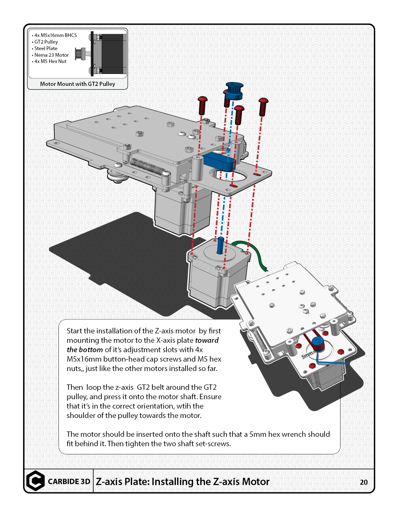
pg. 20 — doubled up commas “M5 hex // nuts,”
pg. 21 — z-axis or Z-axis
pg. 25 — two word stack last two lines of last paragraph should // should
pg. 29 — are the M3 screws as drawn in the inset different lengths?
pg. 29 — decide how Tips and Notes are going to be formatted and differentiated (see pg. 30 and throughout)
pg. 32 — the board illustration looks rather ghastly as a transparent thing over the background, also has no margin to either side — allow it to break out of the box?
pg. 36 SPOK? maintaines (in V-Wheel)
SPOK? thru-holes (in Eccentric Nut) — also v-wheel should have the V capitalized (throughout)
square nut should be re-worded to note that this is a specific instance of this usage, not the raison d’être for that shape of fastener
space or not in Shapeoko 3? (see Power Supply)
SPOK? orthagonal
Fully tight — rather than say tightened as much as possible, say to the proper torque specification or as tight as can be managed w/o damaging the connectors and material being fastened — as much as possible invites stripping out threads and rounding off connectors
pg. 37 — when exporting to a .pdf or saving embedded files use settings which don’t result in some text being converted to outlines (nice that you used the proper fractions for the X-axis Motor Mount with GT2 Pulley)
M5 V-wheel assembly?
pg. 37 — the M3 hardware for attaching the fan isn’t shown? Has a decision been reached on that and how it’ll be attached?
Throughout:
please consider putting a non-breaking space before the last word of every paragraph — there are a bunch of single word last lines
A VERY IMPORTANT CONSIDERATION?
pg. 35 — For the power supply, is it 110/220V switching? Is there a manual switch or is it auto-switching? If a manual switch, mention the need to set the switch?
Anyway, I just took a quick glance through it, and wanted to post this while I had the chance.
That’s all good critical feedback on the fine-tuning and details, and many of those adjustments absolutely make sense to make. Considering this was the first technical manual of this scope that I’ve done, and typically my non-standard printing experience is more in line with plotting large format documents (architecture & design school) rather than regular press stuff, I’m appreciative for new knowledge outside my scope. I will take those observations into account for revision work, and remember some of your concerns regarding document setup/prep for in the future!
Mind if I bug you for some further feedback on other projects since you’ve clearly got some experience in this area?
 but for you So3 folks who are awaiting your pre-order or visitors who are sitting on the fence about it, check out the manual and look forward to how straightforward the process is—Edward really did a good job with the machine design, making sure that he “trimmed the fat” on the assembly process so it’d be a straightforward endeavor you can complete in a Saturday. I hope I’ve managed to do that justice with the manual!