The Mac OS used to, and if Apple still allowed theming, would.
I don’t want to tamp down a good technical debate but I will add that we’re not going to look for OS color values/themes. It’s not worth the dealing with the support problems that would entail on multiple platforms just to get a high contrast interface.
@WillAdams, your comments (for which I thank you) did raise a question in my mind, related to my mention of the apparent dithering.
It seems that font smoothing/diithering is a setting that can be enabled or disabled in Windows: http://www.thewindowsclub.com/disable-font-smoothing-windows
I will need to wait until I’m home later to discover whether this extends to application windows, or is just OS as the other interface tweaking is…
Randy
I LOVE the new interfaces!
I’m finding that in 1 out of 5 times when I start up and click on connect I get a crash. This is on a Mac Pro running 10.11.3.
mark
Tool kits which don’t use native OS widgets and which do not honour settings which the user has gone to the effort to make, annoy me.
Such fragmentation is an active dis-service to the user, and the reason why we don’t have nice things such as resolution-independent interfaces which just work.
Next time you’re at a Windows box, customize the interface, including screen DPI, then launch WordPad and see how it respects said settings, then ask yourself how you feel about programmers who don’t adhere to the guidelines which result in such consistency.
While a foolish inconsistency may be the hobgoblin of a little mind, an inconsistency which fails to adhere to published guidelines, and which creates even greater inconsistency represents a conscious choice to fragment a given operating system’s interface, and which interfere w/ the ideal of computers serving as “Bicycles for the Mind”.
It kills me that the high water mark of my computing experience was back when I used an NCR-3125 running PenPoint, cabling up to a NeXT Cube over a serial connection to transfer .rtf and .eps files. Being able to use TeXview.app’s TeX EQ to EPS Service in Virtuoso.app or FrameMaker “just worked” as did everything else on the system. Oh well, at least my NCR is being preserved by the Smithsonian.
This current mish-mash of tool kits and programming systems feels like a hair shirt by comparison every time I bump up onto some inconsistency, and it makes me wish that I’d bought a Bridge City Tools JointMaker Pro instead of a ShapeOko.
Edit: Oh well, once the Linux version is released, I can just run everything in a Linux environment, using only QT toolkit apps there, which hopefully won’t offend my delicate sensibilities.
I just watched the video on their site, and I agree with you 100%! You should have bought a Jointmaker Pro. ![]()
We ALL should buy one, for that matter. That thing is super cool. And when the zombie apocalypse comes, and the grid goes down, JointMaker Pro users will still be making very precise cuts…
@mbellon - Are you getting any kind of stack trace when it crashes? I’ve seen it happen here, though less frequently, and when it crashes it seems to be so deep in the system libraries that I can’t debug where the problem originated.
@WillAdams - You can try the Linux build at: http://carbide3d.com/dl/CarbideMotion.tar.gz . But it might be a waste of time- I think we’re going to give up on CNC and make our version of the JointMaker. Those seem like more fun.
@Randy - The dithering is probably OpenGL anti-aliasing. Our whole UI is rendered using OpenGL so any wonky drivers or incompatibilities can lead to rendering artifacts like dithering.
-Rob
@robgrz, why use anti-aliasing? The window is a fixed size, and going full-screen the fonts don’t scale. That’s what I said above–given the fixed font size a clean dot-for-dot bitmapped font would be much preferable to an anti-aliased, dithered font. I will check the OpenGL version of the notebook.
Randy
@WillAdams, I have a Mac Plus with nice crisp B/W graphics and well-crafted fonts that display well at any size. Grayscale? We don’t need no stninkin’ grayscale!!!
It’s just a function of the Qt framework we’re using, not a conscious choice. We debated using a graphics-heavy framework like that and ultimately decided that the speed of development, and the ability to take the UI to iOS and Android if necessary was worth it.
I’m a Mac developer and I noticed that the telemetry isn’t there … no incident reporting or automatic stack traceback collection. Not having source I couldn’t dig too far but the stack traceback I could see looks as you describe it - WAY down in the libraries.
The only hint is that it occurs when I clock on connect. When I get it again, I’ll see if I can cut and paste the traceback and post it.
mark
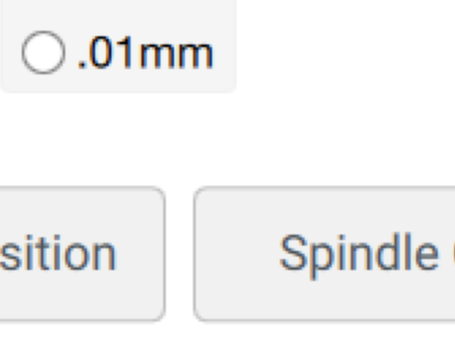
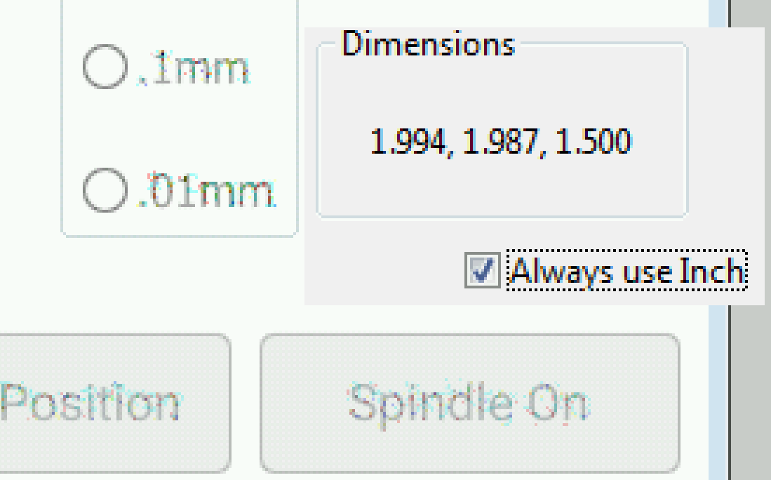
@robgrz, I think that the simple change of making all the text black would improve the situation. Here is a 3X blowup of part of a MeshCAM dialog box superimposed on the Carbide Motion screen
In both cases, the graphical elements are cleanly rendered. The MeshCAM black font is well anti-aliased, in contrast to the Carbide Motion font, which has a much lower effective contrast between the dithering and the tinted background of the buttons.
Randy
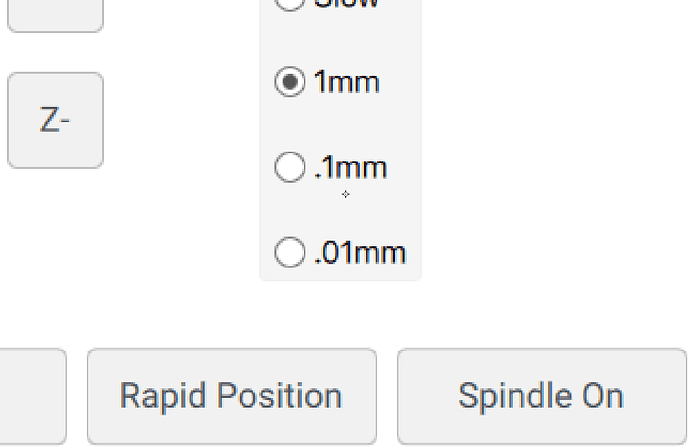
That’s definitely not good. For reference, on my Mac:

I’ll have to boot up Windows and check what that looks like. To my eye, the Linux build looked better than either OSX or Windows when we were testing it.
MBPr 15" // 10.11.3 + 3.56 // direct from screenshot.
-Hank
Yeah, I remember using a 9" Mac w/ doubled-up resolution (so that the display was 1024 x 684) and hacked-resources on all my apps to get the icons the right size. Wonderfully crisp.
Running a Windows PC w/ 15" display @ 1600 x 1200 and UI dpi set to 192 ppi was about as nice. (for those apps which supported UI scaling)
Still preferred the NeXT Cube’s 17" display @ an effective 96ppi, but everything drawn @ ~2/3rds size.
The display issues on Windows are likely a function of the graphics driver and its settings.
I’d like to see more people make tools like to the JointMaker Pro — the other similar tool is the DowelMax, though Bridge City Tools has their own dowel joint system. Let me know when you have a unit to test — be glad to write up the user’s manual for it.
Thanks for the head’s up on the Linux version — I’ll grab it and give it a try when I get a chance.
I’m not sure about the graphics driver, Will. My 1280 x 800 screenshot up top shows MeshCAM and Carbide Motion running at the same time on the same display, and MC has well-rendered text while CM doesn’t. If it were the graphics driver, I’d think all the text would be messed up. I did go through the Windows anti-aliasing-disabling I mentioned above. Windows components are nice and crisp, but didn’t help the in-application text any. I always run my displays at native resolution just to try to avoid any rendering issues.
Randy
Is MeshCAM written/compiled using the same version of the QT toolkit (as the latest CM)?
The problem here is that we’re at the mercy of the settings which it affords, since rather than using a native toolkit for Windows / Mac OS X, we’re going through QT.
If these problems are significant enough that the toolkit is reconsidered, my vote would be to use GNUstep, which would allow for a native version under Mac OS X and Linux, and a decent enough port (w/ crisp text) on Windows. The mind-mapping app Novamind does this last I checked.
I think I’d be more than happy simply with black CM text. One RGB tweak… 
Randy
Personally I could give a tinkers cuss about the resolution of the interface for CM, I spend most of my time in SolidWorks and MeshCam. Long may that continue and carbide motion is only 2min of the over all job run time. It’s elegant and simple, that’s the beauty of it for me. Not too many settings to learn and easy to use. If I compare it to typical machine controllers or Mach3/4 it’s just so much easier to learn.
Keep up the good work guys. You won’t hear any complaints about free software upgrades from me.
MeshCAM uses native elements for the UI so you’re getting the Windows Clear Type font rendering, though it will eventually move to Qt.

