Flubadub
October 21, 2016, 6:40pm
1
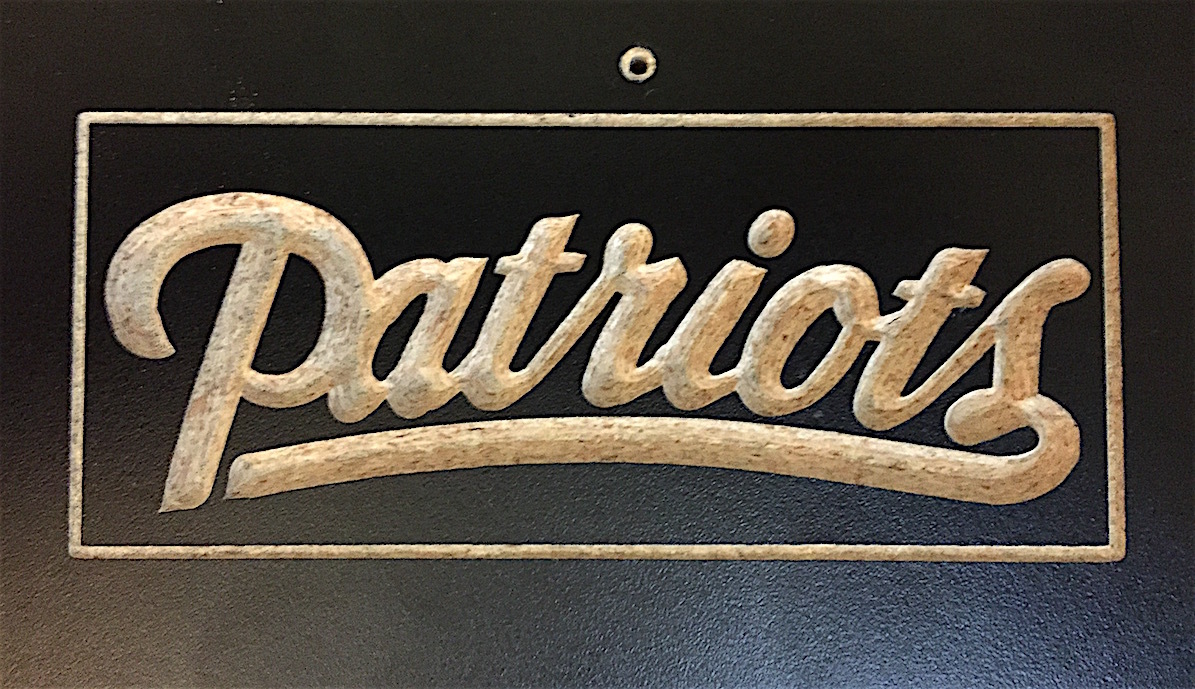
I was able to “print” the Hello World successfully and finally figured out how to begin in Carbide create.
So this was my first attempt at making a simple sign. Notice the spacing between the B and the first O. I’m not sure how that happened, any ideas?
WillAdams
October 21, 2016, 7:24pm
2
Does that match the preview? Post the .c2d file?
Unfortunately, despite my arguing for it, there are no real controls for type spacing in CC — if you want nice typography, set the type in Inkscape or some other vector drawing program which affords more control. (Anyone remember the old days when one would set heads in MacDraw and import them into your page layout program 'cause the early versions just didn’t afford sufficient control over character spacing? I really miss TouchType.app…)
1 Like
Flubadub
October 21, 2016, 8:33pm
3
Flubadub
October 21, 2016, 8:35pm
4
The preview spacing is correct.
WillAdams
October 21, 2016, 8:44pm
5
In that case the problem should be electro-mechanical
Check belt-tension, pulley set screws, &c
Flubadub
October 21, 2016, 9:35pm
6
I’m new to this and had that problem with the Z axis, I will have to do the same with X & Y. Thanks for the advice and patience.
dehoffma
October 22, 2016, 2:57am
7
Try “Philadelphia”, “Eagles” or “Phillies”… it might work better then…
1 Like
Flubadub
October 22, 2016, 6:58pm
8
That’s funny. I live in the Metro Detroit area so I’ve suffered since 1957 with the Lions. But Boston, hell no. Eagles maybe.
This is for a friend who wants me to duplicate the M.A.S.H. sign post with the various city names, I started with Boston.
dehoffma
October 22, 2016, 7:43pm
9
Simple things like that, f-engrave is easy because you can change the spacing (9%) works well for me…
fredfow3
October 22, 2016, 11:49pm
10
OK, I’ll have to throw this into the ring…
Made with V-Carve Pro tho…
Flubadub
October 23, 2016, 12:08am
11
Nice and you have a great Michigan quarterback.
dehoffma
October 23, 2016, 12:20am
12
Great machine work, looks a little flat tho…
fredfow3
October 23, 2016, 12:46am
14
Rimshot @steelers - I’ll just start a long 3D carve job and stream the game…
F
1 Like