I am not sure if there is a solution, but I am looking for text alignment tips in Fusion360.
As an example to illustrate my issue, imagine I have a panel with an array of .5" holes for toggle switches. I’d like to label all of these switches with an engraving. This is where my workflow feels like its falling apart. When I create text in F360, the text is not centered or otherwise consistently offset in the bounding box. If you were to snap every box to a horizontal line, the text would not be aligned.
My solution so far has been to explode the text, then create geometry that tightly wraps the text, including centering lines, nodes/lines to snap to, and selection groups. Its seems a tedious process.
Can you share an example Fusion360 file link?
Out of curiosity I tried some text alignments, and for most fonts the text is aligned to the bottom of the bounding box, while for more cursive fonts it aligns differently (obviously) but in a manner that still seems consistent to me ?
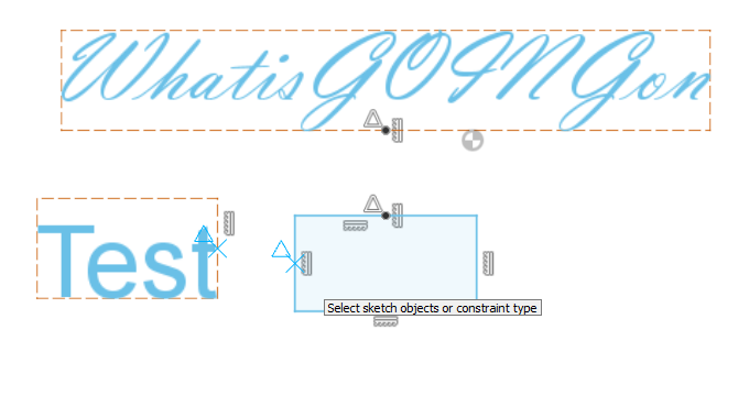
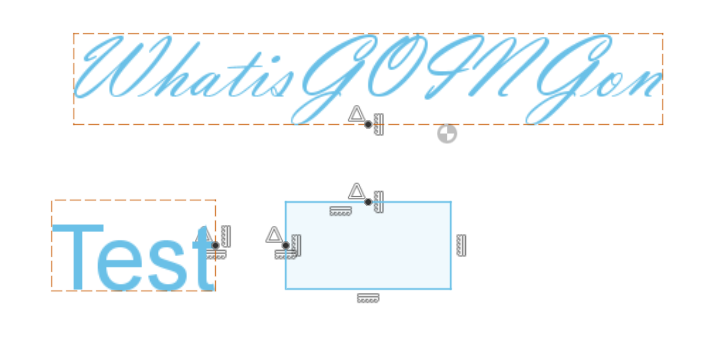
One trick you might be interested in: you can use the vertical/horizontal constraint, hold Shift and hover over the middle section of any side of the text’s bounding box: this will let you select the middle point of [anything] as the alignment point.
In the example below, I have already aligned the top text vertically with the rectangle (noticed the two black dots) and I’m in the process of aligning the text on the left horizontally with the rectangle:
I don’t use Autodesk products, but usually it’s best to align and arrange text in a tool which understands text as text so that one can take advantage of handling text w/in its Em square, and with it all aligned on the same baseline.
With everything put together consistently (for separate components put consistent boxes around them which take into account em square and baseline) import all at once, then if need be break up, move around using the boxes to maintain consistent alignment, then delete the boxes.
See any decent text on typography for further information, (Robin Williams’ The Mac/PC is Not a Typewriter, The Thames Hudson Manual of Typography, &c.)
Julien, thank you for your support and contributions to the community. Very much appreciated.
I will figure out how to share a file from F360 and get something up soon. You’re correct in your assessment, that the text aligns with the bottom of the bounding box. But the difference between your cursive example and the standard example are the Descenders of the “G”. The bounding box is established at the lower extent of the descender. So if you were to put “Test” and “Going” next to one another horizontally, centered using the native bounding box, they would not be inline. At least to my eye. I would like to achieve text aligned based upon the lower extent of the text excluding descenders, like this very line of text.
Thank you for the Shift selection trick. That is much more convenient than lines. I am just starting out with F360, and spending a lot more time on making things work in F360 than actually working with the Shapeoko. Enjoying the small victories though.
Thank you very much for taking the time to look over my question and investigate.
This is where I started to arrive yesterday. I am going to experiment with creating my text in Inkscape or similar, maybe even initial sketches of the overall layout, then import into F360. I have no background vector graphics software either, so I am simultaneously trying to learn both… and trying unsuccessfully to avoid it.
An early lesson — you can’t do a job well without learning the principles and concepts which the professionals are aware of — the Robin Williams book is quite slim and highly recommended.
I feel you, on that F360 learning curve…or any learning curve for that matter. I find myself constantly torn between the desire to dig deeper down the rabbit hole to really know what I’m doing, and the fact that this is a form of procrastination preventing me from MAKING stuff
But I diverge…
Are uppercase letters all the same height? If so, you could align by the tops of the text boxes?
Centering on a point, horizontally, could be done with dimensions or sketch constraints.