Community Challenge #27: Letter cut-outs (and so long)

Can’t enter yet as I don’t have my Shapeoko until the 15th (picking up a used 3XXL from someone upgrading to a new Pro XXL!) but I can’t wait to participate in future constests! I had no idea these went on so now that I do I’ll be checking back for the next contest once I get everything set up and configured! Thanks for all y’all do!

1 Like

Unfortunately I don’t have as many photos of this, as I only learnt mid-fall this year that Google Hangouts doesn’t save the actual picture to my phone when I take the picture inside the app, it just sends it in the message.

I wanted a fairly good sized portable score board for my sports. There’s tiny options, flip chart style ones, or completely jumbo stadium ones available. There’s also the option of using various LED panels that are available, but they are rather pricey to build something this size. And not quite protected from the elements (eg a stray soccer ball) Plus it would be a fun project.

Aluminum extrusions seemed like a nice, easy, modular way to fake my way through knowing how to design some sort of enclosure :slight_smile: Going back now to get screenshots for this post is… painful :slight_smile: Basically the CNC work is the white digits with tabs, cutout of the black as a “negative”. They bolt to the extrusions with t-nuts using M5 bolts.


I don’t have any pictures of machining. The digits are acrylic, the black is ABS panels. The white is known as “sign white acrylic” in the industry and is very standard. Cutting it in a strip let me use less actual material for the digits. Both are terrible to cut - a bit smelly, but a massive static-cling nightmare that gets everywhere. Feeds and speeds are fairly punishing when you get them wrong.

I can’t remember my recipe to be honest. It was rather frustrating, but I think in the end using roughing passes in F360 was the trick as it reduces rubbing. Gives it a bit of sidewall clearance. Also I think I used too small an end mill. My newbie thought was like, smaller kerf is better, right? But I think for this, it leads to less rigidity, which is more rubbing? I dunno. For wood now I sure am in love with 1/4" 3-flutes, and I just received my first 8mm 2-flute to try out in my elaire collet.

Test fit - you can see the screwss in place here as well, looks kind of nice.

I used E6000 to hold them in place. The bond was… mediocre. Good enough. You can see where the tabs were. but since it’s not visible from the outside I didn’t bother doing a great job cleaning them up. The acrylic snapped on me trying to clean up one so I then was hesitant. You can also see here that I pocketed out some material. I wanted some diffusion of the LED’s, but I was worried the thickness would get rid of too much brightness and on sunny days it would be hard to tell.

This is a whiff of the nightmare that is ABS machining. Your sweepy brushes have never been so sad. You will find tiny black shreds for months.

The first plan was to use LED strips. I lightly traced out the the layout. But, this was a pain in the butt. I scrapped the idea.

I exported the shapes from CAD and used KiCad to custom create circuit boards that would be used instead. I used the same wood shown above, and just drilled some holes by hand to bolt them in the right position. The wooden panel is 3mm and slides in the extrusions.

I’ll skip over the actual electronics since that’s not quite the scope of this and it’s already long, but it’s Arduino-based. Drilled some holes for the 3 top switches to increment scores for the teams and customize colors and change brightness. It runs off USB-C and power delivery. Should last for hours even at max brightness. Each team can customize their color.

Fun story - I took it to my first game, and there was software bugs preventing the buttons from working nicely. I fixed those. I brought it to the next game, very excited to finally show it off. Just before the game started I brought folks over to show how to use it (short press of button increments, but a 1 second hold will decrement in case someone adds an extra point by accident). I touched the metal extrusions, static zapped it, the whole thing died. So now I need to replace the board and add ESD protection - the outside metal part of the buttons threads into the extrusions. :frowning:

My neighbor and I joke, it’s the world’s most expensive score board. But it was a fun build and one of a kind, so when it eventually works again… it will be great :slight_smile:

15 Likes

This challenge came at a good time. My niece is getting married in May. My wife and children got me a 90-degree engraving bit for Christmas and I recently retired. What better time than now to create!
Sat down with the computer and started. I came up with a design with the monogram “M” and the words incorporated. Then I found the svg with a heart and couple in it. Figured a way to add it in to the design. Then when I had the programs figured out, it was time to cut.
I had an old stereo cabinet door so I used that to cut for the initial design, sanded and clear coated it. Used .08 plexiglass for the engraving.


Put it together and thought that it would be better with a backing, so I decided to cut an old coffee table a ¼ deep to fit my cut out. After a little more time on the computer, I had another program to cut. Back to the Shapeoko I went. Once that was cut and the practice fit worked, it was on to the sanding and staining. I decided to paint the inside of the heart black to show off the engraving. Then gave everything a couple of clear coats. I got it glued together and installed the plexiglass heart.

I was very pleased with the end result. This process of cutting out the script and embedding it in wood, then adding some engraving, was a fun, and challenging project and I learned a lot about figuring out the programs. Thanks for the challenge. Hope you enjoy the pictures.

Chuck Smith

20 Likes

Got a metal art with my last name for Christmas a few years back, but couldn’t keep it up after getting married and changing my last name. Figured it was about time the Butler name was represented on the wall! This challenge was the prefect motivation to actually finish it :blush: pretty simple, but I’m happy with how it turned out!

There was supposed to also be an “Est. 2019” toward the top, but my doggo decided the wood would better serve as a chew toy than on the sign…


18 Likes

Hello All. For this community challenged we were inspired to build a custom nursery wall art for a special couple who after years of difficulty, followed by several years of doctors visits, finally had biology play fair and are now looking forward to bringing their first little bundle of joy into 2022. The design was motivated by they own childhood joy for Winnie the Pooh.

The piece is 30x40” and we look forward to it being displayed shortly.

I cut out the letters from 1/4" thick walnut, and ended up recutting about 9 of the letters due to the grain pattern and apparently having “too strong” of double-sided tape underneath holding the board down. My wife was kind enough to volunteer to layout and glue down all the letters. The oak tree and branch pieces were cut out in a similar manner.

Wanted Winnie the Pooh and Piglet to appear like an old-fashioned black and white image so we laser engraved them into the baltic birch plywood backing. The image was larger than our Ortur laser so we had to do it in multiple set-ups to get it all in.

We cut some 3/4" yellowhart pieces on the bandsaw for the beehive and ordered some bees from Amazon to add some whimsical depth and tactile features for the little one to enjoy.

The pieces was finished with a 1x1.5” walnut frame. I was planning to spray finish it in the garage but with the outside temperature at -26 Celsius, the space heater wasn’t going cut it so we brushed on a clear finish in the basement today to get it done in time to submit for our entry.

Thanks for reading, looks like we have some stiff competition going on in this challenge, best of luck everyone!

12 Likes

Final day before the deadline, fantastic entries so far, let’s see the last minute ones !

2 Likes

Hi there,

so i thought i`d give it a go with a family name sign.

I used 19mm black MDF and added a light wire in the bottom.


I intend to fill the letters with epoxy to enhance the “glow” as the light wire is a little dull.

Let me know what you think.

Cheers from Germany
Alexander

15 Likes

I want to echo what others have said: I really enjoy these challenges and hope that they don’t go on hiatus for too long. Big thanks to everyone involved in organising them, I find the entries to be a huge inspiration and the breakdowns and workflows of other people’s projects are always enjoyable to read and very informative.

Every year all the band and choir students at a local high school put on a big fund-raising concert and dinner they call Cabaret. It’s a chance for the kids to show off their hard work on a real stage and a chance for the parents to enjoy the music and a nice meal while maybe having a little too much to drink and embarrassing their kids. For the several years I’ve volunteered filming the event but thought that we could kick it up a notch by combining CNC and projector mapping.

I used my Shapeoko XXL to cut out the letters from a 2’x8’x1” piece of white Polystyrene insulation. I wanted to make the biggest sign I could possible make from the 8’ piece so I drew box the size of the foam in Fusion360 and fiddled with the font size until it fit the stock. The same thing can also be easily done with Carbide Create.

Each letter became its own setup in Fusion and exported individually so I could slide the foam panel, cut a letter then slide it into position for the next one. I did two passes at 2000mm/min, 15mm doc, 17000RPM with a 3 flute .25” endmill. I’m sure I could’ve done it in a single pass, the foam put up basically no resistance. For workholding it was simple clamps and tabs. Even with the dust collection going full blast, it made a huge mess and I’m still finding foam pieces stuck to things.


The foam letters are attached to each other with dowels and then gaffed taped to the trusses. The alignment of the letters is a little wonky because I let the student technicians assemble it, but the show is as much of an event for the stage crew as it is for the performers, and I hoped to instill the same curiosity and experimentation that was inspired in me from my mentors when I was an audio-visual tech in high school.

For the projector mapping itself, I used a Lightform LF1 but you can get the same results with opensource solutions like https://mapmapteam.github.io/ it just requires a bit more setup because the Lightform provides a depth map of the scene you’re projecting on to. As a quick aside, the way it creates the depth map is quite clever. By projecting a series of known patterns, it uses a camera to detect how much the projected pattern diverges from the known pattern and uses that displacement to create a point cloud representing the scene.

I initially thought that we’d stack two projectors to make the image twice as bright but quickly realised that only works with a single focal point. Since both the letters and the rear screen are on different planes, there was ghosting due to parallax on the plane that’s not in focus, like taking your 3D glasses off in a movie. It turned out one project was bright enough anyway.

In the software you mask out the areas that you want to project on to, in this case the letters, and it creates layers allowing you to project different graphics on the letters and the background. I have an example below, notice how the letters are animated but the background is white projecting “cabaret” with the shadows of the letters. The animations were variations on the presets and I tried to have unique animations for each set but in the future it would be fun to get the set list beforehand and have a custom animation for each song.

The end results looked great, the parents and students loved it with many comments about how they hoped it’d return for the next Cabaret. The goal was to elevate an already special night for the students and make them feel like rock stars and I think it succeeded.

This relatively simple setup has my imagination going in all sorts of directions and maybe I’ll get around to doing something more complicated than just letters. It would also be great to see what other people can do too.

20 Likes

Long time lurker, first time poster. I have gathered a lot of inspiration from these forums.
(Looks like I can only submit 1 photo per post, please see post below for more pictures)

This project is a Christmas gift for my brother-in-law who recently opened a brewery in Delaware. I asked my sister to share the best graphic she had of their logo and went from there.

I wanted to use as much of their logo design as possible. To start I used GIMP2 to grab all the individual letters rotate them and align them vertically and create two svg files.

Used Fusion to build the model of the tap handle and import the svg files. When I dug into the Jakl and hops in the center I had to do a lot of geometry clean up and close open profiles. The original graphic was not symmetric, so I ended up cleaning up one side and then mirroring it. I def bit off more than I could chew being that this was my first fusion CAD from scratch.

The lettering was features were pretty tight in areas, so I used a combination of sketches and modified heights to drive the tool paths for the “S” and “W”.

I did a two-piece design so I could avoid flipping the part. I then glued the two halves and did some light sanding.

Drilled and installed the threaded insert.

Hand painting all those little details. Now is not the time to mess up.

This was a great project that challenged me and pushed me to learn all kinds of new skills and techniques. Please see my reply below with more photos.

9 Likes

Sorry looks like I can only post one photo per post so here is a collage of the work.

6 Likes

checks date, Jan 16th… fewf made it!

A raised letter mdf sign for a friends new boxing gym he’s opening up.

lets hop back to the beginning.

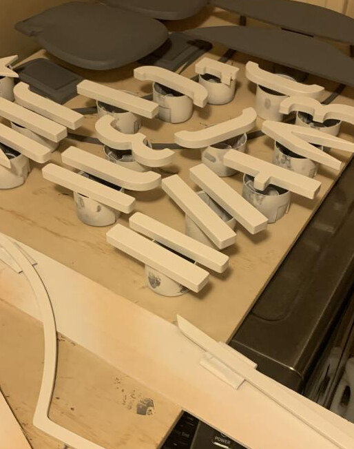
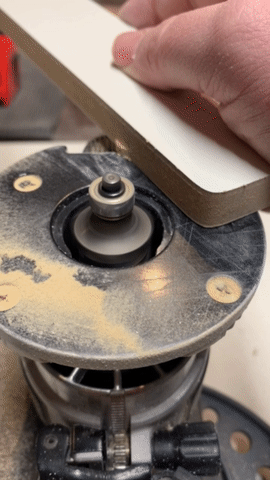
I cut all the bits (nearly 70 in total) on the shapeoko pro. 1/4" bit for pretty well everything.

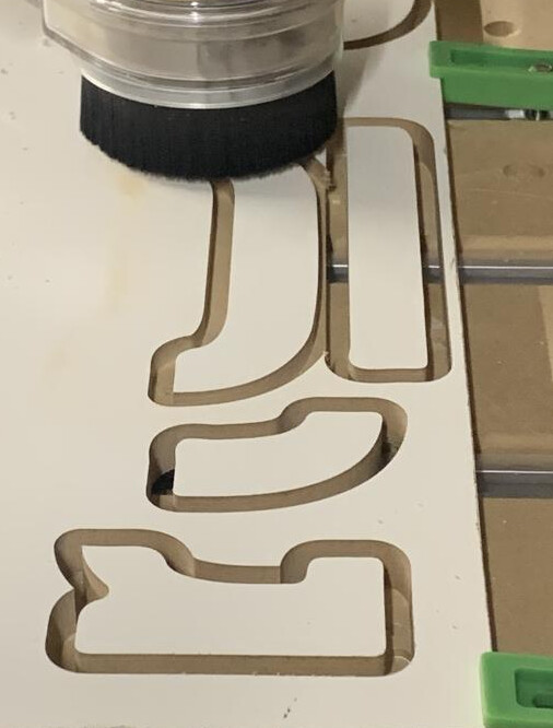
Got a little “ambitious” with the nesting, and created a nightmare for myself where I had to keep pausing and move clamps around… there wasnt much support material left


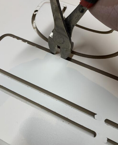
I cut out the tabs with a little saw and then did lots of sanding (this was terrible, better way shown below in a bit)
a couple pieces got mangled and had to be remade but learning experience

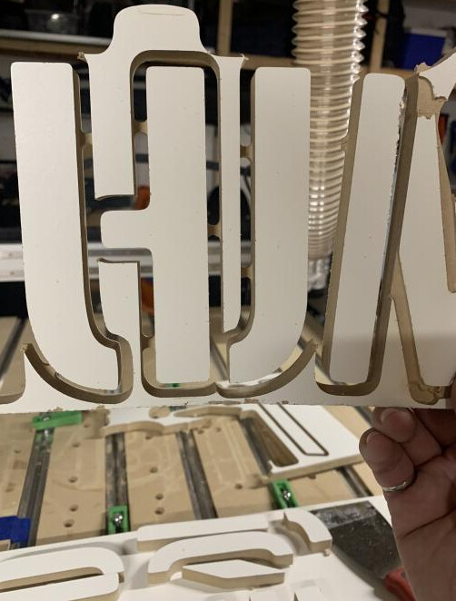
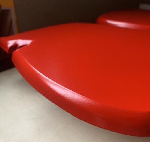
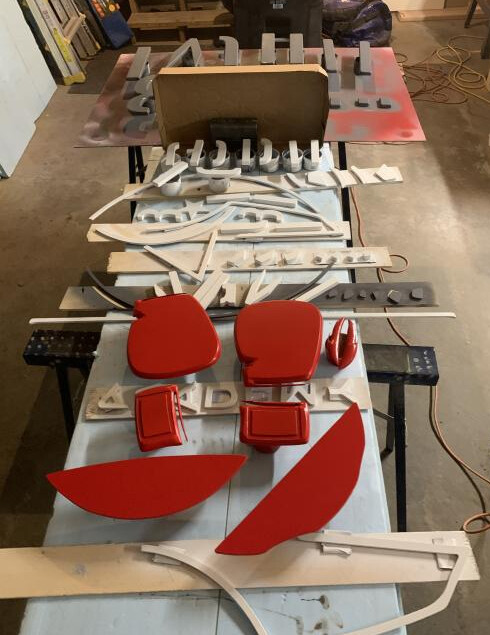
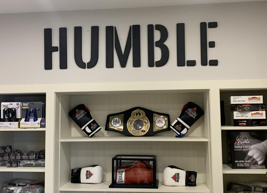
The gloves I used a bit of the carbide create modeling to give it a nice rounded look for the edges.
This is part way through the roughing pass.

Time to take over the laundry room for paint curing time (it was -30C here for a few weeks straight)

Paint consisted of an automotive filler primer, spray paint and top coat
image

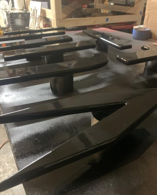
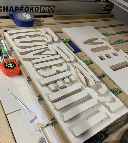
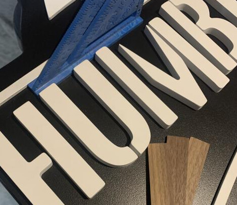
so inbetween painting I cut many more parts. In addition to this sign I made them a larger “HUMBLE” sign. This time I used some snips, and a round over bit like a flush trim bit. for this to work I just mirrored the letters before generating the gcode so the bottom was the front… makes sense right?


ezgif-2-c69e7e328a

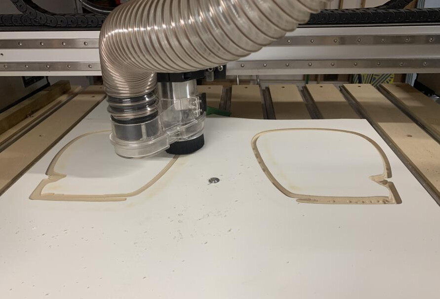
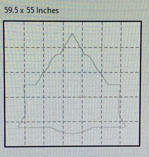
The backer however being 4’ wide was too big for the xxl.
so back to the old process of tiled paper printouts and a jigsaw
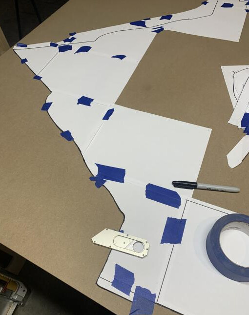
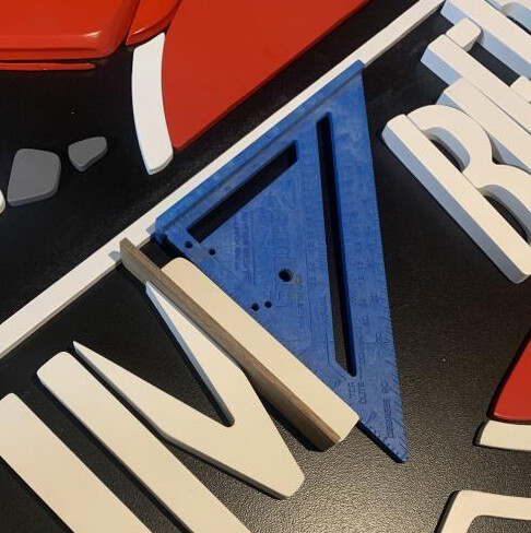

Assembly time!


lots of measuring in inkscape and marking the edges with blue tape

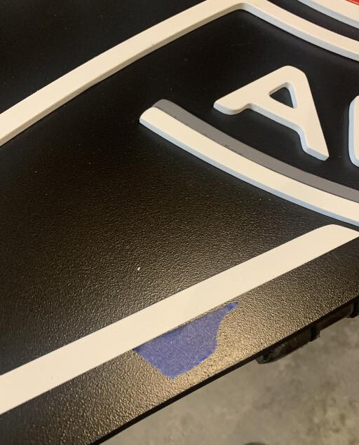
Also shims were invaluable
image
image
glue was starbond thick. worked really well.

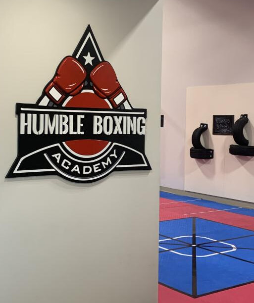
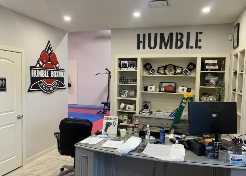
Bonus sign 4’ across as well

will edit cutrocket link once its approved.
edit: add cutrocket link. The gloves turned out really well, anyone can feel free to repurpose those for yourselves. svg files are there as well.

13 Likes

So this project started out as a gift for my mother in law in memory of my father in-law who past away nearly 1 year ago after suffering from dementia for many years . Shortly after his passing a cardinal started visiting us in our back yard which made us think of a popular saying “When cardinals appear, angels are near” and thus the cardinal became very symbolic to our family. Therefore when my wife asked me to make a gift for her mother all we knew was that we wanted something with a Cardinal. I looked at a few models available on the Internet and did not find what I was looking for therefore I decided to dive right in and learn how to use Blender as I figured this tool would be handy to have in the toolbox of software to work on 3D projects. All I will say is that many hours where spent trying to improve on the model and many YouTube videos were watched but alas I finally got something I was happy with.

From here I imported the model into Fusion 360 as .obj meshes which was about when I learned of the latest theme for the community challenge which contributed to the idea of spanning the cardinal on the branch across the word “RemembrancE”.

As the theme is about Letter cut-outs I’ll go a little more into detail about this part of the project. Basically once I got the text into a sketch in Fusion 360 I offset the face (curve) of the sketch to create the outline. I then extruded the text itself and split the body with a mesh which I created using an image of leaves by converting it’s grayscale version to provide the texture pattern. I then extruded the text outline leaving the textured portion recessed into the project.

Once this part came off the Shapeoko I found there was not enough contrast and the texture/pattern was not easy to see on it’s own. I then experimented with a technique by coloring the texture with a black pencil and use the toothbrush to spread it around.

And then I used some sand paper to remove the high spots of the texture to expose the woods natural color.

Finally there was the cardinal… As this was my first 3D carving I was a little concerned about messing this part up so I thought things through and took my time (a lot of time) to get this done. Anyhow many toolpaths involved the Cardinal was carved out from 4 faces (top, bottom, left and right)

I made sure to mark up the stock with the face and the origin where to zero and labeled the matching .nc files with descriptors like (top, bottom…), tool number to use, and zero locations like SWT (South, West, Top) as messing up the stock setup or using the wrong file would have ruined many hours of work. You’ll notice I also decided to put my tabs where the wings are on the cardinal. In blender I modeled the wings separate from the bird and used a boolean operation to match the contact point between the body and the wing.

Here are the parts off the Shapeoko ready for assembling and finishing.

And now a closeup of the cardinal from the top.

The funniest thing about this project was the fact I was working on the 3D model on a 34" computer screen so everything looked big/dense. Then once I started milling it on the CNC is when I realized the actual scale and how fragile these parts were which led to high stress milling moments. That said I survived and now have significantly more experience under my belt with my CNC machine, software to create models and toolpath strategies.

I will admit I do have a bit more work to do on the finishing touches like applying more coats of stain, paint and a clear finish. I also plan on making some sort of bracket to lift it off the table and provide a bit more stability as I’d hate for it to tip over and break off that tail. This will also allow me to incorporate the quote “When cardinal appear, Angels are near” in smaller lettering under the word remembrance. Some may have also noticed that the cardinal currently has no legs, this is because they ended up being too flimsy/skinny and didn’t feel confident with it supporting the cardinal long term. Instead I’m thinking of maybe using some hanger wire to make legs which I can drill into the bird to insert them and secure them into the letter ‘b’.

Anyhow that is my entry for this community challenge amongst many other great entries and looking forward to seeing these challenges again in the future when they start up again.

31 Likes

We needed to dress up the steering wheel of a vintage drag racing car from the late 1950’s. After putting together a tilt wheel and installing it, a brass blank was turned on the lathe and it needed an emblem. We wanted to mill something like a 1938 Ford truck emblem into the brass and I thought the Shapeoko could do it.


I was unable to find a decent emblem so I had to merge the typical oval Ford emblem with a V8 emblem in Carbide Create. After alot of resizing, node editing, and boolean magic, I ended up with the following.

The brass piece is just over 2 inches in diameter and milling it required a 1/32 inch end mill to give the detail I wanted. This was the first time I had cut metal on the Shapeoko so I ran three test cuts in aluminum and one in brass. I had success with the first two tries in aluminum while modifying the design. Parameters were 24000 rpm, 20 in/min feed, 0.002 in depth, 0.006 in step over, total depth of 0.030 inch. Then broke a solid carbide bit in a deep slot and moved into brass. In brass, 10000 RPM, 10 in/min feed, 0.006 inch depth of cut, with a 0.006 inch step over quickly broke another bit. Switching back to my original parameters after designing a pocket in place of the perimeter slot gave a decent cut in brass.

To paint the background, I tried acrylic paint which rubbed off (seen on the aluminum test cut), and fingernail polish which was marginal. I decided to try Oramask 813 on the real cut and spray paint. To hold the brass piece, I milled a friction fit pocket in scrap MDF and clamped the MDF to the wasteboard. While milling, I did pause a few times until the mask was cut through, to clean mask from the bit. I was watching this with a magnifying glass. It did cut successfully but tiny shreds of Oramask required removal before the paint. Here is the piece painted and partially unmasked while the paint dried.

And the latest after pulling all the mask off with a safety pin.

Looks great but stilll needs some clean up. It is definitely going on the car!

12 Likes

ezgif-5-60f99c9e33
Made this for my canadian uncle

ezgif-5-963809a694
Thanks to my wife for flipping the light switch on from off-camera hehehe. Just was never satisfied with traditional LED faux neon lights, so I thought I’d invent something new why not. I’m calling it EFOC (epoxy fibre optic channel).


It always starts with an SVG (as I am a haggard old webmaster I like to use Figma)


Then into the ol Bendler (gratuitous 5120x2160 screenshot)


Humble beginnings here


She may not look like much but she’s got it where it counts kid and she’s loud as frig


The time has come for resin


Ewwww and I thought this was a family blog


Snow flakes anyone? Accidentally skipped to the second toolpath here and shot right through the whole first 8mm in one fell swoop YIKES (no breaks though somehow)


Sparkly clean. Not even a sharp down-cut bit could do this.


ЯEDЯESIN


Uhhh dude where’s my island

ezgif-5-06217d0e89
404 toolpath not found. Looks like you’re missing something there Tex.


Oh well, tirelessly into the dust bag we go.


Found it right next to a case of mesothelioma :crazy_face:


Nothing a little fibreglass can’t fix. (Pay no attention to my flagrant disregard for safety here.)


Blackerish (Spray paint… not great but smells good and it’s quick)


The first reveal… wow. Wish I had some black MDF like @AlFa… maybe soon… this project was a no-new-purchases joint, all scraps and old end mills etc.


Z offset wasn’t quite right at first… As I always say, “If at first you don’t succeed, mumble until someone screws something else up”

Or as my wife said when I showed her this, “that looks like liquorice”

12 Likes

Cutting this one close, but really had fun with this one! Like all good projects, this one started with my wife on pintrest trying to find something to put on our daughters playroom wall. After a bit of napkin sketching and figuring out rough sizing, it was time to get it vectorized and scaled properly for the space.

Once we got that sorted, the nesting optimization madness began, I ended up begin able to get everything on 2 24x48 sheets of MDF with a little leftover for whatever comes next. We got them all cut out with a roughing pass with a 1/4 downcut and then a finishing past with a 1/8 upcut for the smaller corners.

After it was all cut out, it was time to clean up the fuzzies and get rid of any leftovers of the holding tabs. The biggest downside Ive got with MDF is its ability to soak up paint like a sponge. This time I tried giving all the faces and edges a seal of shellac before they got their color coats. Ended up doing 3 coats of it with a foam brush and smoothing it all out with steel wool between coats.

Then the fun part, color! It was a bit tricky trying to make a proper gradient palette when ordering online but Montana paints came in for the win. Went on smooth and with some awesome vibrant colors. Once all the pieces had 3 coats of color & a chance to dry, I had to figure out how I wanted to mount them on the wall. I really wanted to find an easy and invisible solution that didn’t have me measuring for hours.

Enter pushpins. I cut off the heads of some finishing nails, drilled two holes per letter/piece and then with a drop of superglue, we had some glorified push pins :sweat_smile:. Its a beautiful thing when something simple works the first time!

With our sketch reference pulled up and a guideline for the base of the letters we were able to get the whole thing hung up in ~5 minutes. I couldn’t have been happier with how it came out, and my wife was in love with how it ended up finishing up the playroom. But something still felt missing…

And well Ive never been known to be able to leave something alone. Enter COB Led strips! I had just found a pretty good deal on ~45ft of pink strips that would be perfect for this. Got it all ordered up and then it was time to wait… Two rolls made it on friday, and then it was on.

Okay, looking good I think I’ve figured out a flow, this is going to be easy!

Ohhh yesss, this is exactly what I was hoping for!

And then about here is where I started contemplating all my life decisions pretty heavily. But no, its gonna be worth it for sure. All these curved letters with led strips that dont bend well and need to be cut and resoldered every 2 inches is totally gonna be worth it. Now if only the other roll would show up so we could get everything finished…

Spoiler alert, that roll is still missing last seen somewhere in California (We’re on the east coast), but you know what? It looks awesome and I’m super happy with how it came out. It really transforms the room when its dark!

Heres to hoping that 3rd roll shows up sometime soon, or any of the additional 3 I ended up ordering to try and get it all here in time :joy:.

17 Likes

Thank you everyone for an epic set of entries!
Voting is right this way

2 Likes

Say What?.. Wow! Nothing short of FANTASTIC! Now, if this is not eye opening, you must be DOA!

Thanks for your insperation!

3 Likes

Wait, does your uncle own the Empire of Dirt?

Looks great and killer job either way, but will be even more epic if the above answer is “yes.”

1 Like

Absolutely amazing work. Love the bird and the letter texturing so much. Very, very nice work and sorry for your family’s loss.

1 Like

This is beyond fantastic. Thank you for sharing.

1 Like