Community Challenge #27: Letter cut-outs (and so long)

The theme is: Make a Monogram/Letter/Text cut-out

You can either go big,

or go really small on your Nomad like Winston did,

but here’s the thing, to spice things up:

  • this is going to be the final community challenge for a long while. You’d better not miss that opportunity to share & shine !
  • I’ll set a longer deadline than usual to give everyone a chance to participate over the end of year break (in-between family time and eating way too much)
  • And oh my, the prizes. @Jorge must have gone temporarily insane, so I’ll kick-off the challenge before he changes his mind.

Rules for this 27th challenge:

  • the project MUST include cutting around letters/text in some way or another. V-carving/lasering some text does not count.
  • submit your entry in this thread (you can post multiple entries if you want)
  • you must use a Shapeoko or Nomad
  • post pictures of the project at various stages.

Timeline:

  • Deadline is set to Jan 16th 2022, midnight PST
  • there will then be 7 days for voting.
    • voting will be open to legit community members only, and the jury reserves the right to remove votes from “outsiders”, and will also break any tie.

Prizes: #1, #2 and Jury’s prize will get a Carbide3D spindle kit for the Shapeoko, as an early access!

image

(yeah, I have zero Photoshop skills, this is a snapshot from the HDM’s product page)

Should a Nomader win, @Jorge would come up with a suitable prize of equal value.

So there you have it. Let’s break the community record for number of challenge entries !

22 Likes

If you’re going to be cutting text out, you’ll need to join it together:

https://carbide3d.com/blog/merging-script-fonts-in-carbide-create/

so be sure to get Carbide Create v6:

https://carbide3d.com/carbidecreate/download/

and of course, you’ll need to use a script font, or join the letters in some way EDIT: if your design requires that.

If you are using an OpenType font which which has special features, it should work to use:

to experiment with them.

2 Likes

Are these hard requirements for the competition, as stated?

The challenge rules only vaguely hint at this sort of thing by using the word “monogram”. But a monogram doesn’t always require letters physically intersect each other or to be joined - they can be interwoven.

And you don’t need a script font in any case to make a monogram.

There is no requirement to join letters, if anyone wants to cut the largest single letter ever, or a collection of standalone letters, that’s fine. Will’s link will be useful for those who do need to join letters for their project.

5 Likes

Correct, I’ve edited my post.

Also see:

and

and

4 Likes

Not an entry … yet. Just want to give a huge thanks to @Julien and the Carbide3D crew for putting these contests on. The submissions are a constant source of inspiration and new techniques! If this is the last for a long while… let the creating begin!!

7 Likes

Here’s my entry


15 Likes

Forgot to add this one to the original.

9 Likes

6 Likes

Here it is lit up!

11 Likes

Good Evening,
My name is Ryan, and I am a high school student in Texas. One of my teachers asked me to create a sign for the new house of one of her friends. She requested a sign they could hang in their outdoor kitchen with eyehooks and a chain, thus it needed to be quite thick to accommodate the eye bolts. We ended up deciding on an oak background with popped walnut lettering. I began designing it in Carbide Create, although I redid it in Fusion 360 to send rendered pictures, and then in the end, I created the G-code in Carbide Create. I designed the walnut and the oak to mesh using quite a few locating pins. I glued up two 1.75 inch thick oak boards to create a 31” by 18” blank to carve the sign. From there I used Oramask 813 during carving and then painted the V-Carved text and line portions black. For the walnut, I carved it from the back to create the pins and then the profile. This was incredibly fragile after leaving the machine, and I broke it on multiple occasions, fortunately this was usually reparable although I did have to completely redo the “EL” portion after a pretty significant break. After the paint was dry and the pieces had been completely sanded, I glued them together and applied 5 or 6 coats of Helmsman Water Based Spar Urethane. I re-attached the eyebolts, and it was ready for delivery. Thank you Carbide 3D and Julien for holding these contests, and I hope to post another entry soon!

Here is the final sign and a few in progress pictures.


Here are some of the progress pictures. The top one is the carving of the walnut, and the second is a test fit of the walnut on the oak portion being carved.


13 Likes

So it was time to make my yearly Christmas puzzle again, and quite frankly, this challenge really helped give me the motivation and idea to add just that extra little step.

I already had the main locking mechanisms planned out, a centrifugal lock to remove the bottom section which then unlocks the lid to be slid open when being held at the correct angles due to a pair of off balanced pendulum locks. But I won’t bore everyone about the puzzle anymore unless they ask.

At this point in the build it was going to be nothing more than a fancy-looking puzzle box made of a few different types of wood scraps and some thin purple heart strips glue together. When I saw the challenge, I knew instantly that I needed to cut out my wife’s name out of metal, ended up going with copper, and inlay on the lid of the puzzle. So the search for a nice looking fancy font began, and while I found a few nice free fonts that I saved for later use, I came across a paid one that I thought looked perfect, so I ponied up the money $18 for it and got to work.

Cutting the cavity for the copper to be inlaid in was easy enough and went without issue, even though this was my first time using such a small end mill, 1/32. Cutting the copper was a little more nerve-wracking and presented 1 key problem. I cut the main outline of the text first, and then the small interior cavities. This led to a problem on the “L” specifically, since my work holding was masking tape + CA glue. When the end mill went to cut the interior contour of the letters, again especially the “L” the tape flexed and moved out of the way rather than being cut. So I ended up having to use a small flathead screwdriver to help hold it in place. Luckily your speeds and feed will be quite slow with such a small end mill so it’s not terribly dangerous, but I still don’t recommend it.

Contour Cutting


You can kind of see the inside of the “L” is a little wonky

Instead, what I think would have been the best way to cut such a shape would have been to do any small interior contours first, and then the main exterior contours. But live and learn, that’s what these challenges are about.

After the copper was cut, it was just a matter of a few drops of CA on the lid and pressing the copper into place. I think it would have held fairly well just as a friction fit, but the CA glue was just insurance. Then it was just a matter of sanding, polishing, and finishing with tung oil.


Immediatly after gluing/pressing the inlay


After sanding/polish/finish


Christmas Morning with all the other presents

23 Likes

Last year I also made a little name puzzle for my twin nephews. This project was fairly straightforward, just some scrap oak I had lying around, cut out the letters and holders. Sand and stain and BAM, you’re done.

Name Puzzle

14 Likes

Good evening,
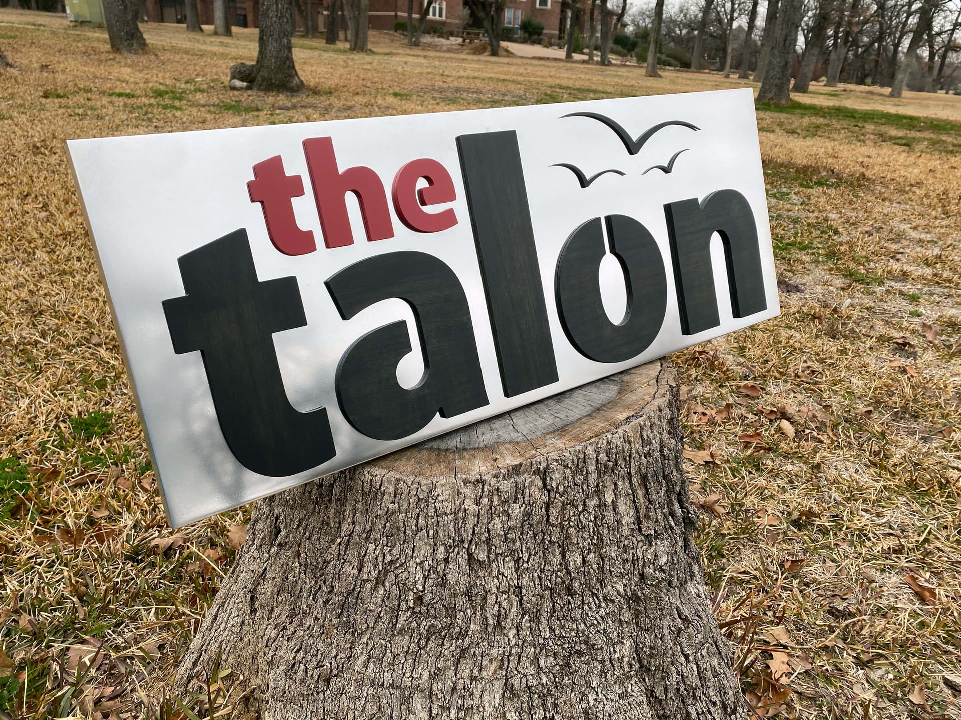
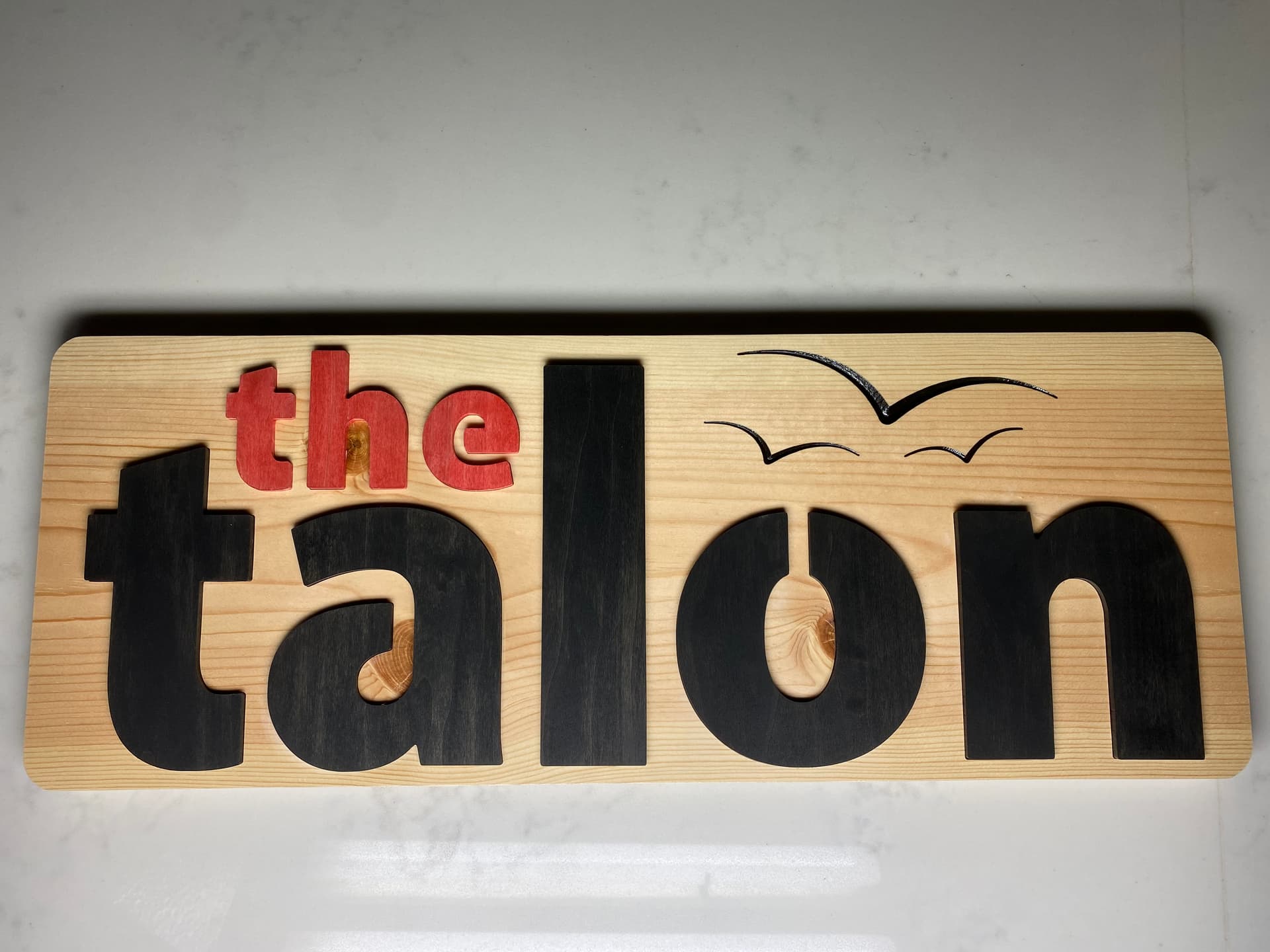
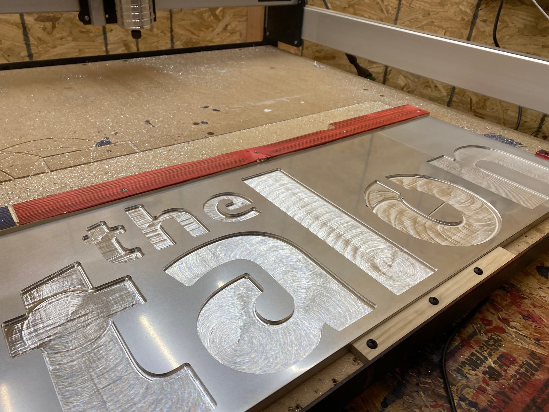
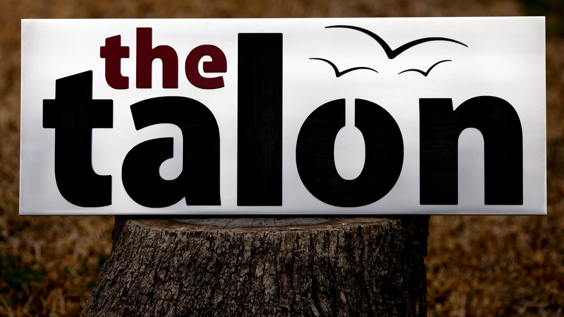
This is an entry of one of the most challenging project that I have ever completed, not through the challenge of the design but due to the plethora of first times involved. It was my first time carving aluminum, first time polishing aluminum, first time tapping holes, and my first time cutting acrylic. This was a sign I created last year for the news organization at my school, The Talon. I did some mockups in Fusion, and foolishly I sent them one with an aluminum background. Unsurprisingly, this is the design they selected. Essentially, the design is carved pockets for the letters with matching letters to go in these slots to create a popped look. Here is the final product before I do a deep dive.

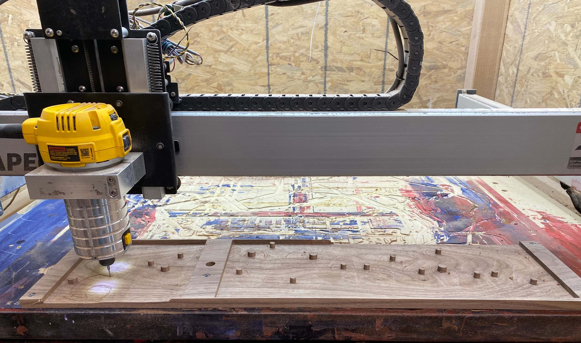
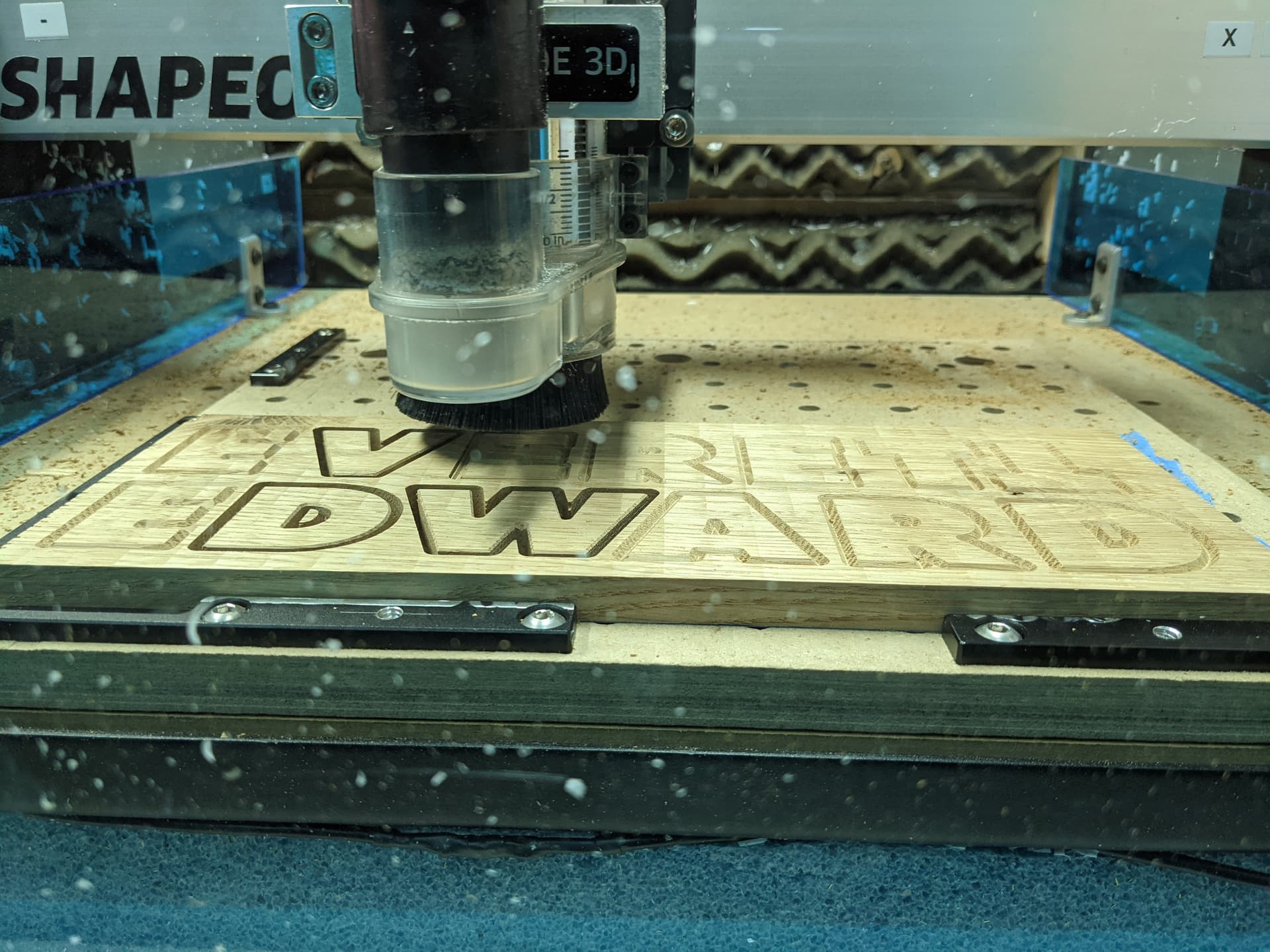
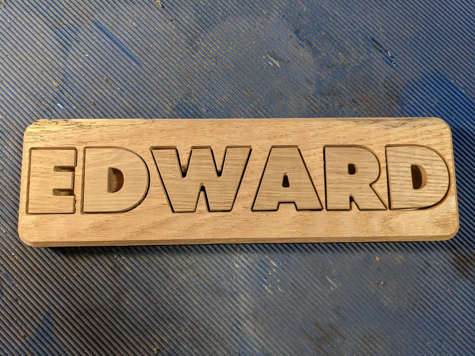
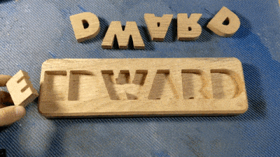
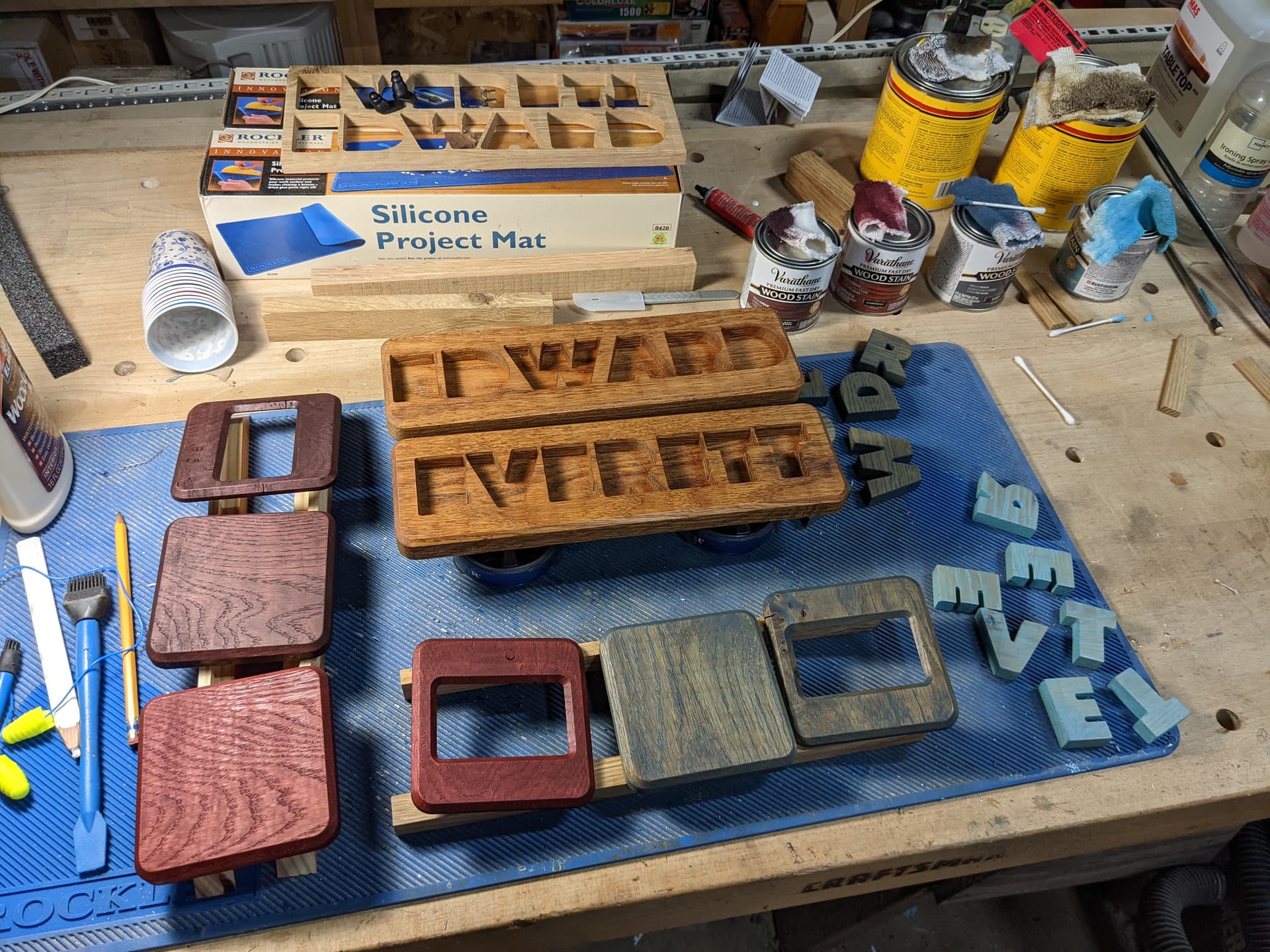
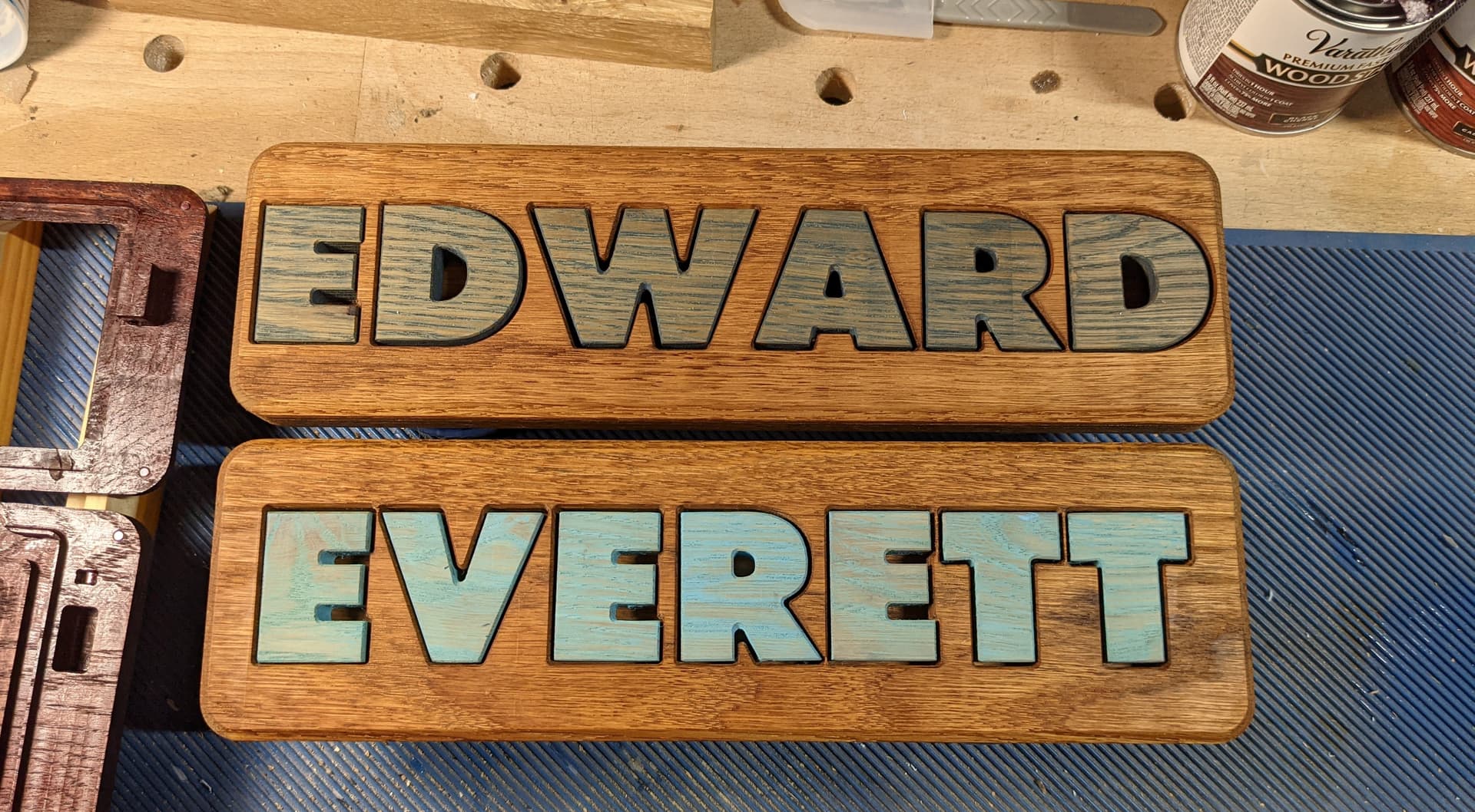
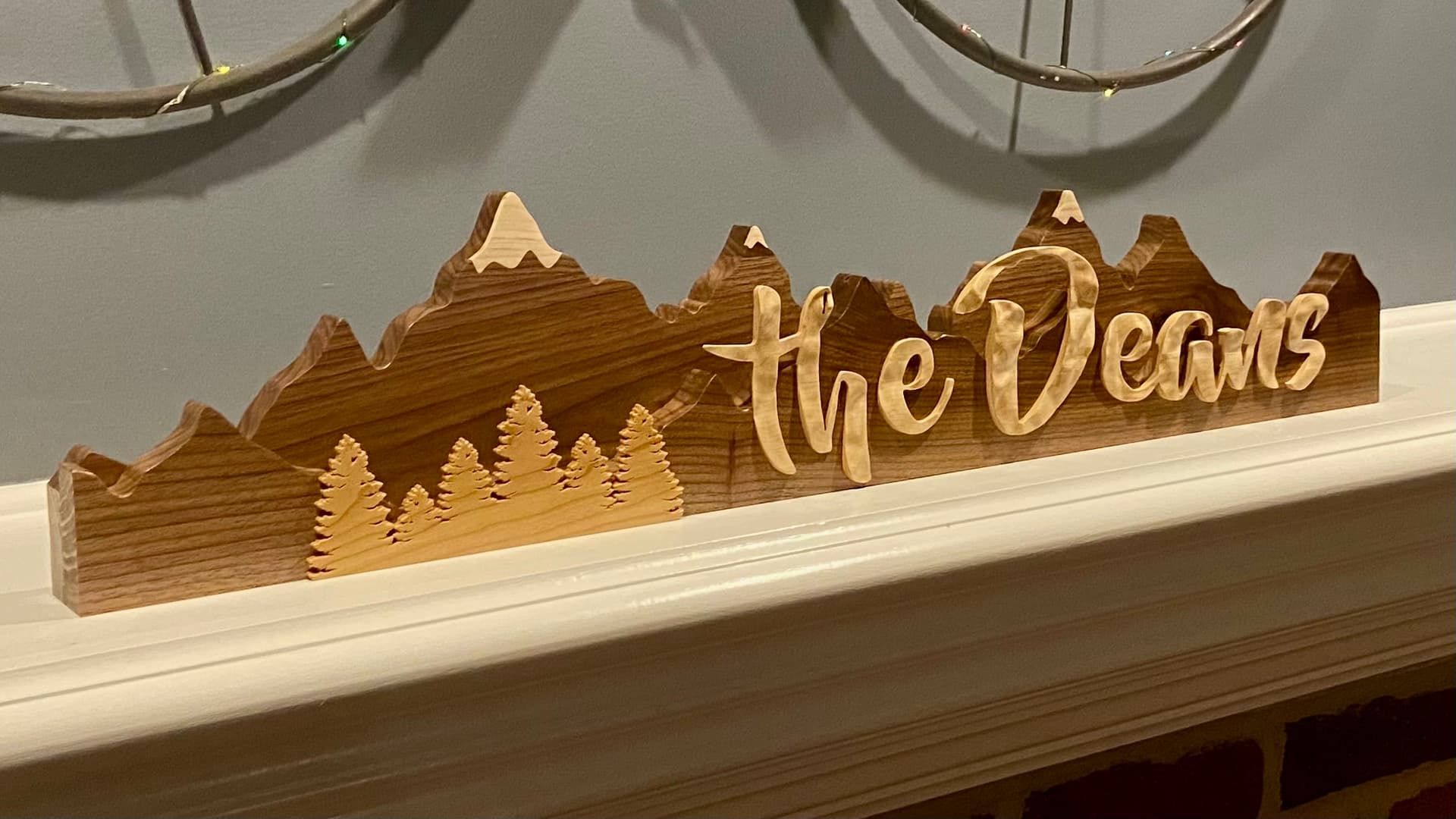
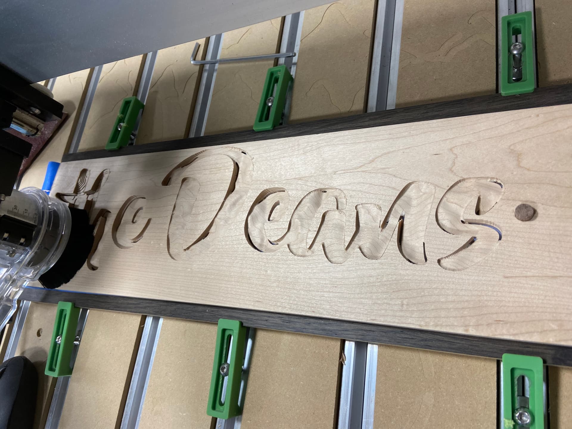
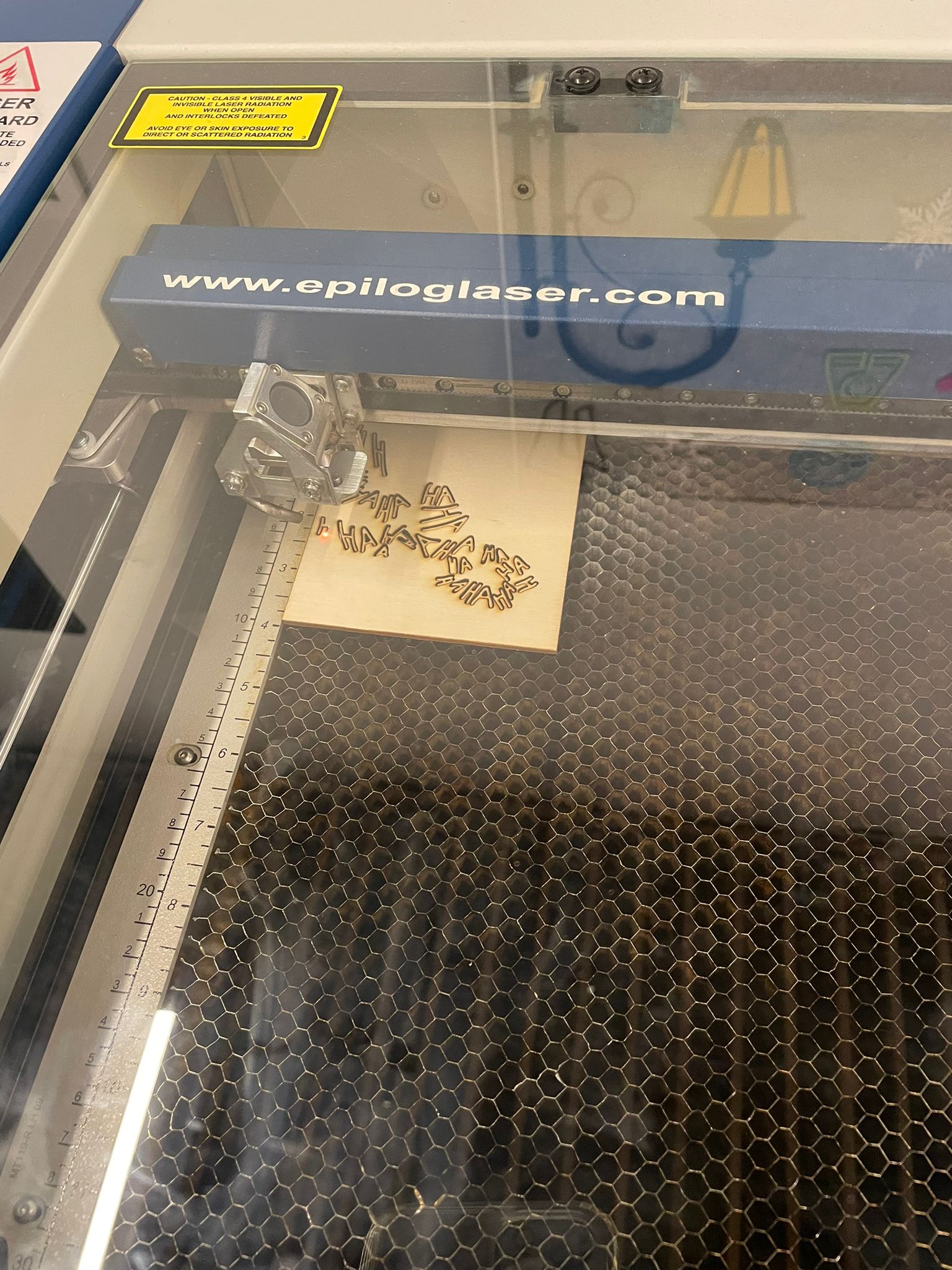
After everything was confirmed, I decided to do a mockup in wood to make sure that the design and tolerances were correct. Here are photos of that.

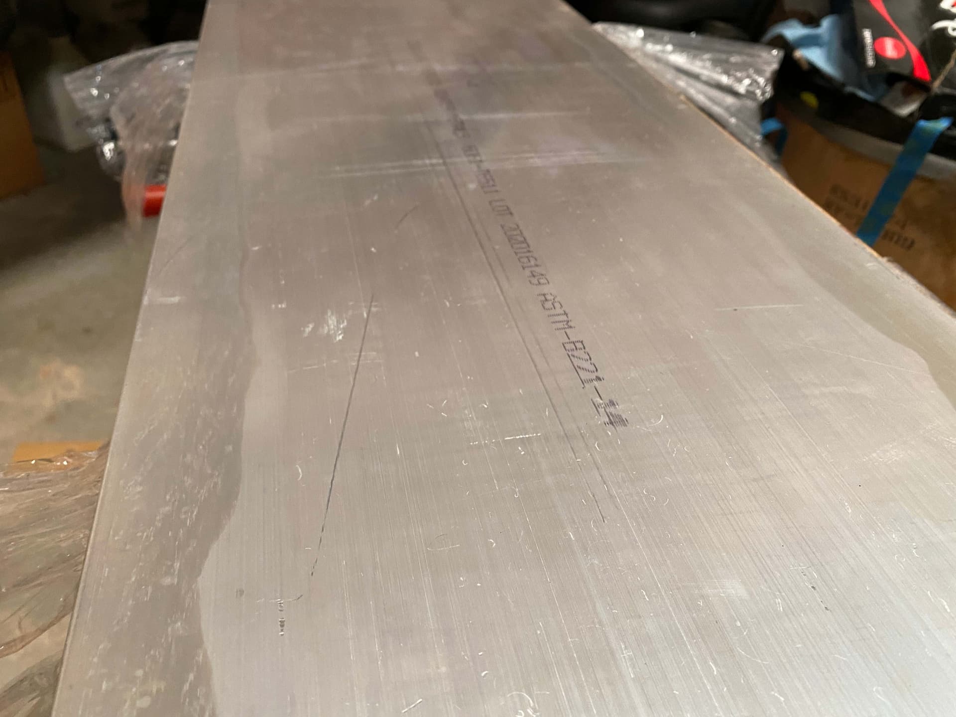
Around that time the aluminum arrived, and I began what I deemed to be the most challenging aspect of this project, polishing the aluminum from a rough state to a polished state. It arrived like this.

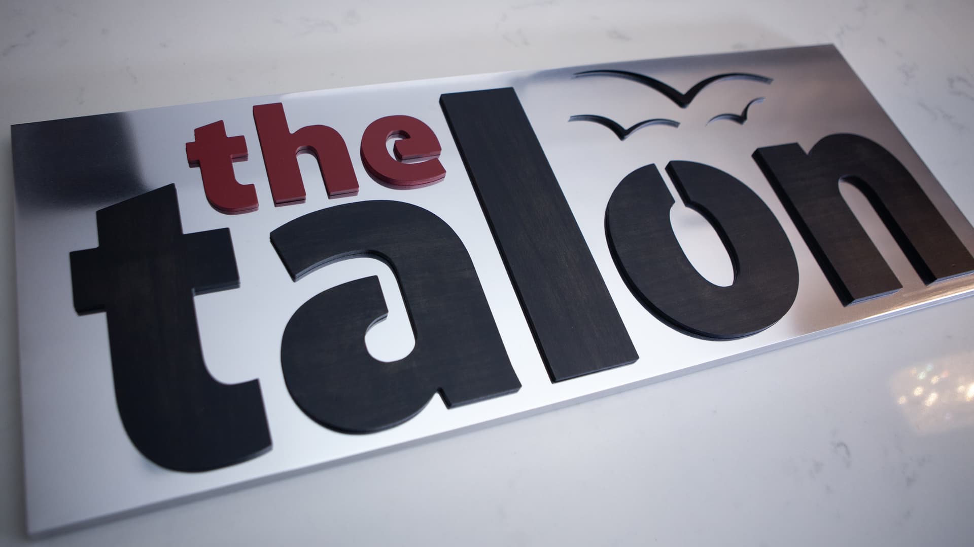
I still have no real sound process for this, but essentially, I worked up the grits slowly using a product called Alumicut to lubricate and minimize build-up of aluminum on the sandpaper. I started at around 80 grit and worked my way up to 2000 grit with an orbital sander, I then switched to 3M ScotBrite pads. After this I applied Mothers Mag Aluminum Polish with some foam pads on the orbital sander and then wiped it off by hand. I believe I did this a few times, and in the end it looked spectacular. This took multiple weeks of trial and error to get acceptable results, and in the end, I still wasn’t completely happy. Reaching a mirror finish is very challenging, something that someday I hope to reach myself. This process is by no way a perfect system, and I would love to hear input if anybody has had good success reaching a perfect mirror finish on aluminum. For now, though, I think that in the future I will set my sights on brushed finishes, which seem easier to obtain. Here is a picture of the finish it is quite close to a mirror, the later one is even better though.

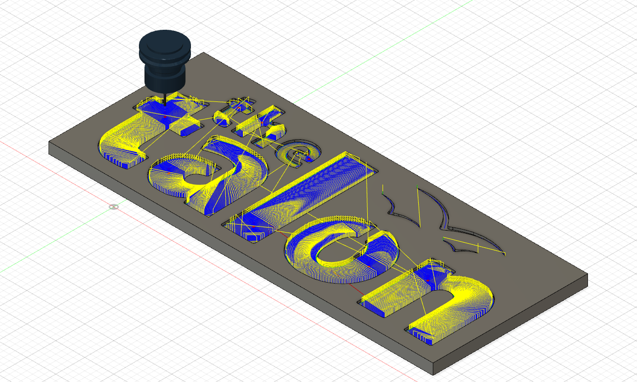
I did all the CAD in Fusion, I did it nearly entirely with adaptive clearing toolpaths. I began using a Zirconium Nitride coated eight inch endmill for the pockets, this was working quite well until it crashed.

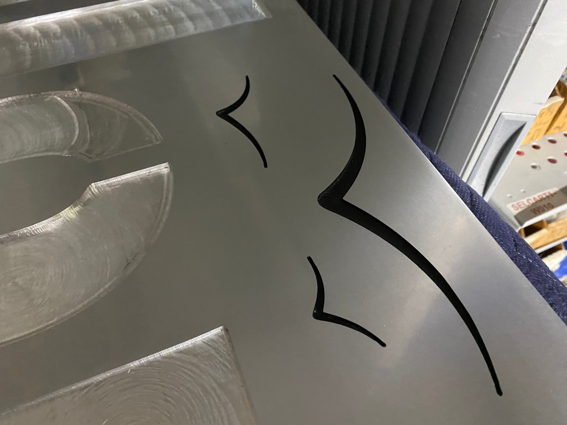
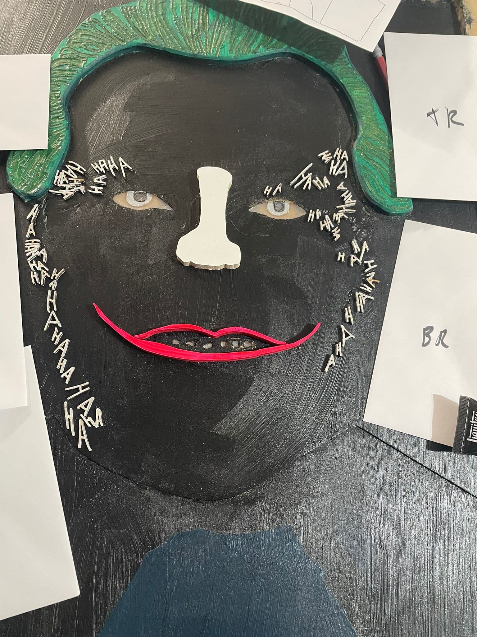
I still have no idea what caused this error. It suddenly rammed into the side of the work piece and careened until the depth of cut and speed was too much, at which point the endmill snapped. I sent the entire GCode for all the letters as one program through Carbide Motion, and with the relatively small step over due to the smaller endmill, this produced a huge file. I was monitoring this as it went, unfortunately I was too late to prevent the error, but it happened once Carbide Motion claimed the program had reached 100%, which was only halfway through the program in reality. Is there a limit on the number of lines of Gcode that can be sent through a single program? Later I had another issue, which left a cut across the center of the “O”, therefore from this point on I treated this version as practice. Despite how disappointed I was about having wasted so much effort, this proved very valuable. After this I transitioned to using 6 mm single flute carbide endmills, which were much more effective for hogging out the central material. I then tried to use a 1/16th in endmill to profile around the edge to make the radius tighter and to create the pocket for the bird to be painted. This while initially successful, proved to be unnecessary and quite fragile. The 16th endmill ended up snapping when profiling one of the letters. As the endmills aren’t cheap, I decided that two breaks were enough and transitioned to using 1/8th inch standard carbide endmills for any of the detail work. Minor sacrifice in radius, but worth it for my peace of mind. After completing the sign, I decided that the painted birds didn’t look great, and they had the potential to ruin the finish if the Oramask 813 was ineffective. Here is the version one prototype.


Not long after that I received a new piece of aluminum that arrived in a similar state of disrepair. I followed a similar procedure to that mentioned above, but as it was my second shot at a reflective finish, I believe that the result looks much better. It is a lot closer to the mirror look that I was hoping for.

This time, I began by carving out the wooden letters so that I could slowly near a perfect fit when carving the aluminum. They were profiled in poplar, then the “Talon” portion was stained black and finished with a matte clear coat and the “The” portion was painted red. I then proceeded to use my revised procedure for version two for the carving of the aluminum. I hogged most of the aluminum with the 6mm single flute, although I sent each letter one at a time to minimize the risk of the aforementioned issue with files size. After all the letters had been mostly pocketed, I then used a two flute 1/8th in endmill to slowly near the perfect fit tolerance. I wanted the letters to be a friction fit so that they could be easily replaceable, I even thought that they could be replaced based on the seasons, maybe have Halloween themed colors.


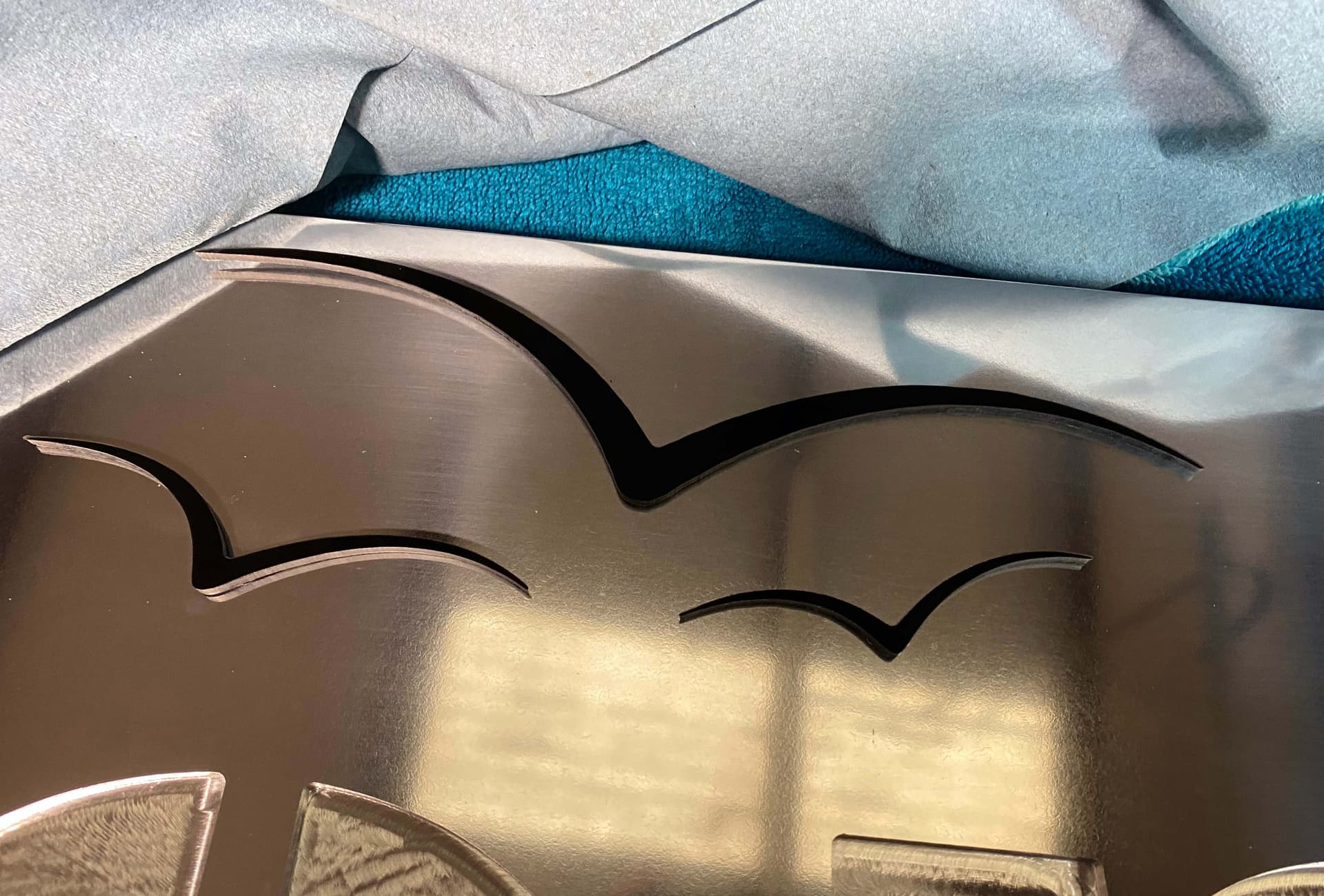
I decided that for the birds, I would try to carve them out of acrylic, I used a similar strategy for the future “El Campo” sign. Although in this case, as there was only one area that would allow for a pin, I used square slots, to force them to be in the right location and orientation. I first 3D printed them to confirm the look and pocket alignment system. I then carved the acrylic from the back to create the pins and then profiled them, after some trial and error and careful sanding this produced similarly protruding jet black and glossy birds.

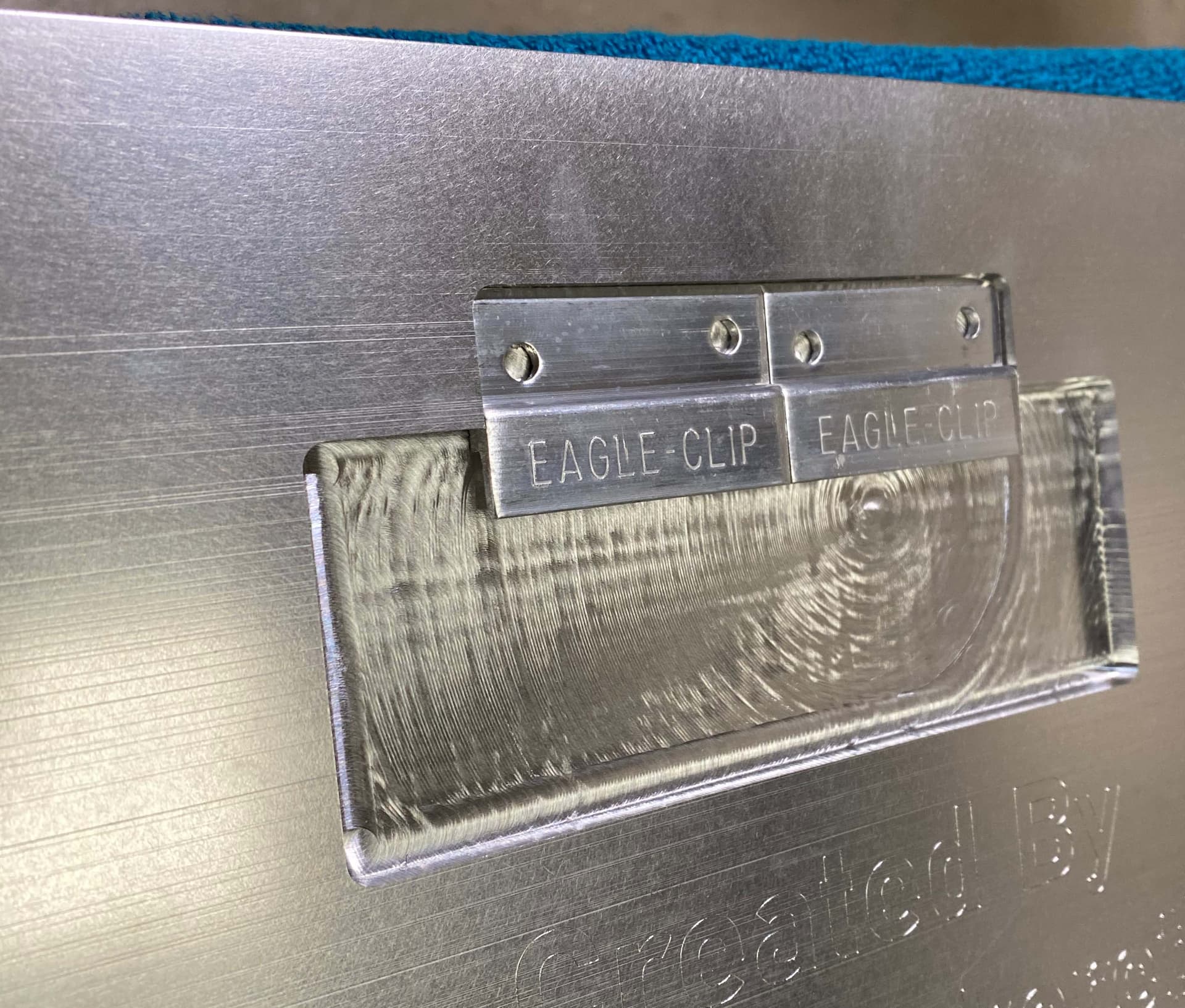
After a final test fit of all the letters, it was time to move onto the hanging hardware. As this was a very heavy sign, and it was going to be hung in a school building, it had to be incredibly secure. This was one of the factors I felt was most important. I wanted it to be flush mount which proved quite challenging. I ended up deciding to use aluminum z-clips which are essentially French cleats. To achieve the flush mount, I carved pockets to perfectly fit the thickness of the stacked clips, as well as providing room for easy installation. I followed the aforementioned procedure for carving the letter to carve the back. While I was carving the back, I used a drag engraver to engrave the names of all the current people on staff, which I thought was a very neat and personal touch, that is a huge benefit to the CNC process.

After this I had to drill and tap holes for these hangers which proved incredibly challenging, as I had never done any hand tapping. Although incredibly nerve-wracking (as one false move so late in the process, could have been devastating), it managed to go successfully. I screwed them into the back and the piece was essentially complete. After many photographs had been taken, I wrote up some installation instructions for the maintenance team, as neither student or faculty are allowed to make permanent installs in the hallways, and it was ready for delivery.


Although I was initially reluctant to work with aluminum, I learned an incredible amount from this project. And although it was completed after months of trial and error, and way beyond budget, it was all worth the final product.
As I can see the sign every day, (It was hung prominently so that it can be seen at the very beginning of the major hallway in the school) I get a unique perspective to see how it wears over time. Thus far there has only been one issue. I decided not to glue in the letters, as I wanted to be able to replace the letters or change them depending on the season, this wasn’t sensible. As I had predicted there would be some complications with the unequal expansion and contraction rates of the two material types, as well as the typical expansion throughout the seasons. As a result, on a couple of occasions the letters have fallen out, I ended up super gluing them in place which has solved that issue.

Thank you all so much for reading, and I want to once again thank Carbide 3D and Julien for hosting these competitions.

22 Likes

Well I’m a little late to the party and sad to see the contests coming to an end! I got my SO4 a couple months ago, and the previous contests are an amazing source of inspiration, so I knew I had to at least give one of these a go! I’ve been wanting to play around with topographic carving and have been trying to learn F360, so I decided to see if I could integrate that into this contest.

The idea was to overlay a topo of the San Juan mountains in SW Colorado onto script lettering of our name for a mountain themed mantle decoration. Unfortunately we no longer live in the area, but those mountains are a source of many fond memories. The cutout script lettering would then be overlaid onto a layered mountain range.

Two mountain ranges were first cutout from 3/4" walnut. A shallow pocket for the script lettering to register in was cutout into the outer layer of mountains. A combination of 1/8 and 1/16 end mills were used to get into all the areas.

A group of trees was v-carved with a 60 degree bit and then cutout with a 1/16 endmill from cherry.

A topo of the San Juan mountains north of Durango, CO was brought into F360 using the Image2Surface add-in and then used to split extruded bodies of the script lettering. Due to the small detail in the lettering, I was limited to a 1/16 endmill for the profile operations, which only had a 3/16" cutting length. In order to maximize the height of the topo scaling, I decided to profile from both sides. First, the backside was profiled to 3/16" depth in a piece of 3/8" maple, and then the stock was flipped using pins on either side to register position. Then, the topo was carved into the front side with a 3d adaptive roughing and parallel finishing with 1/8" flat and ball end mills. This resulted in the scripting being a variable thickness from 0.1" to 0.35".

After completion of the topo carving, the remaining stock was removed to a 3/16 depth by a profiling pass with a 1/16 end mill.

Snow capped mountains were a late addition per the wifes request with small maple inlays on the three tallest mountains.

The layers were then glued together and finished with spray poly to get into all the detail areas.

This was certainly my most challenging project to date and stretched me to learn numerous techniques. Thanks again for all of your inspiration and I look forward to continuing to learn and grow with the community.

Note: Additional pictures to follow since my newby status only allows one embedded image on this post.

11 Likes

6 Likes

And unfortunately this is the limit…

9 Likes

I don’t believe the contests are coming to an end, just that there will be a hiatus while we recalibrate a bit in terms of prizes and frequency and so forth.

5 Likes

My Entry:

The Joker - Tell me something my friend, You ever dance with the devil in the pale of the moonlight

For those unaware of the movie reference, here it is

The process
Step 1. Took a 3/4 piece of MDF scrap (22x22 inches) and painted Green where the hair was to go (FYI - prior to painting, I made a small square profile pass on the top right, that helped me see where I needed to paint green)

Step 2. Vcarved the hair. This was filled in with green mica metallic epoxy to give it that Joker Luster I felt the piece would need.

Step 3: Surfaced everywhere but the hair 0.25 inch. Then surfaced an additional 0.05 inches for where the suit would sit, as I wanted the face pieces to extend a little further than the suit.

I also vcarved an area for the teeth and small HAHAHA, as these were too small to cut out individually on the Shapeoko and get the fine definition I wanted.

For the eyes, these were actually done in two parts. After the 0.25 surface, I pocketed an extra 0.05. I then painted the recess with some “silver rub n buff paint” that I purchased based on the results @tomh and others had with the Aztec calendars. I then vcarved/pocketed an additional 0.05 around the eye, excluding the iris. This got rid of the silver on the white of eye (think the technical name is sclera), which I then filled in with a whitish epoxy. (If you scroll all the way to the top you can see those scary eyes just pop at you.

Step 4 I then epoxyed the white HAHA. The challenge with this step, was that it just wasn’t popping off the wood. So I ended up painting black over it and adjusting with micro letters (see Step 7)

Step 5. To conform to the rules, each of the white large letters, nose, lips, suit jacket, tie, shirt, were individually cut pieces on my Shapeoko Pro on 1/4 inch MDF which I pre-primed

Step 6 Which were dry fitted on to my wooden canvas

Step 7 I went to my local library that has an awesome Epilog Laser. I imported my HAHAHA from vcarve into CorelDraw and did manipulation to cut them out on a very thin piece of 4x4inch plywood that the library supplied me.

Step 8 Painting all those tiny, and I mean tiny HAHA white. Also, I had to paint both sides, because once they are all individual pieces, you have no idea which is the front or the back.

Then I had to take each piece and try to determine which of the micro-grooves it fit in (this was why it had to be painted on the correct side). In the image below, you can see me working away, as I figure out which H and A, fits in which slot (2 hours of my life was destroyed by this).

Once complete, I had to remove all of the small letters, as the big letters needed to go on first (the main attraction). I used envelopes to group the letters, so that the arduous task of putting them back on was shorter.

Step 9. Painting all eyebrows, lips, nose, letters (which were pre-primed, but I wanted to paint the tops again and the sides of the pieces. Also, I poured purple metallic epoxy into the squares of Joker’s Tie. I also sanded the shirt collar down a fraction so that the suit jacket was higher, and makes the tie pop more at the bottom.

Step 10. Gluing all the pieces onto my canvas (FYI - that included running to Home Depot to buy two tubes of Loctite Super Glue Gel)

Step 11 Cut off the excess, where I had holding pins with the band saw and then a huge, clean up

So what new skills did I learn:

  1. Procreate to trace the initial image that I thought I could take into Adobe Illustrator only to learn that it creates a raster vs vector, and so then I had to go through image tracing and the like in Adobe Illustrator to convert to a vector. This should have been easy, but my procreate image did not conform.
  2. Locating Pins. With this job, I had to put the main body back in and out of the CNC machine. So I peck drilled 1 inch deep holes into my 3/4inch material and created dowels from a 3ft dowel I picked up at Home Depot.
  3. I’m not sure why, but when I cut the large letters and face pieces out of the 1/4 inch MDF, it did not cut all the way through (0.24 vs 0.25). I then just sanded the back of the MDF to free all the individual pieces (normally, I’d just go bandsaw, but there were so many pieces). FYI - I also consequently had to learn how to create the ‘cheap but effective air filter for my garage’ - box fan and Merv 13 filters) - https://www.youtube.com/watch?v=aw7fUMhNov8
  4. Laser - Surprised at how fine it can cut, and will definitely be added to my workflow in the future. Plus I finally got to use CorelDraw.
  5. Using Mica Powders vs using paint tints in epoxy resin. I was hesitant about using Mica Powder as everyone talks about having to mix it really well, but it seemed just as easy as the tint.

Parting comments:

  1. Don’t pause these competitions. It is truly inspirational to watch all my fellow artisans create mind-boggling entries, month after month.
  2. The next challenge could be lamp/light fixture design, as I am sure that my fellow members have all been inspired by @Julien journey Tips on making this wall light? - #123 by Julien

Lastly, here is a link to the Aztec Calendars I was referring too

12 Likes

Will put it the right way (that the words of my imperfect English in the original post failed to convey). Call it a pause to recalibrate on our side, and extra time to hone various CNC skills on yours. In the meantime…already a lot of great entries in this contest, keep them coming !

7 Likes