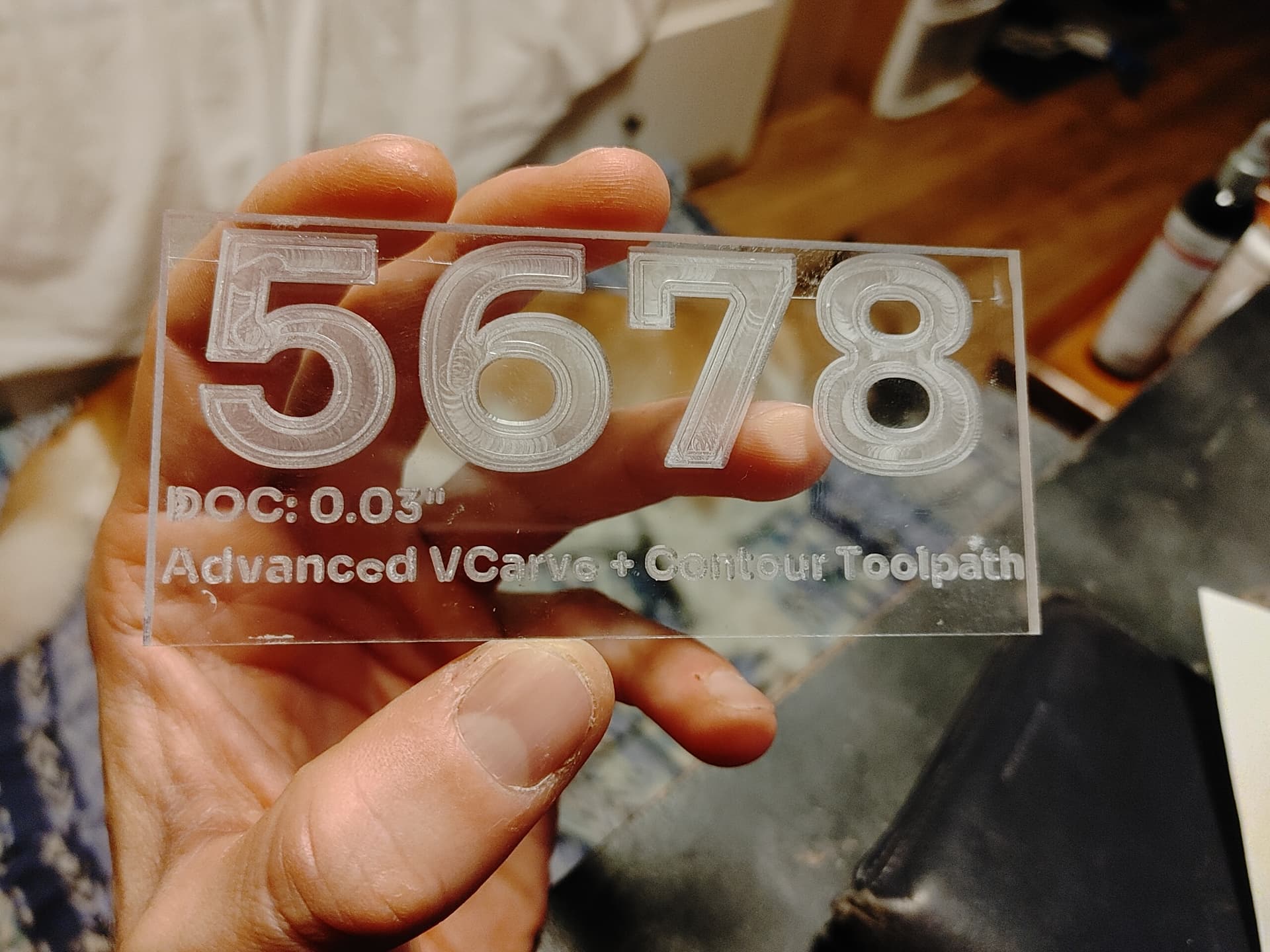
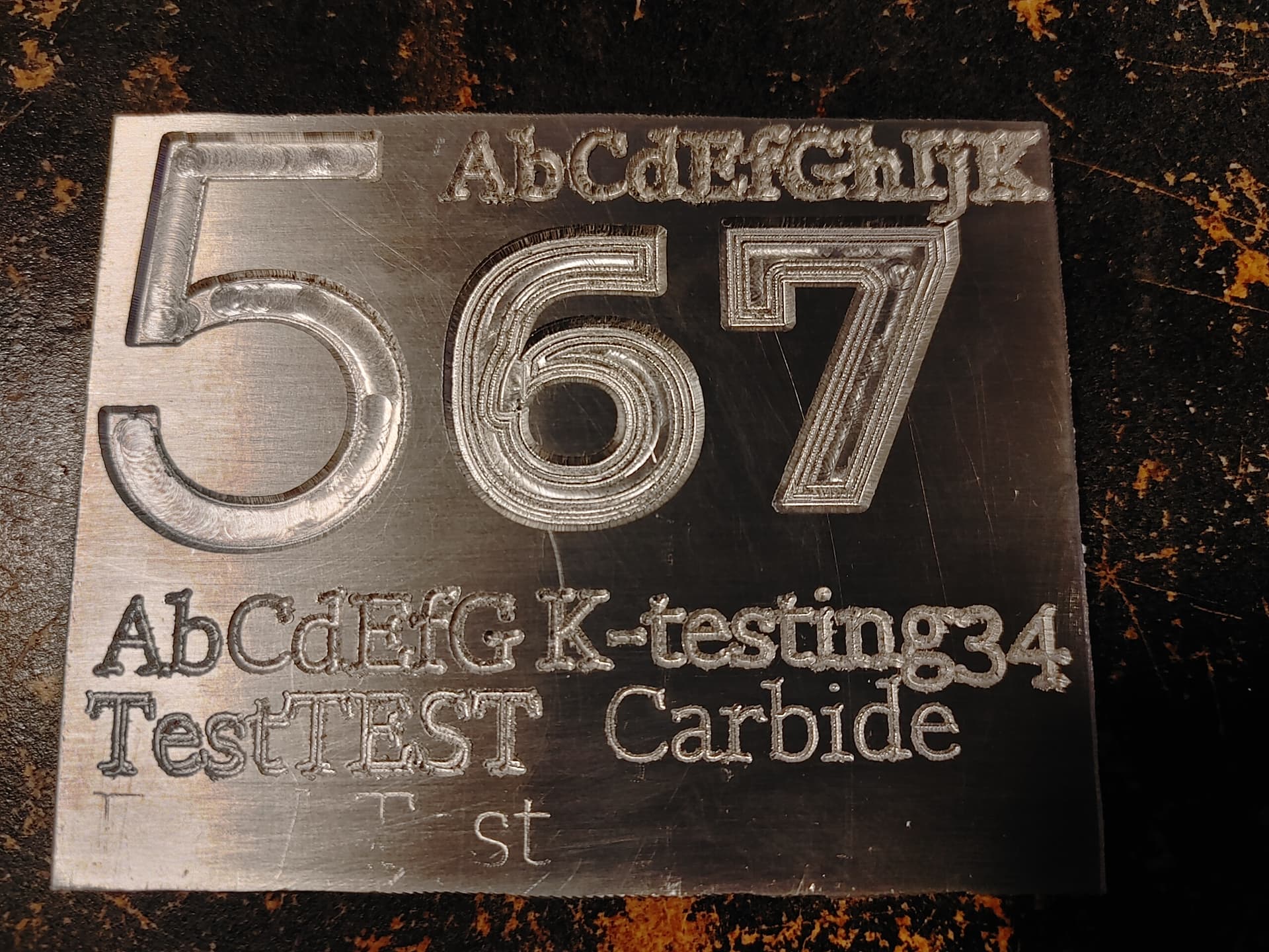
I was playing around with all kinds of settings today trying to get some clean Vcarve results into acrylic.
Things went well. My end result looks really clean IMO with only a couple of issues in the end:
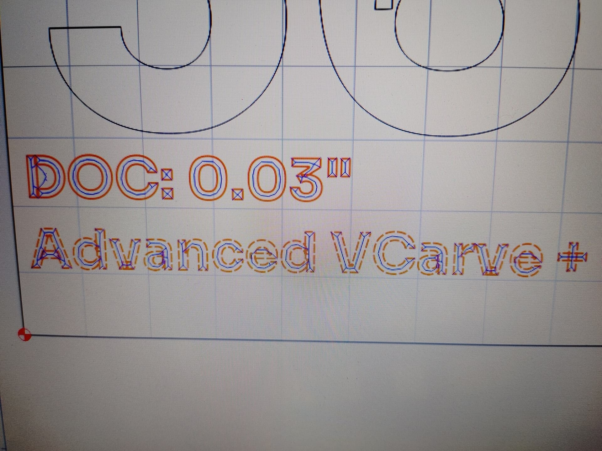
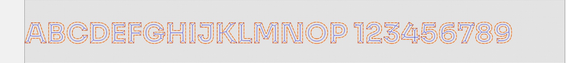
For some reason when I was carving small text the toothpaths are messed up on certain letters. See images. The “D” in DOC is scuffed and also the lowercase “e” in 2 locations on the bottom line. Any ideas what’s causing this?
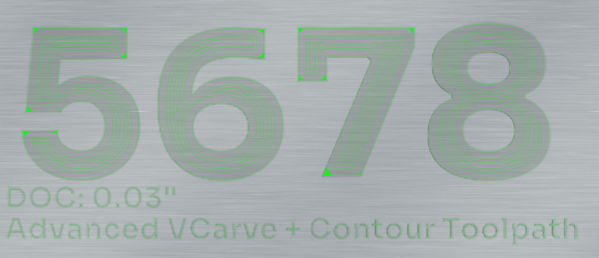
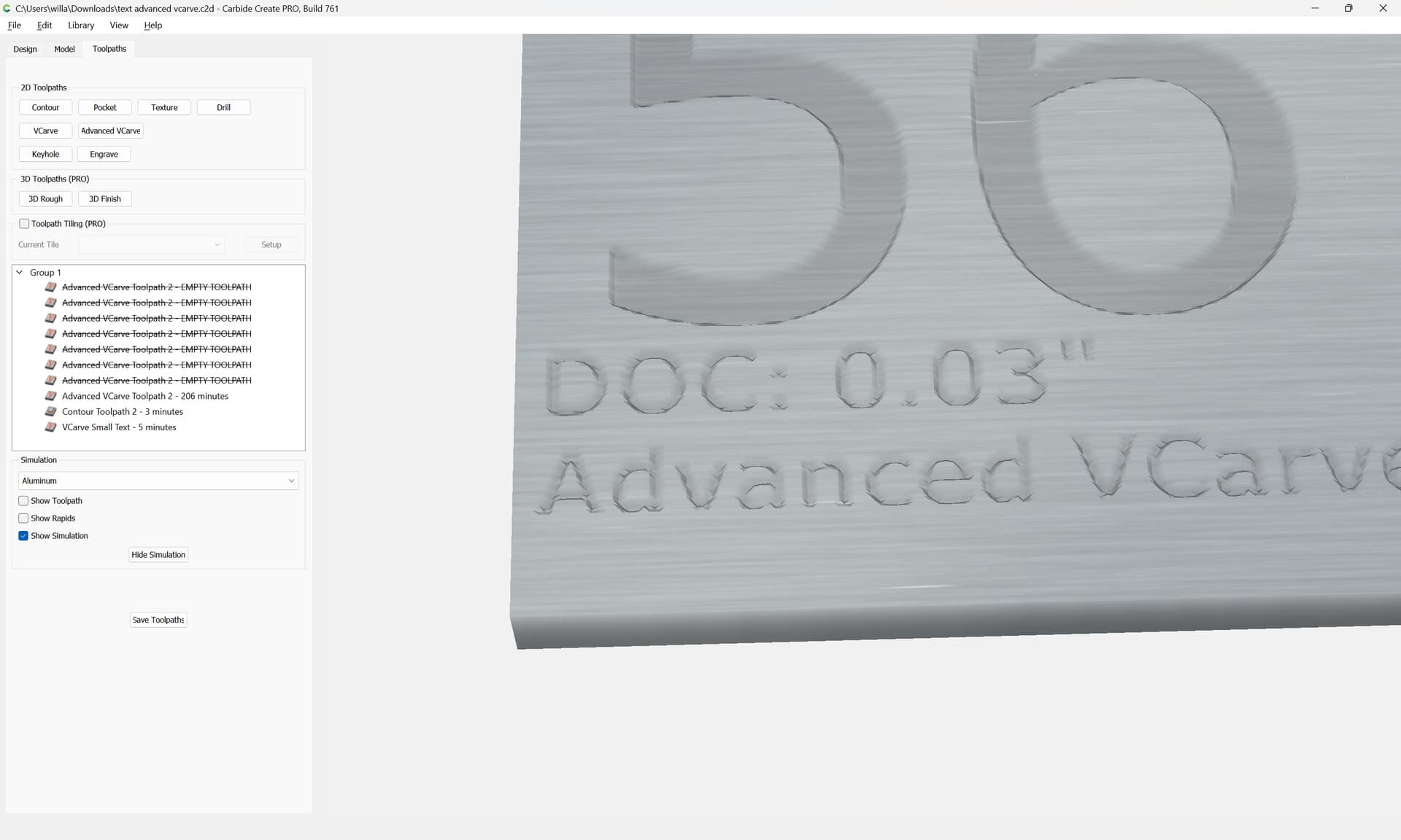
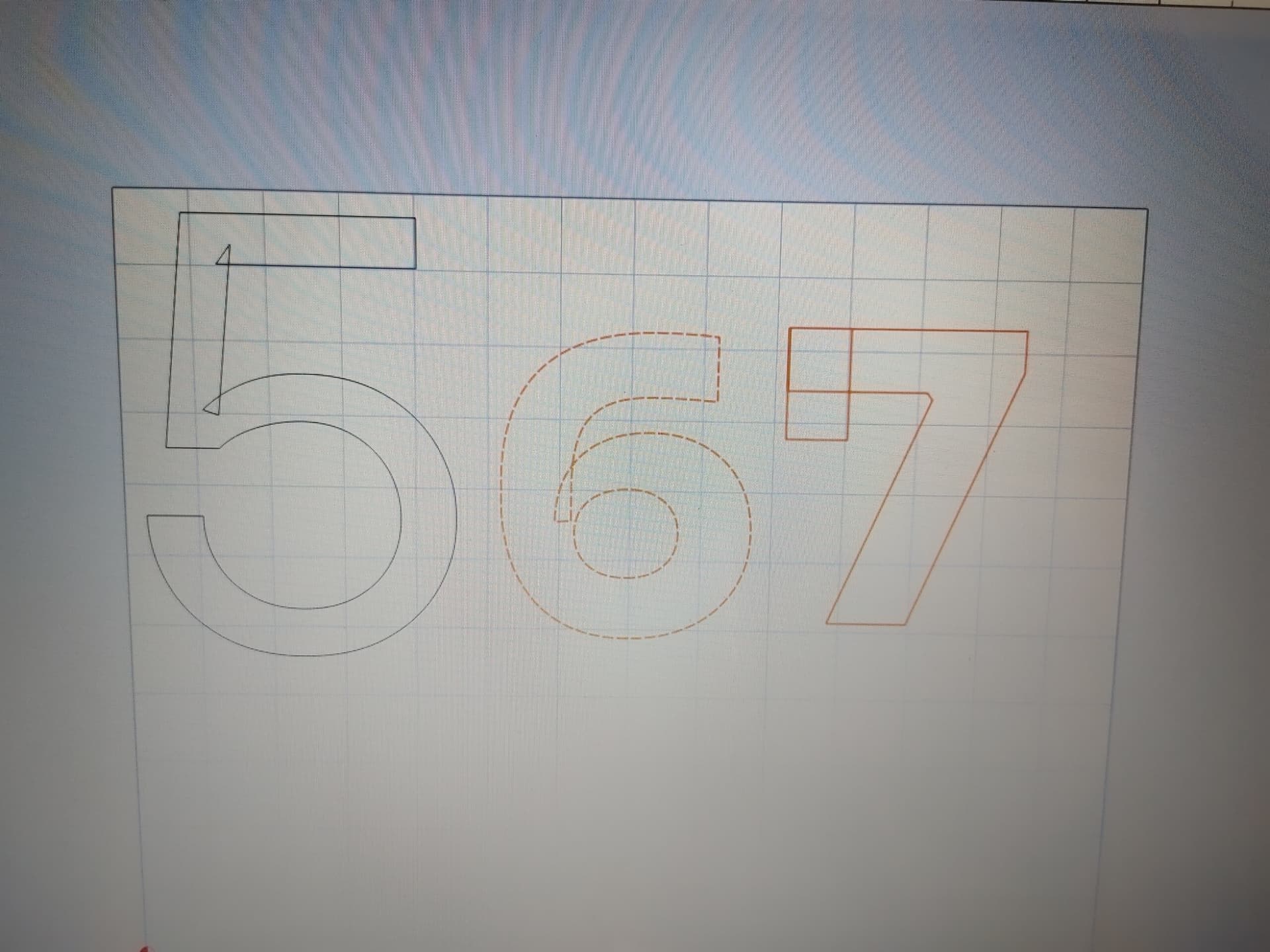
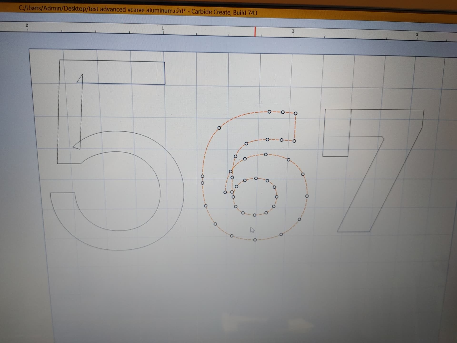
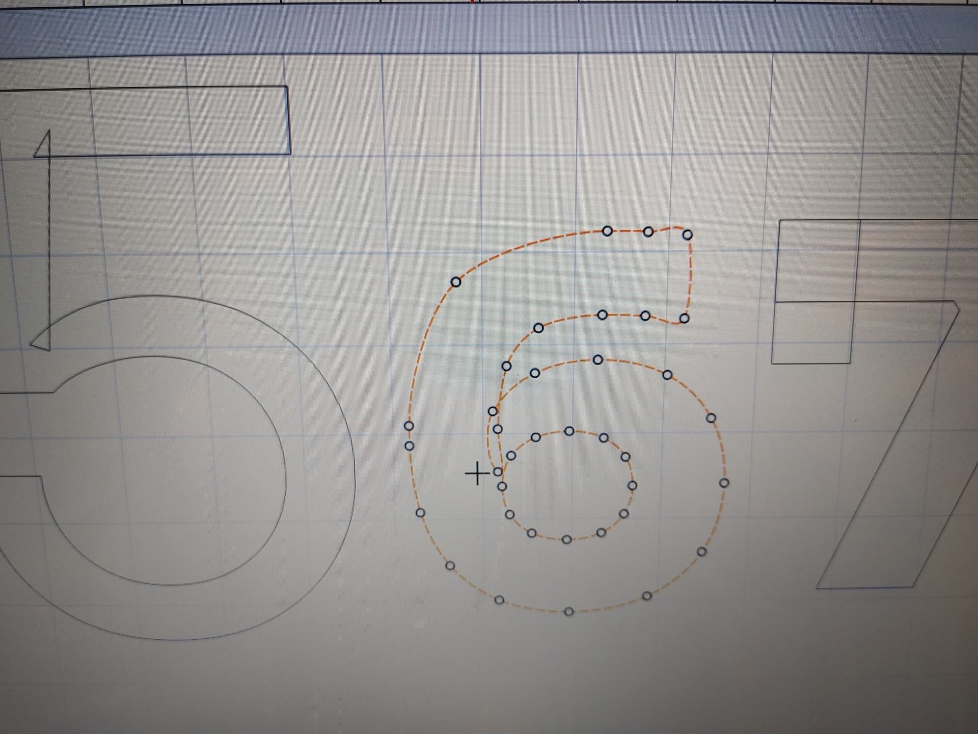
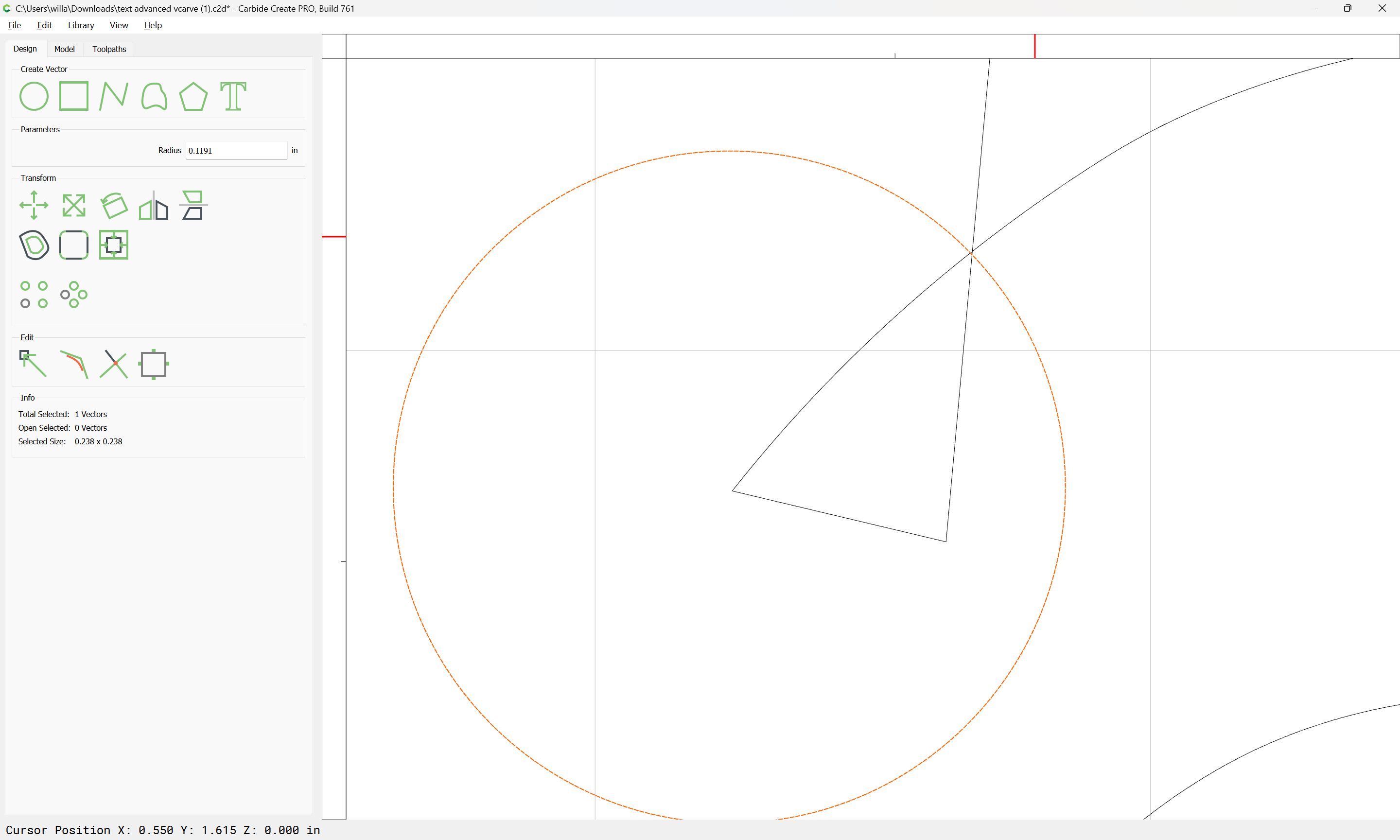
My process for advanced Vcarving the large numbers was to use a 1/8" endmill then clean up with a 1/8" 60degree vbit. To get the best results I need to set the stepover at 0 but it gives me an error saying the minimum is 0.0004", if I choose that result then close it and re-open it, it’s saved as 0 for some reason. Everything works but I found this strange. Is that what you guys do?
There were some very minor imperfections around the letters after advanced vcarve so I ran an inner contour toolpath and it seemed to clean things up to near perfection.
Not sure if I’m doing it the right way but it seems to work.
I bet the problem with the ‘D’ is the font. It appears the font you are using has multiple overlapping regions for that letter, that does not play well with VCarve.
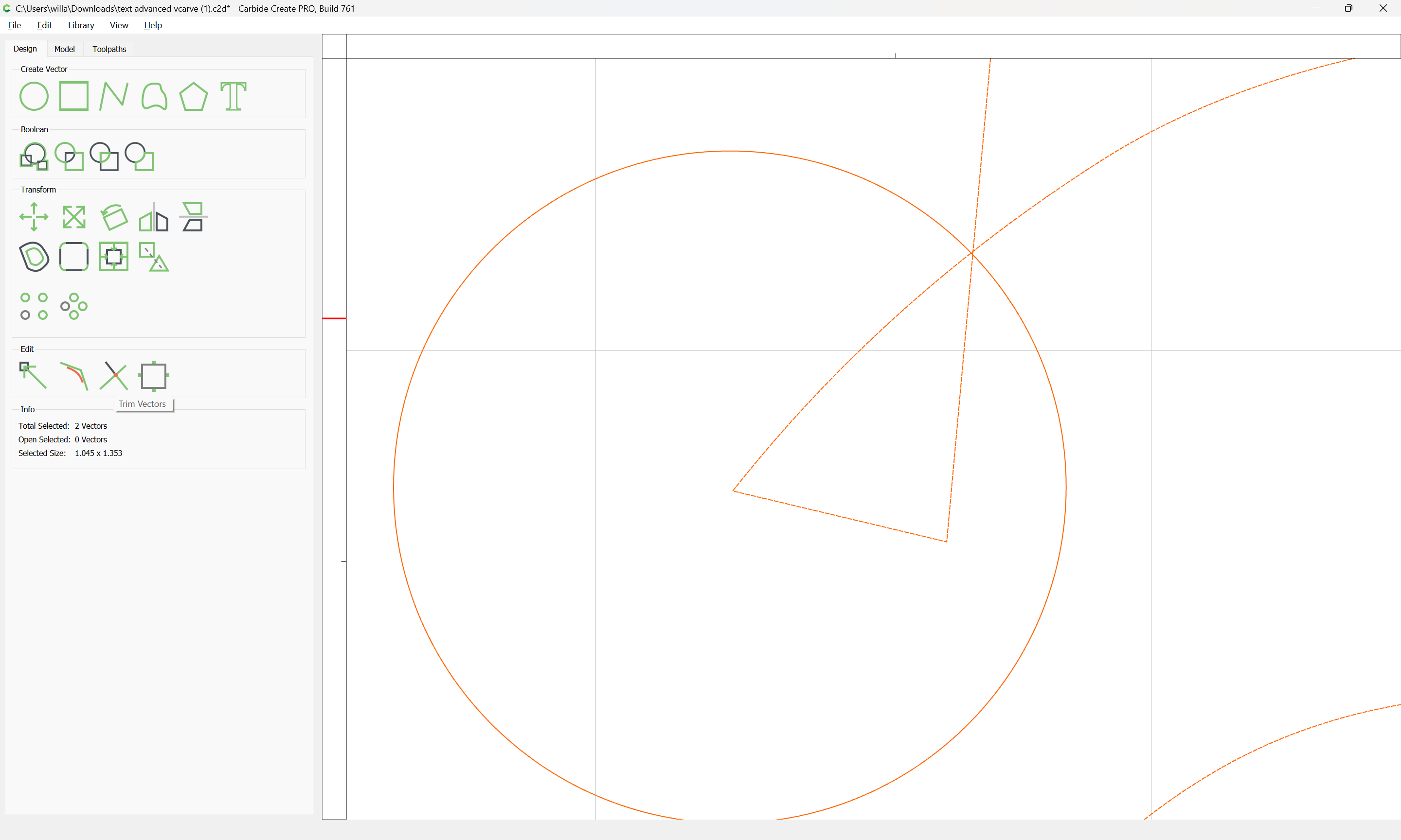
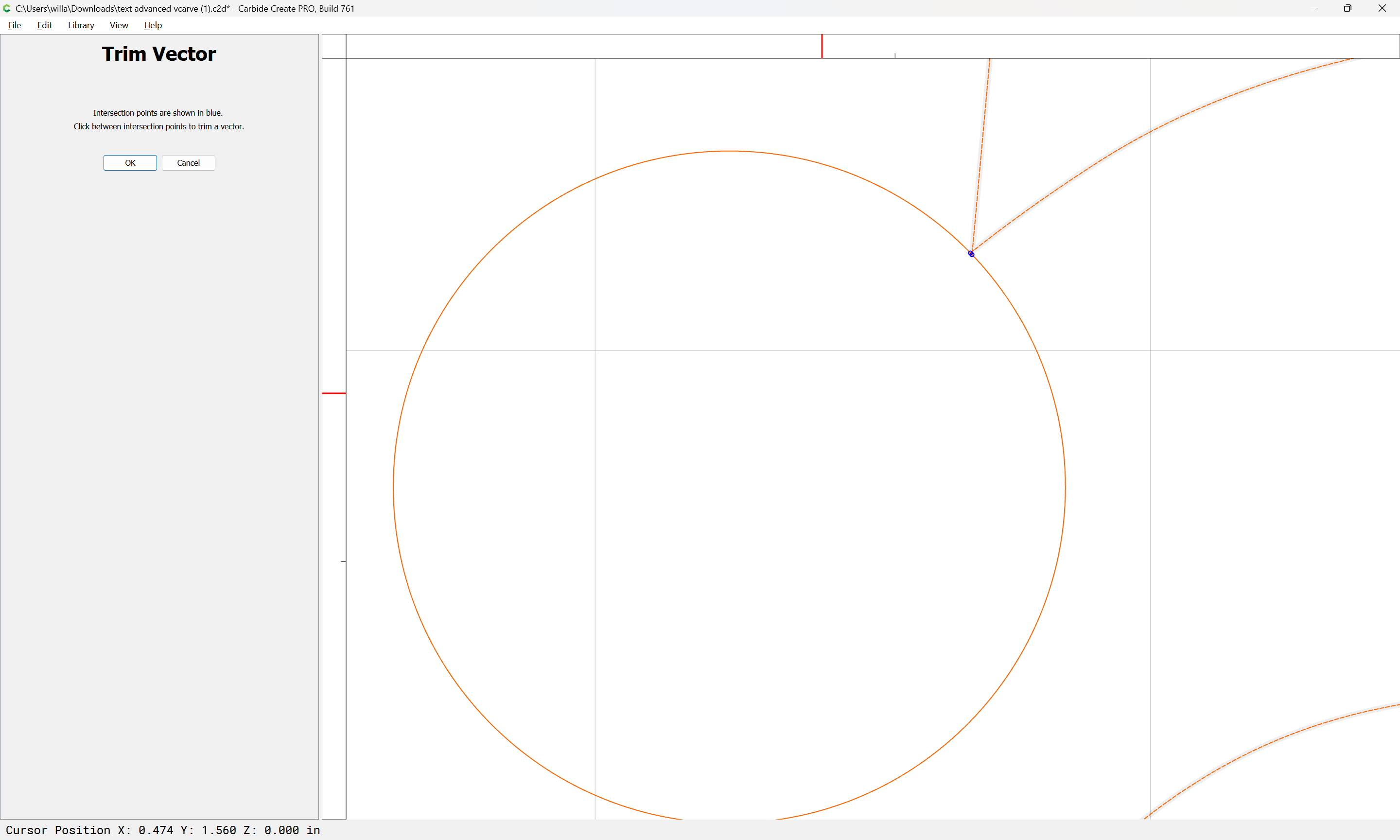
About the only thing you could do is convert the text to Curves, then apply boolean operations to clean up the letter and VCarve that.
As @mhotchin noted, it looks like overlapping/doubled up geometry confused the V carve toolpath algorithm — what does look like this in the 3D Preview?
My screenshot in my OP was taken on my CNC laptop, these ones are from when I loaded the file on my main PC. Carbide Create isn’t calibrated on my PC and it seems to have thrown off the sizing a bit, but now the toolpaths look good.
I’m not sure if I’m messing up. When doing advanced vcarve I’m getting some minor distortions in the edges from my vbit pass. When it’s clearing out the corners it pushes into the edges of certain areas very slightly - but enough to notice it.
I’m really trying to optimize my cuts so I can move forward in the right way. Do you guys see flaws in the process I’m doing, like running such a low stepover or something else?
Is it normal to have to create an inner offset and run a contour of that to sharpen up the edges at the end? The end result is really nice, but I just want to be sure I’m not doing unnecessary clean up passes.
I am no font expert but I have seen that a lot and I guess it has to do with rendering them on “paper”. Maybe that extra tidbit tells the systems which side of the area to fill.
It is annoying though. I just did a project using a downloaded version of the national park font and had to go in and fix certain letters. Of course my fix was to that letter, not the font so the next time I use it I get to do it all over again.
Ditto on a font I used for some Halloween stuff.
I usually cut, not delete the node and then draw new poly lines in to reconnect where necessary and then join the vectors. If there is a better way I am all ears.
Just a quick update for anyone having issues with the font adding extra geometry, in my case it was caused my the font coming from google. I downloaded the same font from “fontesk” website and it works flawlessly on my laptop.