Had a request for a sign design on the Facebook group:
Thought it would be a nice way to discuss / show designing something.
Had a request for a sign design on the Facebook group:
Thought it would be a nice way to discuss / show designing something.
Start by looking for a suitable font — in particular we need one with a loop on the L. A great place for free fonts is Font Squirrel:
In this case we’ll try Dancing Script OT:
Download and install that.
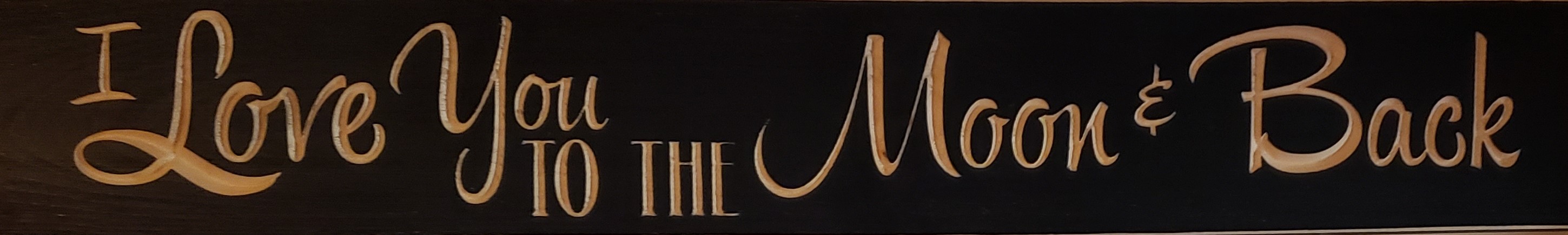
Next, we need a design to work from — in this case, it was posted to the group:
Open up Carbide Create
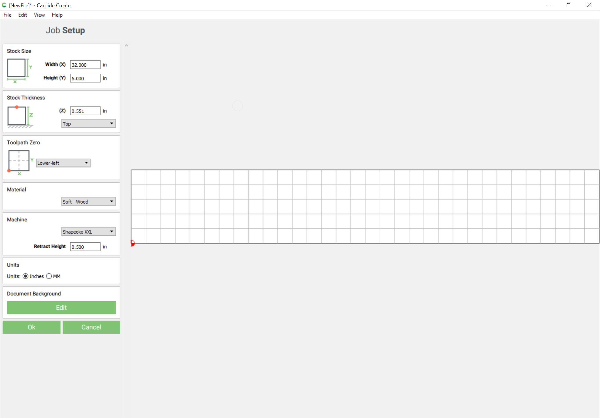
Open up Carbide Create, go to Job Setup (gear icon) and set things as desired:
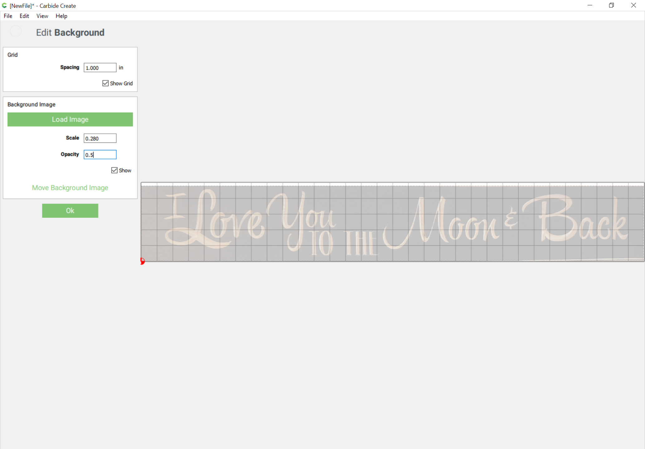
click on Document Background | Edit and then Load Image and adjust as desired:
OK | OK
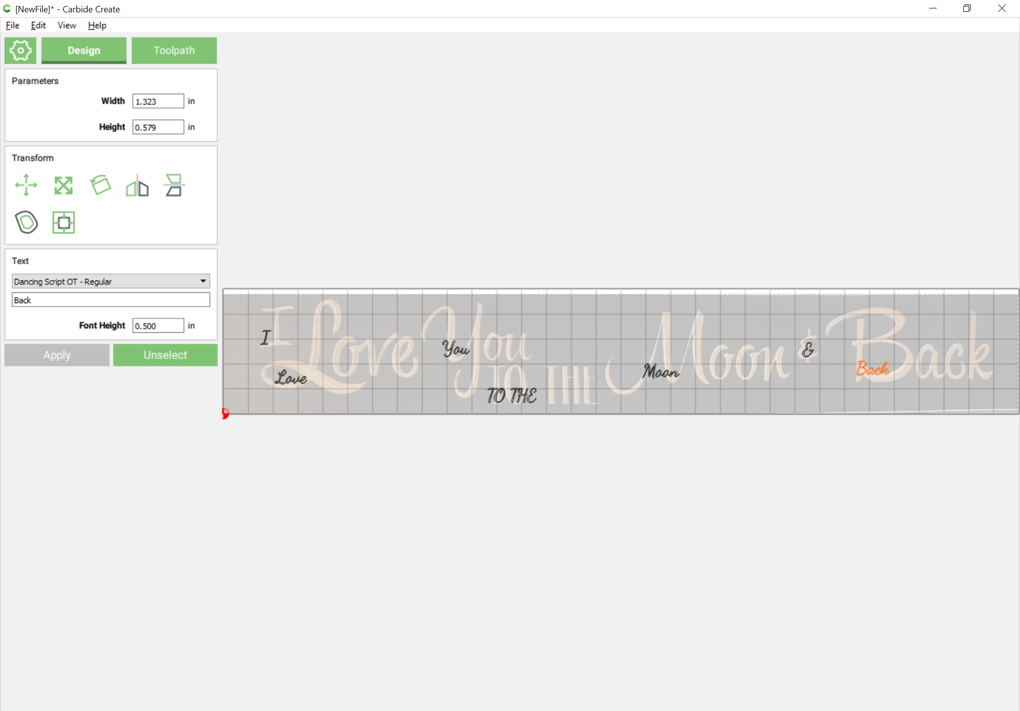
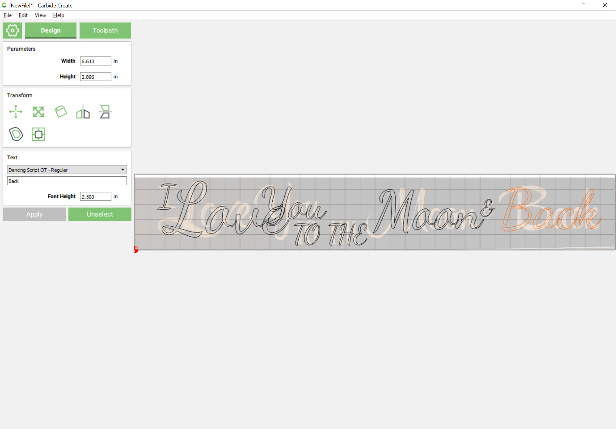
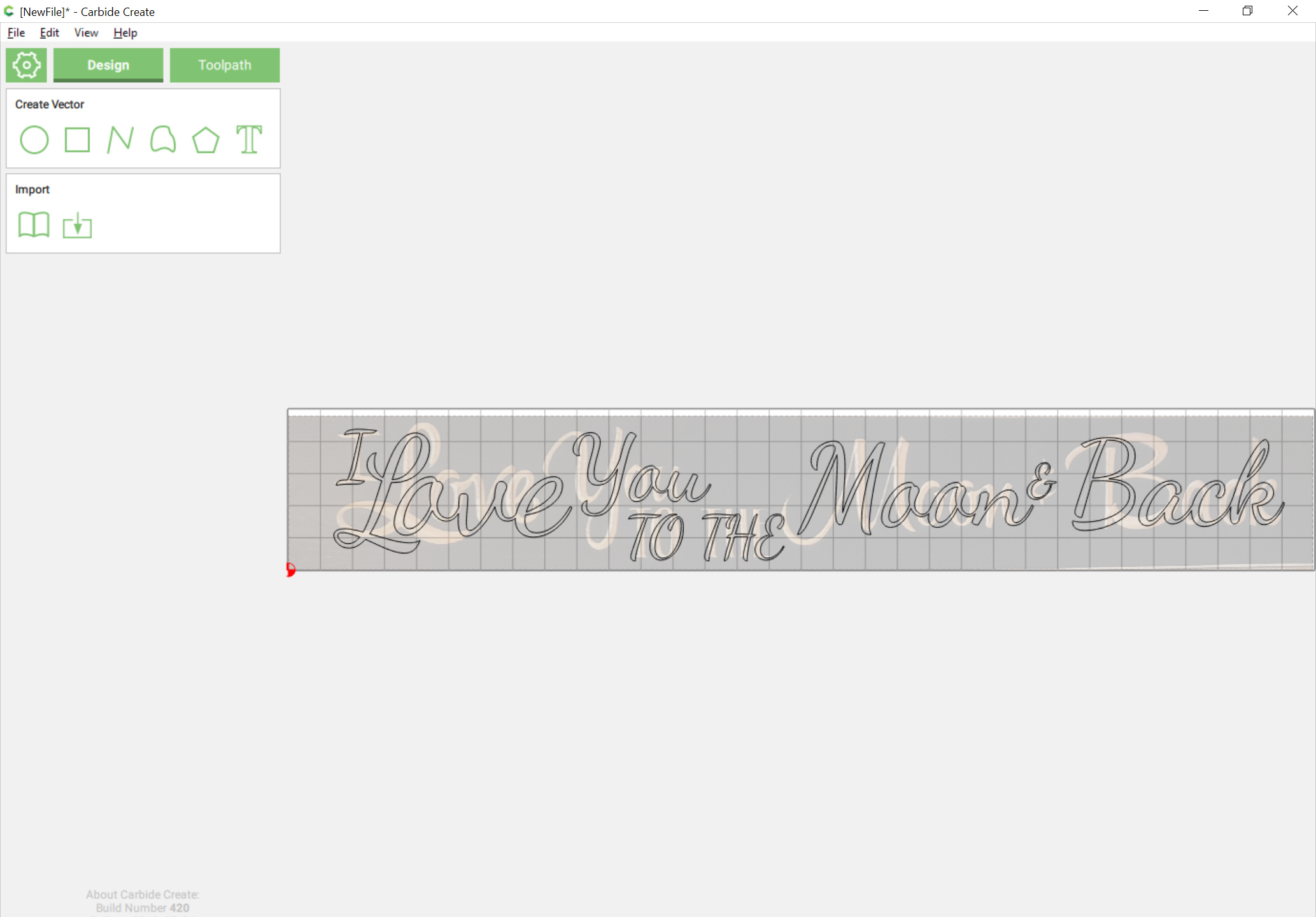
At the Design pane, set each size/section of text in a separate text block, so you’ll need:
Drag each text block into position:
select each in turn and adjust the sizing:
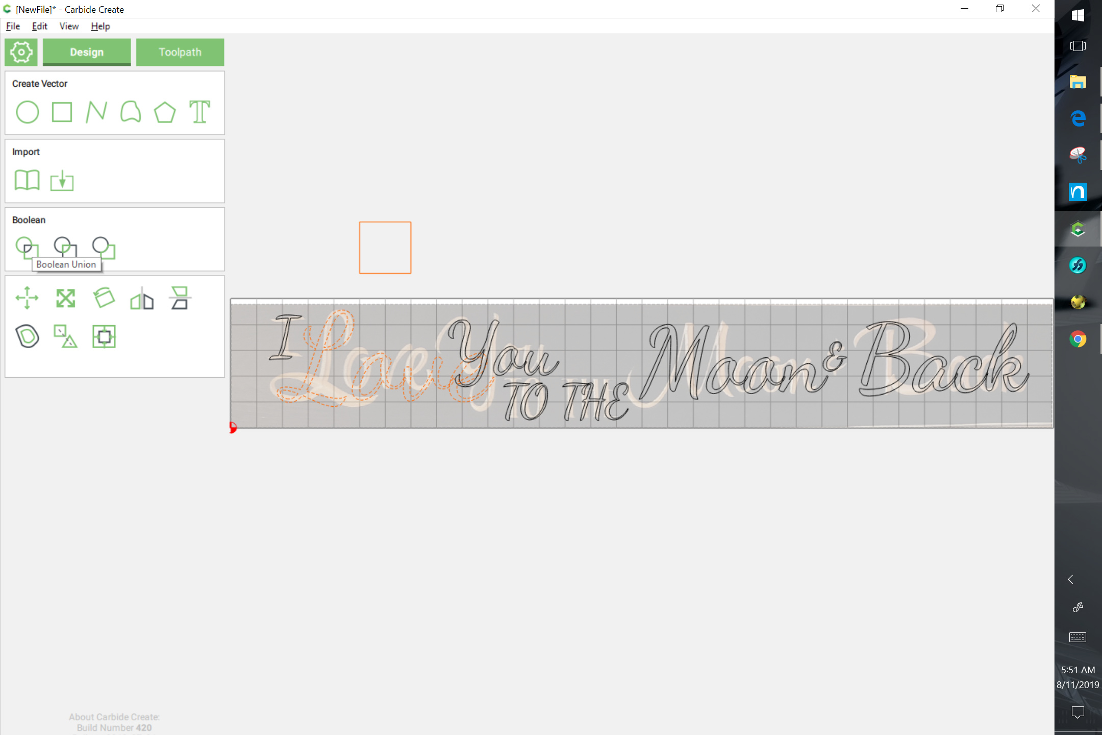
We see that one section has a bit of a problem — the setting of “Love” requires more adjustment than Carbide Create will afford for text as text, so we draw in an extra bit of geometry, select it and the text in question, and do a Boolean operation to convert the text into geometry (alternately you could slightly inset it and then offset it back):
You will probably want to turn off snap to grid.
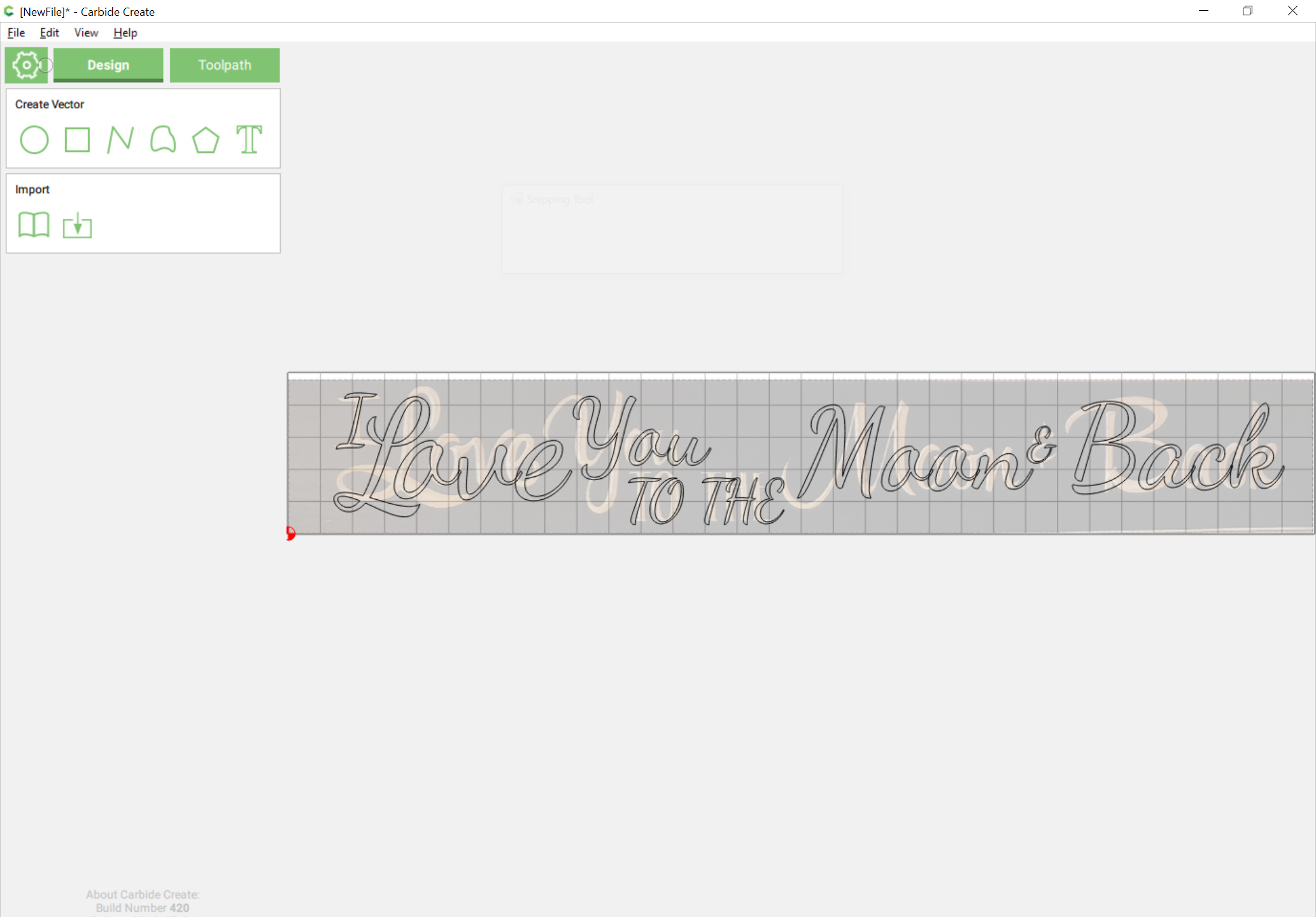
Select and drag and adjust and if need be, resize until things match up as desired.
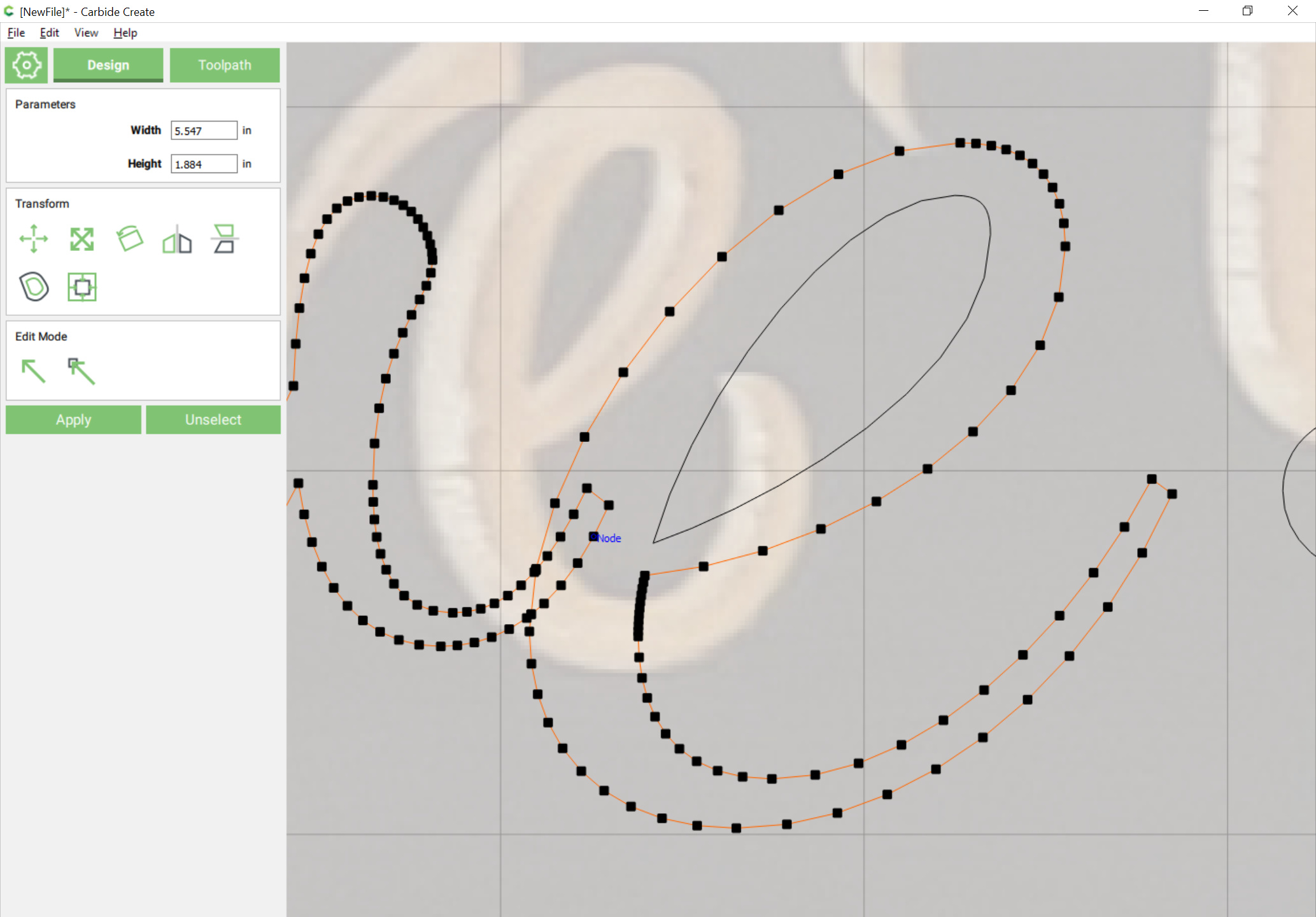
Select the text which has overlaps, and the outer area of the letters which have been converted into paths and union them:
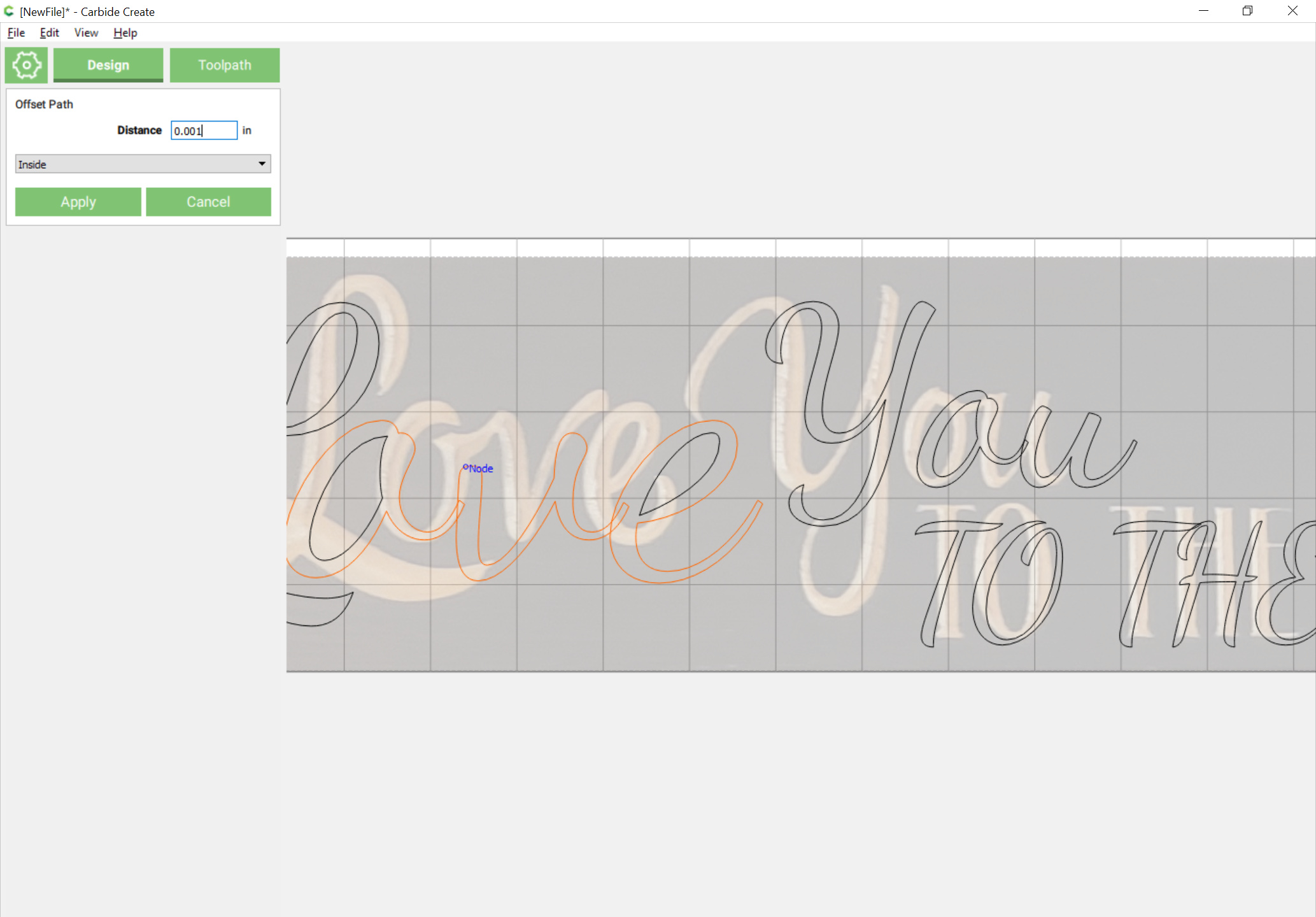
In the event that doesn’t work as desired, select each problem section and inset or offset it slightly:
If that doesn’t work, zoom in on problem areas and go into edit node mode and delete and if need be, move nodes to eliminate overlaps:
Edit and adjust (one may have to revisit Booleans) until one arrives at a design with no overlapping geometry:
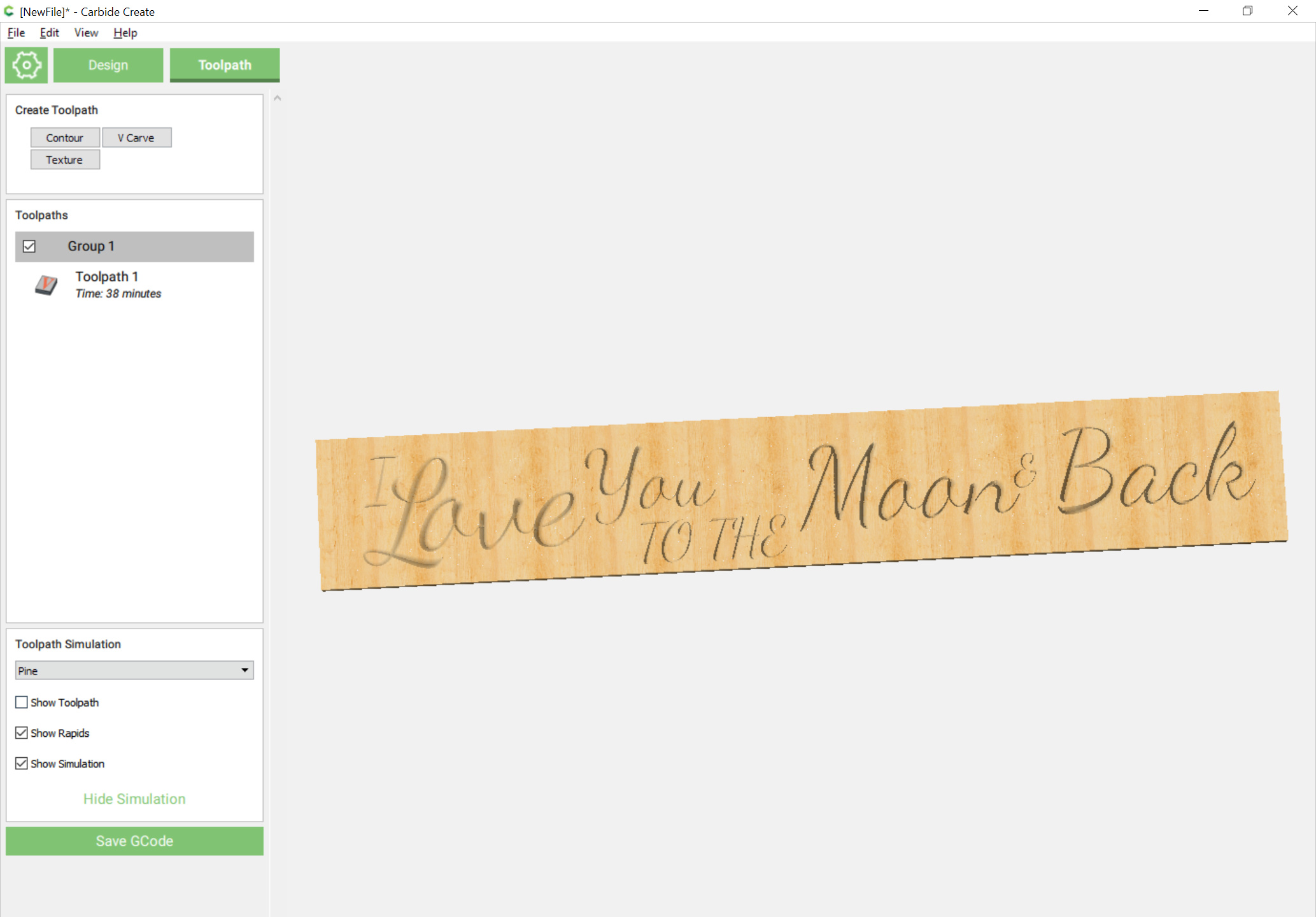
Assign a V carving and you arrive at:
Attached:
iloveyoutothemoonandback.c2d (2.6 MB)
Including an SVG for folks who don’t have CC420:

.zip archive: iloveyoutothemoonandback.zip (24.1 KB)
Please test and adjust feeds and speeds and endmill selection to match your needs.
Thanks for this, I was not aware of Font Squirrel, it looks like a good source for fonts. As a typographer, you will notice that the script font you use makes the O look more like A if you compare the tail of the O from the original, you see how much lower it is.
Yeah, it would’n’t’ve been my first choice, and it’s pretty obvious why it’s free rather than commercial, but easier than running down copies of Murray Hill
You have to find messages that do not contain the lowercase letter O! 
I guess this is a warning to people who are not familiar with fonts to look at the result objectively to see if the font is really suited to the project. My late father who was a typographer always said that a word processor in the hands of a neophyte would seldom be able to produce commercial quality products.