side view.pdf (125.4 KB)
having trouble with a simple cut…just not cutting to depth. in carbide motion i see this on the side view. That must be a clue to what is wrong…but have no idea what the clue means. Thoughts?
not sure what the red line means???
The side view shows the rapid movements.
Switch to the top view, and you’ll better understand how the project will be cut.
the side view help to confirm depth of cut…what does that red line mean?
The red lines are the Rapid movements - how the spindle moves between cuts.
Since you posted a picture instead of the C2D file, we can’t actually look at any interesting part of your project to help you. At a guess, the retract height is quite high. The actual cutting depth we can’t say anything more about, since you didn’t post your C2D file.
here is the file…
serving tray logo.c2d (204 KB)
…
The depths on all your toolpaths are completely inconsistent, it’s hard to figure out what you want to do. However, for VCarves without the pocket clearing option, you should set the depth to the special value ‘t’ (which indicates the full thickness of the stock), and allow the tool to cut as deep as needed.
The Depth on the Advanced VCarve is not how deep it will cut - it is a maximum value that the cut may never reach. The cut is always limited by how deep the bit needs to go to touch the surrounding vectors.
If you could describe the effect / result you are looking for, we can probably get you closer.
i started the cut with a 30 degree at depth of 2MM for the whole logo. it started and cut way too deep…no sure why. I stopped and set up a pocket to cut through what i had done so i could start over…could never get it to cut properly. So i stopped and tried to cut just the date. That is what you see in the “side view”. I have used this template of the logo many times and have always used the 30 degree with 2mm depth. i did increase the size of the logo but nothing else. So still not sure what went wrong.
Your pocket is 0.098 deep, so the other paths should have a start depth of 0.098.
The 30° is probably OK for the top letters. It will make the logo very deep. And the logo is too narrow to clear out with a 1/8" tool, so it will use the vee-bit to clear if the depth is shallower.
The red line from the origin on the left to the beginning of the path is a misrepresentation of the first rapid move. It will really be above the job wherever the tool sits when the job starts.
The simulation doesn’t know where the tool will start, so it starts it at 0,0,0. (Goofy, I know)
It should probably just skip that move & start at the first approach point. Or default to something like Z6.0"
So if i only want to cut the year (2025), what would you recommend as a V bit and depth of cut?
Tomorrow, unless we are snowed in, i am going to try to reset Zero at the bottom of the pocket and then use the 60 degree at 2mm. thoughts?
No need to reset zero at the bottom of the pocket, just set the Start Depth to be the depth of the pocket. Keep the Z Zero where it was.
This reduces the chance that a too-low retract height might hit areas of the project that are now higher than the Z Zero.
For lettering and such, you almost always don’t want to set a shallow depth on the toolpath. Set a large depth. The tool will not cut that deep, the tool will only cut as deep as needed to cut the width of the lettering. Use the special value ‘t’ as the depth.
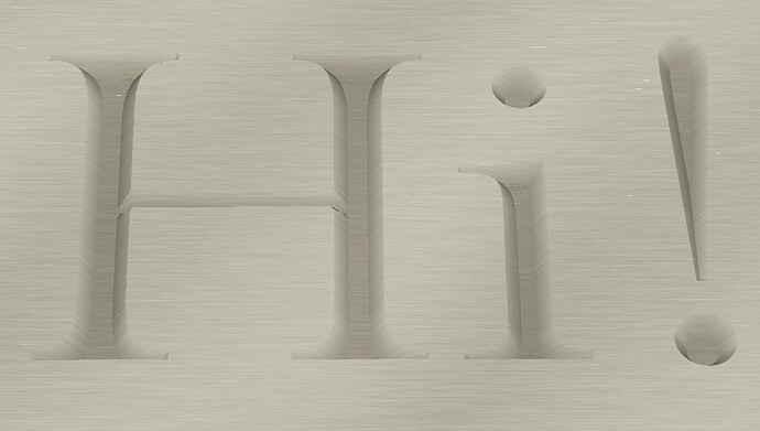
With those settings, the preview shows as (rotated for lighting):
ok…thanks.
what would you use to cut really big letters, like for a sign?
For really big letters, I would likely use an Advanced VCarve - one with a clearing bit, and in that case I would set a depth limit.
Here’s some large text, 5mm deep using a clearing bit. It produces the same tapered edges as above, but flat bottoms. For larger letters, unless you have an enormous V Bit, you wouldn’t be able to carve all the way across the letters.
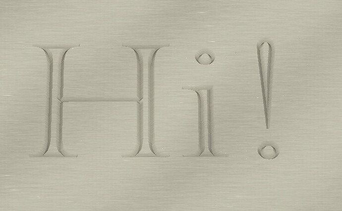
If you don’t set a clearing bit, you get something like this. The V Bit traces around the perimeter of the letters, and leaves the interior uncut. It’s a different but viable look.
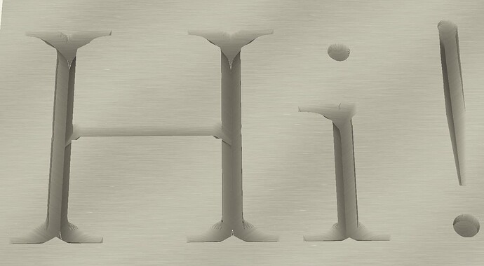
When the lettering (or whatever vector you are using) is wider than the VBit you have, and you go deep, you get this. The bit isn’t wide enough, so you get vertical walls where it’s wider than the bit. It’s likely not what you want.
That said, if you really want the full depth carved look, on very large letters, it is possible by combining options 2 & 3 above - A deep carve to get the depth, then a depth limited carve to clear the perimeter properly. This works up to double the width of your V bit:
This topic was automatically closed 30 days after the last reply. New replies are no longer allowed.


