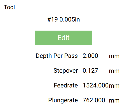
I got a spring loaded diamond drag bit a few weeks ago. I work it on my nomad for Brass and Silver engraving. The bit itself works perfectly fine and was easy enough to set up (I watched the carbide & Winston Moy videos on youtube).
However, I think the results I get when I use a small font (3mm in height) are quite dreadful. They’re super shaky and not precise at all.
I’ve attached a picture, so you get a better idea. The big E on top is 10mm high and the lower one is 3mm. It’s the same font.
I understand that 3mm is quite small, so maybe the DD bit can’t quite handle it, but it’s probably just me struggling with it.
I’d be very thankful for any ideas on what the issue might be.
I suspect it’s caused by the drag bit being spring loaded which perforce must allow some deflection.
While it would slow it down a lot, I think the best thing to try would be to break up each letter into an open stroke and at the end of each stroke retract to a bit more than the height of the spring give.
I suspect you need something like the corner correction which drag knives need — perhaps there’s a CAM tool which is optimized for this sort of thing? I know dxf2gcode does have a corner correction option.
How much downward force/spring are you putting on the bit? May be worth trying both more and less? My mind says less would help your cause but I am just guessing. I would think the nomad is moving it very accurately and that isn’t the cause of your issue
Good advice from all of the above. The shear nature of the way a drag but works (bit moves inside its body under spring force) means that the bit itself has to have some slip between itself and the body. With letters that tiny it’s gonna show. I think as has already been suggested, try different depths/pressures, lift at corners, will probably help. If you can adjust spring force a little less, but increase depth it may also help since you’ll have more tool inside its body, which “best guess” would give less deflection. But those are some tiny letters. Let us know how it works out.
Reduce spring force AND increase depth of cut so more tool is inside the holder/body. You’d have to also increase retract height by the same (or more) amount of the deeper depth of cut. You may already have done all that, I’m just not sure if I explained it right the first time.