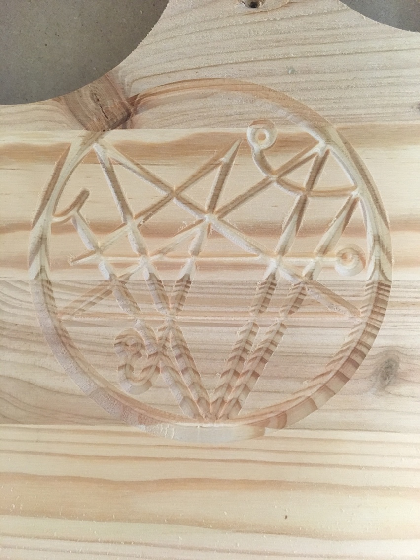
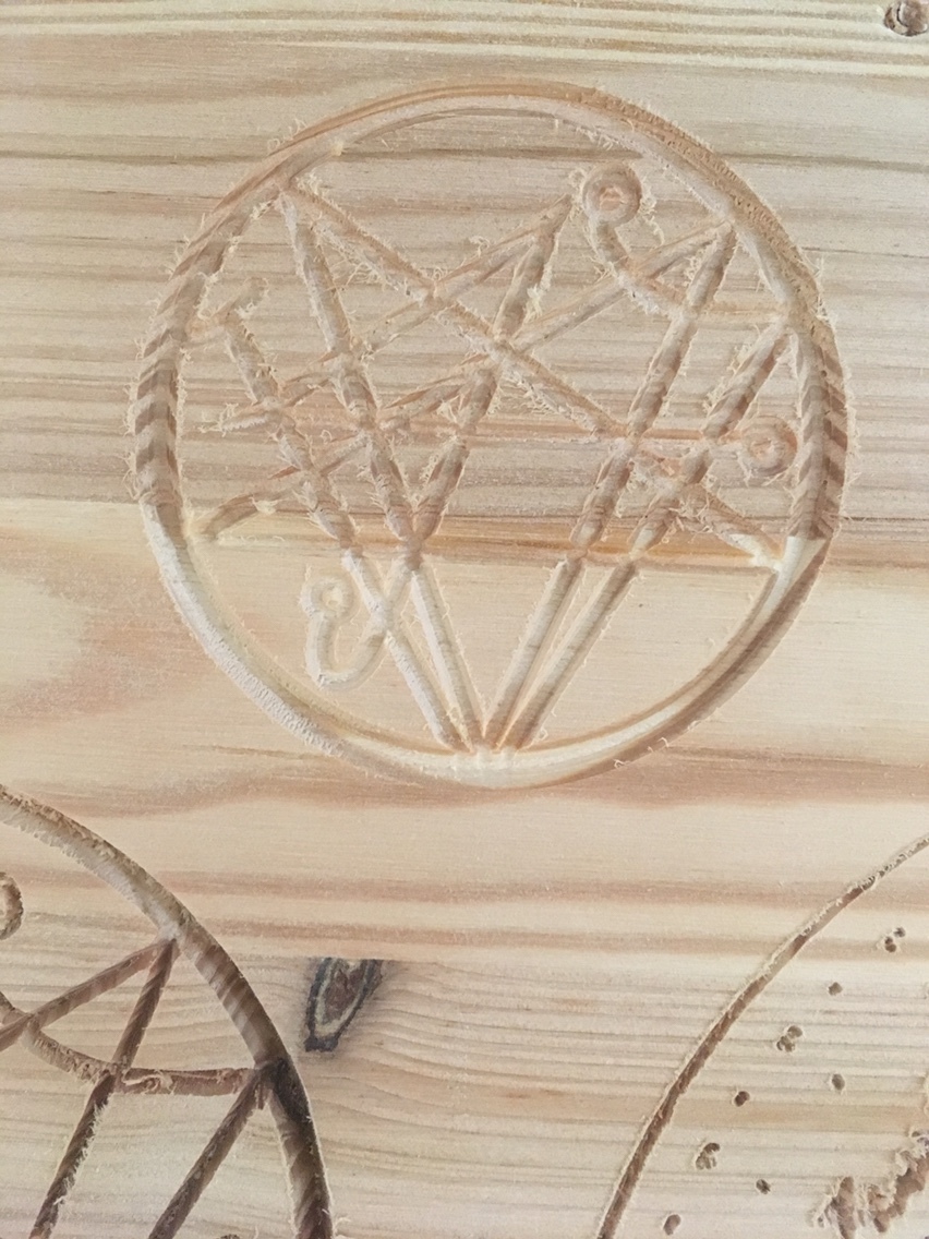
Your cuts parallel to the grain are fine. Across-grain or diagonally, not good at all.
That would indicate a problem with your bit and/or material. Plywood is difficult, those veneers can be very thin and even the most experienced woodworkers need to use the sharpest tooling to prevent tear-out.
My first comment would be to clean up and smooth your vectors in aspire for something this small using node editor mode.
A 60 degree bit is too wide for detail work that small. Use a downcut v bit if possible. Try a 45 or 30degree bit.
27000 RPM is too fast for this toolpath at your feed rate. Try 16000 or 12000 if your Spindle goes that low.
If you want a smooth burnished surface, slow your feed to 25 ipm and increase your DOC to the max depth of cut. If you get burning, increase your feed speed by 10% until it no longer happens.
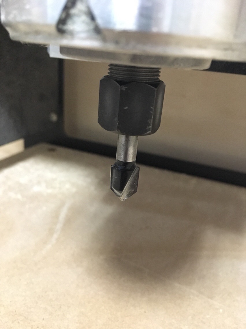
I suspect the Dremel bit is a big part of your problem — they’re not terribly good steel, nor that sharp, and they tend to not have terribly deep or well-shaped flutes.
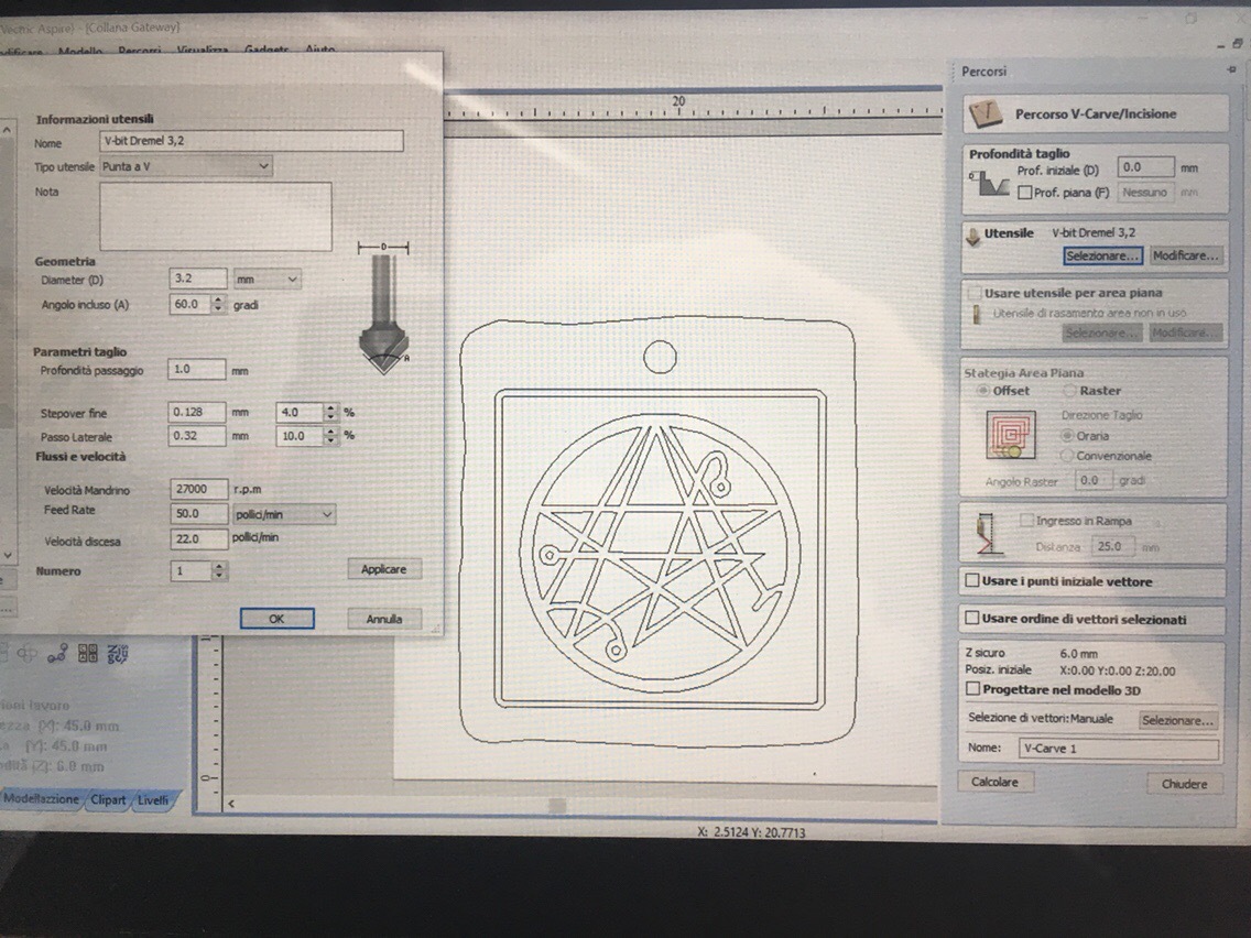
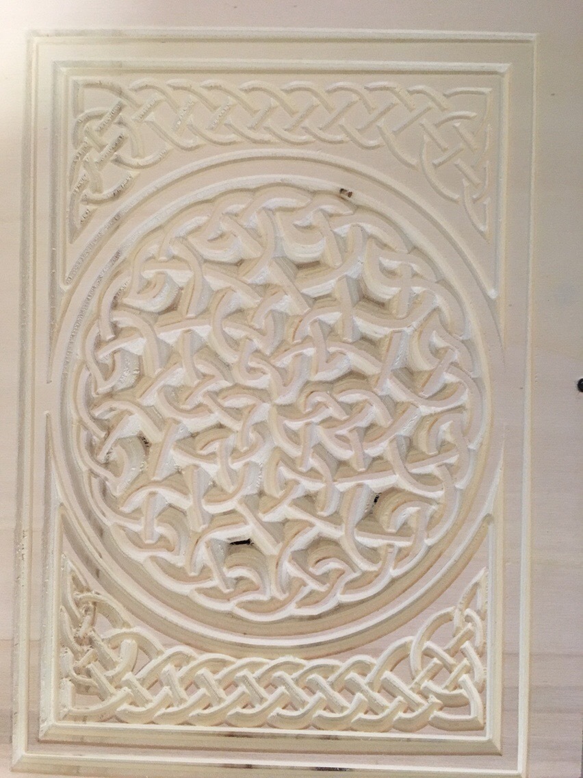
-Pine
-Bosch V-Bit 90° (the only other v bit i have now) 3/8’’ Wide - 1/2’’ tall
-Dimension of the drawing 15cm diameter
-DOC 1mm
-Feed 25 ipm (+30% on motion)
-Speed on router 27.000rpm but on Aspire is set on 16000…does this make any changes??? i simply turn on-off the router and set speed manually with its trimme…r
I’ve changed DOC and Feeds but i can’t reach a sharp result as the 15cm diameter one is that because it is too small for the bit i use? or i’m doing wrong settings?
Please note that wood is a living material and that cutting direction can matter — the piece with the good cut was one orientation, the problem was another, and both cut through the sapwood well, it was the harder heartwood which was the problem (and that only in one orientation).
and the best way to get a nice cut in problem materials is to work out what a suitable roughing clearance to leave will be, then puzzling out whether the finishing pass should be climb or conventional direction, and using a nice, sharp endmill (some materials may warrant switching to HSS from Carbide).
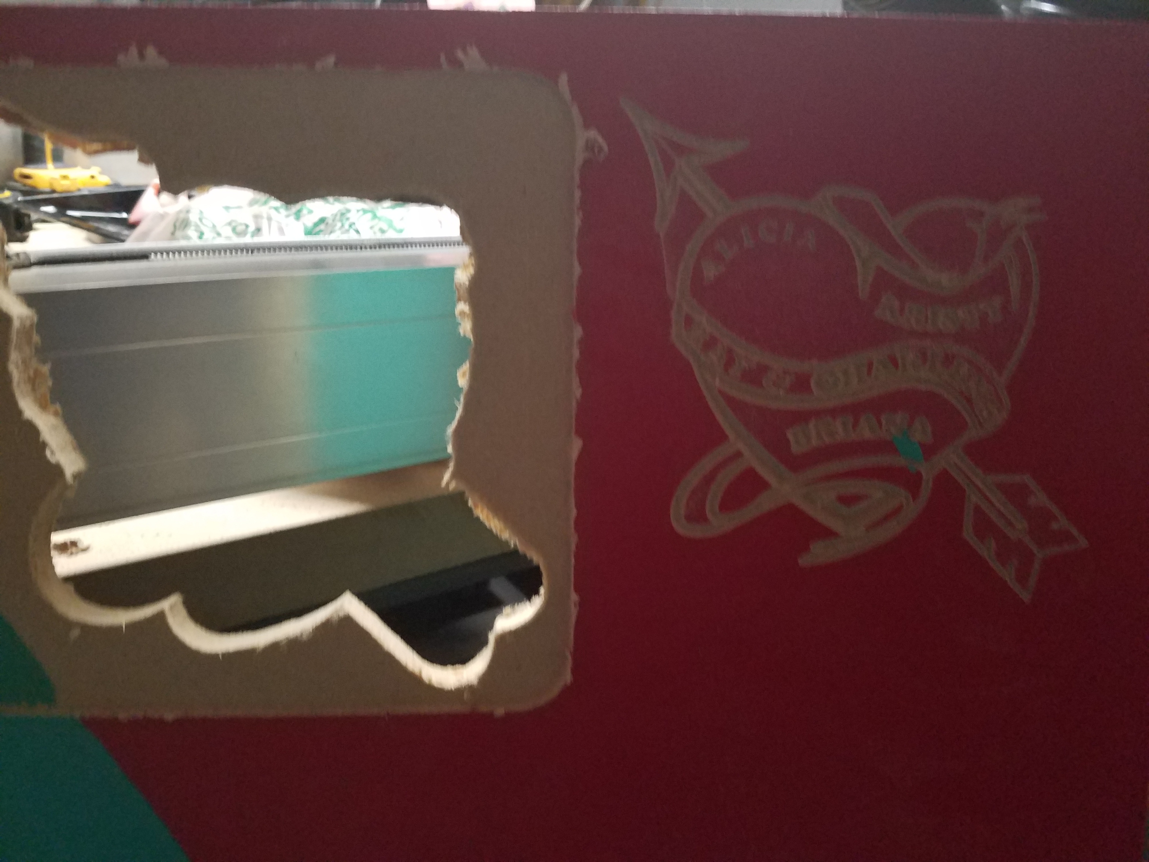
You can see at the bottom of the pic that the v carving is not so good…it goes to much deep…and destroyed the drawing same thing you can notice for the external frame that is thin on the top right and deep on bottom…
I thought was because of the waste board leveling… in fact the deeper side is -0.7° and the opposite is -0.3
Is just because of this?? or there is more variables? (the celtic drawing is the same on both areas …copy paste…so it’s not vectors drawing fault)
Before worrying that the issue is with the machine, you might want to look at the stock, too. I did a tracing/engraving in some 1/2-inch birch plywood strictly to test the tracing/engraving features in Fusion 360. In the 1/2 inch piece of birch plywood from Home Depot, the surface was so uneven that there were places the bit was cutting air. I ran the same job on a piece of much more expensive Baltic birch and it cut to depth without a problem (about a 40-minute job 16 inches in diameter). One of the things I really like about Fusion 360 when doing tracing/engraving is that once you bring in the SVG file, you select the toolpaths individually and separately. So if it didn’t cut deep enough on certain paths, you can go back into Fusion 360 and select just those paths, lower the Z and recut those on the S03 as a separate job. When I did the Home Depot plywood, I had to do that three times to get the entire area cut to depth.
With v carving, I highly recommend using a sub waste board and levelling it before beginning. V carving is tricky and made more difficult, if not impossible with an uneven work area.
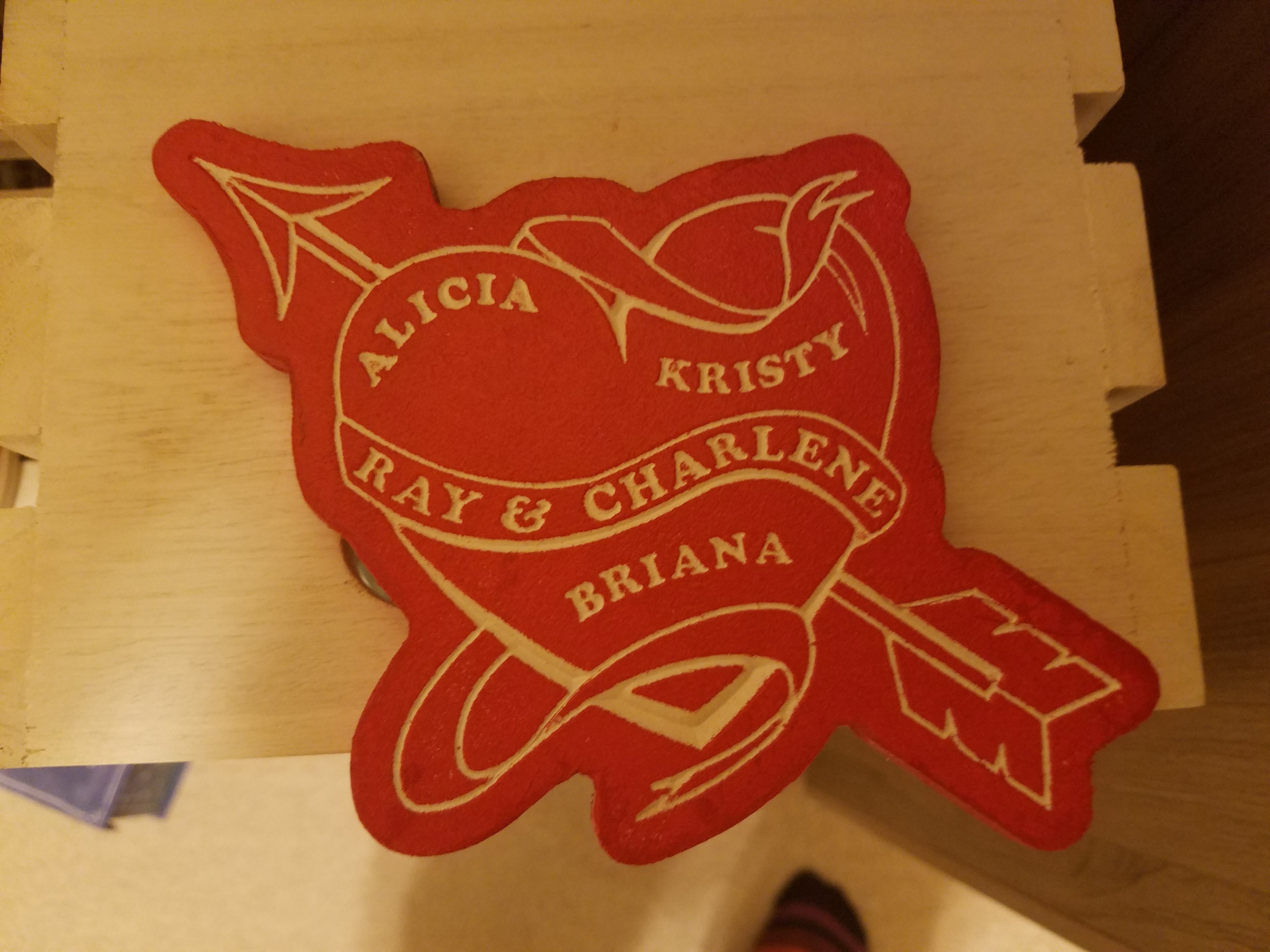
This piece I tried first and the names were blended together because the board was out slightly.
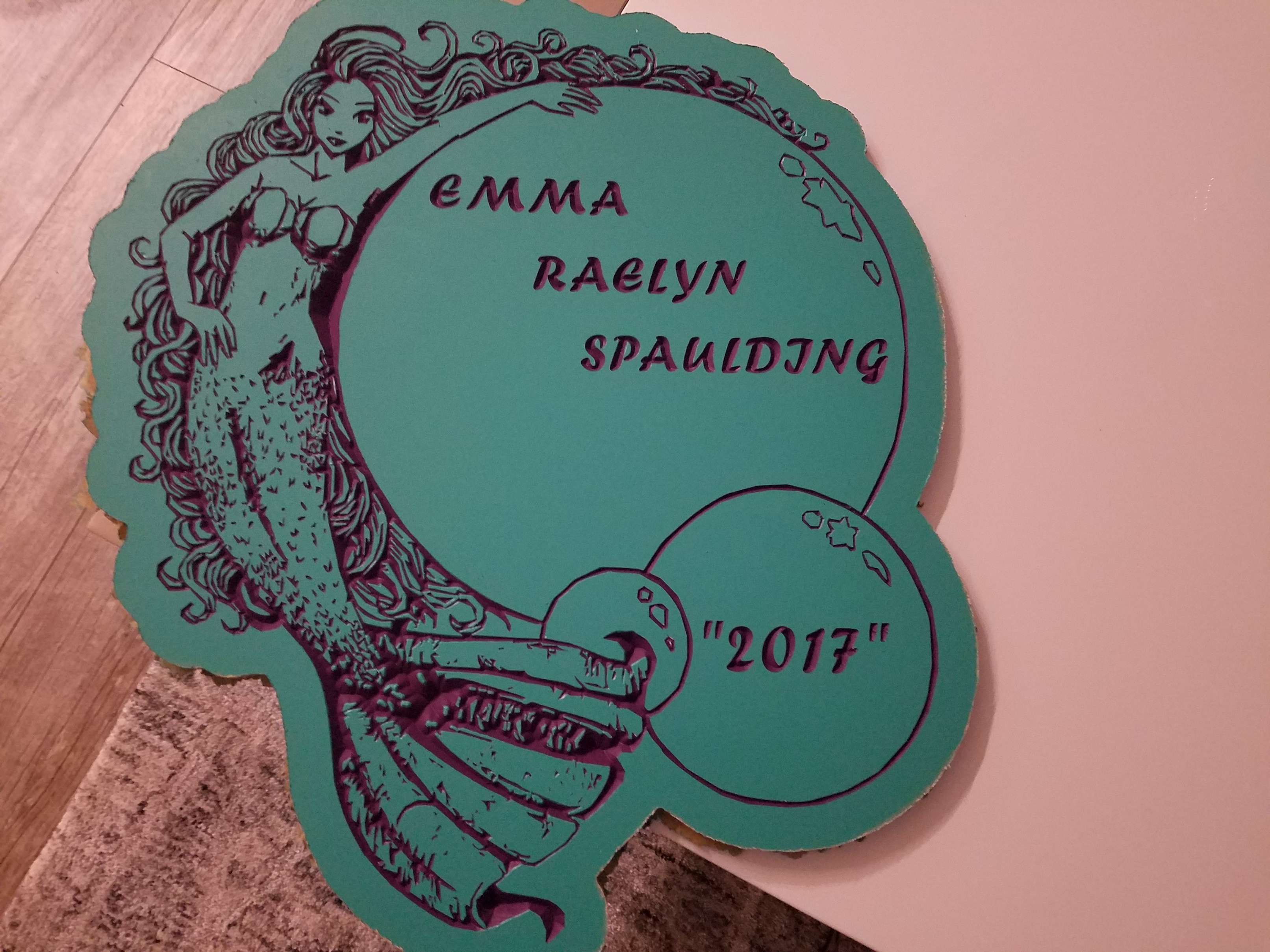
If I may pick one typographic nit — please don’t do “emphasis” quotes — quotes should only be used when one needs to indicate quoted material. To emphasize a piece of text, set it out in some other fashion: by location (which you have already done w/ the 2017), size, font choice (a different typeface), style (bold or italic or if need be bold-italic).
Robin Williams’ (not the late comic) The Mac is Not a Typewriter covers this nicely (there’s also a PC version).
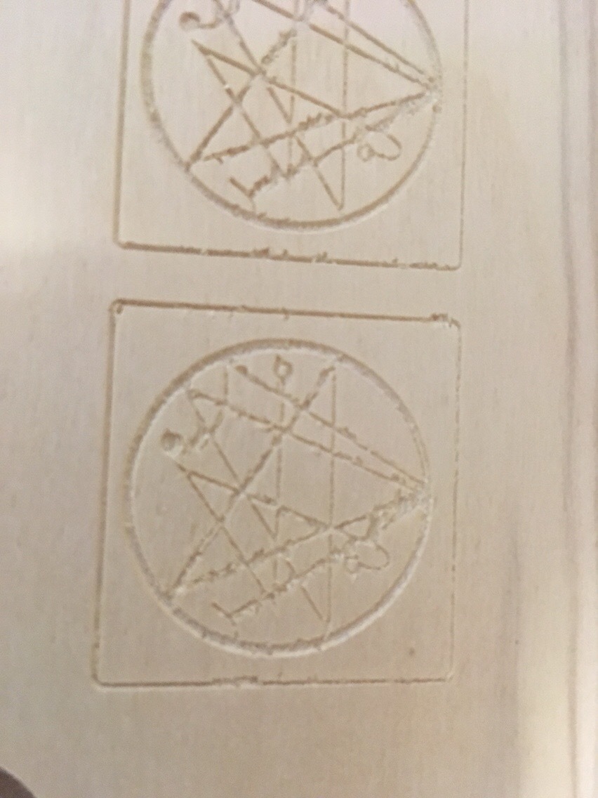

 same thing you can notice for the external frame that is thin on the top right and deep on bottom…