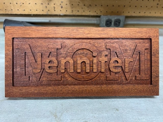
Thought I’de try out my first Layered Text Sign as a mothers day present.
Pretty happy with the results but next time I will cut a little deeper and see if
I can make the letters stand out more.
Maybe see if i can figure out how to paint the text layers different colors.
Used a small piece of Mahogany I had laying around.
Nice. I have been so busy making things for kids or my shop that I have neglected that the boss’s 50th is coming up at the end of the week. I was just thinking about doing something Thule this last night. Time is not my friend.
Here’s a link to a video i found from Chris Powell on how to make a stacked text sign without using the functionality in Carbide Create. I found this much less confusing to do it this way than to use the CC functionality.
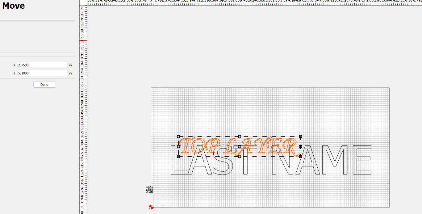
When I’m positioning i always use Align to Center. First on the Lower Text. Then on the Upper text. That way when i over lay the top text with the Bolean Union top and bottom text it ends up in exactly the right position and i dont have to worry about entering X and Y axis location.
Curious about this statement too. Loren didn’t use the numeric text location, he just aligned.
Whether you use the align tool, or visually align the shapes for aesthetics, I don’t think you need to be concerned with the location numerically??? If you don’t use the align tool, you can use the nodes on the levels to align them with each other.
Loren, I noticed you cut your example bottom up. I assumed this was because you were painting the background, and didn’t want the middle layer painted.
But then you painted the top but it looks like you may have surfaced that paint off.??? Was the paint just to provide a smoot flat surface for the mask?
I’ve been trying to think of an elegant solution to painting all layers different colors. Best I can come up with is to cut out the mask with a drag knife, and remove the portion that gets cut out with the top layer.
Paint the 2nd layer, then reapply the mask, then cut the bottom layer. Now both top & middle layer are masked.
Did the outline box and the bottom text. Set box and bottom text to center of project
Did the top text and set to center of project.
3 Made a copy of top text and moved off grid
4 Group bottom and top text and merge
5 Selected merge text and create pocket cut toolpath inside of box
Move top text that i had outside of grid back to center of project
This should align perfectly with bottom and top merge text
Select top text and box and create pocket cut
When creating tool paths i have bottom cut set to twice the depth of the top text cut
10 Run file
I didn’t do any painting on this project. I just stained the whole thing then did a clear overcoat.
Ill tackle that next time
Sorry, I was referring to the video where you painted the top, but at the end I don’t see the paint so it looks like you machined or sanded it off. Ah… That was Chris’ video. Nevermind.
I don’t understand the “without using the functionality in Carbide Create.” comment though???
The latest version of CC has built in functionality to create layered signs but i couldnt figure it out so i just used the process described in the video to do it manually
the ability to start a toolpath at the bottom of a previous pocket
One or more of which can be used to make this style of sign, but there isn’t a single feature to support cutting such designs as there is for Inlays or Tiling.
When I do mine. I put the bottom layer in one spot. Then I put the top layer in another spot.
I like to locate the top layer in a location that is easy. IE X 4.5 Y 10.5.
I make a copy of the top layer and move it out of the way before I do a Boolean with the bottom layer and the top layer. After I finish that I bring the top layer back to the EASY X Y coordinates.
I hope that makes sense.
For this example, when I manually placed the top text it was X=2.7109 Y=5.0978. Nobody will really notice the difference between that location and X=2.75, Y=5.1. Now you all know now how bad my OCD is… lol.
Ah, OK. So you’re settling for something “a little off center” or out of alignment to get nice round numbers.
This is a real dilemma for you, isn’t it?!?
I position it initially to where I think it looks good, ignoring the numeric position. Then I just line up the copied top layer using one of the nodes. Usually at a corner or somewhere easy to select.
I think the “Functionality of CC” Loren mentions is the “Layers” in CC
Rather than move the top text out of the way, you could move it to another layer, hide that layer, then just turn it back on when you want to see it. Then you could also use layers to define the geometry for each toolpath, rather than selecting the vectors individually.
While Layers weren’t specifically created for doing layered text (or layered carves), really as a way to organize your geometry, especially when the screen gets pretty busy… they can certainly be used to organized layered toolpaths.
Not sure if using layers, in this case, is any ‘easier’. You have to create the layer, select the geometry, move it to the layer, then hide it. Then if you want to switch the layers you see you have to show the hidden layer, activate the layer, then hide the other layer. All separate steps requiring a right-click.
If the top layer geometry is already visible & off to the side, you just have to move it into place.
On a more complex part, with a lot of geometry, and more than 2-3 layers, the layers will certainly help keep things organized, and worth the effort.
Layers could certainly be improved / optimized to be more functional. Pin to window to stay open, use the icons to change visible, active, hidden, locked status…