tring to get good definition of lettering…using 60 degree V. i am using Basic Script as the font, .6 in height and 160 spacing. see attached. any recommendations to get better definition without getting too big…this is a logo we want to put on the back side of our pieces.
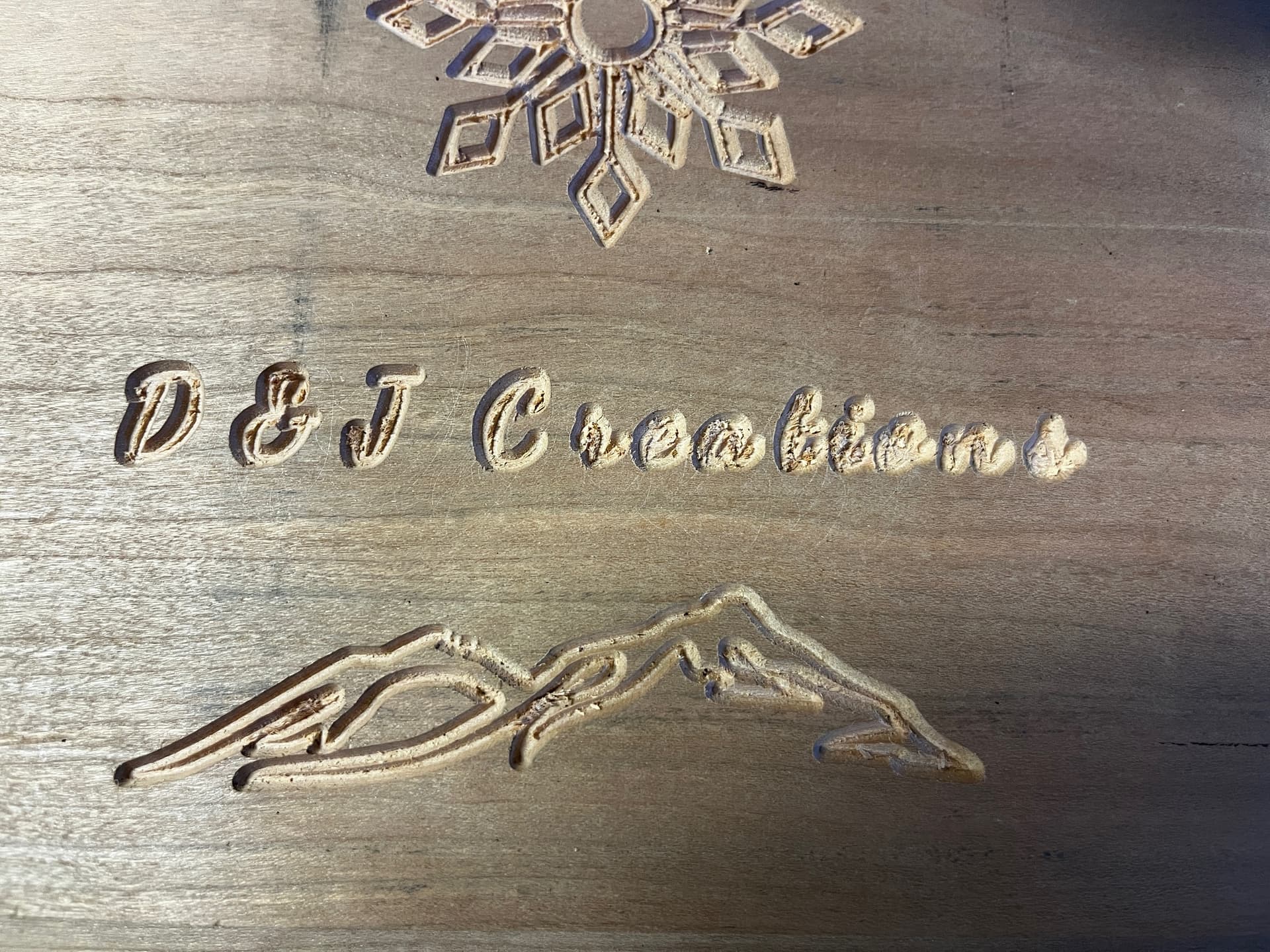
…and 2mm deep…started at 4 and back off.
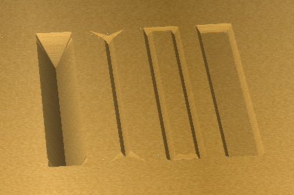
It looks like you’re doing a basic engraving toolpath. If you use a V-carve then you’ll get sharper corners.
2 Likes
If you are setting the depth for a V Carve, don’t. It never does what you want it to.
The right answer for the depth of the VCarve is pretty much always ‘t’, a special value that means “the thickness of the stock”.
If for some reason you want to reduce the depth, switch to Advanced V Carve.
From left to right:
- V Carve, full depth
- V Carve, limited depth
- Advanced VCarve, no clearing bit
- Advanced VCarve with clearing bit.
6 Likes
This topic was automatically closed 30 days after the last reply. New replies are no longer allowed.