I guess you are going to glue up two pieces of wood at 90 degree cross grain. That can work because house numbers are generally thin. When you have wood glued together at cross grain it expands and contracts opposite of each other leading to failure of a glue joint. since this is a small sign that might not happen but wood does strange things when introduced to hot/cold wet/dry conditions. So if you want the contrast maybe not glue the two pieces together but put them inside a frame and let them free float with a little room for expansion. Depending on the species eventually the wood will turn gray or brown exposed to the sun light. You can slow that down with some finish like spar urethane. Spar urethane is used a lot on boats and will last a good long time but even the spar eventually fails.
One thing you need to consider is house numbers need good contrast. Remember mostly the delivery man finds your address but if 911 needs to find you then you need good contrast for them to find you in a hurry. In the emergency you dont want the 911 personnel hunting for your address you want them to find you quick. So making an attractive sign for the house numbers is important but dont lose sight of the fact that the house numbers are very important to be seen and easily recognized. Ascetics aside there is a practical side to house numbers that could save someone’s life. Plus they will get their Amazon packages.
I hadn’t considered the differences in direction of the expansion and contraction, so that’s very helpful.
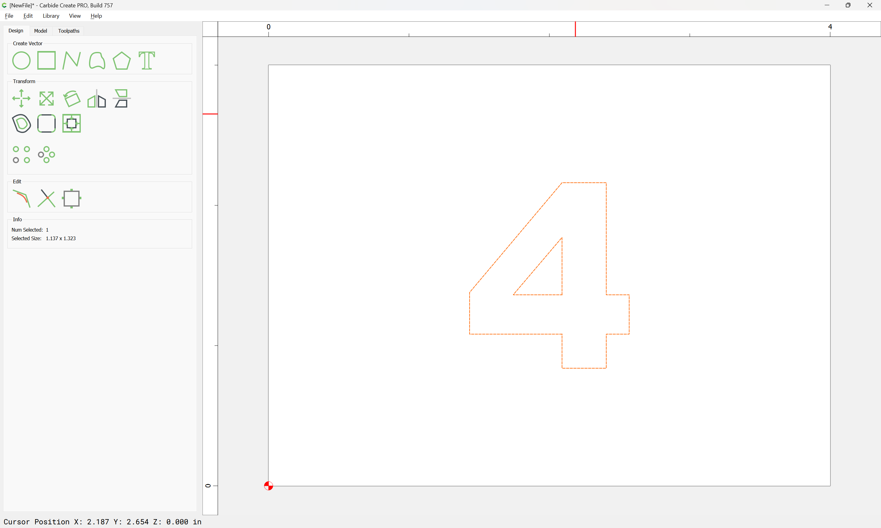
I’m using shallow pockets for positioning and planned to glue the numbers, which will be in relief, into the pockets.
I suppose I could make a little more gap between the pocket and letters to allow the expansion, but I think that could cause a bigger problem when freezing rain hits it etc. I think I’ll just cut them the same way and avoid those issues.
Planning to finish it with spar urethane for the reasons you listed, but if the contrast fades or isn’t enough to get the Amazon drivers’ attention they can easily paint the raised numbers (he and his family are pretty crafty).
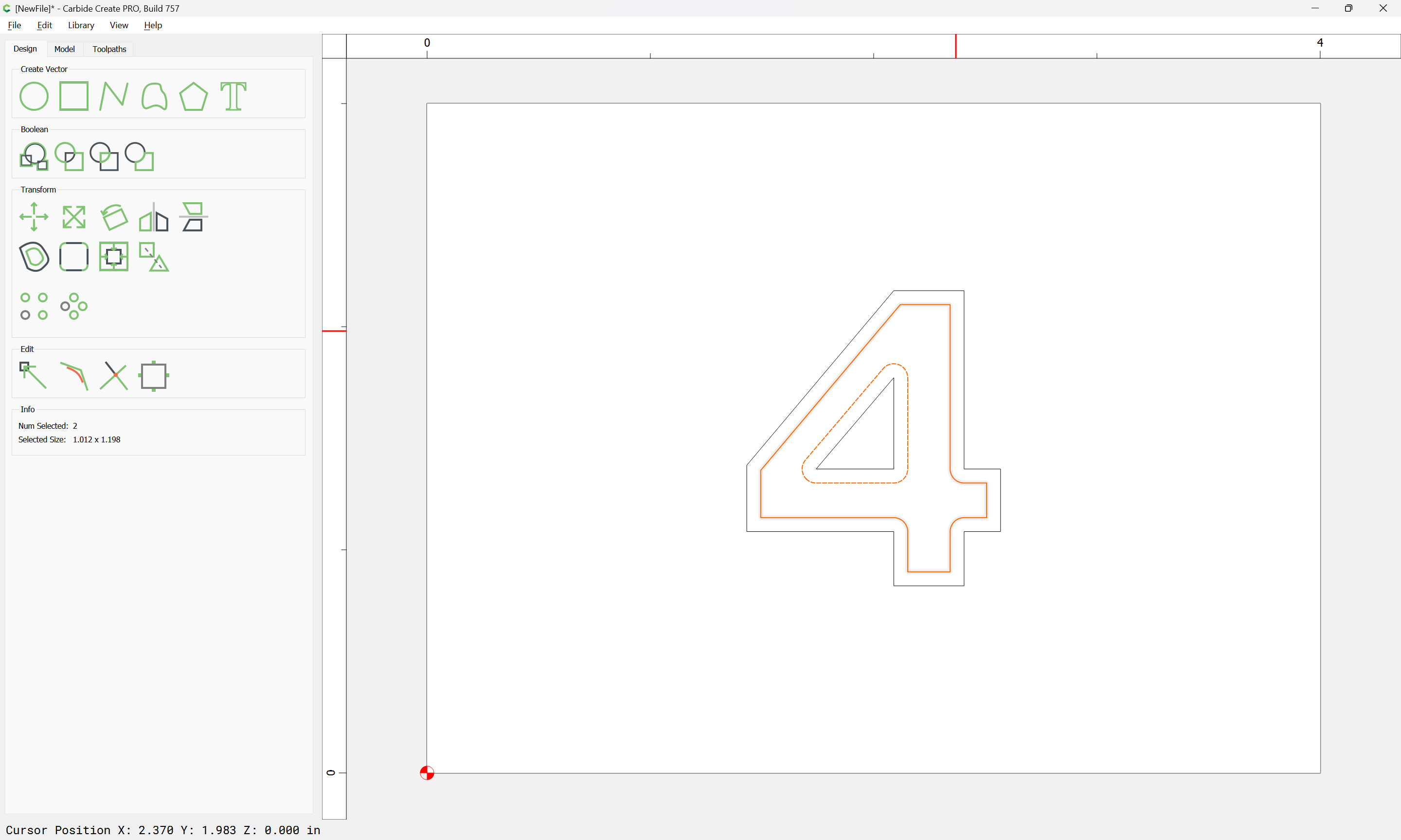
A solution for the cross-grain issue would be to use an inset version of the number cut out of plywood — this would also make for a better contrast/shadowline.