It’s the southern Green mountains are in south east Vermont. I live in north central CT which has rolling hills and it’s not impressive. I also tried the Adirondacks, but have not cut it.
You can ramp the Z scale up, but I am stuck in “true” dimensions mentality ( Draftsman by early career ). It’s the non artist in me.
Topomiller exports DEM ( digital elevation model ) data which is bare earth, meaning no buildings, roads, vegetation, etc. There is a DSM ( digital surface model ) which includes those items but removes vegetation.
I have asked Topomiller to include DSM data. I think that may create interesting results where the ground elevation is to flat.
I have always wanted to do these, but I am struggling with the "art’ aspects.
Thanks for sharing the results even if it is a pig with lipstick on. I’ve certainly learned a bit from this endeavor.
I’ll probably not use that type of material for this kind of terrain when I get around to doing one myself. Setting it painted, it reminds me of the base of a model, something that will get filled out with mod podge, grass, and model props. To be honest it looks like a great start to a model park or something.
I think the texture of the substrate is at the most fault for making it look off in some way
I don’t know how you end up reacting when you take a step back and look at the work you’ve done. When I accidentally put make up on a pig it’s hard not to chuckle and think “Well. That could have gone better.”
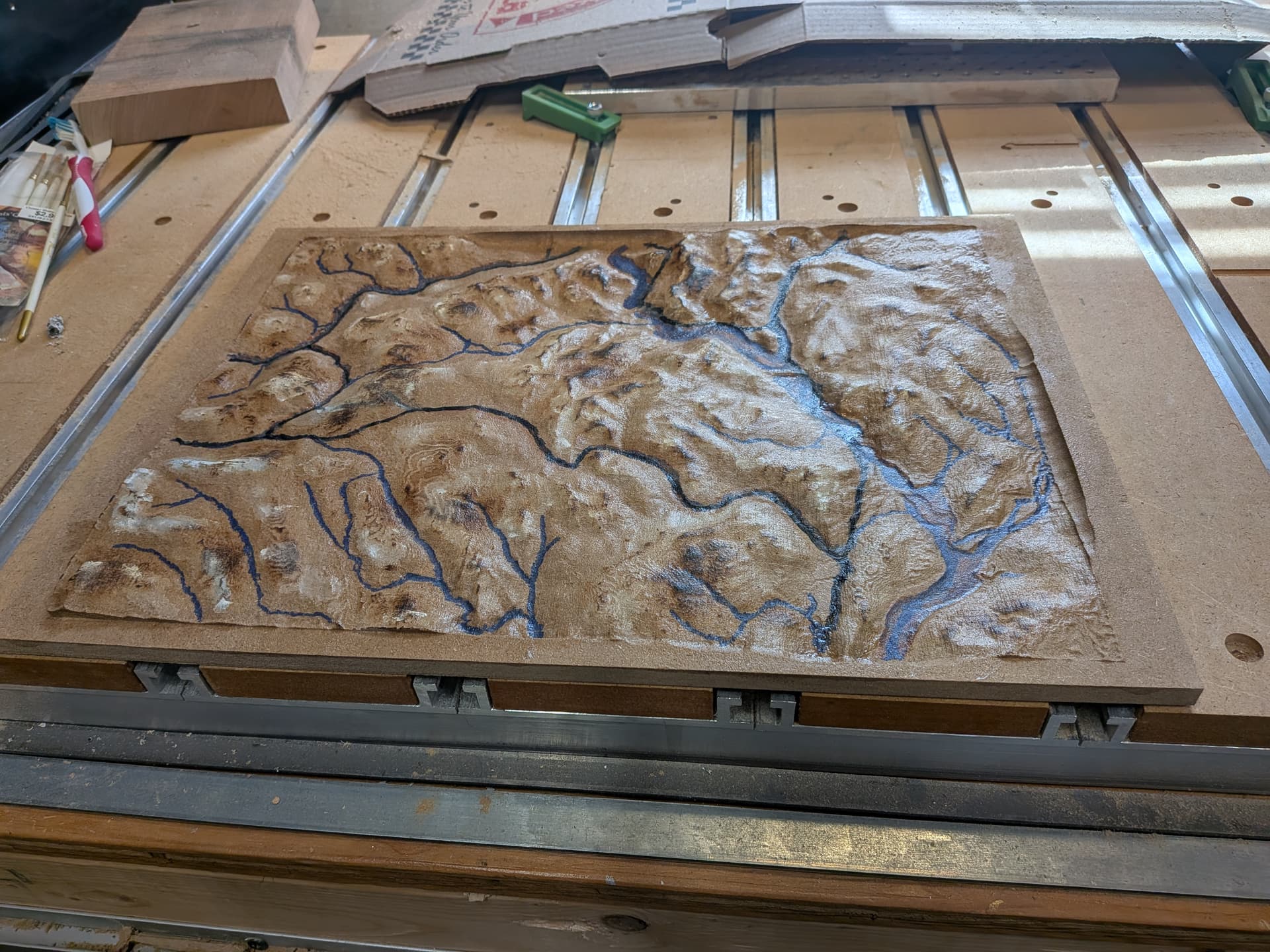
For my little topo map of Svalbard, a torch was my lipstick of choice. I figured some darkness would increase the contrast. It did but it was obviously the wrong way round with black on the top of the mountains (closest to the torch)
The wife still keeps it on display, mixed in with all of the real art she loves…I’m convinced she does this to keep me humble
Well the project became a Christmas gift after my wife said it looked good.
She’s tough, so I took that as safe to give away.
I think the gloss is the real positive.
The burning definitely helps, but I need to learn technique.
Peaks are a target. I noticed on another piece ( cherry ) I could singe a flatter area and streams (grooves) would stay lighter.
I have spent a while thinking on this as I slowly (mentally) head towards a project like this. I find myself wanting to maintain the actual aspect ratio but feel like unless you have a strong side light, you will never accomplish the true 3d effect we are all looking for when creating a map like this. So I end up landing on the exaggerated z-axis.
I wonder if adding some kind of side lighting would work in a project like this. A frame with recessed lights “hidden” inside it? I feel like that would be very effective(?)
All still just conceptual thinking not experiential.
HDU seems like it would be an excellent candidate for a project like this .