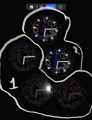
This is a Dial design I created an hour ago with 2 different color ways. They will be in candy color & I’ll be metallic flaking them also. If you came by here, send a quick feedback on which color-way you think I should stick with, either 1 or 2.
I have given this advise to many people about a clock here on the forum. The first purpose of a clock/watch is to tell time. That means that it must be able to be read easily and fast. With 8 stops instead of 12 it would be very hard to tell what time it is. Although your drawing is interesting from an ascetic view from a practical view of telling time not so much. So either have the classic 12 stops or make it 6 but 8 not so much. It would be difficult to tell when it was 1,2 4,5,7,8,10 or 11 o’clock.
1 Like
This topic was automatically closed after 30 days. New replies are no longer allowed.
