I am in the process of trying to design a logo the shop I hope to start doing projects in. Not trying to open a big business, just look a little more professional to the people who might want to commission a piece or two.
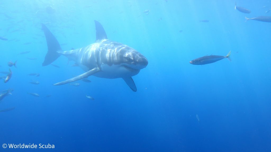
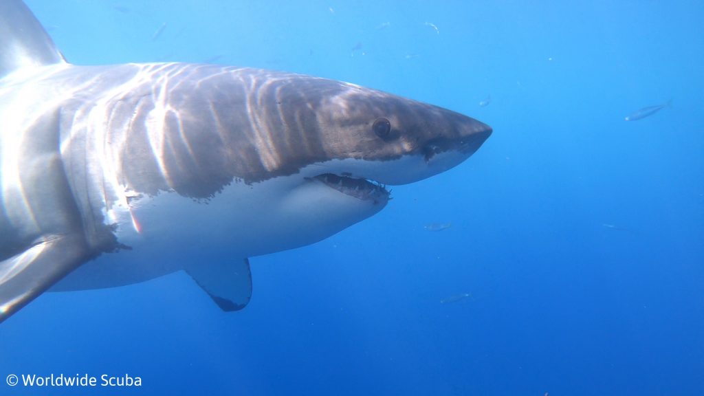
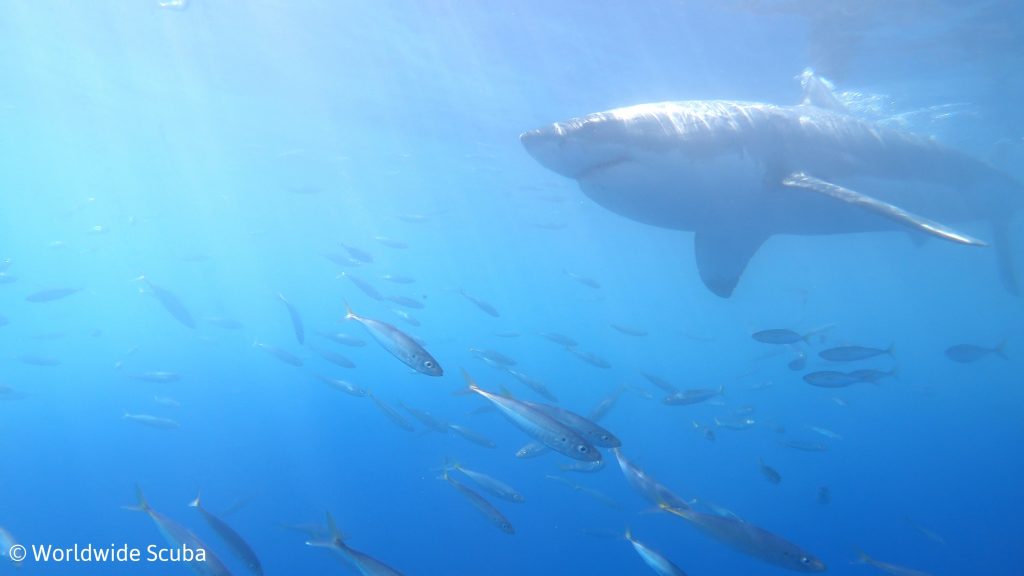
“Asylum” references that some people think I am a little nuts, but I think it makes me a little more interesting. I do things like scuba dive with sharks and sky dive, which my family doesn’t quite get. Here a couple of the pictures I took last year on a dive trip to Mexico.
The watermark on the bottom is from the website I own and operate for scuba divers. Anyway, back to the reason for the post. I have two designs I am working on but need a little advice on which one I should use and maybe some ideas on improving them. One design is very basic and good for most things including the branding iron I want to order. The other is a little more intricate, but can easily be carved on my CNC.
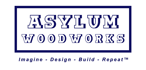
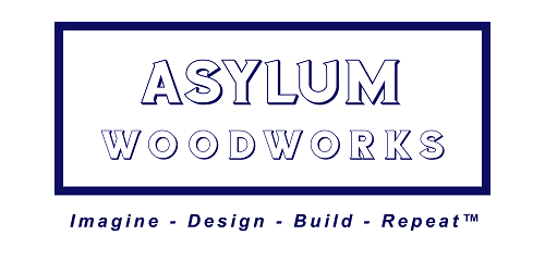
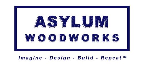
Here is the first one with several font choices I am thinking of using as a branding iron. No. 1
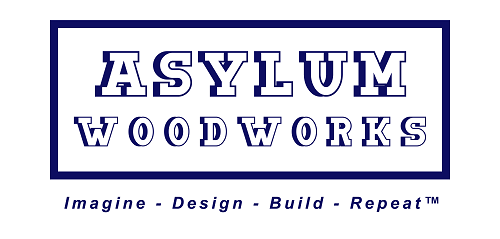
No. 2
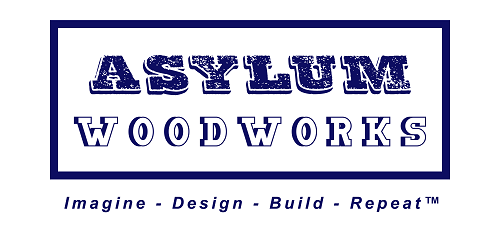
No. 3
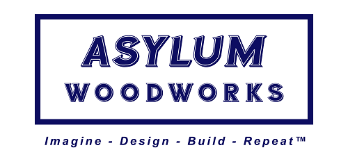
No. 4
No. 5
No. 6
No. 7
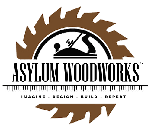
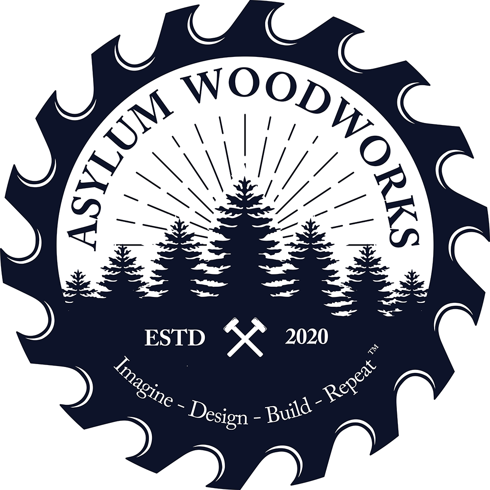
Here is the second one I am think about using. More for the CNC and web than anything.
Let me know what you guys think. I have Photoshop, Illustrator and several other applications, so making changes will not be a problem. Any advice would be greatly appreciated.
My initial reaction (after going through a similar process recently) is to remind you that there is no “depth effect” with a branding iron. Simple sans serif font is better. The woods you use will be affected differently.
My second reaction is that thicker/larger is better, but not mixed with thinner/smaller. It might be tough to find the dwell time. It kind of depends on how many brands/minute you’ll be doing.
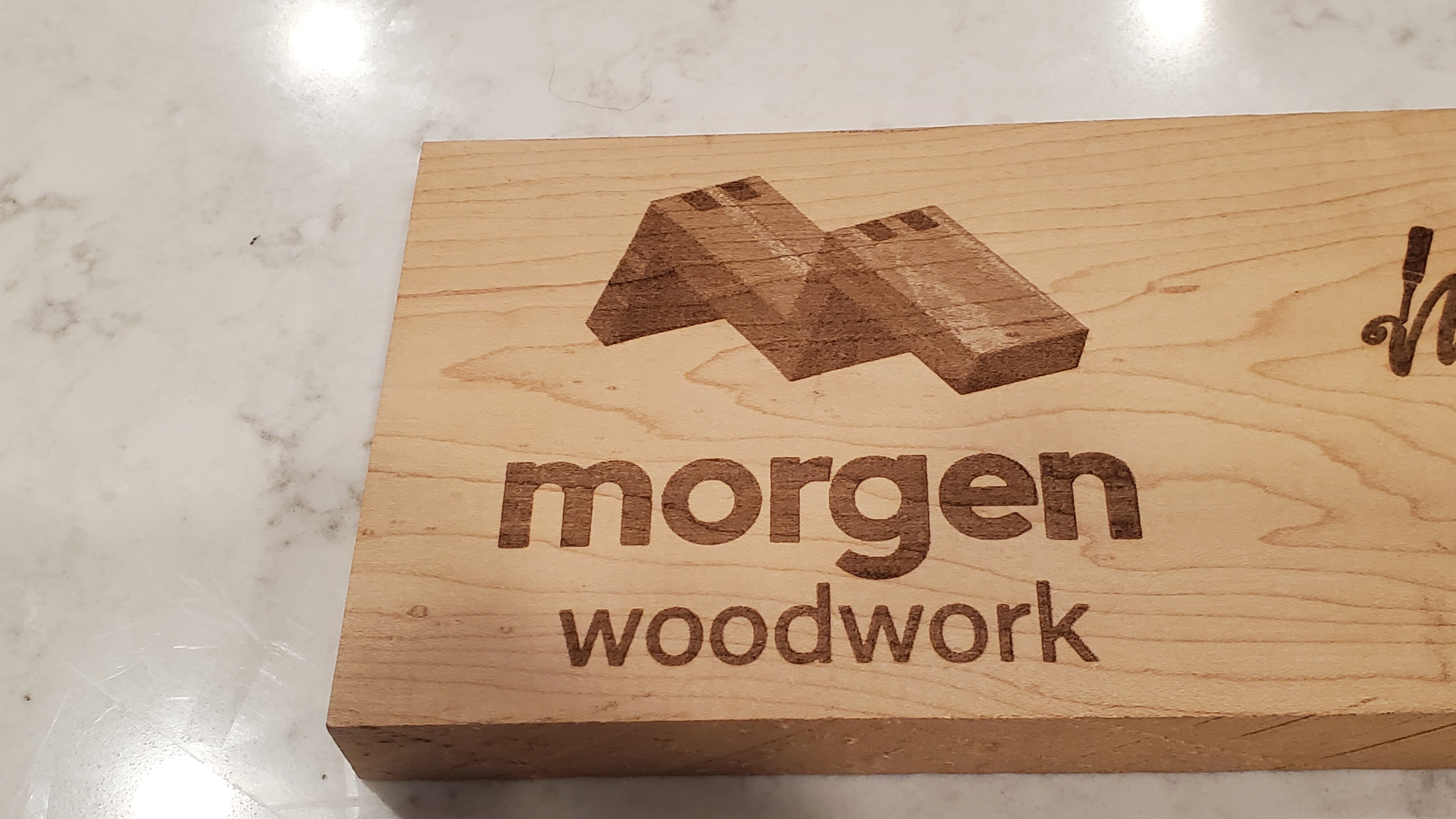
Consider adding a laser to your CNC setup - and burn your logo that way. It’s what I do. You can get all sorts of depth impact - and your logo will come out looking SO much better than a branding iron. It costs you all of about 10 minutes per project to set it up - or you can make a multi-up run of plaques to apply to your pieces. Here’s what my logo looks like burned on a scrap of unfinished maple.You play with the software to make it darker, outlined, more subtle, sized, etc:
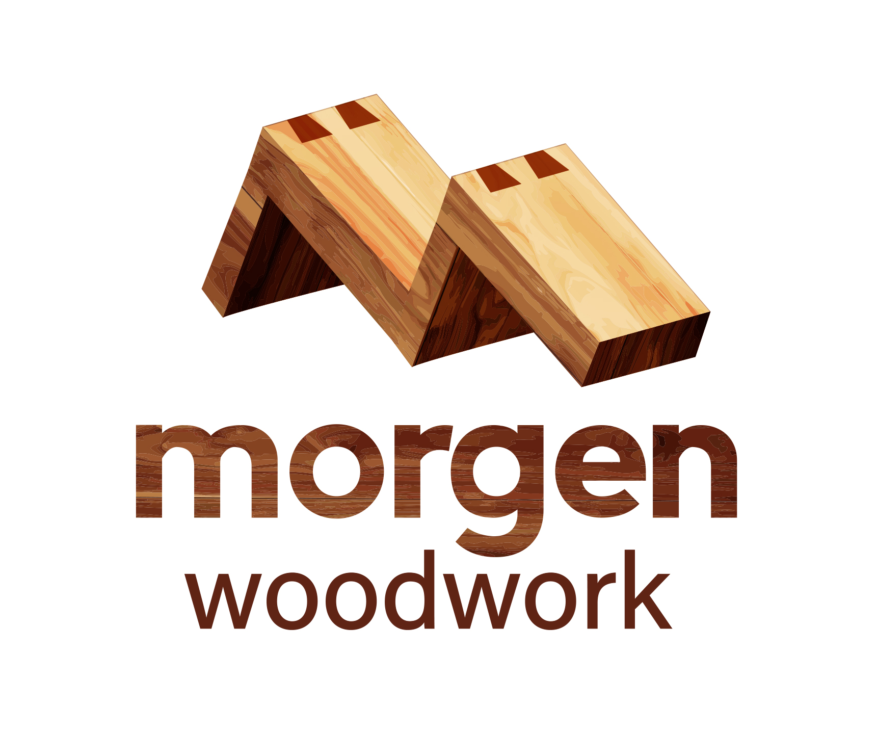
I recently went through a rebranding exercise and arrived at this logo for my business. I know you’re not looking professionally, but if you want a name, I’d be happy to make the connection for you to the guy who did mine.
I like #6, #1 (same as #7, no?), and #5, in that order, I don’t like the others. IMHO as a consumer, the style of the ones I like offset the heft of the word ‘Asylum’ without being too cartoony or dense…
@GJM, I don’t know why I did not even consider a laser. I have wanted one and this would kind of give me the excuse to “invest” in one. Since a laser is probably going to be the way I go, I can use a logo with a little more detail but would also allow me to v-carve it out if I wanted to. I came up with another one after modifying a template I purchased.
I like the bi-color - I think that’s an effective technique for text
That said, if you are going laser, you can add more color to your logo and convert it to greyscale…because the laser will handle it. Then you can use the color version on the web and any pamphlets you create
I’m not a fan of the crossing (I guess axes?) in the ESTD - for some reason it feel swastika-like, maybe because it’s so central and bold. It’s a feeling I got without any thought.
All of this is, of course, personal preference…When I worked with my designer, he interviewed me for a while and had me list the things I wanted the logo to convey - he looked at my work - and he looked at other woodworker logos. I was looking for “material-integrity”, “Quality”, and “Craftsmanship” … and my family name was important to all of that.
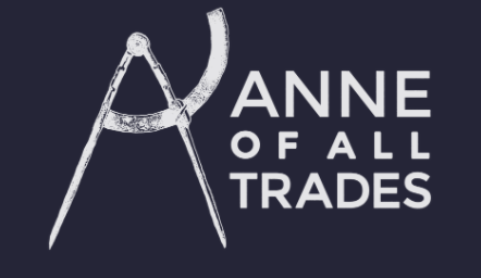
I deliberately asked him to stay away from saws, hammers, and other common woodworking tools - only because I felt they were “overdone”. Again, personal preference. The one exception I have to that rule was for Anne of All Trades (Anne Briggs) whose logo uses an old compass in her logo…and I just love it because of the fact that it’s an “A”.
I think I like #7 the best of all…including this latest one. I like the inch marks - conveying “precision” and the plane, of course, promotes “hand-crafted”.
I will say though did you ever debate putting some shark related personal touch on your logo since from your post it appears to be a passion of yours? They dont always have to be woodworking related, often time logos can also strike up a conversation with a client because they are unique.
Maybe a big shark bite out of the letter A or a larger shark bite out of the corner border of the logo.
In the end it’s your logo and if your happy with it that’s all that matters.
@AsylumWoodworks All your logos look nice but don’t reflect the Asylum nameplate in my opinion. They all look professional…no missing screws, none half-baked or crazy. Just a thought.