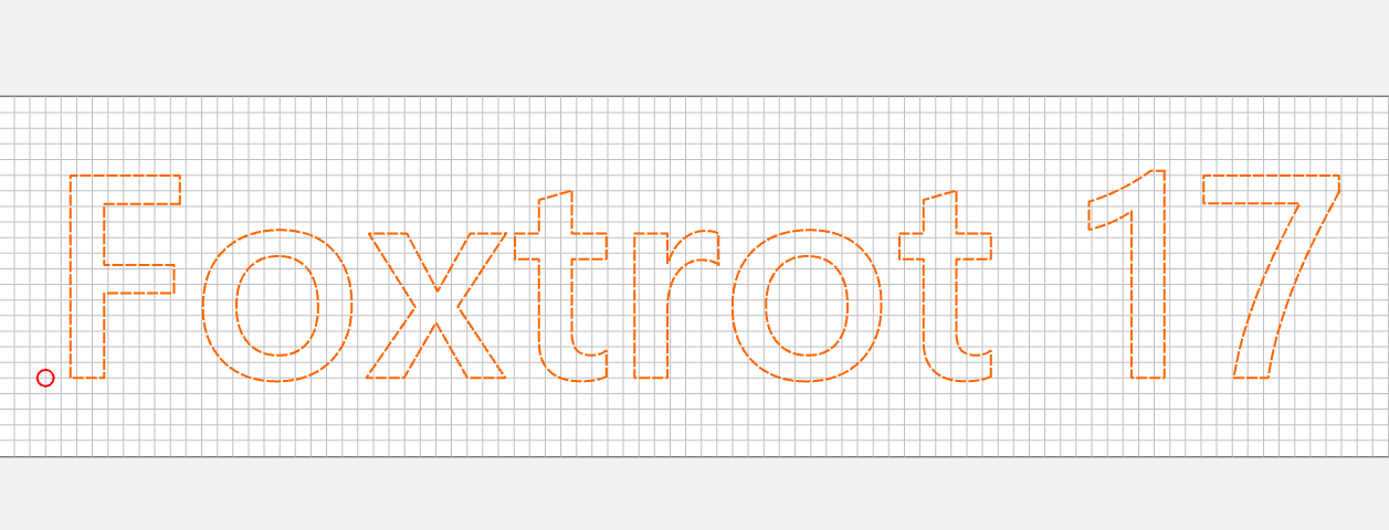
I want to make a basic sign with letters. I noticed that the kerning of the letters is all over the place. Here is what I want to write: “Foxtrot 17”. The spacing between the F and the O are much wider than the next three letters.
Do I have to separately create each letter and kern them manually? Maybe a different font?
Second question: I think I should use a Vee bit for letters, but I am unclear on which one to use. Is the 90 or the 60 a better choice? The letters will be about 5 inches tall.
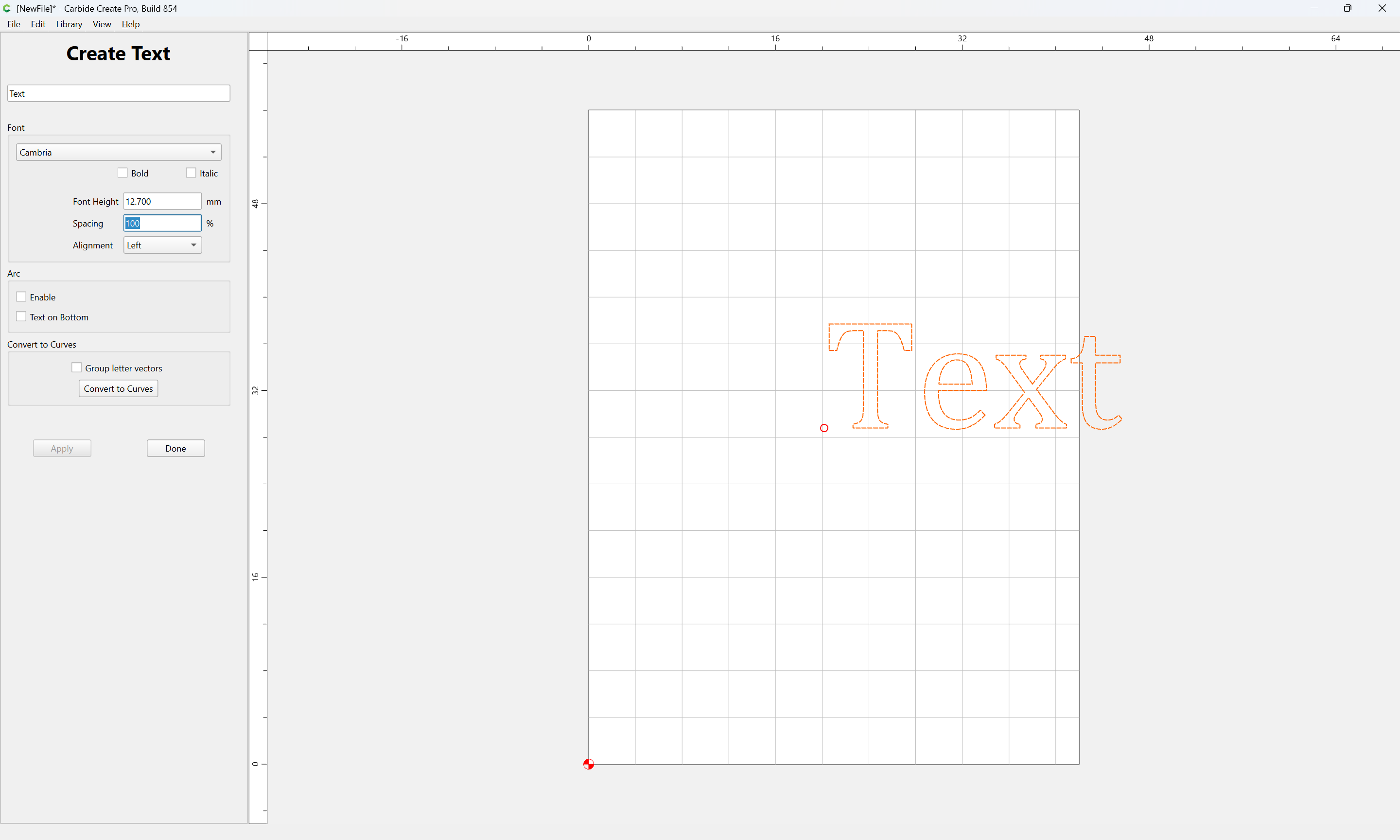
Carbide Create uses the spacing built into the font — I don’t believe it avails itself of kerning pair information, so if you want more control than is afforded by the Spacing setting:
then you will either need to use a font which is spaced as you want, Convert to Curves and move each letter individually, or use a 3rd party software option which allows control over kerning between character pairs.