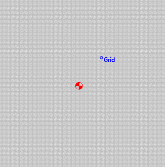
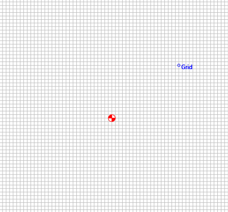
I recently upgraded to CC853 and found that now any mouse movement on the window is accompanied by the ‘Grid’ popup indicating that I’m on the grid line–would be good to only have this popup when zoomed into a level where it’s relevant. I currently run a 1/16in grid but when viewing my 24x24 workspace it seems a bit overdone to show me that I’m on the grid at this level since the chances of correct component placement at this zoom level is slim to none.
My opinion, but seems we should only see the blue text popup when the grid is clearly visible and say 1/8in wide as seen on screen?
2 Likes
There’s an argument to be made that the grid itself should go away as you zoom out. A super sweet implementation could maybe smoothly (but relatively quickly) make the grid transparent once it’s too close together to be useful.
1 Like
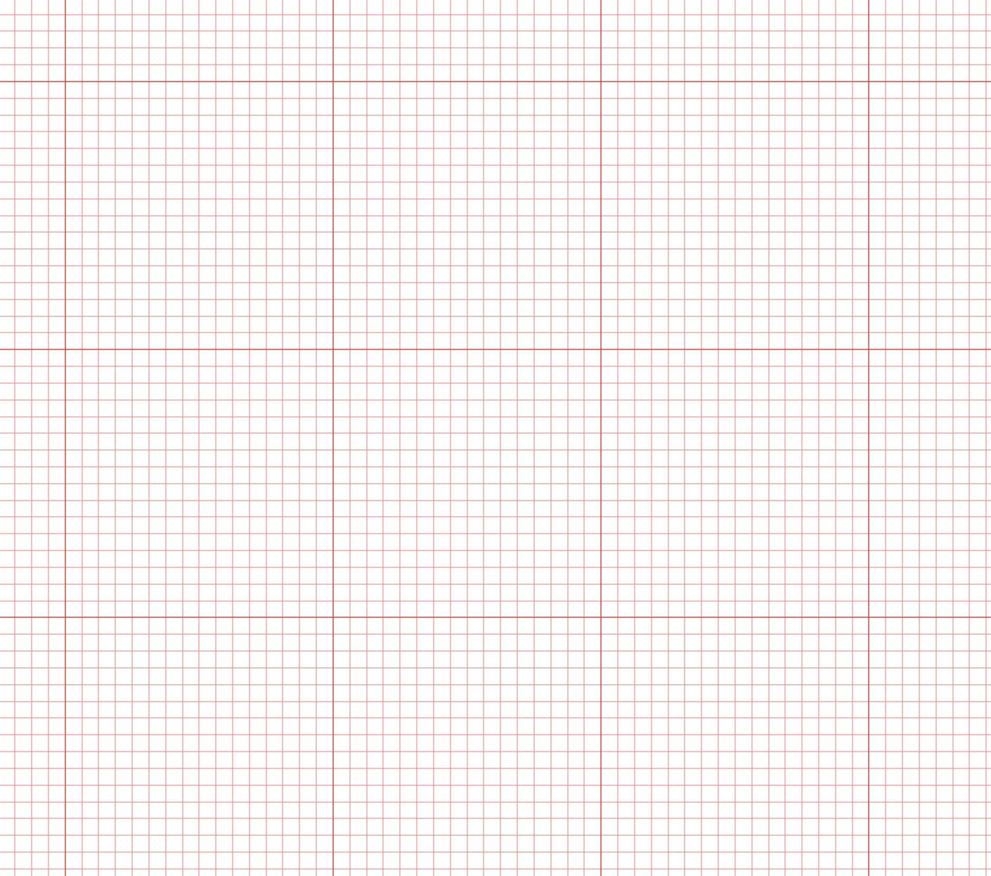
I think better than the grid going away, the ideal would be to have major and minor gridlines and the further away you are, the minor ones disappear and you only see the major. So minor might be 1/8", 1/16", 1/10", and the major is 1". Major lines being slightly thicker than the minor like how Adobe Illustrator does it.
3 Likes
I agree that a scalable grid would be great.
Also, adding the blue text “grid” popup constantly, interferes with the ability to find the component Center which is also a blue text popup. I often find myself scanning the mouse around where I think the center is until I get the ‘Center’ popup then narrow in to grab and move it where needed–having to filter through the constant popups for ‘Grid’ when looking for ‘Center’ is frustrating.