I’m looking to decrease the time needed to VCarve Bible verses into wood blocks for a project at church. (50+ items needed) All the font’s I’ve been using use multiple passes up/down at the end and corners of most letters. Does anyone know of a font that will be cut with single passes? Looking for a simple quick cutting font.
2 Likes
With you doing V-Carving can we assume you are using Aspire software.
IF SO, there is a selection when you click on the left Font it brings up a selection for “Single Line” right under the Larger Edit Button just below where you type in the text. 23 fonts to be exact.
But, not all of those would be usable for you. Put some text into the Text Box and watch what each of those do for you in a simulation. Actually slow the simulation way down and you can see how many tool paths each font makes also.
That’s a $2000 assumption. If the text is small, is probably running in one pass. The up and down at the corners is how the v carving makes the corners sharp.
2 Likes
Depends a lot what software you’ve got…
- If you’re V-carving, make sure you increase the cut depth on your bit so it’s only doing one pass (this will depend on the bit and size of fonts, but worth a look)
- As above - look at single line fonts and a shallow ‘profile’ cut. Many websites have options available for download
- If you’re doing multiples of something, look at setting up multiples of the job in one toolpath to save time, again this depends a lot on what software you’re using - Vectric software makes this quite easy
- Can you run your machine faster? I run my 1/4" 45° bit at about 2500mm 20krpm without much issue
I’m using CarbideCreate to generate code. I just started with the machine a few months ago and am getting comfortable with the entire process. But I’ve been pleased with what I’ve learned and are doing so far. I’ll look to see what different programs I may upgrade to.
I’m just running CarbideCreate today. And for what I’m doing sharp corners are not a need or requirement. I’ll be looking at other code generation software.
If you can get them into Carbide Create, single stroke fonts will work — they can be used in Inkscape using a plug-in which enables the Hershey fonts:
https://wiki.shapeoko.com/index.php/Inkscape#Hershey_Text
The community has some further notes which link to: http://imajeenyus.com/computer/20150110_single_line_fonts/index.shtml
as well as some links on the commercial software page
V carves with a reasonable plung depth should be pretty quick, and if one uses mono width fonts which have rounded ends, essentially equivalent to a single stroke fonts.
1 Like
Just to add to what @neilferreri and @WillAdams said, sharp corners add a lot of machining time because of the frequent retractions. I made about two dozen coasters for Christmas one year. The design was very simple. 4" square blanks, 1/8" deep v-groove around the perimeter (inset about 1/8" from the edge), and a single 1.5" tall monogram in the center. Start-to-finish, the machining time was about 60 seconds, if I remember correctly, and the v-groove around the perimeter only took about ten seconds. The rest of the machining time was the fiddly serifs on the monogram. I don’t remember which font I used, but there were 14 retractions for a single letter “W.”
Finding a font with no corners (e.g. comic sans) will save you more machining time than trying to find another code generator. I’ve done plenty of simple v-carves and Carbide Create works just fine for stuff like this.
1 Like
One thing that I’ve noticed about Carbide Create and Vcarving fonts is that CC adds a bunch of plunges depending on the geometry of your outlines. I’ve had many different letters have 15+ plunges like Anthony describes.
If you have the patience, you can edit the nodes in your project and reduce the number of plunge/retracts. I’ve gotten some of my projects to half the time cutting for the effort I put into it. I’ll see if I can post some examples of what I mean.
The problem is Carbide Create converts everything into polylines, and depending on how their placement averages out, you’ll get extraneous movement (draw a pair of circles, group them, assign them to a V carve toolpath, duplicate and rotate them around the center of the stock, repeat — note how the V carving of the circles differs as the circles rotate.
1 Like
May useful fonts here:
https://www.1001fonts.com/
I’ve have found that CC really likes to plunge a lot on rounded fonts (for example, Arial Round), up to 10 to 15 times at each rounded end. As far as number of plunges, fonts with sharp corners are better because it plunges just once at each corner.
I have found that script fonts are the best as far as minimizing ups and downs. I prefer changing the font rather than spend time editing the fonts.
I also always change retract height to 1mm, 3mm max so that it doesn’t take so long to go up and down. The default 10mm in CC makes the carving take waaaaaay too long, especially on fonts that need lots of plunging.
1 Like
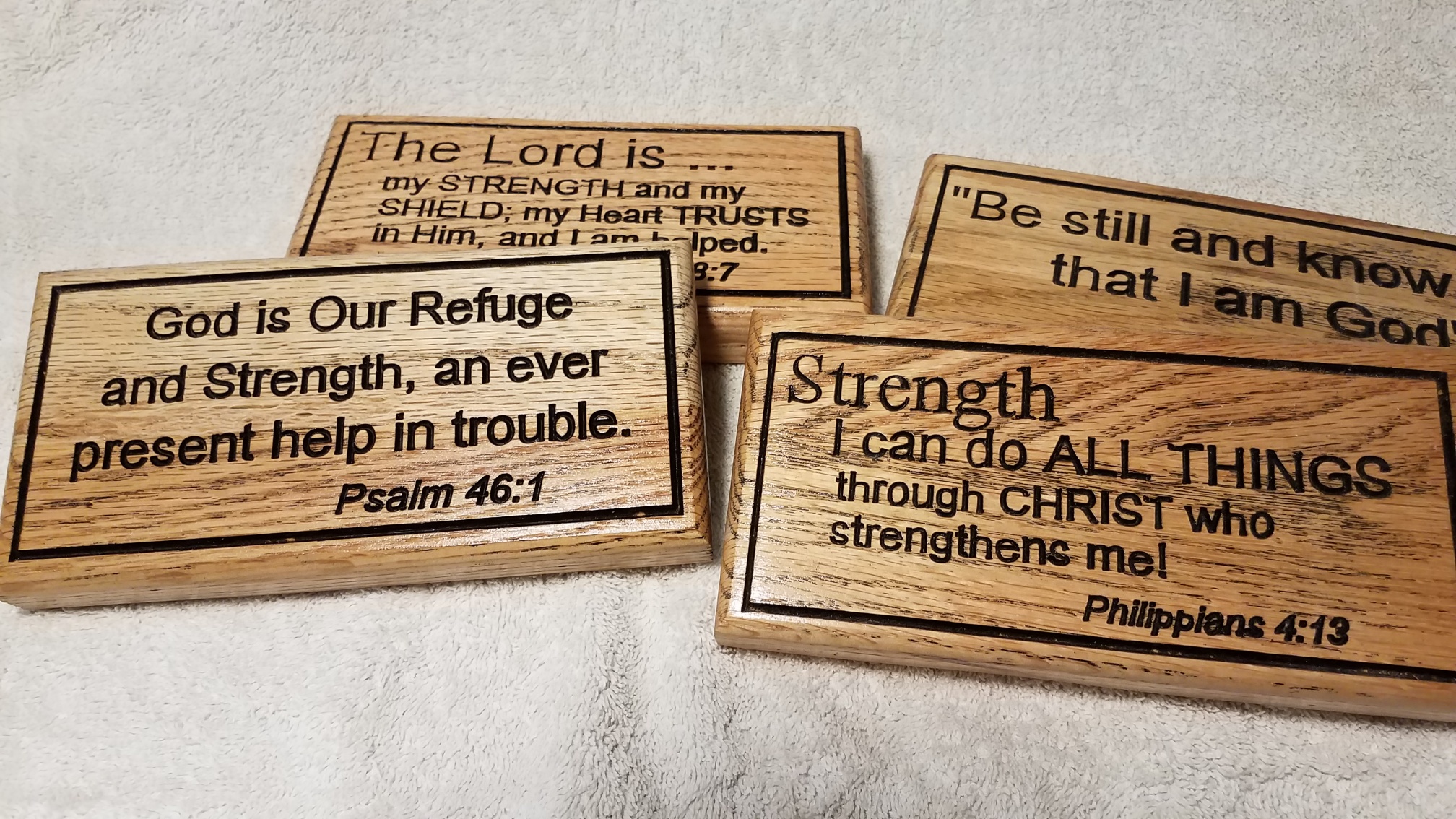
Decided to use a basic Arial font for this project keeping the woodpecking at each corner of the letter to one stroke per corner.
Here a a few pictures of completed project … a total of 60+ items to give to our outreach ministry group to share this Christmas.
Desk%20Plaques|690x388 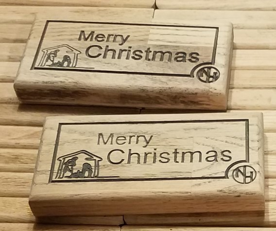
3 Likes
CamBam has free single stroke fonts that you can download.
This topic was automatically closed 30 days after the last reply. New replies are no longer allowed.