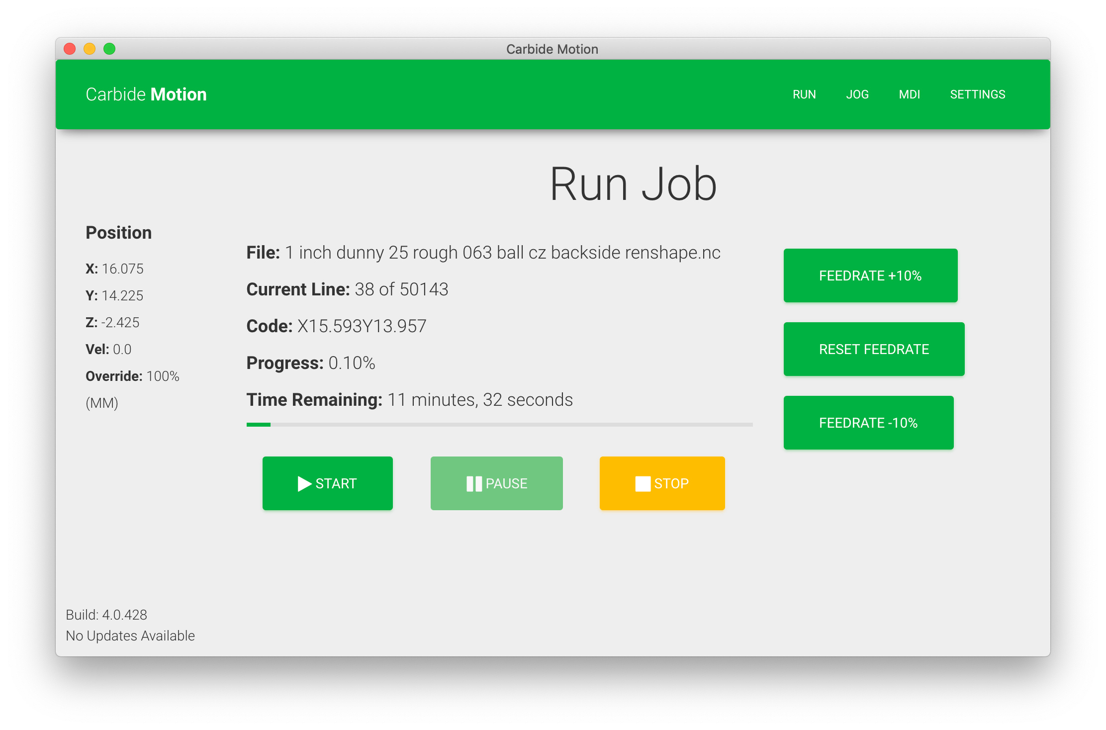
This is a noob issue, but I’ve seen several new users confused. In CM, when a job is running, there is a green pause and a yellow stop button.
The stop button does nothing when running - It is difficult to tell as there are no other yellow buttons but it lacks some color saturation which is supposed to indicate it is not functional. This isn’t obvious without other yellow buttons on the screen.
If you hit pause, then you will see it become a more vivid yellow and to show it is now active.
It’s a bit of a safety issue if your trying to stop the machine quickly (pause) seeing the different color can lead you to try it first instead of pause.
I’d suggest either the stop button be hidden until paused or even make pause yellow and stop red and reprogram it so when stop is pressed it immediately stops the machine. Or at least also pauses the machine.
If you need the machine to stop immediately you should hit a paddle-style emergency stop button which kills power to the machine, router, and vacuum.
Stop only becomes active since it’s more of a “cease running the current program w/out entering an error condition” — which is why it’s not available until after the program has been brought to a successful and controlled pause with the machine position (hopefully) remaining accurate.
At least, that’s my understanding/interpretation. It’s open to correction/clarification by higher-ups.
I think the point is that the STOP button is useless until you’ve pressed the Pause button…so why show it at all? If you’re in an emergency situation (and don’t have a paddle), or just really want to stop the thing - you might press the disabled Stop button by accident - and then remember that you have to press Pause anyway. The suggestion was to either enable STOP from the beginning, or only make it visible it when it’s enabled.
It’s not obvious that stop is not functional until paused and the yellow color draws ones eye/attention to it first. It’s desaturation is not obvious as nothing else is yellow to compare.
It’s an interface choice to show that it is not currently available — if it were fully hidden as opposed to being shown as inactive that functionality would not be exposed.
The other part of my concern is that it is not immediately obvious that it is unavailable. The slight desaturation of the yellow is not obvious unless there is something brighter yellow to compare to.
Perhaps another option would be to keep it green as all the other buttons - and desaturated if not available. then it would be slightly more apparent that it is unavailable.
As I mentioned, our primary role is teaching some basic CNC operations and this has tripped up many newbies trying to pause the machine.
It’s good UX design (generally) to show what options are available, even if not in the current state. It’s definitely good UX design not to have buttons move as modes change.
I’d agree that changing the Stop button to grey which is fairly universally understood as “greyed out” would likely be an improvement for users.
That said, it’s never confused me, it was obviously desaturated and given the difficulty of restarting the job after hitting Stop I think it’s best that it’s disabled.
A manual feed hold button is also an option as covered in quite a few threads.