I have been using the text on a circle since the v7 beta versions. I am really liking it and wanted to comment on several things I have discovered.
-
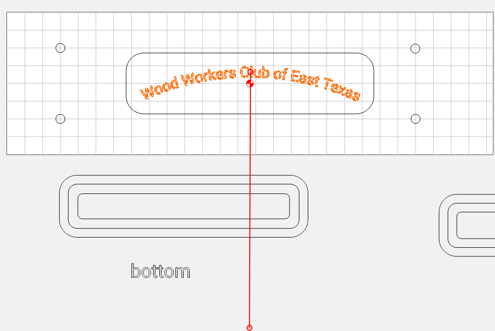
When creating the text I have found it easiest to center the text when trying to align the text.
-
Picking the correct font for vcarving is very important. Some fonts work better for pocketing.
-
When creating the text on small circles you can use the spacing (kerning) to get your text to not run together.
-
At first I struggled a bit on getting the circle aligned where I wanted it. So I have been creating a circle the size I want the text to line up to and then creating the text. So far this has worked better for me than just eyeballing the placement of the text.
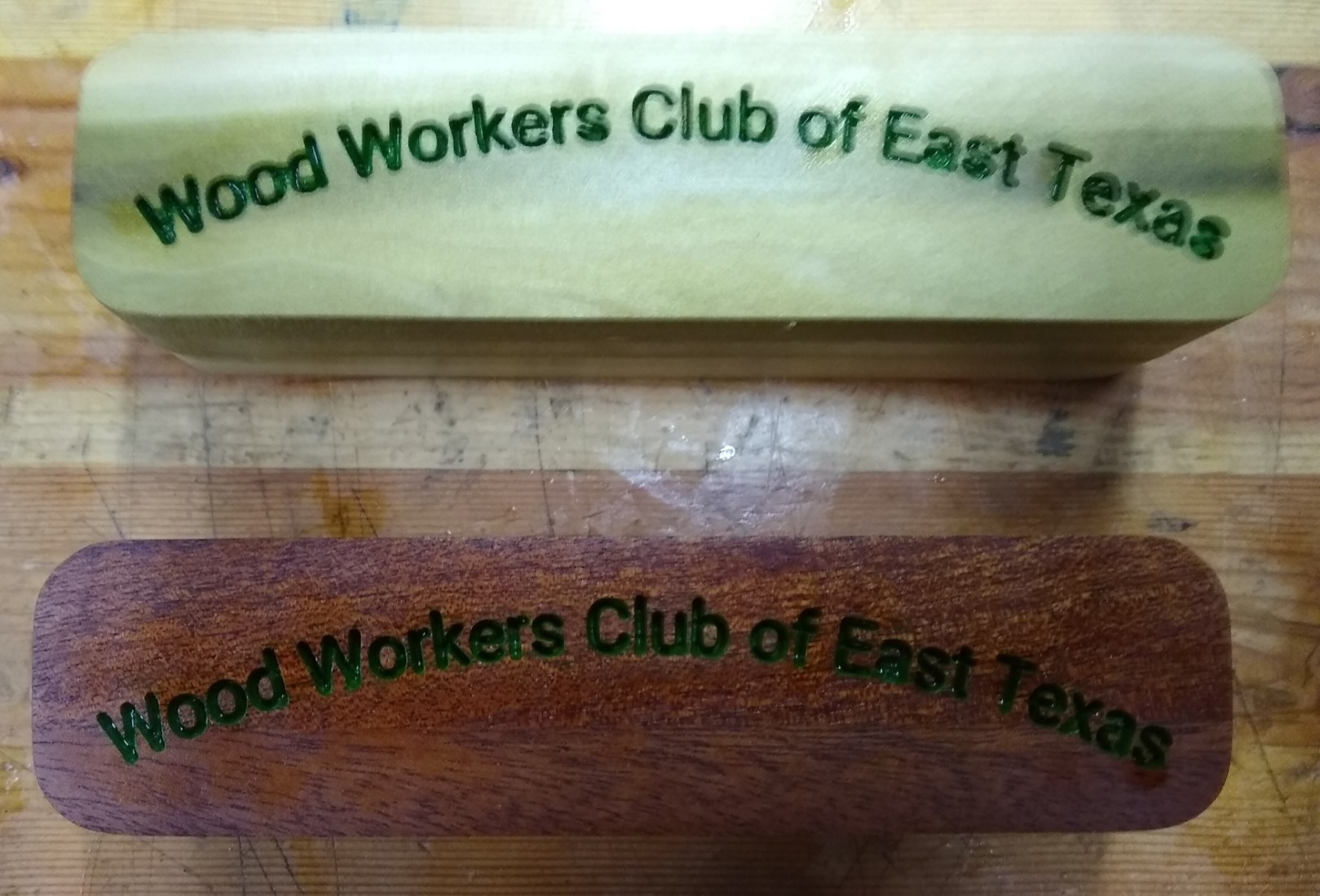
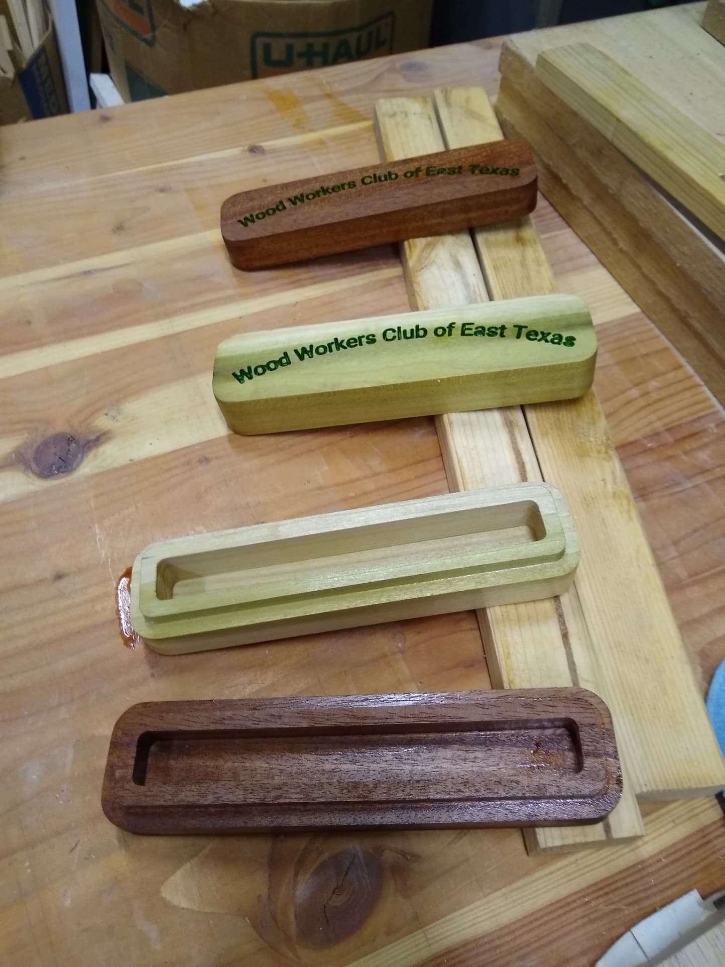
Here is an example I carved today. These are boxes to hold a writing pen that I turned last weekend for some Christmas presents. One is mahagoney and the other is poplar. The poplar one was to see if the thing would work but the boxes will likely not be used after the pen is put in use. The pic is a little blurry at the tip and the finish is still wet (Watco Danish Oil Natural). I created a much larger circle to get the text on top of the long and skinny box. I am very pleased with this new feature.
FYI I got the idea for these boxes and others from watching John Clark on youtube about making boxes.

John Clark has several videos about making boxes.