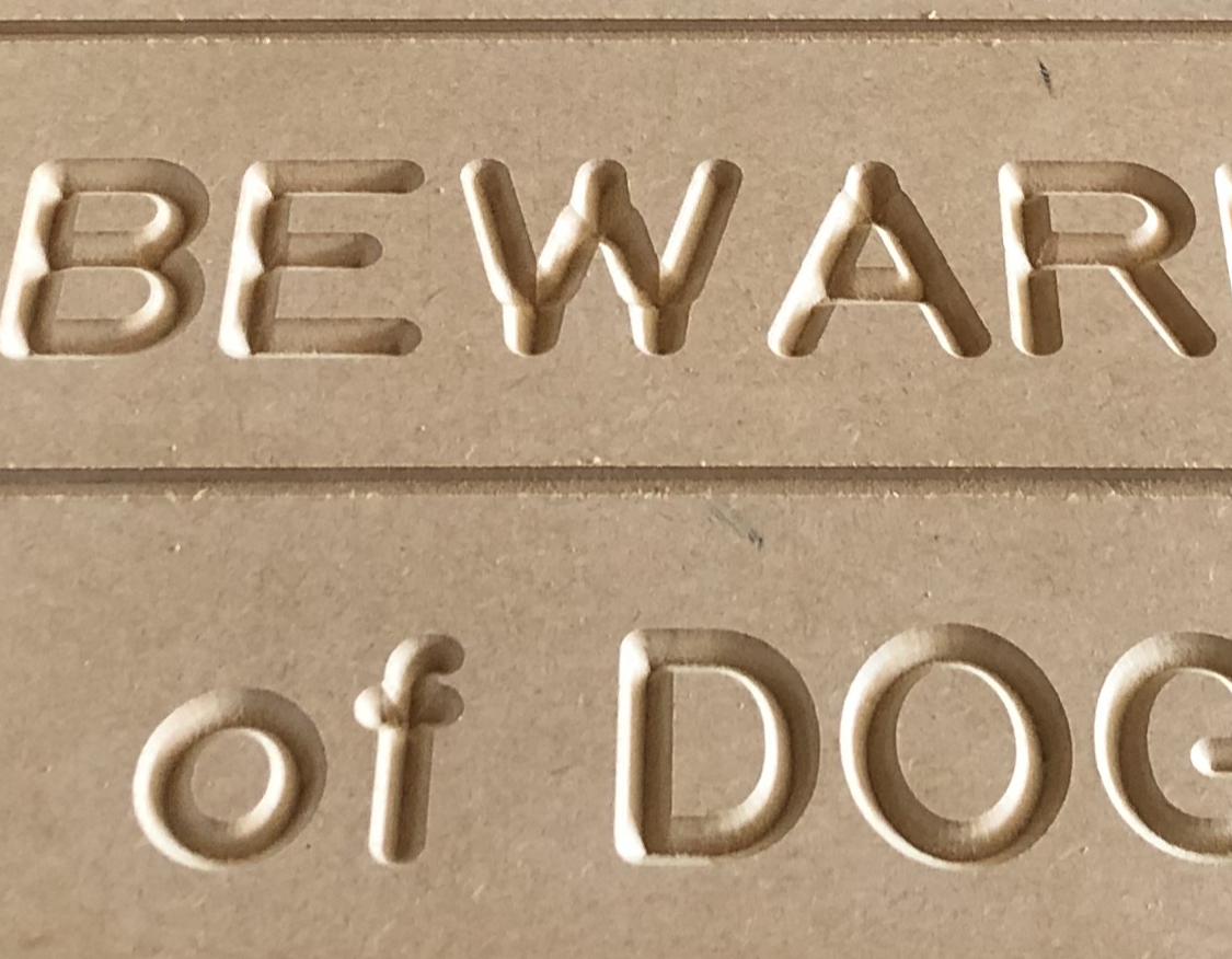
I am using a “stock” font to make “state park” style signs. Text only. I just assembled my new XXL, v-carved one sign in this font last week with a 90 degree end mill and it was perfect. (attached). I tried again this morning with the same font, same parameters, it isn’t “translating” the font correctly and the “M” came out weird. (also attached) Super simple application. Can’t get it right. Any thoughts? I’ve attached the c2d file as well.
Leo.c2d (118.9 KB)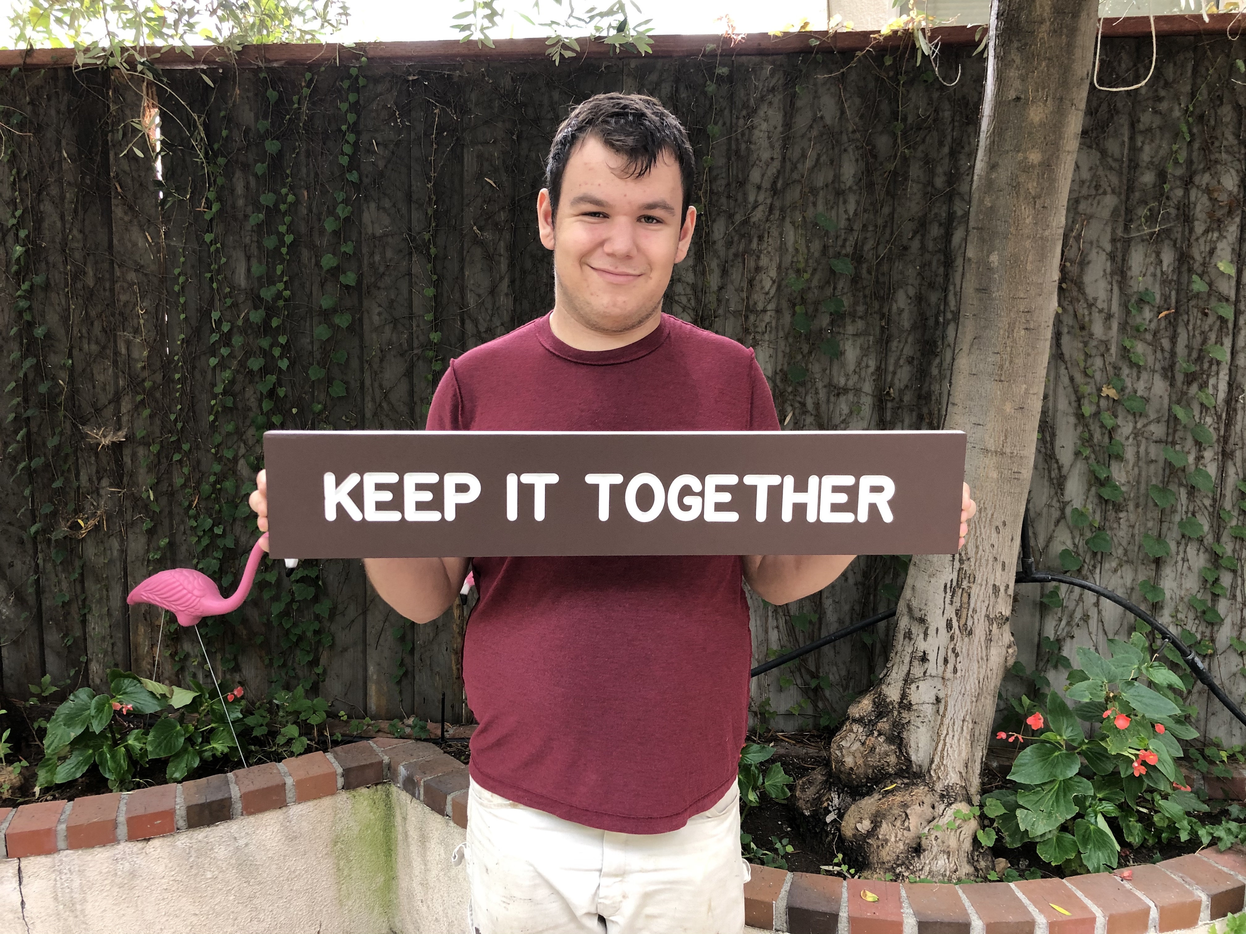

The first thing indicated by your second photo is something mechanical. Most likely a set screw or eccentric adjustment. Something is not tight and/or has slipped.
You should go back over your setup until you find the one thing that has slipped.
1 Like
Does this match the preview?
If so, this is caused by using a font at a size which is larger than the V endmill can cut wide.
The fix is to use Advanced V carving.
2 Likes
There is a tool called “camotics” (open source, so free) that can simulate your exact bit etc… worth checking if that has the same artifact
3 Likes
Can you post the g-code file too ? Something does not add up, the c2d file you linked shows a proper v-carve toolpath using a 90deg V-bit:
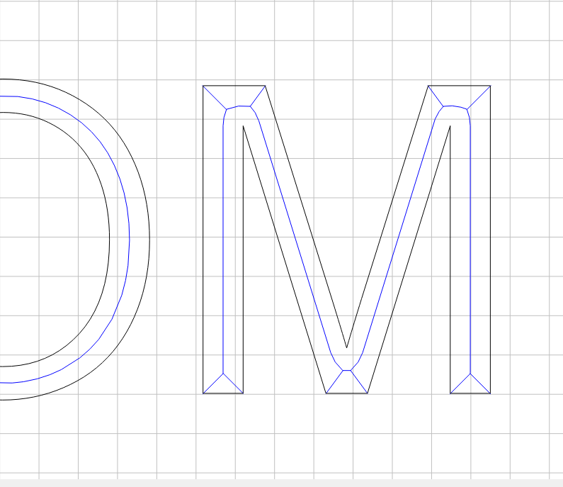
which previews correctly:
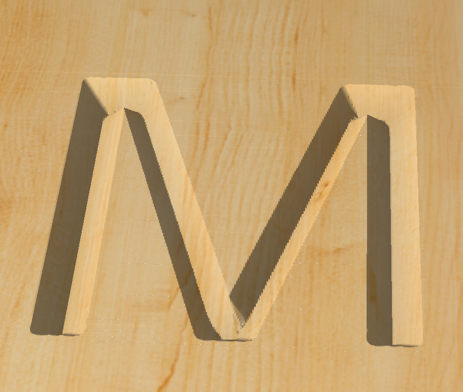
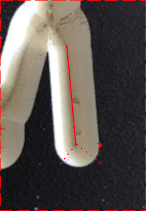
but the legs of that M letter look like the 90deg tool just did a long straight movement, without the two “corner” movements that would have made the bottom of the leg square:
Did that cut complete normally ?
2 Likes
hmm wonder if this is “dusty brushess” case ?
Were you using the dustbooth with the brushes touching the wood?
Hi Julien, here’s the G Code and thanks for taking a look! Leo’s G Code.nc (54.1 KB)
Hi Arjan, yes, I am using the Sweepy dust boot with the very soft brush barely touching the wood.
sometimes folks here (and I have had it happen to me, even with a HDZ)… the brushes pushing down on the wood are so “strong” that the vertical motion does not happen as much as it should have.
but my brushes are pretty stiff (I have an early add-on version, maybe they changed it since)
Ahhhh… interesting. I will try it without Sweepy. I have a Z Drive and soft brushes, but it’s worth a go. Thank you!
Thanks Tex. What’s weird is that every other letter is perfect and only the M is slightly mis-formed. I’ll do a run through of the setup. I’m new and it will be good practice regardless 
Hey Will! The preview shows it “normal”, but when it cut it came out wrong. I think these letters were routed at 2" high and I’ve used the same file at 2.5" high without issue.
So the G-code matches the (bad) cut:

while CC’s preview shows this:

Now, when I open your c2d file and just regenerate the toolpath myself and visualize it, it’s then ok and matching CC’s preview:
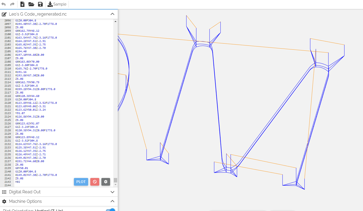
Something wrong happened when you generated that toolpath.
Can you try to relaunch CC, open your project, re-save that file, and post it here for a check ?
2 Likes
Interesting… so while I was testing a new sign in the same font with the same parameters, the W also came out dissimilar from how it is intended to be. So the M & the W should look like this 
but instead the W looks like this. All 24 other letters in the alphabet work fine. Just the M&W are trouble!
What but are you using?
Hi Neil, #301 90° v bit
I’m pretty sure that if you measure that setting of the M and W you’ll find that the letter strokes are wider than the 1/2" which the #301 can cut.
3 Likes
What @WillAdams said.
CC is assuming that bit is infinitely wide.
May be worth it to grab a tool like this.
btw there is a relatively easy way to “solve” this.
Step 1: Turn your font from “letters” into vectors. The easiest way to do this is to draw a circle somewhere outside of the text, and then use the subtract tool to subtract this circle from the text. (since there is no overlap… it’s a noop except that the text becomes vectors)
Step 2: Select your text and use the offset tool to make an inner offset that is the diameter of your tool. If this creates any geometry, @neilferreri and @WillAdams are right (and step 3 will then sort of fix it).
Step 3: Make the toolpath selecting not just your text, but also the shape that the offset tool left behind… this avoids it at least going too wide.
You will need to do something else to clear up the ridge that this will leave behind though… probably best to use the offset tool to make an inside offset of half the diameter (eh so radius) of your tool and just use a normal bit to pocket that area
2 Likes
I’ll try it! Already ordered. Thanks Neil…