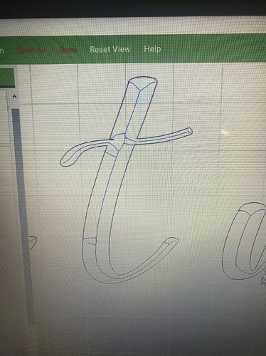
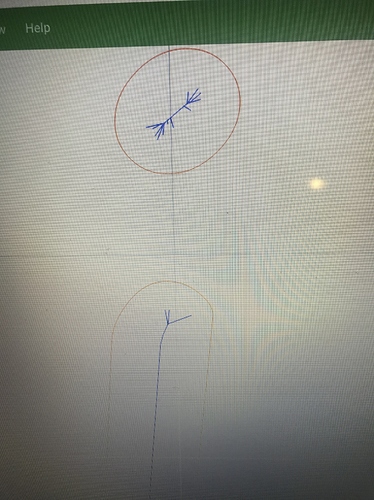
Ok, so I’m learning to use v Carve and I’m trying to figure out why there seems to be a lot of unnecessary movement in the letter. I’m using beautiful script but the tool path looks rough. Any advice?
Using “vcarve” the software or vcarving in carbide create?
V Carve in carbide create
Unfortunately the preview in CC isn’t the best, if you look at the non-3d preview it should show blue lines where it intends to move the cutter, if these lines are smooth as you’d expect the actual cut will be as well.
That just seems like a lot of unnecessary movements
The issue is in the font itself, if you notice in your first group of pictures there’s some weird geometry in the top left of where the bar crosses the vertical portion. Essentially the font has vertices which are inconsequential when drawing the font on screen but vcarving involved drawing lines that connect every vertex.
So what type of font can I use?
There are a couple of problems here:
- all geometry gets converted into polylines
- Carbide Create uses a fairly coarse internal unit for measurements
- the algorithm for calculating the V carve movement isn’t perfect — unfortunately, it’s not possible for a machine cutting with a fixed angle bit to make the single central line of traditional carving
- Carbide Create only uses straight line moves to approximate curves
In practice, things don’t come out as bad as they appear on screen.
Vectric Vcarve uses Bézier curves internally, and can generate G2/G3 arcs, and is noted as creating crisper V carves
An interesting exercise for the reader is to draw up a series of circles, rotated around a center point, then assign a V carve to them.
Thanks Will, I reread what you posted and think I have somewhat of an understanding of what you’re saying. Do you have a preference of font that you find vcarve really well? Also, is vcarve the only way to engrave letters?
As far as the exercise with the circles how would I go about making that? Brand new to carbide create.
Thanks in advance!!
The thing about V carving is it’s supposed to represent everything well — Times New Roman is the usual suspect and seems to work well.
Draw a pair of circles separated around where you want the center point, group them, then rotate, then assign a V carve.
This topic was automatically closed 30 days after the last reply. New replies are no longer allowed.

