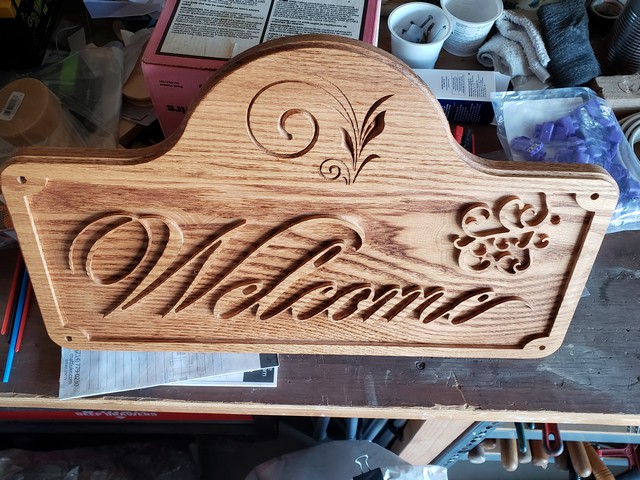
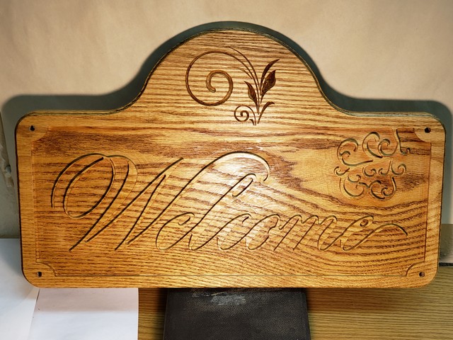
This came out pretty nice, took longer to cut because of Z axis issues but I got it completed in 4 hours.
It’s ~ 14" X 21" out of oak.
I was going to paint it but my wife said try staining it, I think it would look better if I paint the tops of the letters black?
Here’s a relatively low effort way to paint/stain the raised portion.
Pre-stain or paint the material before you CNC. You could ballpark the location of the “Welcome” and paint just that area black, then when you CNC only the black/welcome remains untouched.
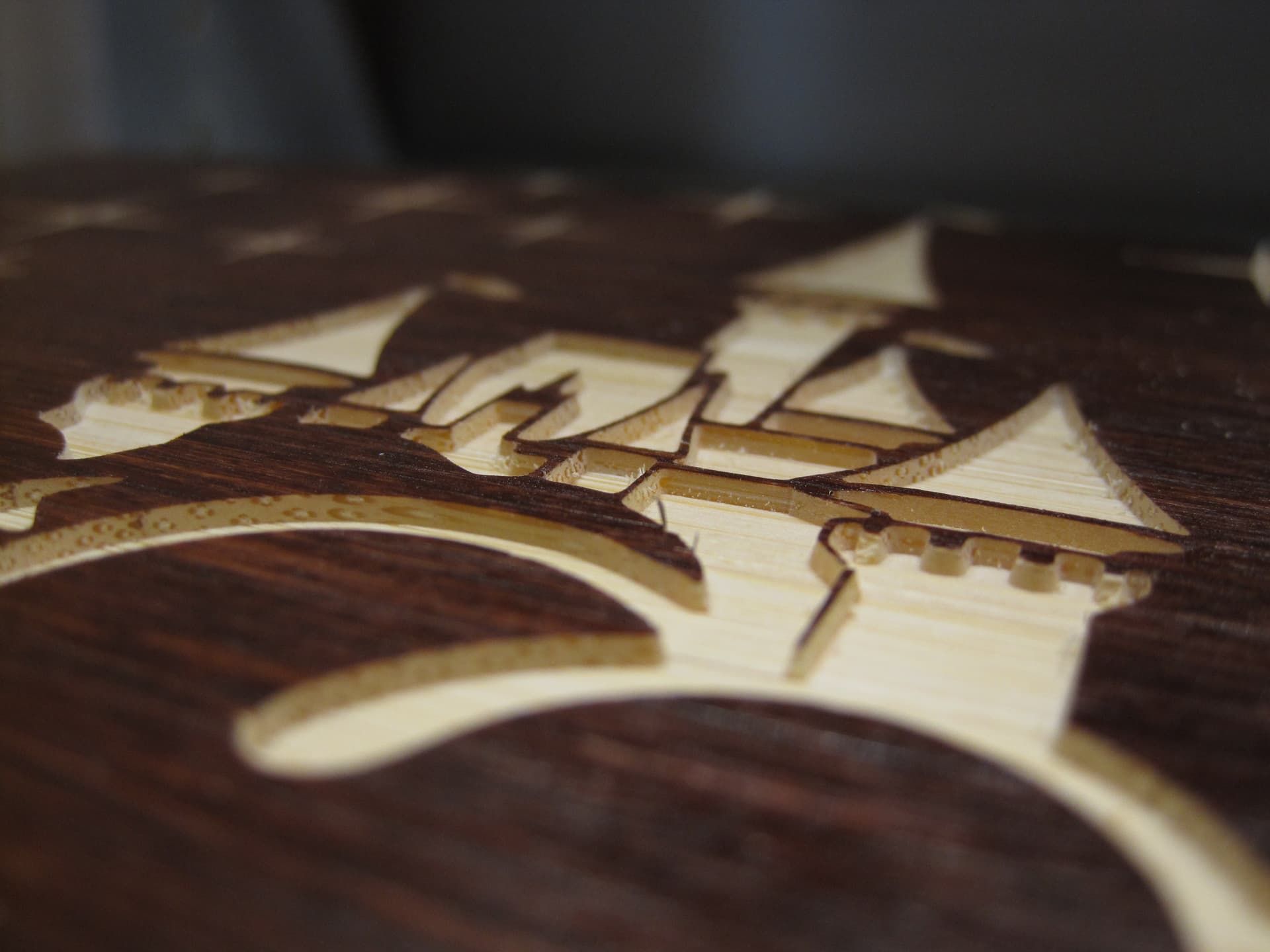
This is a picture of light wood, stained dark and then CNC’d.
And you can do the opposite by painting the recessed part then using a sanding block on the raised lettering. The only drawback to that is the vcarved “walls” will be painted and you may lose some of the visual appeal. You can always do an resin infill also.
Good suggestions guys, I wanted to paint the recess green with the letter tops black.
Guess I have to make another
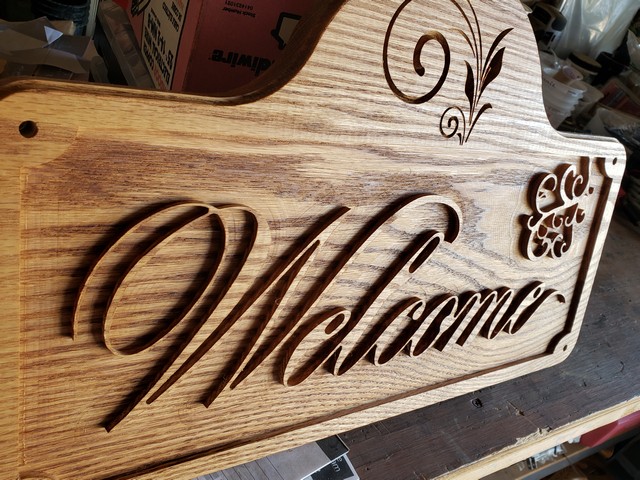
Here are some angled pictures showing the text better.
Thanks for helping,
Pete
When I do signs, I like to stain the board dark first, then cut the letters into the wood (which turn out white because I use maple). In your case, you would have painted or stained the wood a dark color, then run your CnC to cut the sign. The result would leave you with dark letters and frame and everything cut would be the natural color of the wood. Super simple.
That is a great looking sign. In my opinion, the letters do need some contrast. Painting or staining the raised letters is an option. Epoxy filling the background would be very tempting for me just because I like epoxy, but picking the right color would be challenging for me.
No worries. I am a simpleton when it comes to the CnC. I can send you the Gcode file or the V-Carve file if you’d like. Just message me your email address. No problem there as far as the font cutting goes, I guess the software does the work. I simply tell it I am using a V-carve, and put in the text. The software calculates everything else based on the thickness of the line within the text. If you are using a raised lettering like you did, then I’d use a 1/8th" endmill bit and cut to a depth of .20". Looks like I misunderstood the assignment. LOL.
Hi Steven;
I messaged you but maybe it didn’t go through. If you would send me the Gcode file and the V-Carve, I could maybe get a better handle on how this works so well for you and not for me.
Thanks
Frank
[email edited out, please you a private message instead]
 )
)