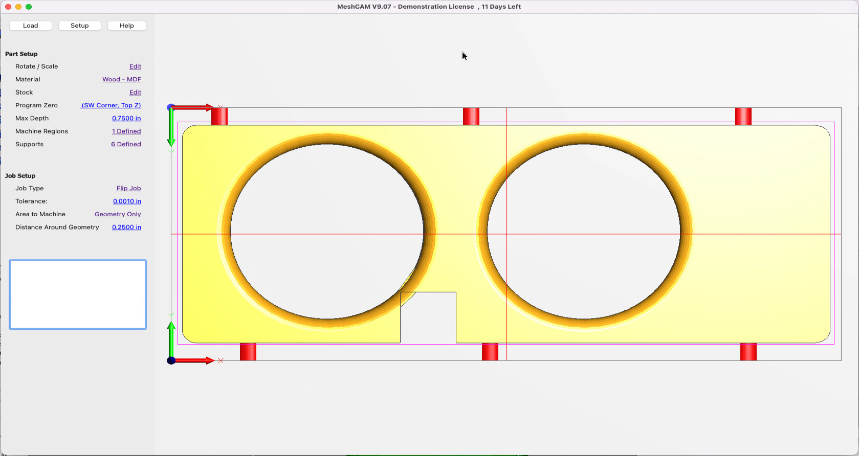
I have downloaded meshcam and started the 15 day evaluation period. For some reason, the UI in mine looks a lot simpler than in all the screenshots I’m seeing online. I have tried going through the menus but did not see any settings to toggle to make it look like I was expecting. Mine has no icons to click. And no dialog pops up to help pick the options for generating toolpaths. Is there something I’m doing wrong?
The pics you linked to are 6 years old at this point and that build of MeshCAM is around 8 years old so they no longer reflect the current state of the program.
The UI has changed over time to remove arbitrary icons that weren’t in common use and replace them with text that says what they do.
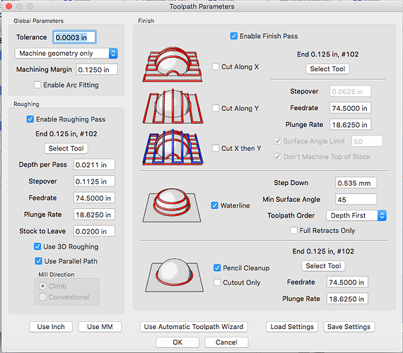
So does that mean there’s no longer a dialog that look like this one?
It looks like everything was moved up into the menu bar across the top.
The extra images in that older version do explain a lot. For somebody new to the thing, the new versions thats mostly text based doesn’t do as good of a job at explaining what all the things do.
The current design philosophy has a UI that is like the index to a book that only shows the pages you’ve read and doesn’t hint at topics that are available that you might need or want to explore.