Here are two more items I just finished for my personal geek collection…
Here are two more items I just finished for my personal geek collection…
Nice work Greg!  …
…
Really nice.
I haven’t done any inlay work yet. I’ve just been reading and learning a couple ways to do it.
I’m excited to try some soon. Inspiring.
Greg, good work and good use of the v bit to give the pockets some class.
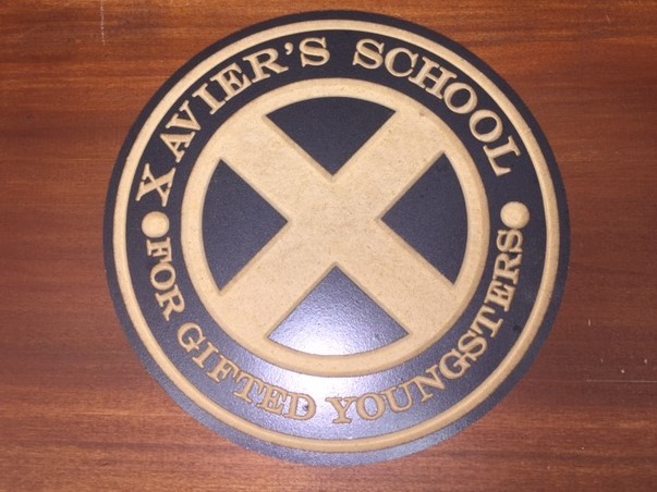
Jerry, those aren’t inlays (though it could have been done that way), Greg’s method cuts through a painted or stained top finish to expose the base material. There are some simple techniques to get the reverse effect (color into the cut areas only), or combinations of both. Lots of fun.
Greg, out of curiosity, did you use Inkscape to bind the “for gifted younsters” to the curve? I ask because I’ve had some issues with Inkscape not really following the curve precisely. I’m not sure if it’s because Inkscape uses 96 points per inch where almost all other graphics programs use the traditional 72 points per inch.
The units or scaling factor don’t affect text going around a curve in a graphics program.
Unfortunately (I sound like a broken record), the only program which got the UI for this right is Macromedia Freehand (and Altsys Virtuoso), and Adobe InDesign inherited that UI by way of Aldus).
There should be some adjustment though, and it’s always tricky to get right (says the guy who fiddled w/ a cut piece for a while last night trying to decide what was wrong with it, before deciding that the spacing between some letter pairs needed to be adjusted in the text on a curve)
If you have a problem file in Inkscape where this isn’t working as you expect, please post it and we’ll gladly look into it.
If you do everything in the same program, the 96 points per inch doesn’t matter. But if you were to curve some text in Inkscape and take only that curved text to a program that uses 72 points per inch, it will be different and off. A lot of tutorials on Inkscape will recommend setting the default points per inch to 72 to match other programs for this reason. The letterspacing is also inconsistent, which is what prompted my question about what package was used to generate the curved text. I have 30 years in publishing/printing.
It will be scaled up or down — it’s a vector program, so scaling should “just work” — in order to use the SVG in Carbide Create the text has to be converted to paths, so any letterspacing information will be instantiated in the positioning of the paths.
Moreover, any adjustment to letterspacing should be done in terms of Em units, which then would be applied to physical spacing — yes, rounding errors would affect this, but if the type is converted to paths, then, as I noted, the logical units used to define pixels won’t affect the underlying vector information unless one turns on some sort of hinting / grid fitting.
Look at the underlying XML of the same file saved as 96ppi and 72ppi — the textual description of each element will be the same, it’ll only be the numbers which are different.
I don’t use Inkscape. I use Vcarve Desktop from Vectric. It has tools to curve text on an arc.
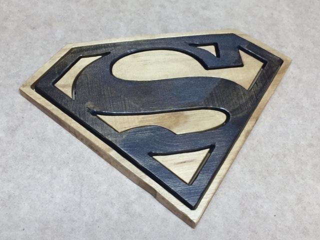
The Xavier’s sign was done in the method you described – I painted MDF and then cut through the painted side with a 60-vmill. However, the Superman symbol IS done using inlays. There is a post in this previous discussion where I described my process: First Few Projects
Will, you’re not understanding what I’m saying, but this discussion is already more tedious than we deserve for a Monday morning.
Please feel free to explain clearly so that what you said is understandable.
Arguably all typesetting systems should be programmed in integers so that such rounding issues aren’t a problem — that’s one of the things which I like about TeX.
Typesetting systems are designed in points. 72 points per inch is an integer. What “rounding issues?”
Yes, but spacing is done in terms of Em units, and one also has to work with other systems — start w/ points and picas, which sort of points? While PostScript points are 72 / inch, traditional American/English printer’s points are 72.27 per inch, and France has/had 3 different sizes.
Similarly, an Em space will be divided into units (either 18 or 54 for older hot metal systems), and then when setting the type, one has to apportion the spaces in-between words — they rarely fall out to nice neat units, and as I noted when letterspacing, or kerning, one does this in Em units or some similar value based on the type size, and -1 unit in Quark XPress, for a 10 pt. font is not going to be 1 point and moreover, kerning tables for fonts are not done in points.
TeX was written using integer math, 65,535 scaled points per Printer’s point (for the curious, that’s smaller than the wavelength of visible light, and small enough to consider measuring atoms — 0.00536293 microns)
To go back to the question at hand, adjusting the spacing of letterforms around a curve requires fine adjustments, in units smaller than a point.
Here:
For the record:
0.206 inches == 14.832 (PostScript) points
0.8425 inches == 60.66 (PostScript) points
0.7911 inches == 56.9592 (PostScript) points
Is there a difference in these two statements:
0.206 inches == 14.832 (Postscript) points
and
0.206 inches = 14.832 (Postscript) points
In certain programming contexts, one is used for assignment, the other for indicating equality.
At work, I run RedHat so I couldn’t demonstrate what I’m talking about. Now that I’m home, I can do a really simple thing. My original question was whether Greg had used Inkscape to do the curved type. I have done this a lot because curving type works in Inkscape. I usually use the Gimp for graphics. I’ll just hop out to Inkscape, create the fancy text, save it as a graphic and bring it into the Gimp. A 72-point Arial capital T in default Inkscape is larger than a 72-point Arial capital T in default Gimp.
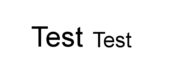
The word “Test” on the left is 72 point Arial from Inkscape. The word “test” on the right is 72 point arial from gimp. If you go into preferences and set the default to 72 points in Inkscape, then the two will match up exactly. that’s why most tutorials on Inkscape suggest you set the default to 72 instead of 96.
If you were to do the curved text in Inkscape and bring it into gimp, the arc would be different. Because I’ve seen this before when mixing and matching Inkscape with other graphics programs, I asked.
Also, just for the record, I have several pica poles at home. Each one of them is 72 points per inch (not 72.xx). These are from the 1970s. They also have an agate scale on them
As I noted, if you convert the type to paths before saving, the files will be identical when scaled, to the same size, save for floating point rounding errors. Similarly, if you scale the pixel image appropriately, it will come out to the correct size. Moreover, that such measures are different argues for the need for scaling.
That the American Printer’s Point was 72.27 points to the inch is a matter of historical record. Yes, there were systems and rulers which used 72 points per inch, and that became the standard with PostScript, but if one bought and set metal type on an American body, the points which they were measured by were 72.27 to the inch. I’ve got Pica sticks to that measure, and more metal type so cast than I’d care to weigh.
At work, XyVision is a system rooted in the old standard, so I constantly have to explain why its 10 pt. type is 9.96 points when a PDF is examined using a tool such as Pitstop.
Should anyone else ever need to work w/ such systems:
To round out this classic Schaedler Rule, we have placed Printer’s Points & Picas down the center. These are the original points & picas still used in the printing industry — where six picas are equal to .99576 of an inch, not quite a whole inch. We’ve coated this entire Single “A” rule with a blue color tinge so it will be easier to find on a cluttered work-table.