Hey good people, should be a simple question. I am trying to cut letters with a simple line. not pockets, not contour just a simple line. when i try to use the vcarve the v bits don’t show in my selections. I just tried 5 ways from sunday with a oflute up 1/8 and it was to carve it out so only the stick letter is uncut. Please tell me what simple thing im doing wrong.
For a work-around to approximate single-line fonts see:
If you have a single line text imported from some tool which makes it (or have drawn this up by hand) apply a No Offset Contour toolpath to a reasonable depth using a suitably sized tool — a V tool could be used for this, but will be rounded at the ends — a ball-nose cutting to the depth of the radius of the tool has a better appearance.
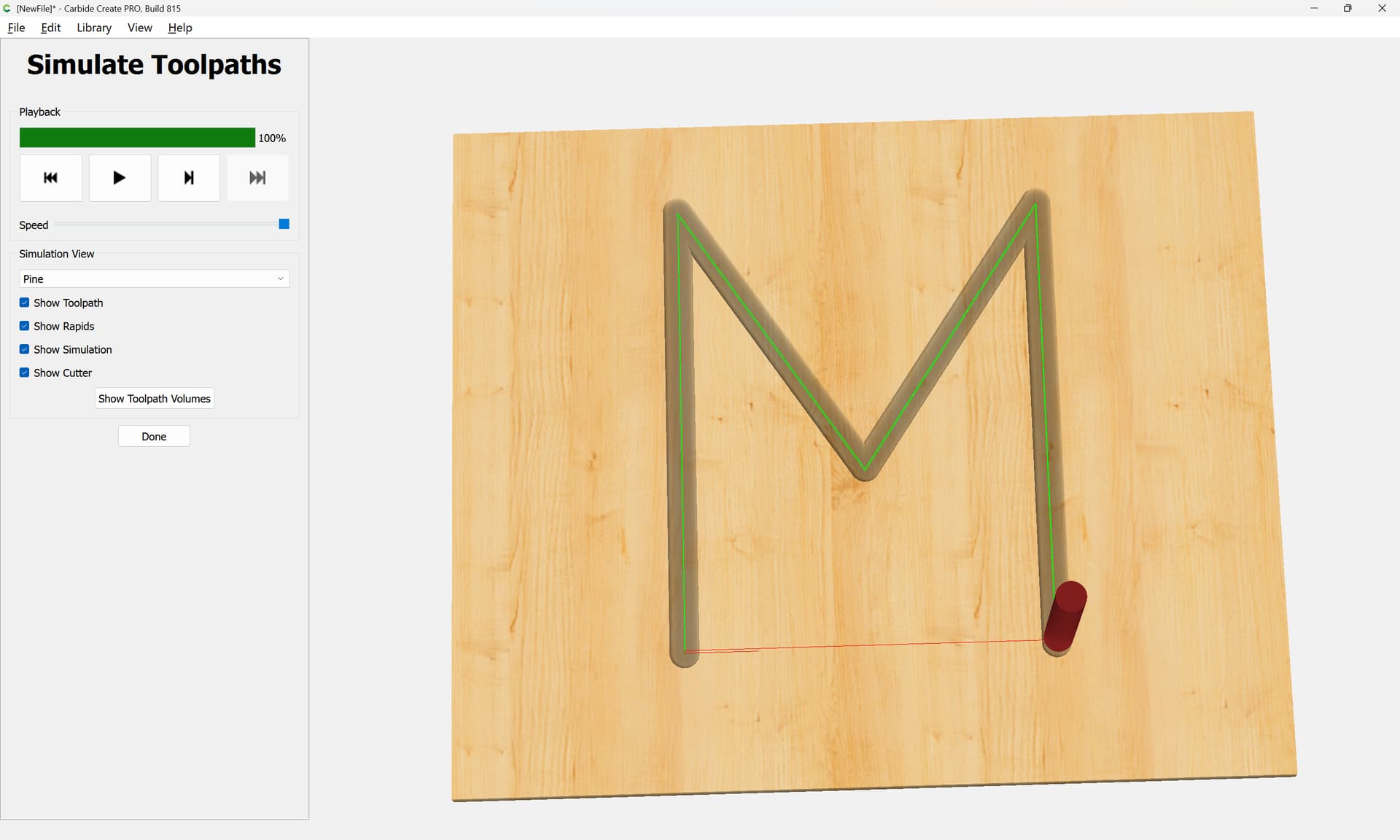
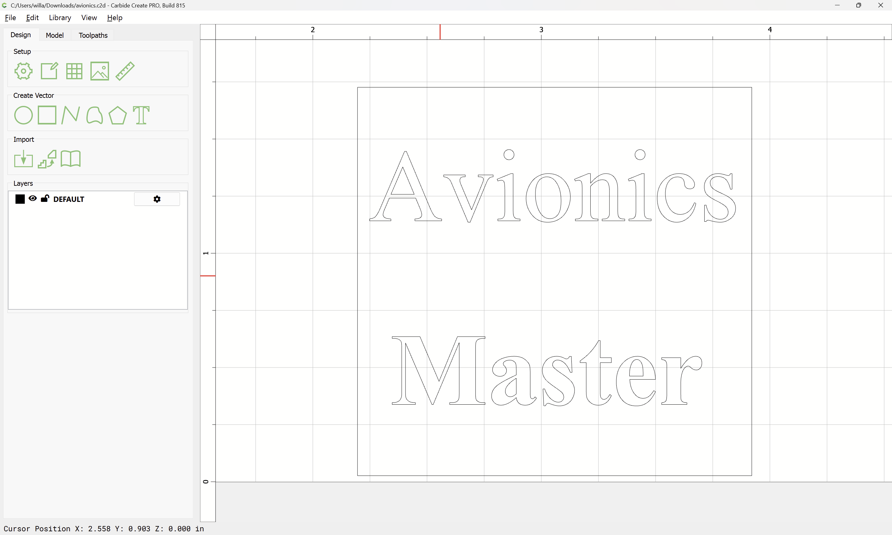
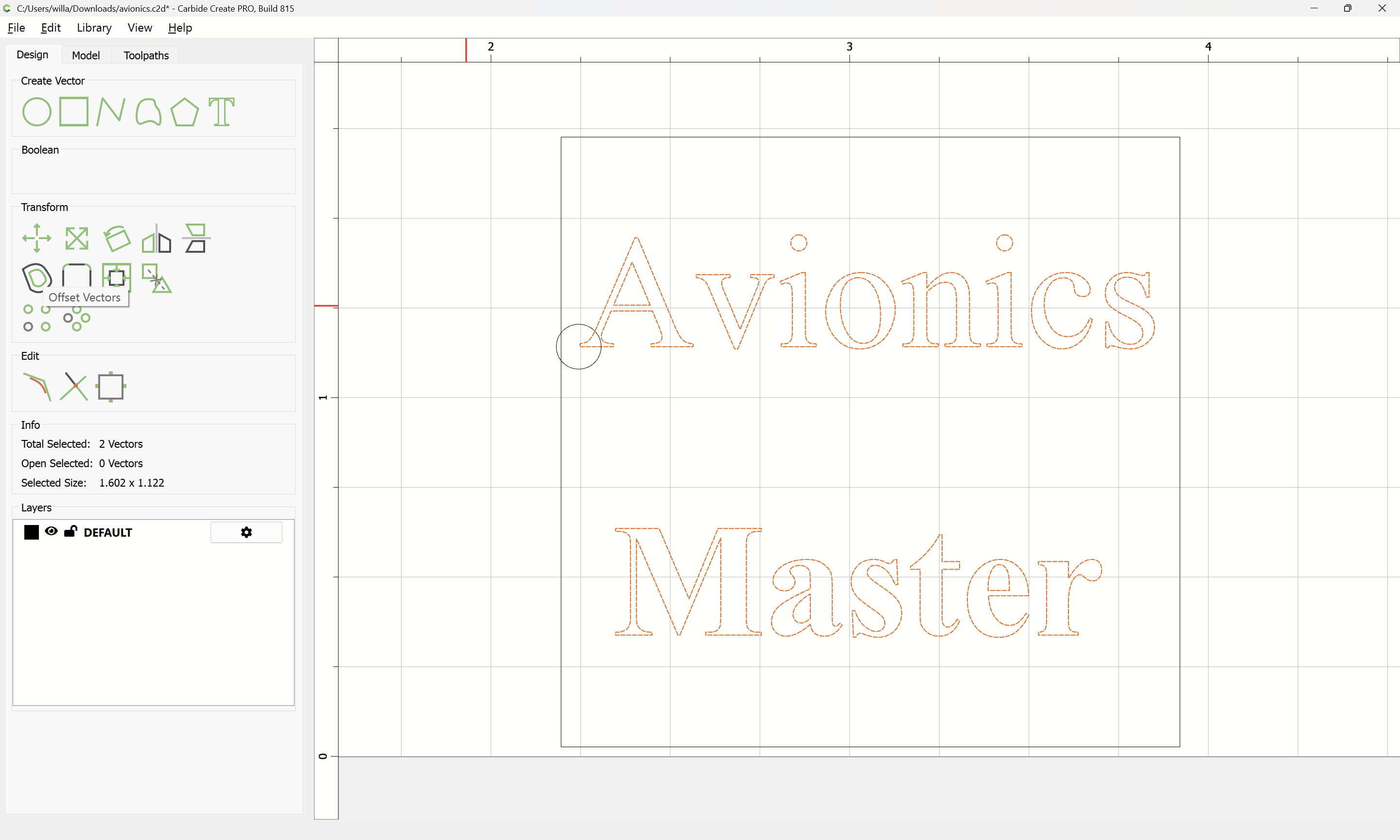
I’ve confused myself here. Let say you have a pencil. And you draw a M. Where the graphite sits, is all I want to cut. Just lines I’m using the text in the carbide create, like times new roman.
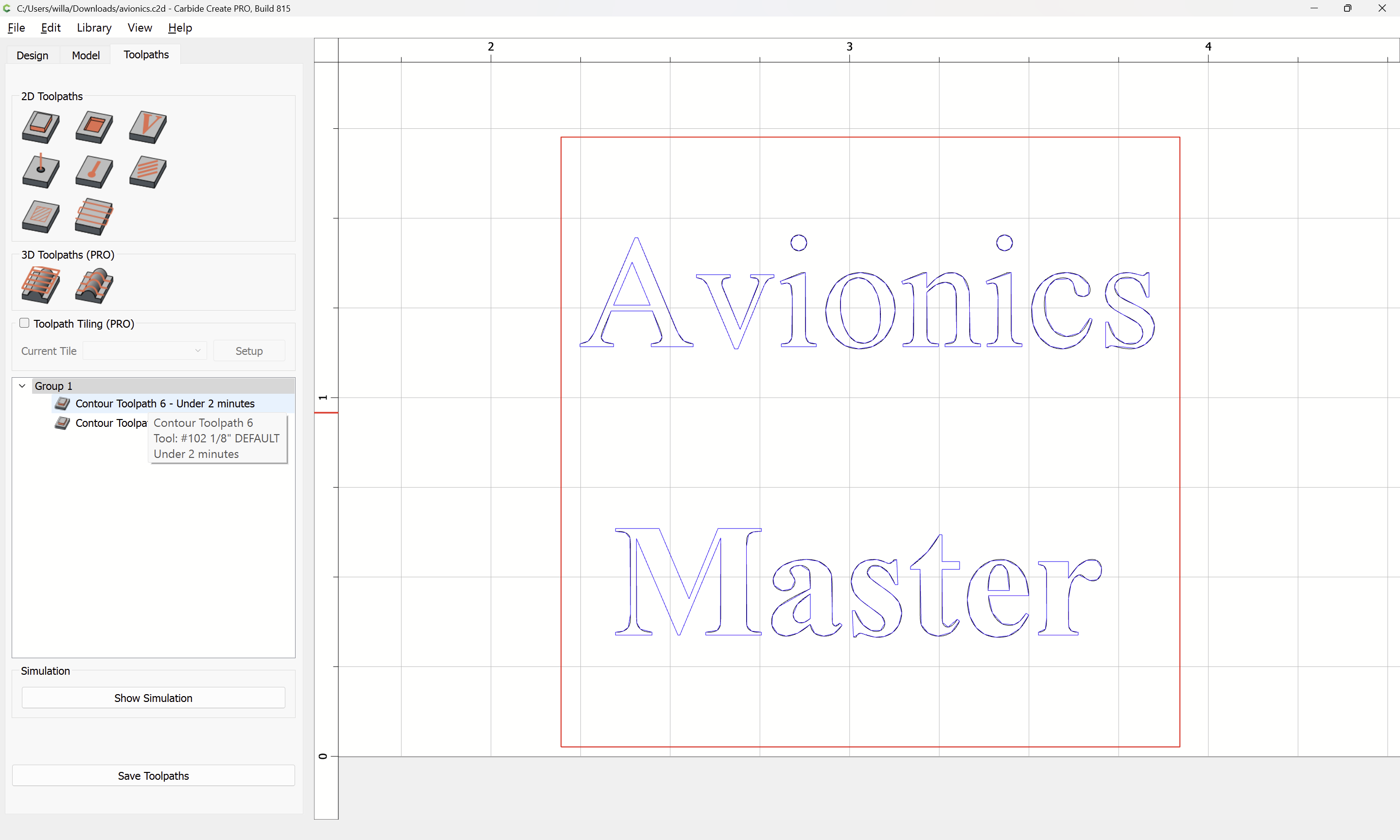
Vcarve is when may work, but when it set the settings, it says empty toolpath.
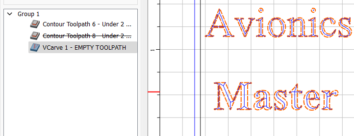
Is this what you’re talking about? It shows EMPTY TOOLPATH, but there is a toolpath displayed in the graphics window? Move your mouse over the toolpath listing, and it will update.
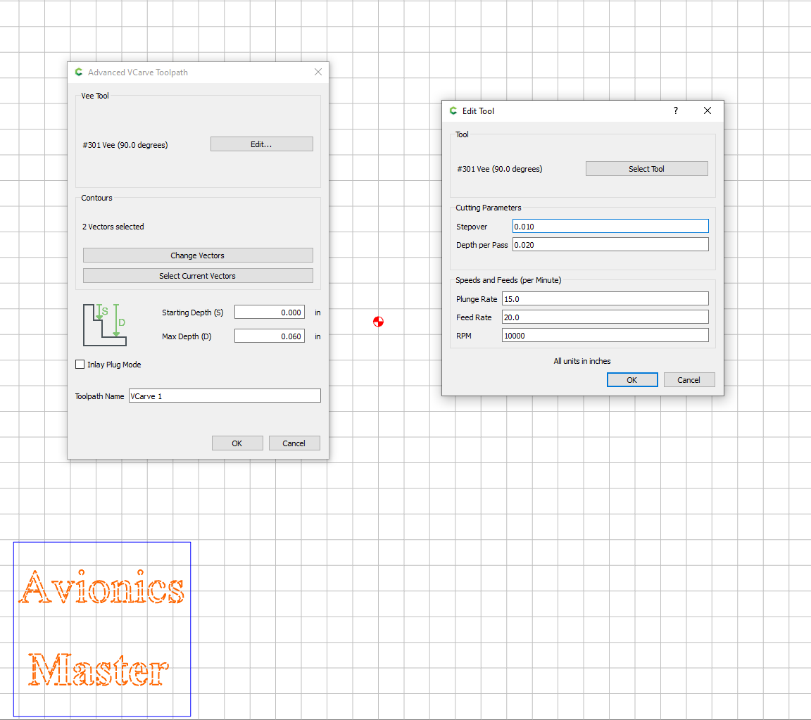
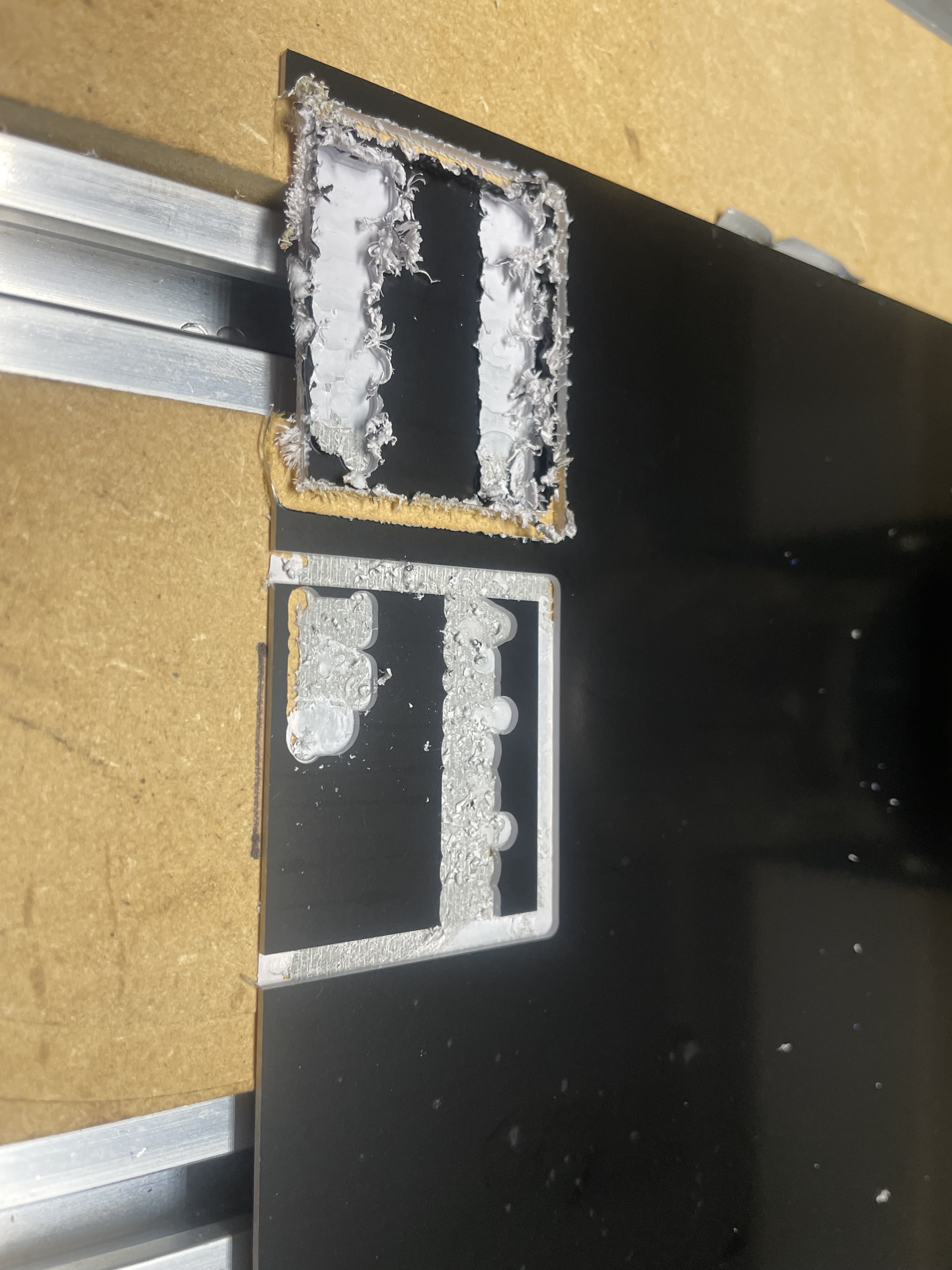
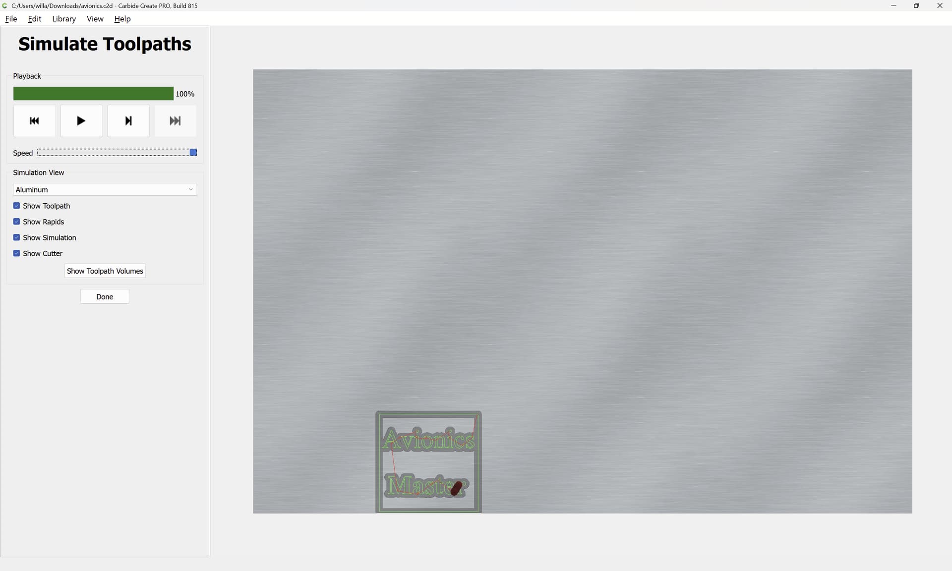
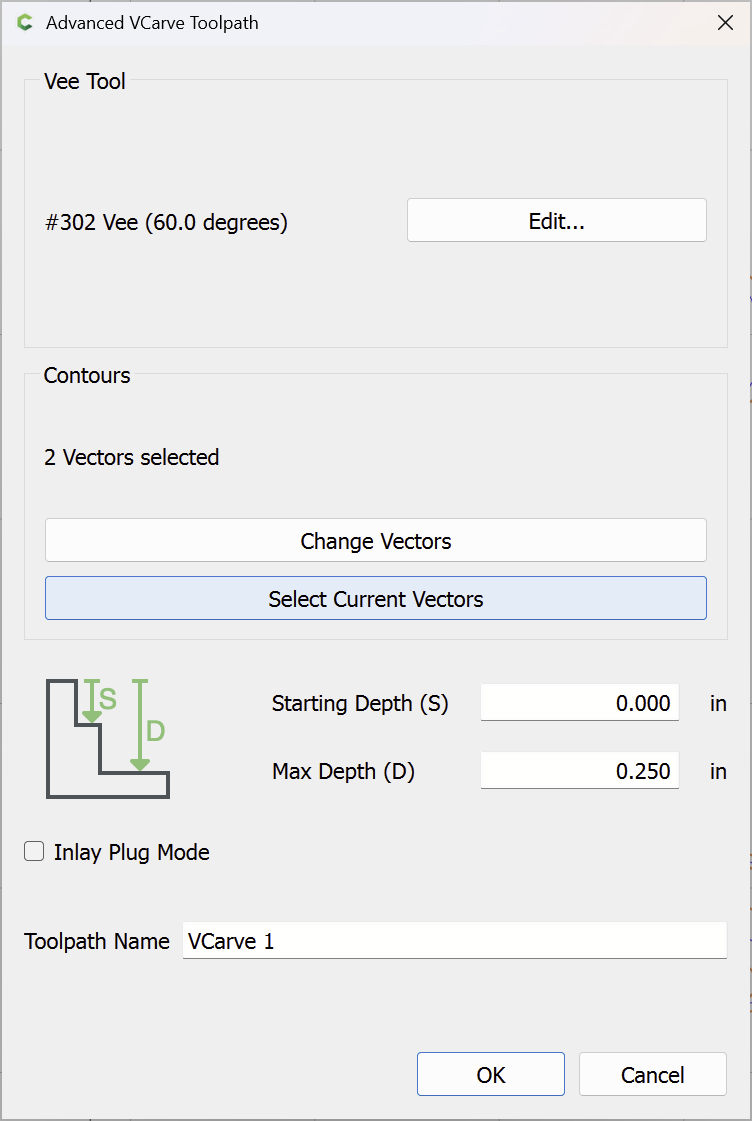
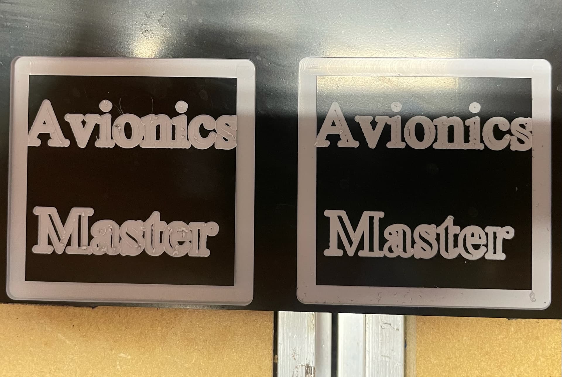
I switched out the .125 EM for a 60degree v bit and reduced the cut depth to .005 it looks OK.
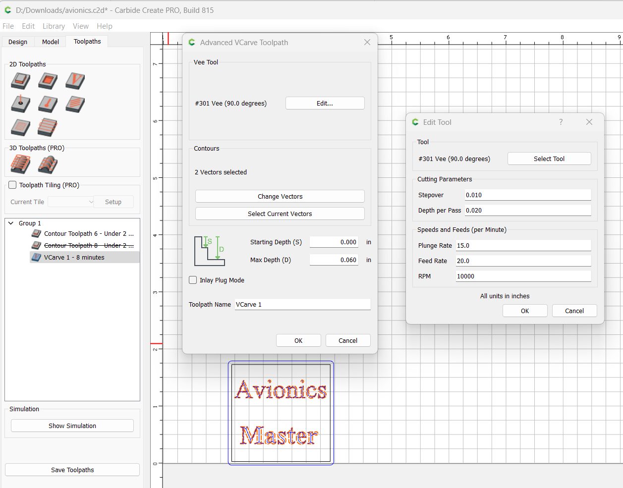
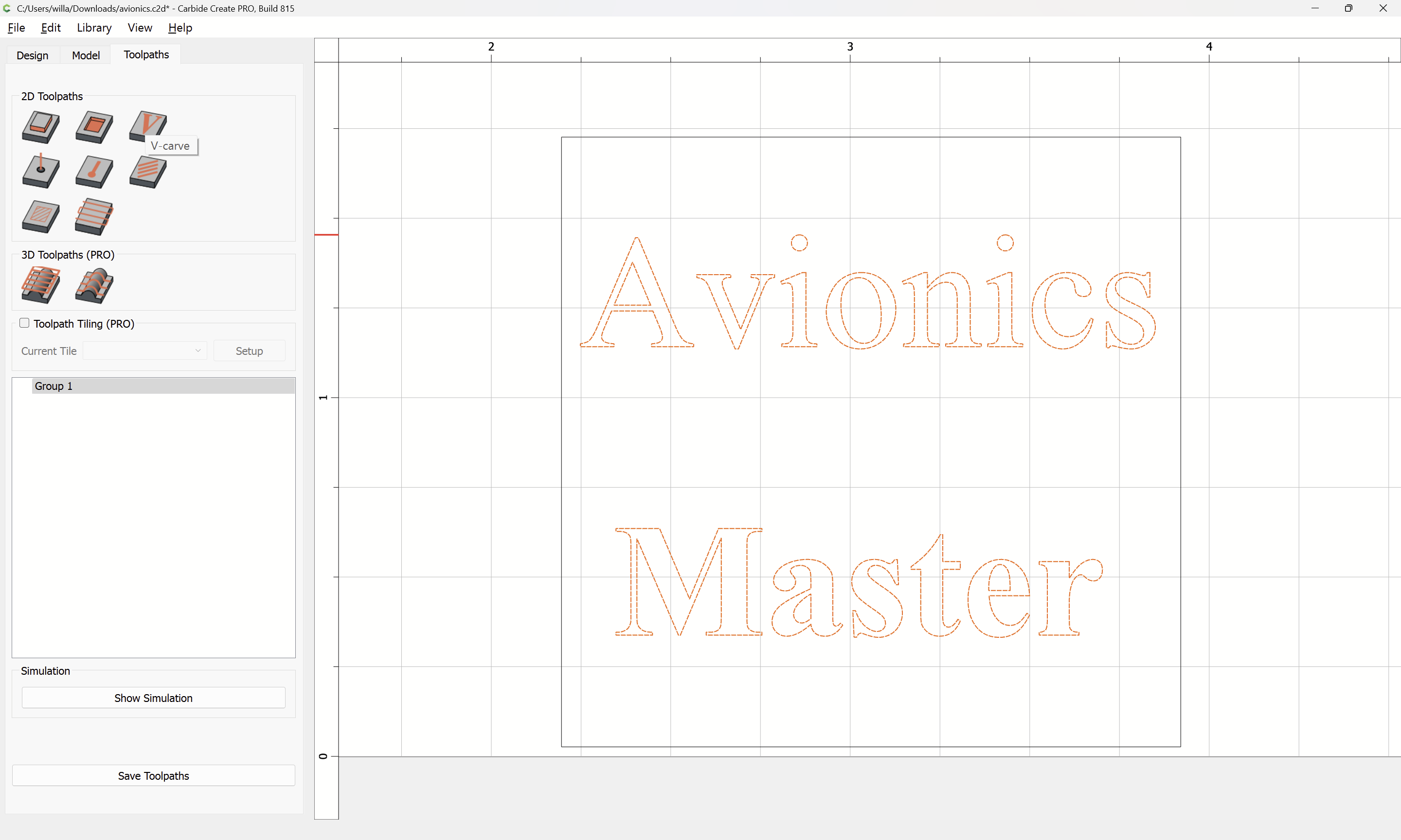
I suggest switching to the v bit and then running the file, if you like the results stop, if you want the carve to go deeper, reset the MAX DEPTH and run again until you are happy. avionics sdgy.c2d (140 KB)
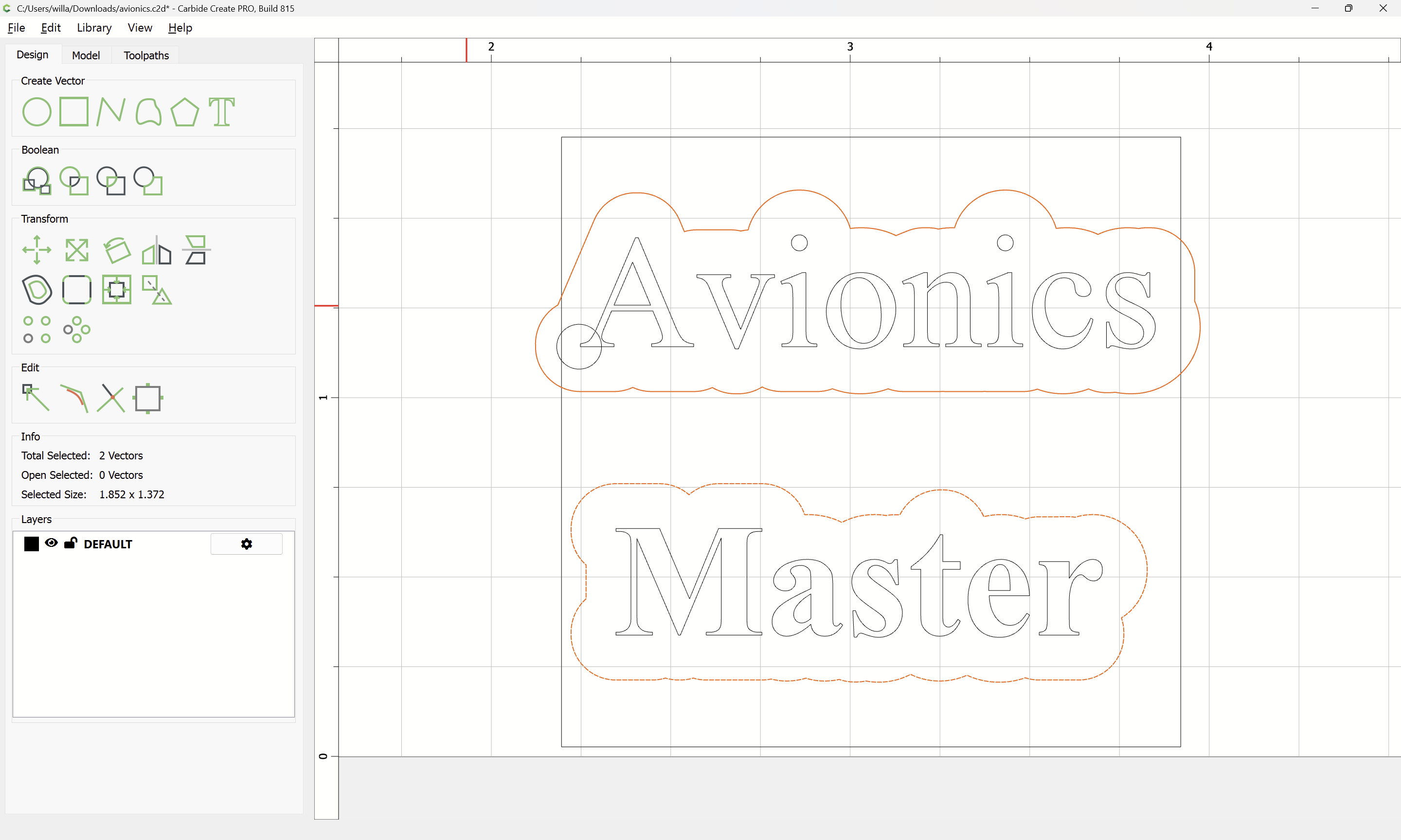
If you are using a Contour toolpath on an outline of a text, then it goes all the way around, as opposed to cutting out just the center as a V carving or a No Offset Contour will do with the central stroke as shown above.
It is not possible to use the afore-mentioned workaround for single-line fonts because the contrast of the font is too high, so that a tool small enough to cut the delicate serifs:
Ill do one from scratch, it would let me use vbits, and showed them with your file. but not mine. Weird. Thanks you helped a lot allowed me to illustrate my entire point of this thread. see next reply
SDguy Thank you your helping allowed me to make this crystal clear.
I used your file with the vbit and varied the depths. It helped BUT it also showed me the issue clearly. NO where is there a setting to make this font like this? at .020 it blew out the ( pocket )? at .015 it CLEARLY shows its cutting around the centerline of the text , this also makes it 2.5 times wider, which makes small fonts impossible. Ideas?