I’m looking at creating some labels for equipment at work. Are single line fonts the way to go, or would a simple font like arial do fine? What is everyone’s experience with this?
Also, what is a good source for the best materials to use? I read in a previously closed post that single flute bits work best. Any tips/tricks/advice is appreciated.
Look into ColorCore.
Alternatively, I have use Max Metal in the past. It is 2 very thin layers of aluminum with a plastic center. You can cut through the aluminum to expose the color of the plastic in the middle. The color choices would be greater with ColorCore though.
You can also get dual or even tri layer acrylic. Its really designed for laser work which is where I have used it. I guess you could get it to work on the CNC but the top layer is super thin so tolerances would be tight. You could however glue up your own acrylic to provide a multi layer effect.
Fonts can be controversial in the work place. Many companies have style formats that must be adhered to. There are also some state and federal regulations that must adhered to.
You primarily want to use a font that is easy to read so there are no misinterpretations. Machining plastics the single flute bit does work best.
Suggest you do a little research about font, size and placement requirements for your locality. Absent any 3rd party requirements make what looks best to you. For readability single line fonts would be easiest to read.
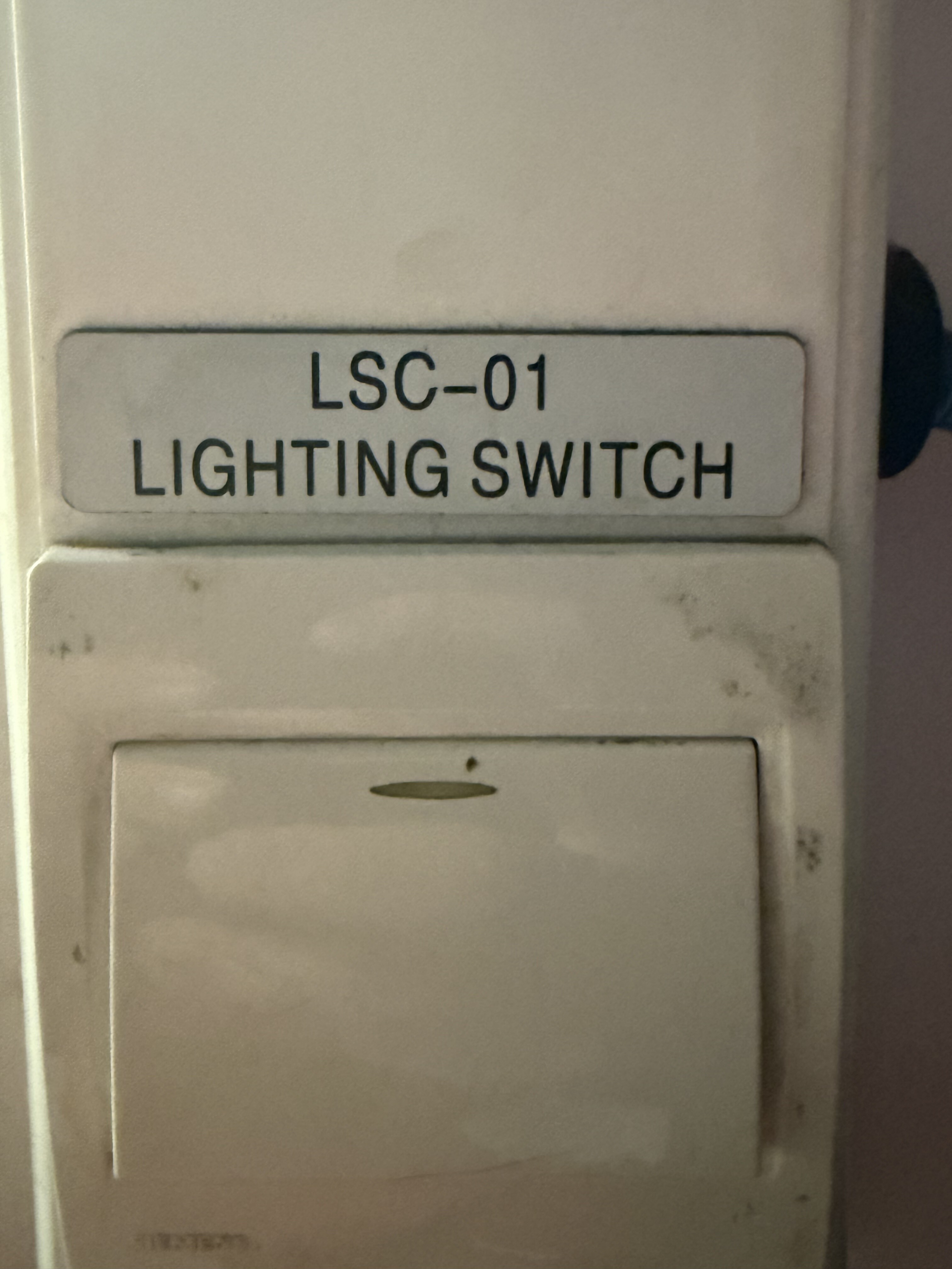
That sign in your picture is engraved in what is generically referred to as two-color phenolic. If you search for “two-color phenolic for signs” you should find what you are looking for.
For years (might still be so, I don’t have access to Google right now…) NASA’s specified font for labeling stuff was Futura. It has a pretty uniform stroke width.
use o-flutes. Low rotation speed, fast feed. Must produce chips, avoid melting. I do not recommend V-bits, their large surface that rubs on the material produce too much heat, so sharp corners of the letters cannot be achieved, therefor letters with round corners should be chosen, like this one:
or a free font like this
also appears nicely balanced, IMO too playful, but free. The Adobe DIN font IMO is the best, but several years ago I had to pay for it.