I have done several inlays over the past few years. I printed the post from Fenrus about the new inlay feature and have read it over several times. I have 3 signs to make and 2 of them need to have an inlay.
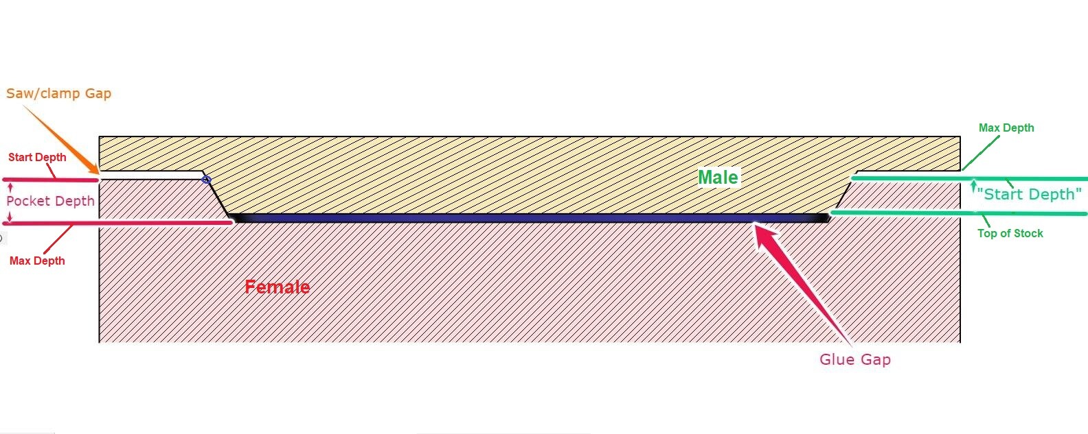
The feature in CC you check the inlay for the male inlay and you set the glue space at the bottom. My question is in the manual way of creating an inlay I would start the male inlay at .1" and that realized itself as the male inlay slightly smaller than the female pocket. In the new feature does the glue gap accomplish the offset to make the inlay slightly smaller than the female pocket? The instructions are to start the male inlay at the top of the material instead of starting at .1" for the manual method.
Is Carbide Create creating an offset to make the male inlay slightly smaller to it seats into the female pocket with the glue gap at the bottom. I have used the new inlay but had some gaps around and was not too happy with the result.
Fenrus suggested cutting the female pocket at .2" and the male inlay also at .2" with a 0.04" gap at the bottom.
Any suggestions to refine this procedure which Fenrus produced early in the release of the beta CC for the inlay mode.
When you use this method is the flat surface of the male plug flush with the flat surface of the female plug? I too tried following the guide this weekend and used the same dimensions but the plug didn’t mate flush. I think I had a shift in X due to too deep of a cut in one spot though so that may have led to my issue. Just trying to determine what to expect.
The inlay should not be flat with the surface of the pocket. The inlay should fit tightly in the pocket and to do that it must be slightly proud of the pocket. I used the Vetric method which starts the inlat at .1" below the surface and is making the inlay slightly smaller than the female pocket but the inlay is cut deeper so the surface of the pocket and the inlay are not even but the inlay is wedged onto the pocket making the surfaces where they meet tight.
I think “Glue Gap” in the inlay feature might be a bit misleading. What you’re actually defining on the male insert is the “Saw Gap”. If they are the same it’s insignificant.
What CC is doing is essentially setting the Start Depth for tracing the vector at (Max Depth - Glue Gap).
But then keeping the Start Depth for calculating depth of cut at the top, allowing you to still make multiple passes.
Previously, the manual method before the inlay feature, your first cut would be below the glue depth plane at depth of cut. Which in many cases was just a single full depth cut.
So it projects the vector down to the glue gap plane, then traces it at the glue gap depth. It’s not doing any lateral offsetting, other than a result of making the tool trace the vector at that height. (hope that makes sense. )
Your explanation makes sense. So in the Fenrus tutorial he suggested the glue gap at 0.04". Would agree that is a good number for wood? I can make another prototype but have a deadline for making 3 signs that 2 of them are purpleheart and maple. So I dont want to waste any purple heart and my maple stock is limited. I will try some secondary wood like poplar and some cherry to make sure this feature works ad advertised.
I have already made a prototype that has some smaller sized letters and I got some chipping of those letters when I ran them through the planner. I have learned my lesson on a planner and epoxy and wood inlay. You can take off some but not down to the surface of the project without the potential of disaster. I will plane some down but finish on my drum sander and then with an RO sander.
I have some lacquer sanding sealer on this prototype and in the smaller text I was able to fill the maple inlay with some natural filler. I was afraid it would show up lighter than the maple but after applying the sanding sealer it looks good but if you look closely you can see some jagged edges.
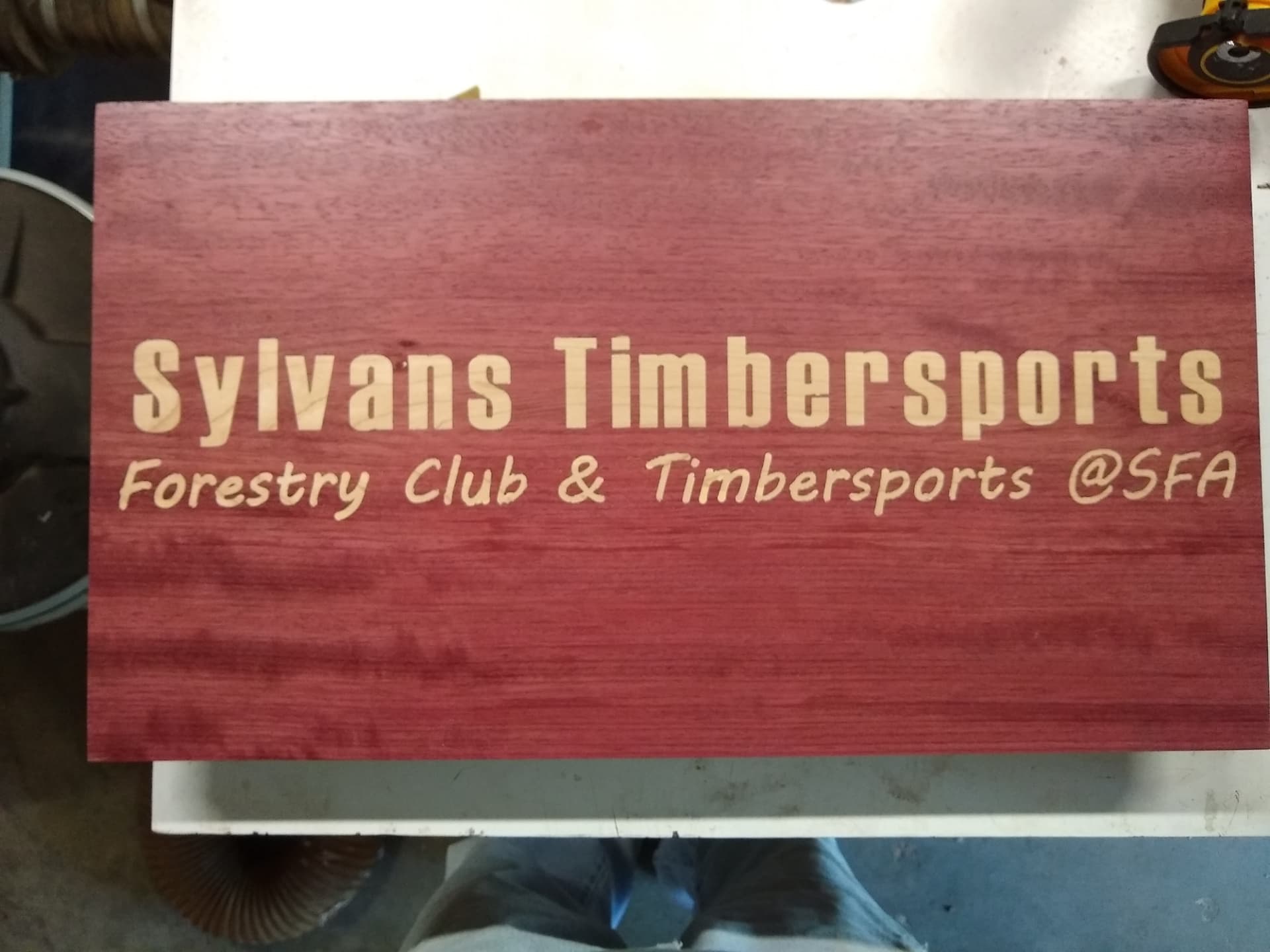
The larger letters are Impact font and came out well. The smaller font is more of a script font (cant remember the font name) and is about half the size of the larger font and did not come out as well as the larger font. Plus the Impact font is more of a block letter font and carved very well. The Impact font is 1.5" tall and the smaller is .75" tall. Fenrus had advice in his tutorial about trying to cut small objects.
I have shown the flip side of the above sign and it turned out pretty good. I have laquer sanding sealer on it and will cut a little deeper to .15" from .1" and the logo will be different. That logo is for SFA Athletics and will not be used on the final project.
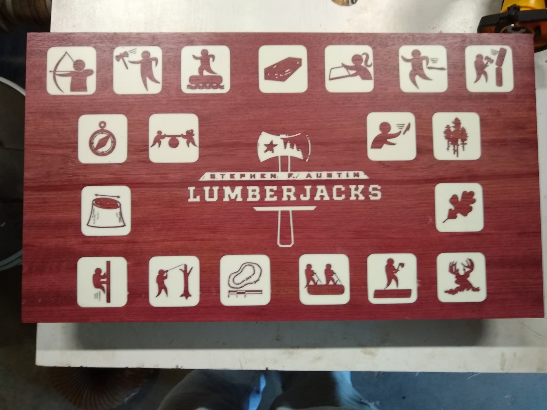
The design I am using has a couple of fine details. I have tried maple in walnut and walnut in maple and had issues with both but I did have a depth issue. I am going to try again and be more careful If that doesn’t work I may modify the design to remove the delicate portions but it is the logo of a company.
Your sign looks good to me though but I would be worried about messing up Purple Heart.
I would highly recommend practicing on similar materials. The parameters you use will depend on the material, hardness, how cleanly it cuts… and the vee bit angle & any runout or slop in your machine.
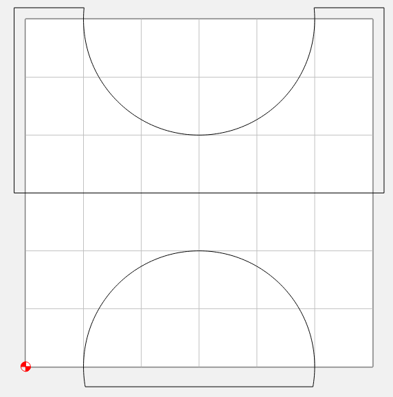
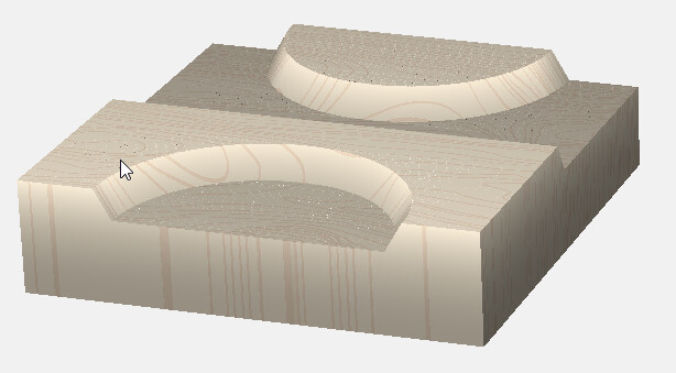
One thing I like to do is make my test cuts intersect one edge of the workpiece so I can see the whole fit. For your circle example, something like this. bandsaw the workpiece in half after cutting, and you can see the joint, the glue gap & top gap, and make any adjustments if needed to get a better fit.
The sign above was a 1/8" downcut for clearing and a 60 degree down cut vee for the vee cuts. I was thinking about trying a 15 degree vee cut because one of the signs has the SFA logo and that logo has an outline of Texas around it that is pretty thin. When I cut that one part of the inlay pulled out so I was thinking a 15 degree would cut deeper and give me more side surface to glue to.