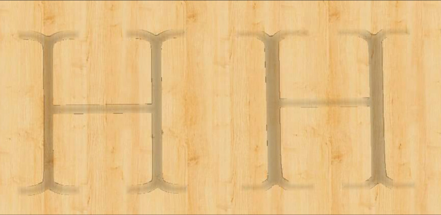
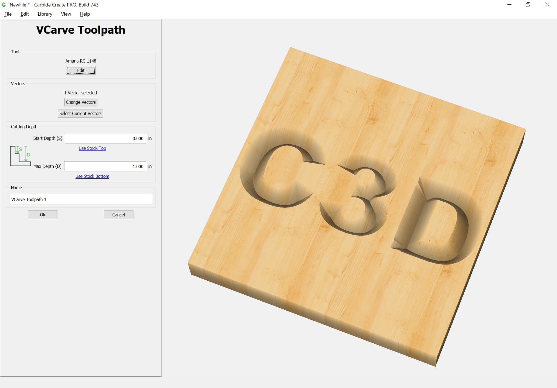
I am using Carbide Create and when carving letters larger than 2.5" I don’t get flat tops or bottoms. “H” is about the most noticeable. The larger the letter the worse the problem. Font doesn’t matter and it also is worse with a 90V Than a 60V but both do it. Seems like the toolpath is not allowing it to go across the tops of the letters. Using V carve and Advance V Carve. Can this be prevented or is it a software problem? Thanks
Post your file. I bet this is a vee carve. When you vee carve the bit tries to touch both sides of the lines. If you limit the depth the bit just goes down the center of the line. So when you do a simple vee carve use the “t” or bottom of material to get maximum cutting depth. However this can lead to cutting through on thin material.
Alternatively use Advanced Vcarve. You can limit the depth and the difference is an Advanced Vcarve only runs the vee bit around the edges and not down the middle like a simple vcarve. If your Advanced Vcarve is too small for the end mill even if you enable it it it will be skipped and just the vee bit will be called for and basically you get a contour cut around the edge of the object.
The default setting for depth on a VCarve should just always be ‘Stock Bottom’. I don’t know why CC doesn’t use that as the default, this problem just keeps coming up over and over and over…
Anyway, change the depth and see if that looks better in the simulation.
Draw up the V carving in profile, as well as the tool — that will show you how deeply you need to allow the tool to cut — if it’s not possible to make a normal V carving look good w/ a given tool/depth combination, try an Advanced V carving.
Even when using advance V Carve if I enter a max depth of more than .2" I get the problem. As you say the bit only goes down the middle of the letter but this is happening at deeper cut depths (over .2") which seems backwards to me. I will attach the file. It just has 3 H’s with the right hand one being what is happening with the deeper cut. H Test.c2d (96 KB)
These are 3 different shape H letters with different tools selected for each one. So, I don’t really think this is a good comparison of looking at the difference in the cut based on the depth.
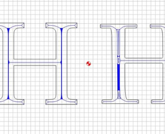
I modified your test with more consistent tools and depths for each different type of letter H and I agree with your assessment. The deeper you cut, the worse the tops and bottoms of the letter become. It should be squaring off that top and bottom line based on the toolpath IMO. Test is done at .2", .25", and .35" depths. 3H Test.c2d (168 KB)
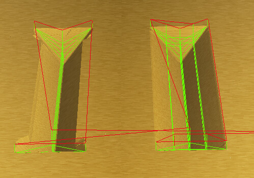
Will, how did you fix your cut between screenshot 2 and 3?
Based on the example I just posted, the part that is not cutting correctly is only 0.25" wide on the areas that are showing a problem, so a 90 degree V bit should be sufficient for that cut. At the very least, the bit should travel in a straight line to cut the border of the design (shouldn’t it?).
If the text is too wide shouldn’t advance v carve take of that by using the pocket tool to clean up the middle of the text. Even with advance v carve at a depth of more than .2 it is just running the bit down the center of the text.
It definitely seems like this is a bug or a deficiency in the CC toolpath generation. It isn’t like we are cutting past a physical limit of the bit.
For the third H in the file I posted, The bit should travel horizontally to cut the top and bottom portions of the H, but it travels in an arc. It is not calculating the toolpath correctly if it is not following the perimeter (i.e. the designed path) of the shape.
This is like carving a pocket with a 1/8" bit and it only carving a small line around the perimeter because the bit isn’t wide enough to carve the pocket in a single pass.
I posted an example above.
That’s my point. The algorithm is not right. It should look right with an advanced V carve toolpath, but that doesn’t look right either.
Or maybe I’m just misunderstanding what V carve should be used for. I assume it would look right if the font was a single line font, correct?
The problem isn’t the limitation of the tool. Its the algorithm that’s at fault.
Since the current algorithm is limited by the tool, it should issue a warning to the user when it’s applied to geometry that the algorithm doesn’t work on.
Limitations are fine so long as they are well communicated. This just ends up being a confusing, frustrating silent failure.
The preview matching what will cut communicates the limitations far more effectively than a dialog which would become more annoying each time it was seen.
Moreover, folks have used this to make rather interesting effects such as making stars from squares, and engraved effects on solid fonts.