So I’m working on a plaque and I need some honest feedback and criticism. I feel like I’m really good at the “science” of using my SO3: Toolpaths, measurements, feeds / speeds, etc. However I feel like I suck at the “art” portion of it: Font choice, sizing, placement, graphics, etc. Would any of you (especially those with graphic design or artistic backgrounds) give me some feed back on this design? Is this something you would walk by and say “Cool” or would you say “Good god put it out of its misery.” I plan on using this thread to display the finished product as well once complete.
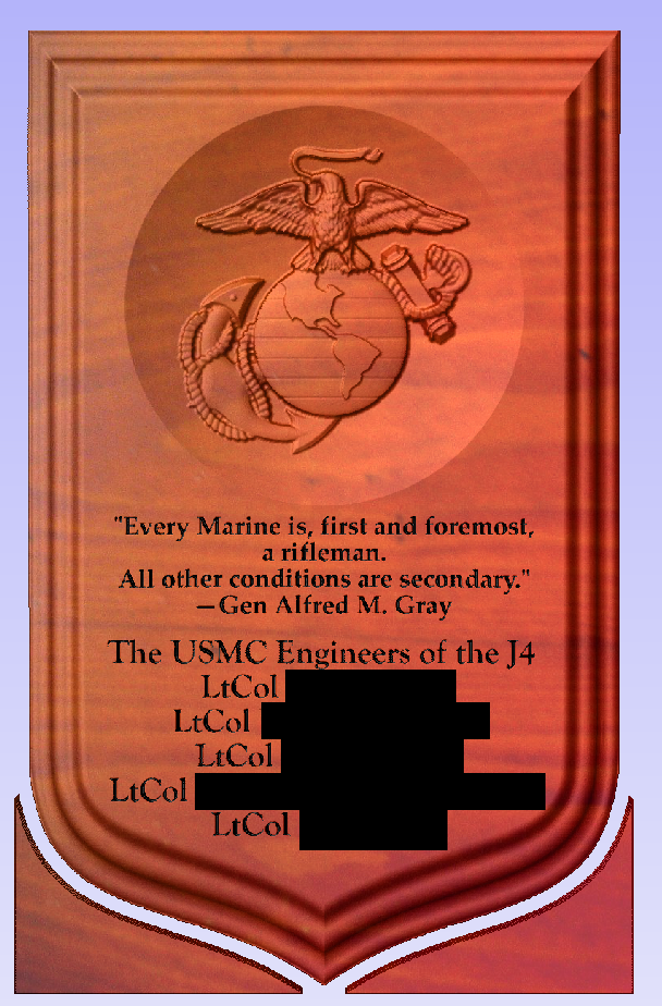
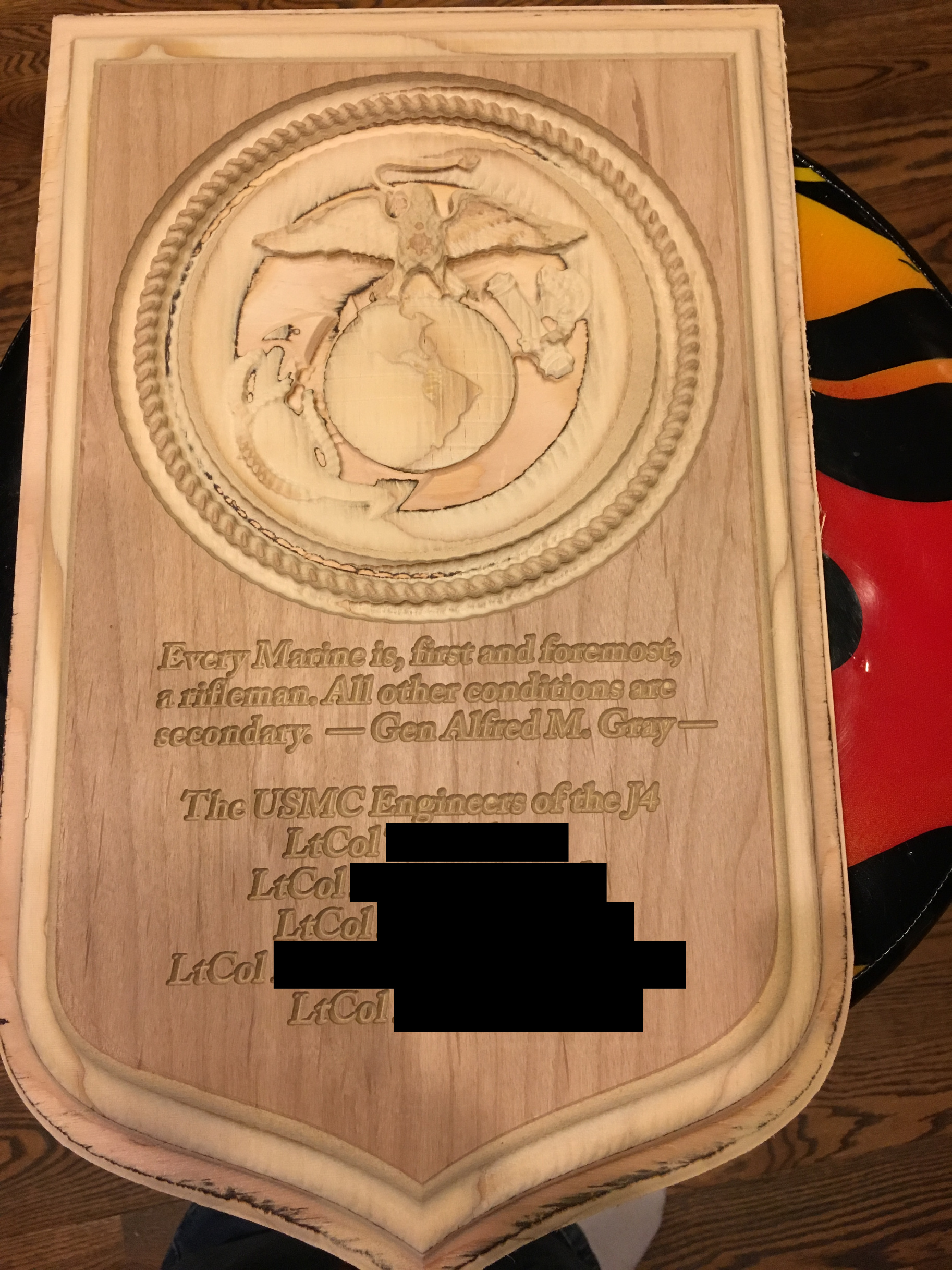
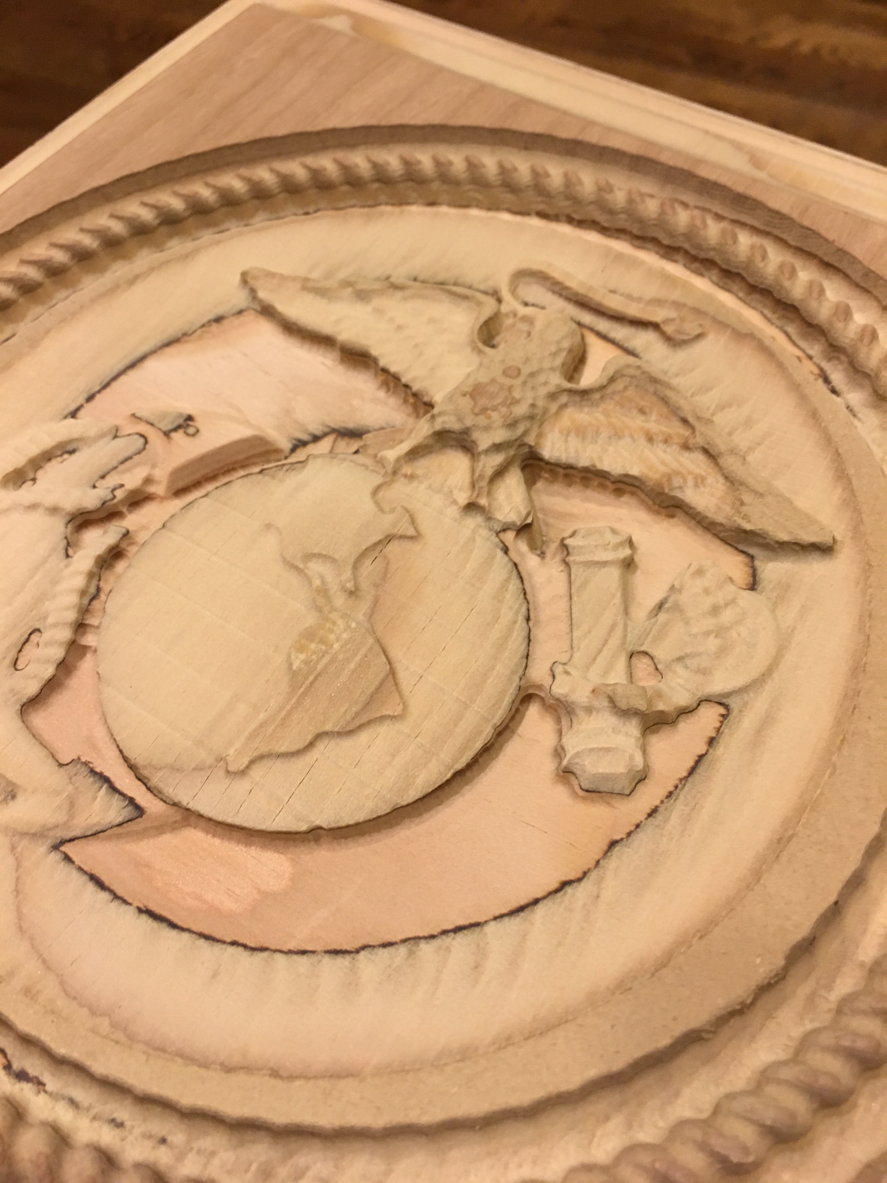
The plaque will be made from dark walnut and the text will be V-carved. I like the 3D model used for the USMC Eagle Globe and Anchor (from Vectric’s Design and Make store). I’m still not sure on fonts to choose. The whole plaque will measure about 10.25" (~26 cm) wide by 16.5" (~42 cm) high.
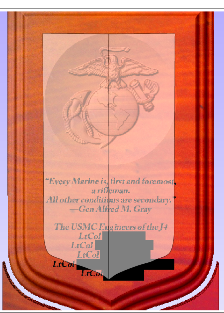
If I was designing the plaque the only thing I think I would do different would be to make the space around the dish equal to where your edge profile starts… make the top the same as the sides… if you have enough room, try making the distance between the dish and the top of the text the same also… But I think if you make that margin at the top the same as the side you should be looking really good!
The best design resources to my mind are those for calligraphy.
A couple of things which come to mind are:
Please use curly quotes, not stick quotes
If things are going to be different sizes they should be unquestionably so, and there should be a reason for the difference — the other option would be to differentiate things by placement and spacing
spacing should include space all around — you should have a bit of room to breathe at top and bottom.
@Ton80, thanks for the ideas regarding spacing. I think I will have to mess with the sizing of the model and text a bit to get it to work out, but that’s easy enough.
@WillAdams, Today I learned that curly quotes are good typography (and how to make them). Thanks for the other tips as well. Any ideas of a good font you think would vcarve well in this case?
My inclination would be to use Caslon, since it’s a typeface old enough for the Marines to have used when they were founded.
An old printer’s adage is “when in doubt, use Caslon”.
If you can get a version which allows for oldstyle figures and true cut small caps, they help with setting a mix of caps and numbers as are used in some ranks and unit designations.
Here’s a new version. Resized some things. Text size is currently about .3" tall. I probably can adjust that larger. The font is Adobe Caslon Pro Bold, and set in italics. With curly quotes… I also got smarter with my 3D finishing toolpaths and split up the outer edge on the plaque from the EGA. Combined together in one toolpath with a rastering setup, and they would take 8+ hours for a .125" ball mill. Now split, they only take 2+ hours each. There was a lot of wasted motion rastering the whole thing at one time.
You mean like the justification of the text? Like make it all left justified? I could do that but since the names are under the black blocks they will be uneven on the right, unless I’m not understanding you.
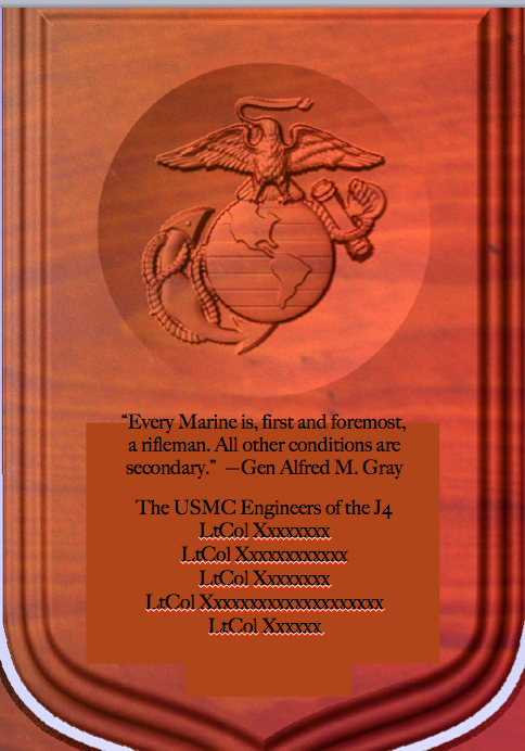
Consider making the author text smaller than the Quote.
The lower part might read better if the font was a little smaller with more space between lines. Left Justified the lower part might read better too, if slightly smaller.
I wasn’t suggesting justification, just that the bottom two LtCols shouldn’t stick out into the margin defined so effectively in the upper half of the plaque. But I’m beginning to feel like maybe I’m one cook too many here… It basically looks pretty good already.
I see what you are saying now. I’m at work so not in front of my file, but I will try some edits like this tonight. And your input and effort is very much appreciated.
I was looking at this earlier today (on my lunch break) at work and was thinking the same thing. Being Marines you could go “maritime” and do a nice rope hoop around the EGA, I think that would look really slick. It looks good as-is, but a few little details like this could really make it shine. Another thought would be to carve the EGA proud of the rest of the plaque instead of in a dish, then do a nice decorative border around the shield to tie it all together.
Ex-USN here, and I have to admit that I’ve always been a little jealous of the EGA, it’s a really cool piece of artwork. Back in 1990 I was just short of going into The Corps, but the stupid recruiter kept calling me at 6am on Saturday mornings to go PT. He finally irritated my 18 year old self enough that I walked past his office and enlisted in The Navy (true story). I ended up working in aviation structures (sheet metal, hot bond, etc.) alongside several Marines doing the same job, so it all worked out in the end. Admittedly their camos looked way more comfortable than my Navy dungarees, but I ended up in flight deck greens by the end of my enlistment which weren’t so bad
Oh yea, almost forgot. I know this example is just in preview mode, but when you run the actual thing make the grain of your wood go vertically instead of horizontally. I recently did a family crest project that I ended up running twice. The second time I ran the grain up/down and the finished product looked a whole lot better. Remember, it’s a shield, and a shield would likely be constructed of wood running vertically, not side to side. Just little things to think about when you’re cutting, think of the subject matter and design the way the real thing would be assembled.
The only contribution I have would be to do away with the quotation marks all together. The placement and formatting indicate that it’s a quote, no need to use quotation marks. Put the quote in block by itself, cite the source below with lines on either side to indicate source visually.
Thanks all for the continued comments. I was working on a separate project this weekend and am now getting back to this one.
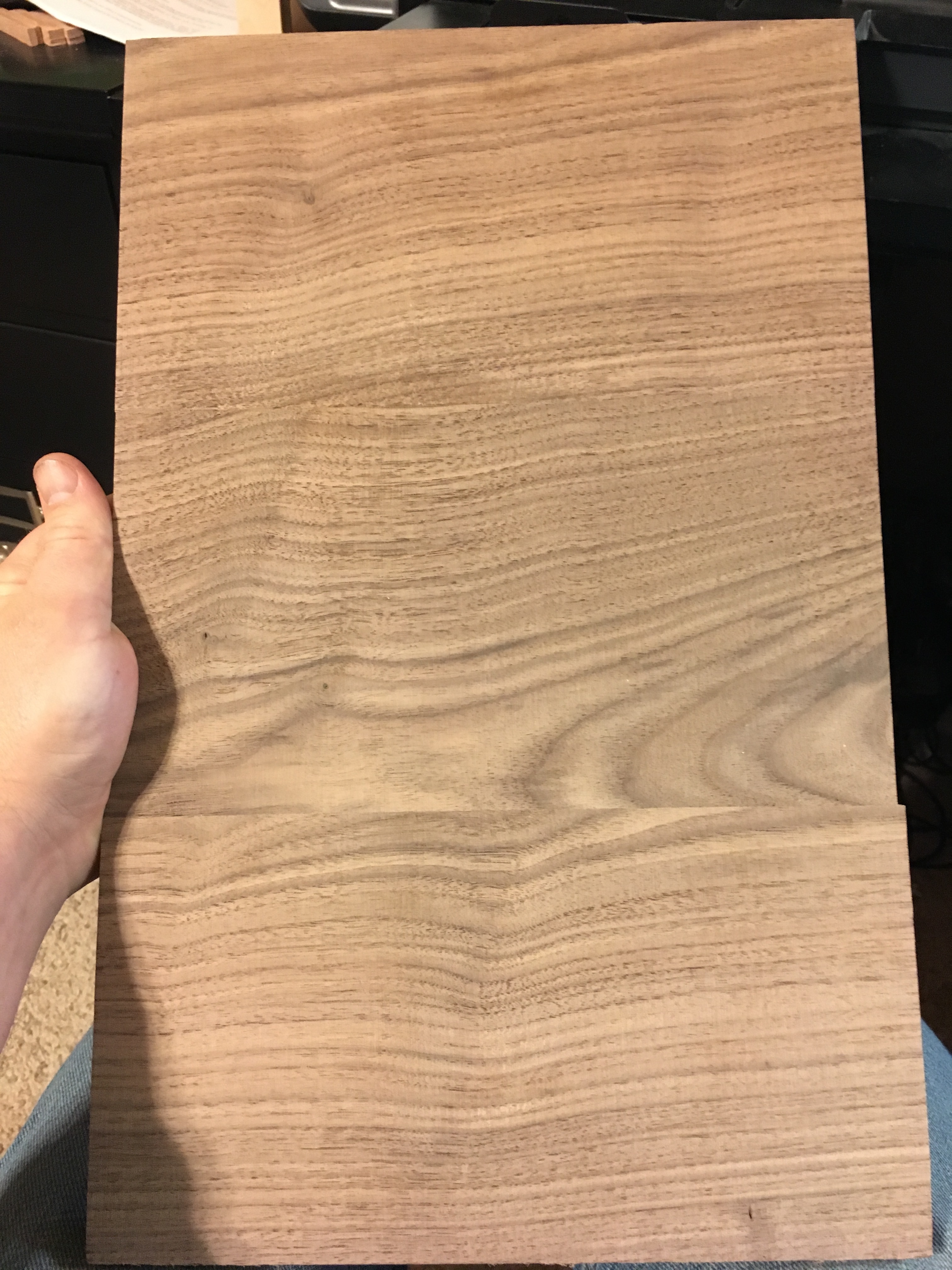
Dan (@DanoInTx) I may take your suggestion about the circle, however its more of a bowl because its a 3d relief carve. I will toy around and see if I can make something around the edge. However I disagree on the wood grain direction. I played around with the wood grain going either way when I was coming up with the first design, but I like the grain going horizontally. Mainly because this walnut I am using has a really pronounced grain, and I think it will look better since your eyes move left to right to read, that the grain goes the same direction. If it was less pronounced I might go vertically as you said. See picture below of the glue up I did for this.
Stephen (@MaxamillionX72), I like your suggestion regarding the quote and may incorporate that as well.
Picture of the glue-up stock I’m using (the camera made it loook much lighter than it is):
Thanks again all for the advice and assistance. Finished up a complete mock up in scrap plywood tonight. Overlooking the crappy wood (the detail is there, its just hard to see), I think after a few minor tweaks to spacing this is going to turn out excellent. All the toolpaths are looking good.
Thanks, I think it will definitely be better in Walnut. The details will pop out more in the carving. Also, the feed adjustment is a life saver here in CM4. I just couldn’t get G-wizard to spit out anything of value for feeds / speeds (it kept telling me 27000 RPM and 190 IPM, basically run it maxxed out). So I started with the Vectric built in conservative estimates of 50 / 20 IPM and ran the 3D portion at about 22000 RPM. I was able to crank it up gradually to about 90 IPM with no issues. Probably could go even higher, but I think its a wash because of the short movements involved.
 I also got smarter with my 3D finishing toolpaths and split up the outer edge on the plaque from the EGA. Combined together in one toolpath with a rastering setup, and they would take 8+ hours for a .125" ball mill. Now split, they only take 2+ hours each. There was a lot of wasted motion rastering the whole thing at one time.
