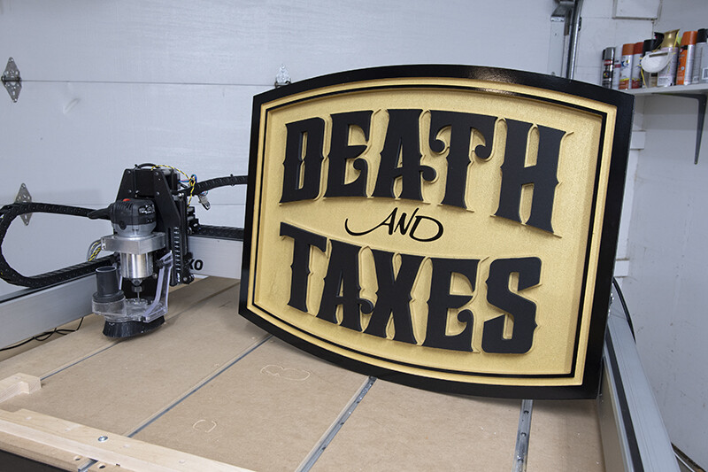
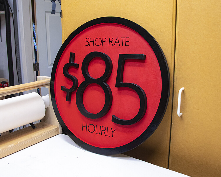
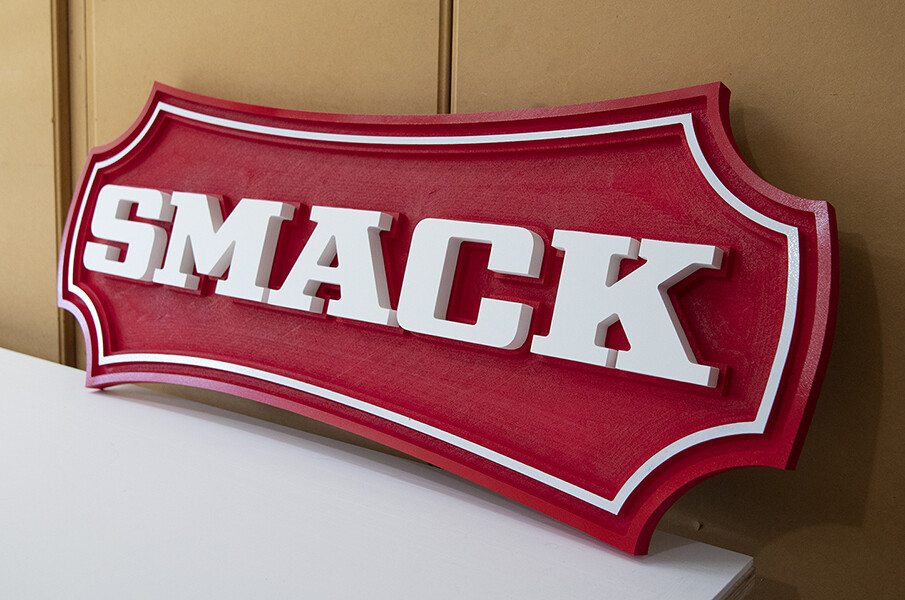
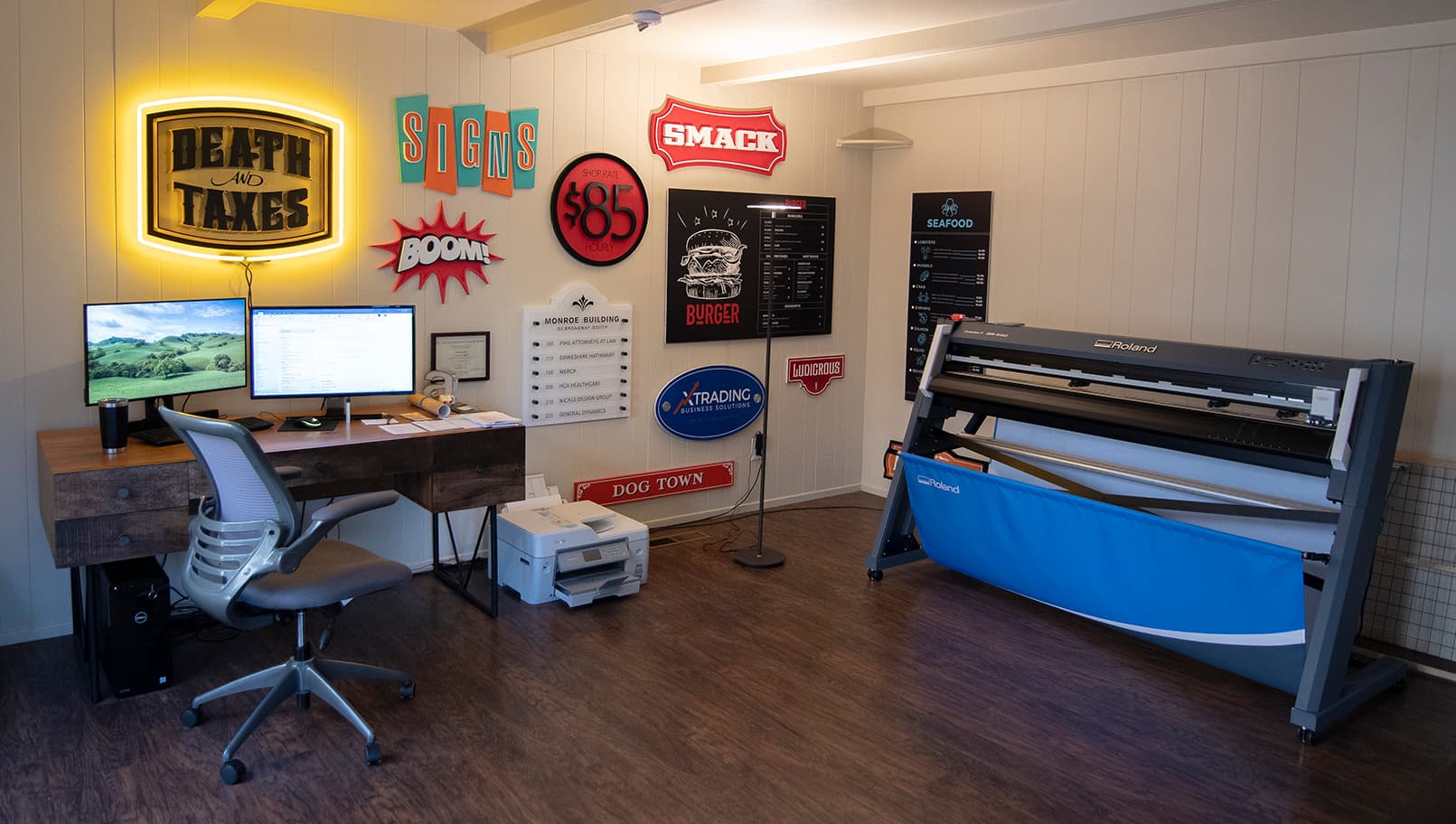
I’ve posted most of these before. Posting them all at once, hopefully spark some inspiration.
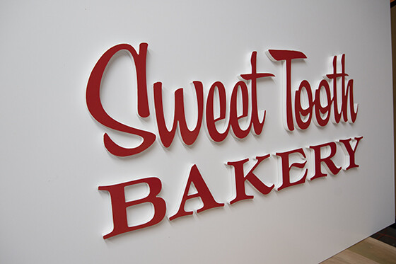
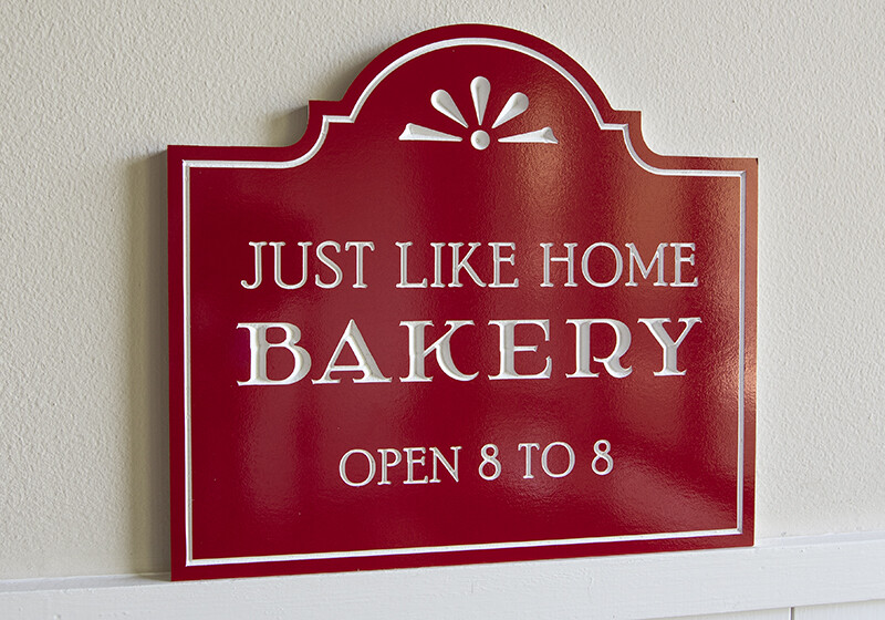
Nice! For the Bakery sign, is that PVC that you painted red and then cut out the letters? How do you align then when they are mounted?
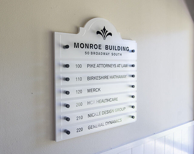
That Monroe Building one looks really good, what are the standoffs that you use? Is that painted MDF or PVC as the white backing?
Hey Jonathan,
Everything is PVC.
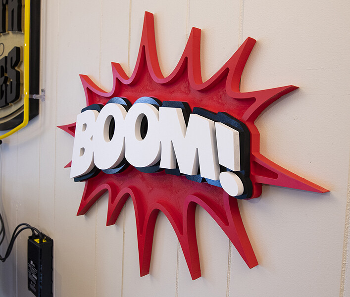
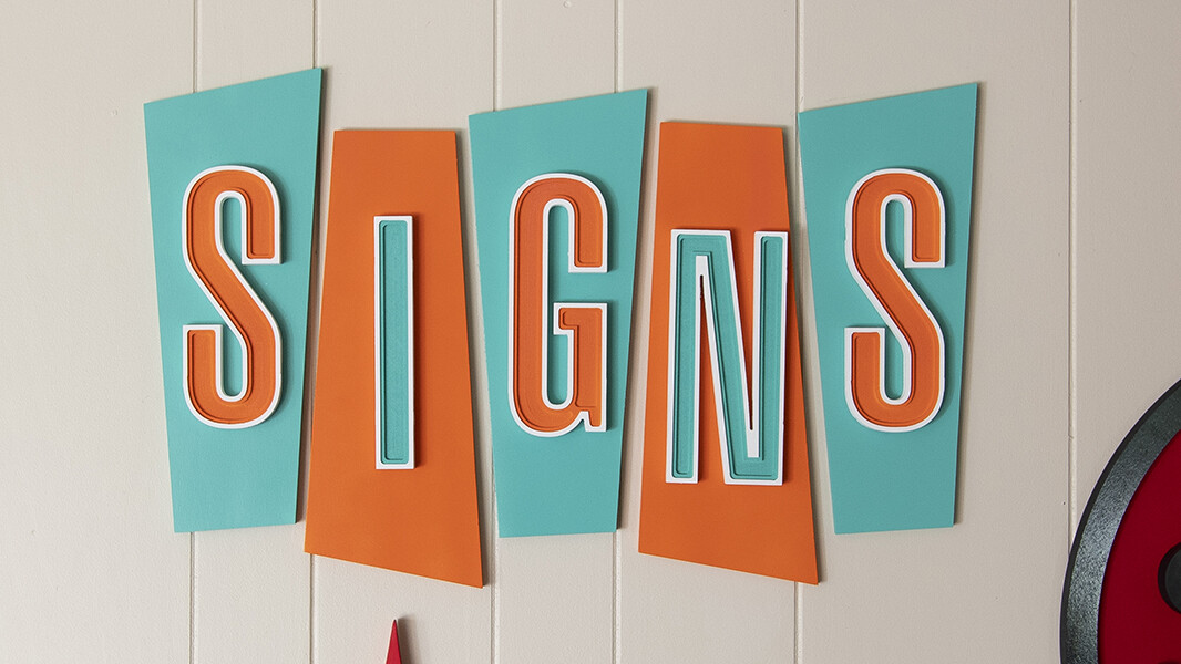
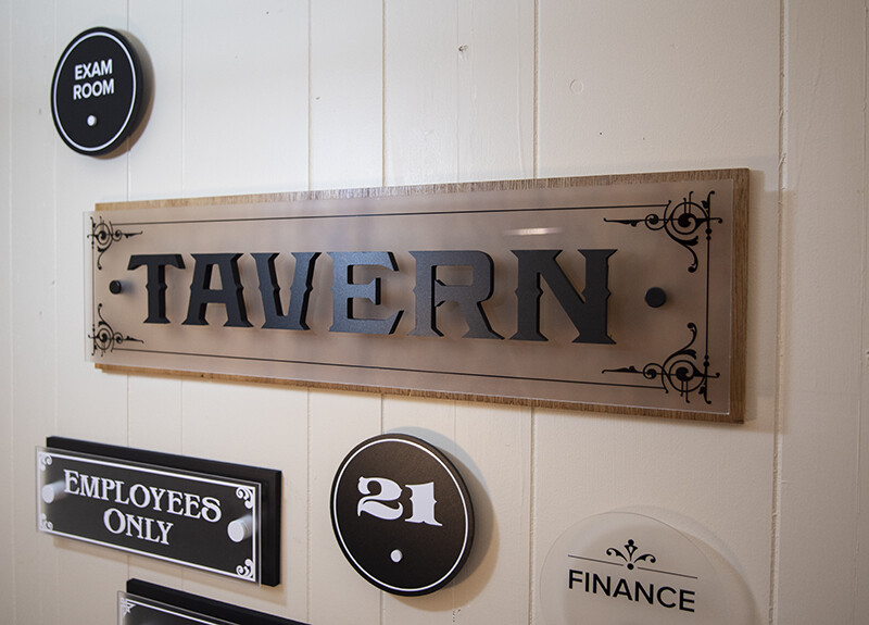
The lettering is 1/2" thick PVC. First I lay down the colored vinyl film on a sheet of PVC, either white or black. Then I lay a piece of premask on top of the vinyl to protect it while cutting. I then cut out the letters on the router. For installation I usually just use double-sided adhesive tape. I will make a pen plot with my plotter to make a pattern to tape on the wall and install the letters spaced correctly. If you dont have a plotter you can just use your printer and tape the pieces together to make a pattern.
The monroe building directory is 3/4" white PVC. No paint. I used a matte 1/8" acrylic for the name strips. I just bought cheap stand-offs off amazon.
Anytime I paint I just use Krylon. It usually works well but I’ve had some failures. Painting is not my strong point.
Dennis
Place the Krylon can in a bowl of hot water 15 minutes before painting your project
Thanks Ken, I will try that.
Dennis:
You have sparked an interest and by the way your work is wonderful.
Actually, I am looking for some help with sign making and since you seem to have mastered the art I thought I’d ask. The signs I have made in the past, and most of those I would make in the future, have been and will continue to be, much smaller than what you are making.
I usually like to make small things like door name plates, small plaques with Bible verses, etc. and I have run into a number of issues. First is the issue with painting because I always want more than just one color. To help with this I have used a product called OraMask. However, the problem I am running into is that especially with lower case letters: a, e, d, o, p, b, d, m, n, etc. the OraMask tears away from the center of those letters. Having to try to hand paint those can be problematic at best and impossible at worst.
I suspect this may have much to do with both the font and the size of the letters. Have you run into this issue? Are there some particular fonts that you recommend that would work better? Are there some minimum font sizes that you would recommend?
Thanks and blessings,
Mark
Hey Mark,
I find the smaller signs are more difficult to make perfect. I think you are on the right track using a mask. Maybe you can find a mask with a more aggressive adhesive. I am not sure what brand I use but I do have issues with the smaller signs and obviously a letter style with a fatter width will give you more surface area to apply your mask.
I like cutting my letters out and I usually dont try anything smaller than 3" in height. Getting a clean cut you will have to put tabs on the letters then file them off.
Have you tried v-carving the letters? I will lay down some vinyl on my PVC board and then cover that with some premask to protect it. Something like this. The V-carve actually produces a beautiful crisp letter. Lastly it always starts with a good clean design.
“Birkeshire” Hathaway - might want to check that.
Yea, there are a few misspellings on that sample.
Holy Cow these look amazing. A friend asked me to make him an outdoor sign and my instinct as usual is to make it out of wood. in another thread a lot of people recommended PVC and actually sent me a link to this post.
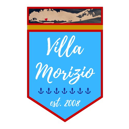
So my friend asked me to make him a 18x27 poolside sign for his backyard on my Shapeoko. (Outside, exposed to elements, Long Island weather)
Being 18" across my first thought was plywood of some kind. But after seeing your examples maybe PVC really is the better option for this project.
So any recommendations or guidance would be amazing. thanks