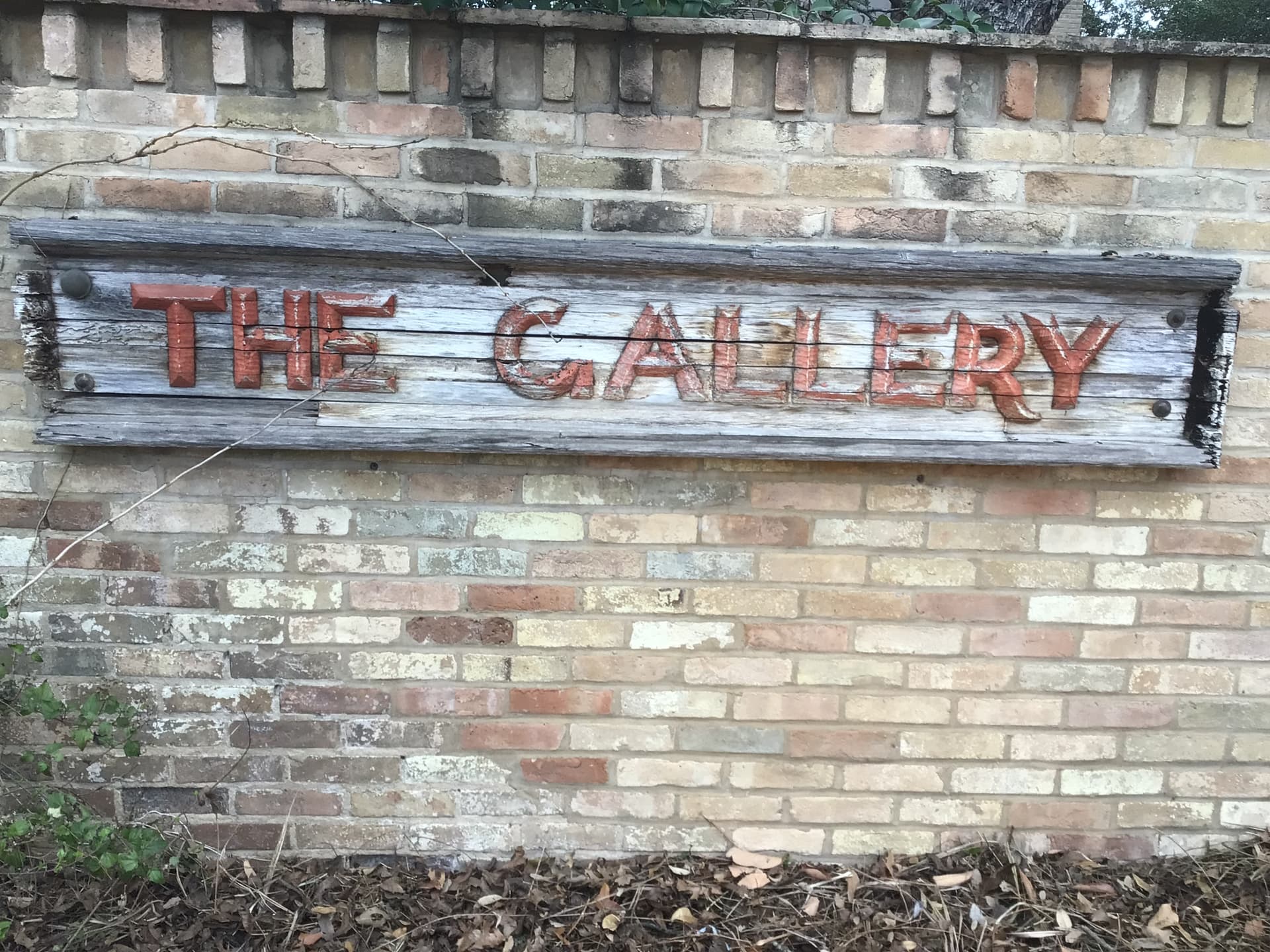
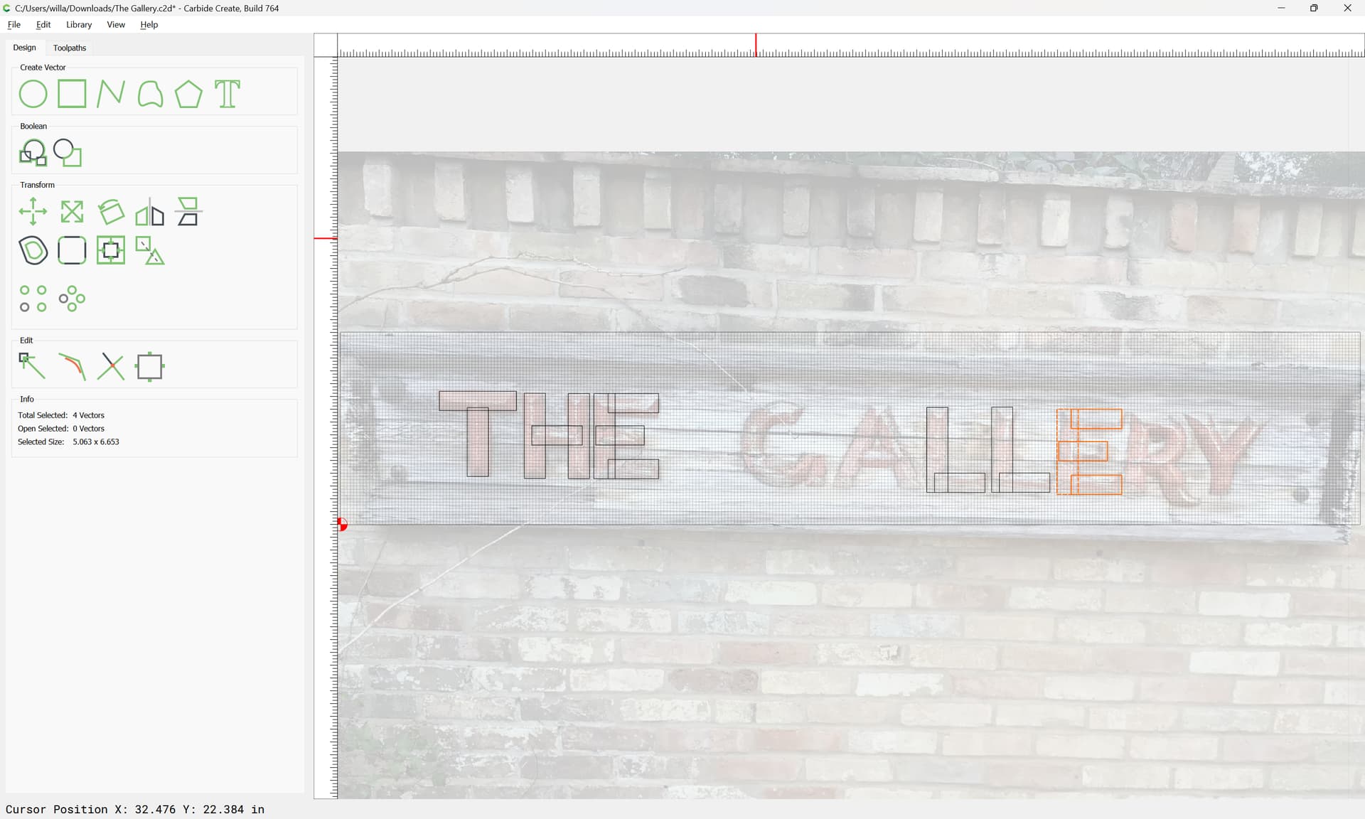
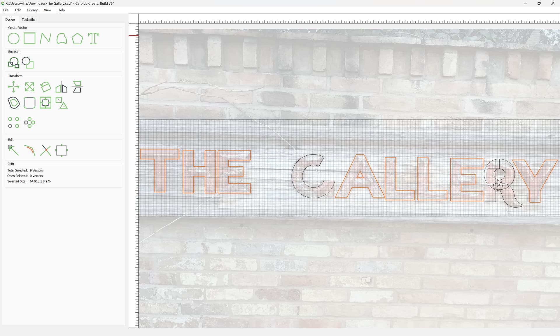
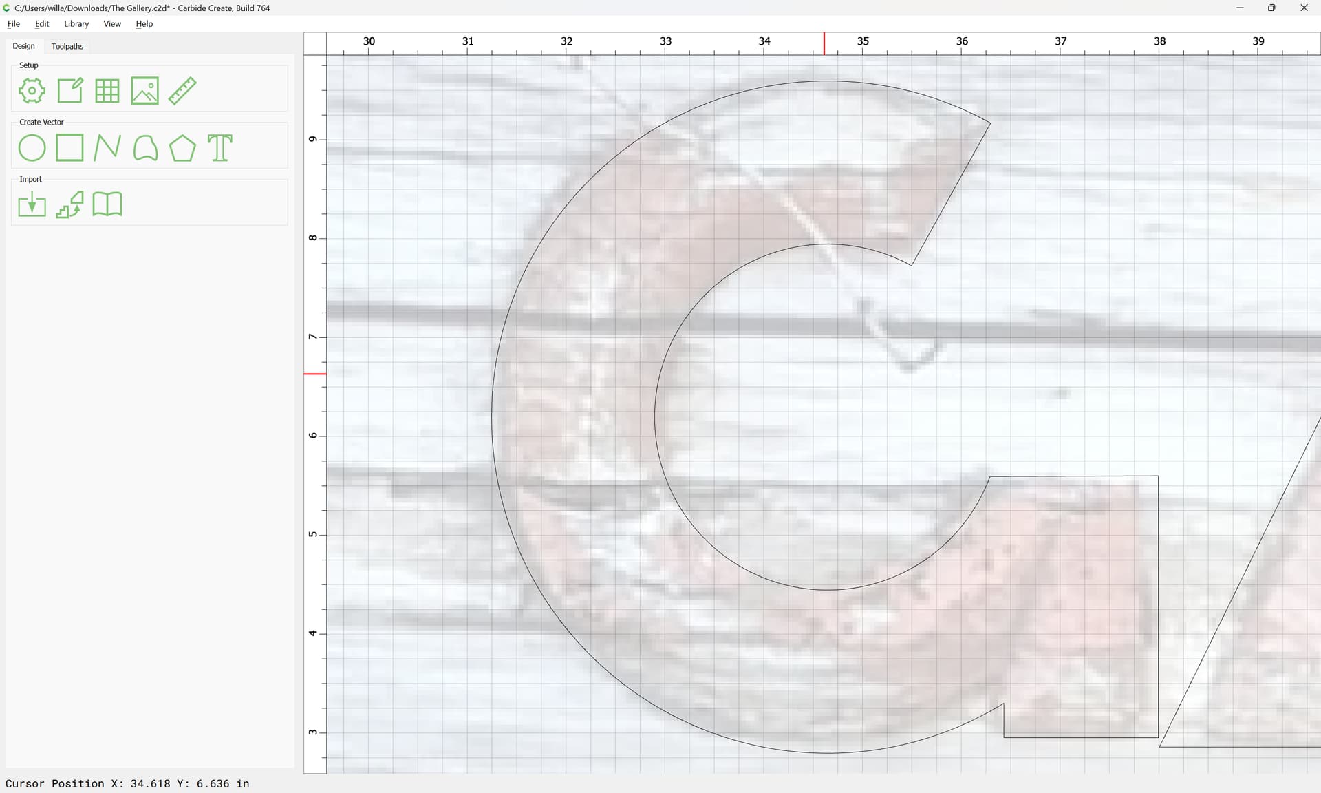
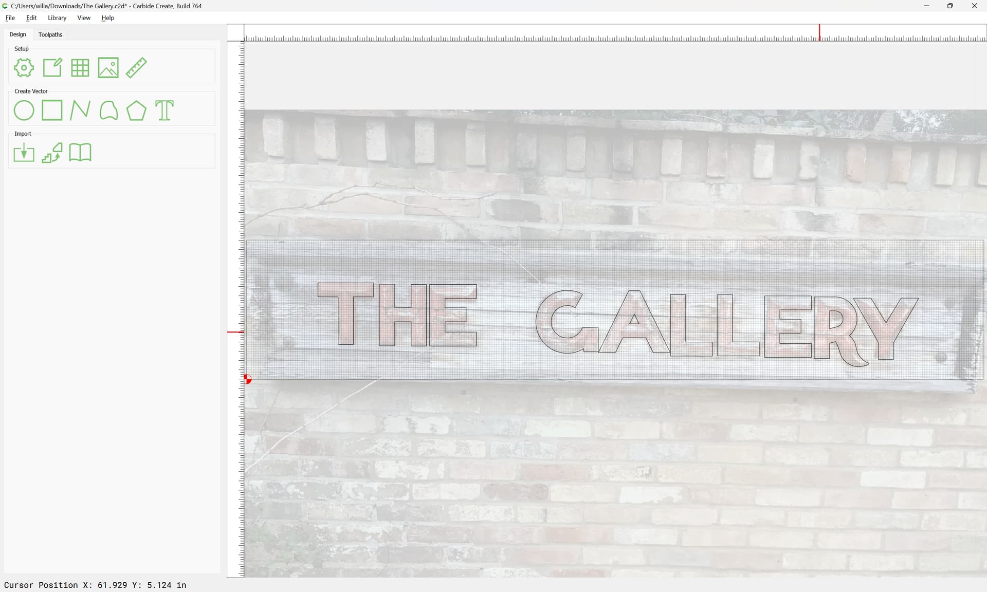
I have been asked to assist with replacing a 40 year old sign for a condo association, and am looking for possible fonts for the lettering. Any assistance would be appreciated. The association wants to keep the original flavor. Sign is 84 inches, letters are about 7x6. I will attach pics as soon as I figure out how to.
Why not preserve the charming original design?
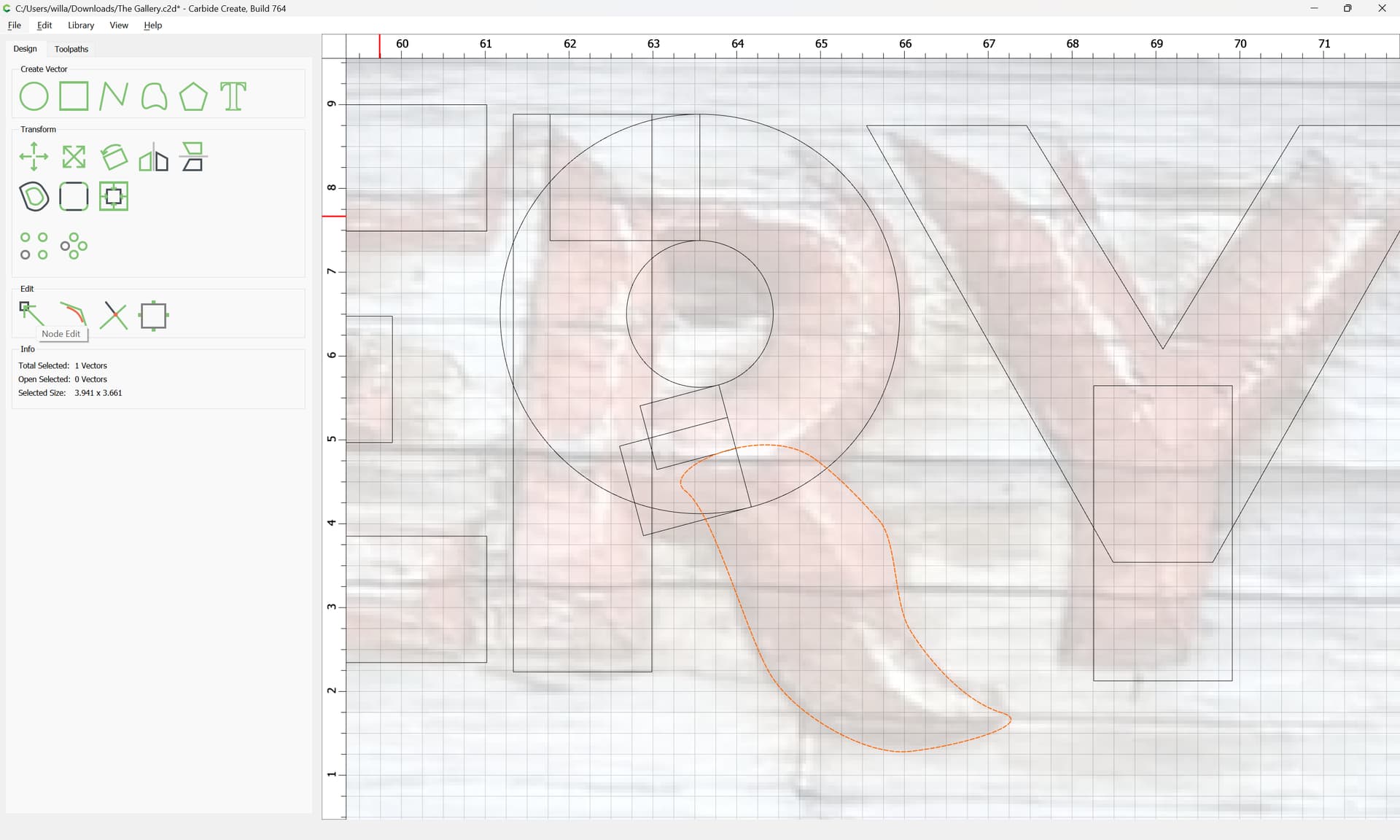
It would be pretty simple to straighten out the first photo and re-draw based on that.
Let me know if that’s something which your friend would want and we can do it here as a tutorial.
1 Like
That is an amazing amount of carving in the original sign. Are you going to mill it out of something thick again, like 8/4?
I am all for any help you can provide. Original design has a lot of charm, as you say. Tutorial would be outstanding.
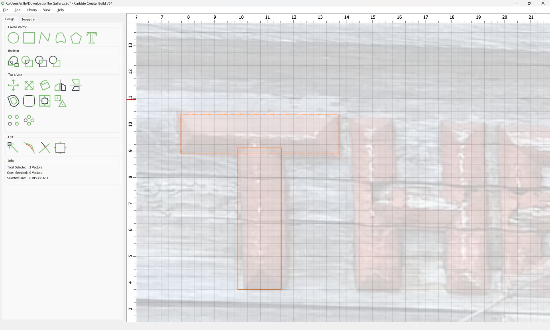
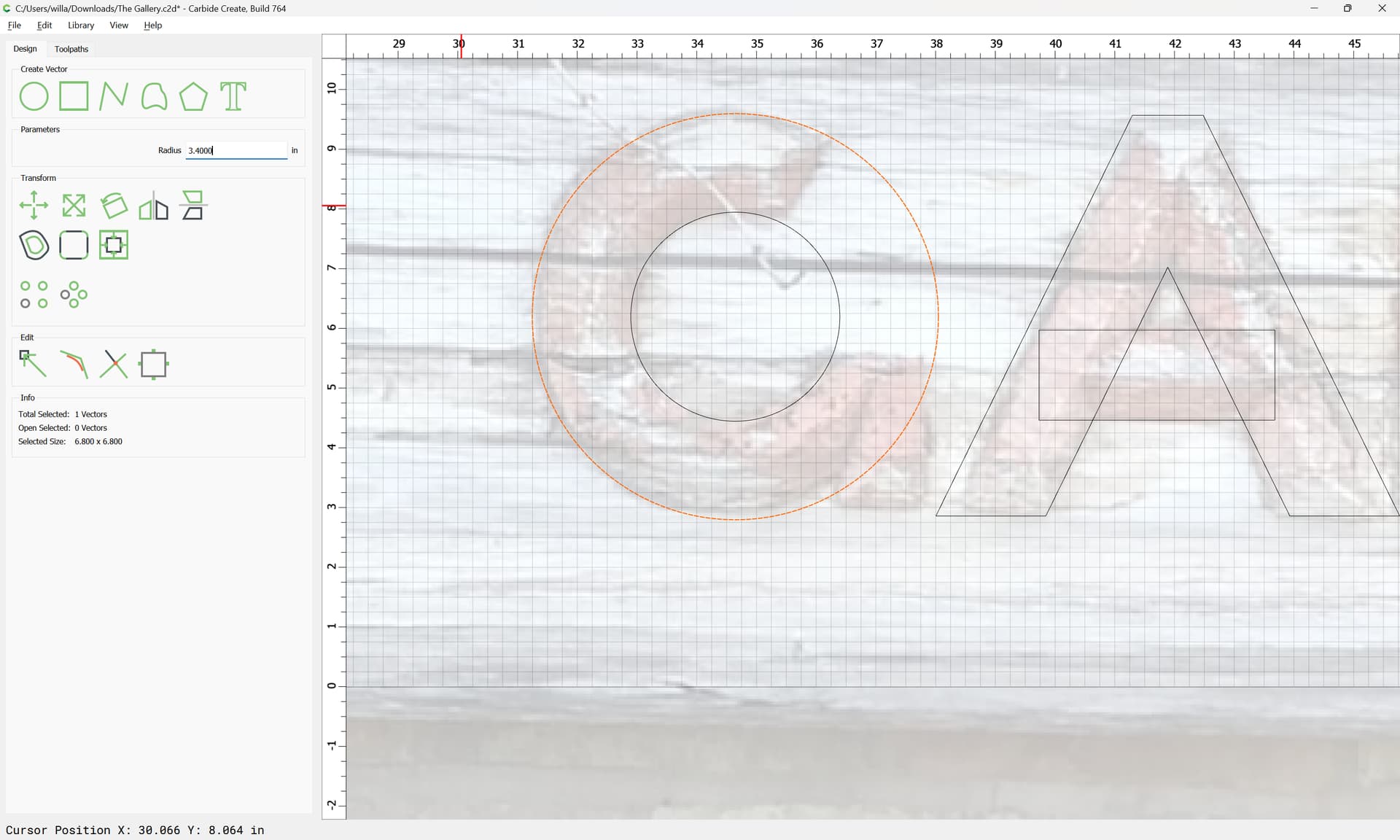
The original characters are 7/8 inches tall (thick). I intended to go to 6/4 stock for the new ones, but am open to discussion.
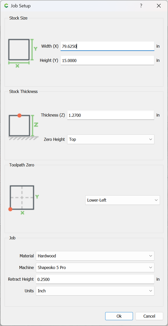
I will be using CC Pro for the design work.
With that much end grain exposed, my vote is for a wood that is naturally water repellent, like red cedar or white oak. The thicker the backing, the more strength the sign will have, unless you are thinking about mounting it to a substrate. Have you done tiling on your machine before?
1 Like
Right now I am only planning to do the lettering. The backboard and frame we will work out as we take the old one down.
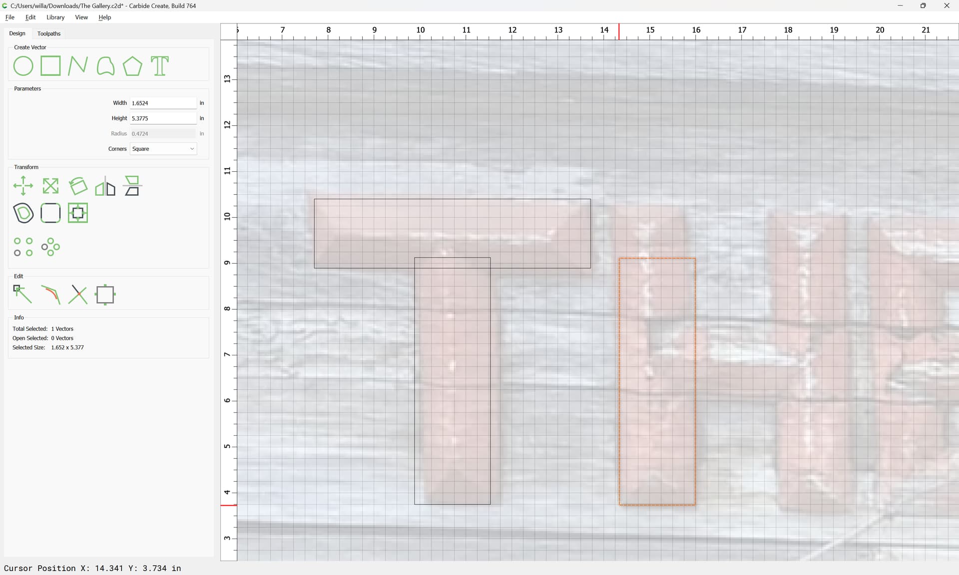
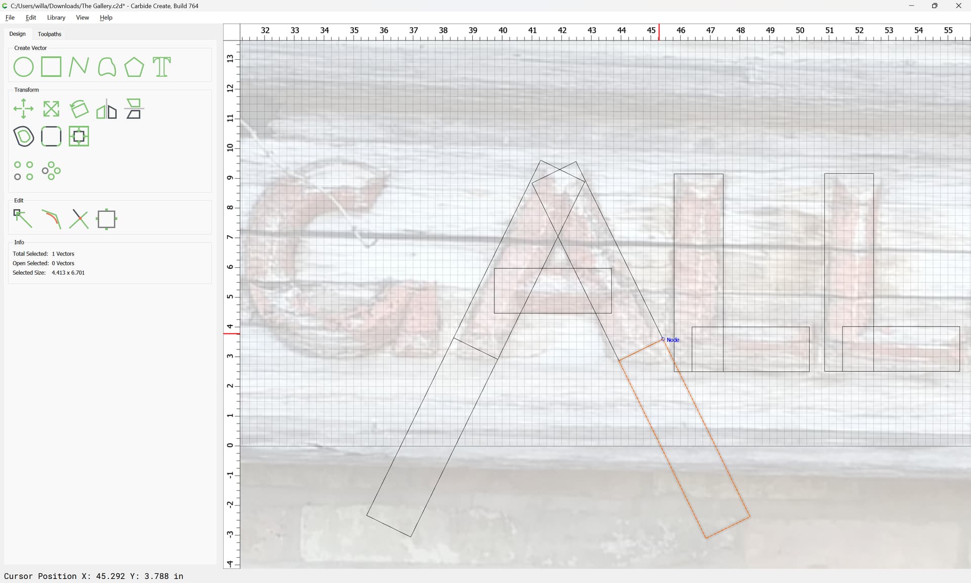
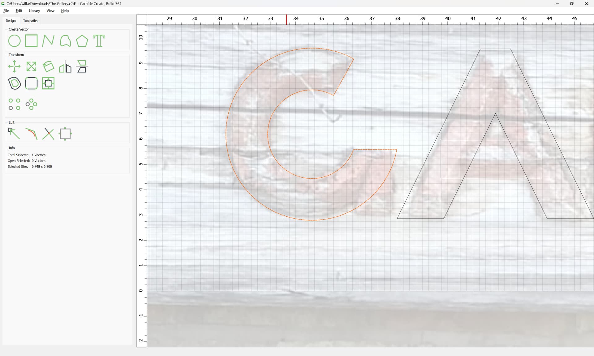
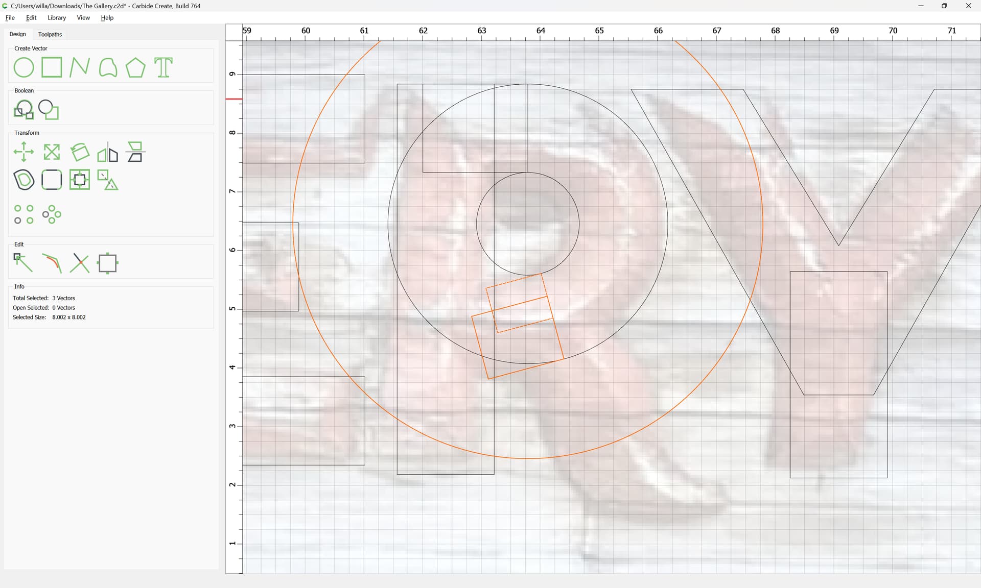
Okay, working from the photo, first we estimate the dimensions — a typical brick is ~7.625" and I count 10 across and a mortar joint is ~3/8" so:
10 * 7.625 + 3/8 * 9 == 79.625
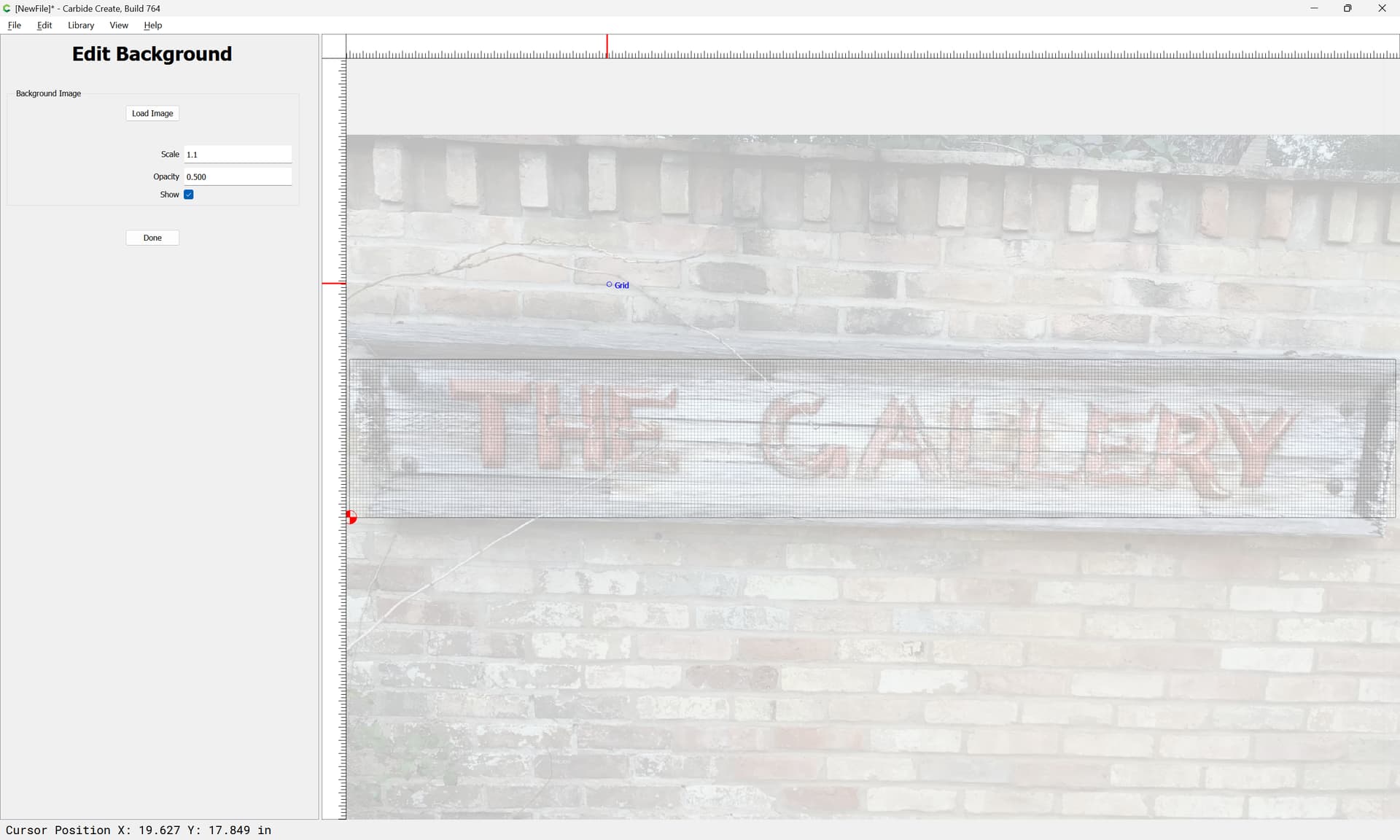
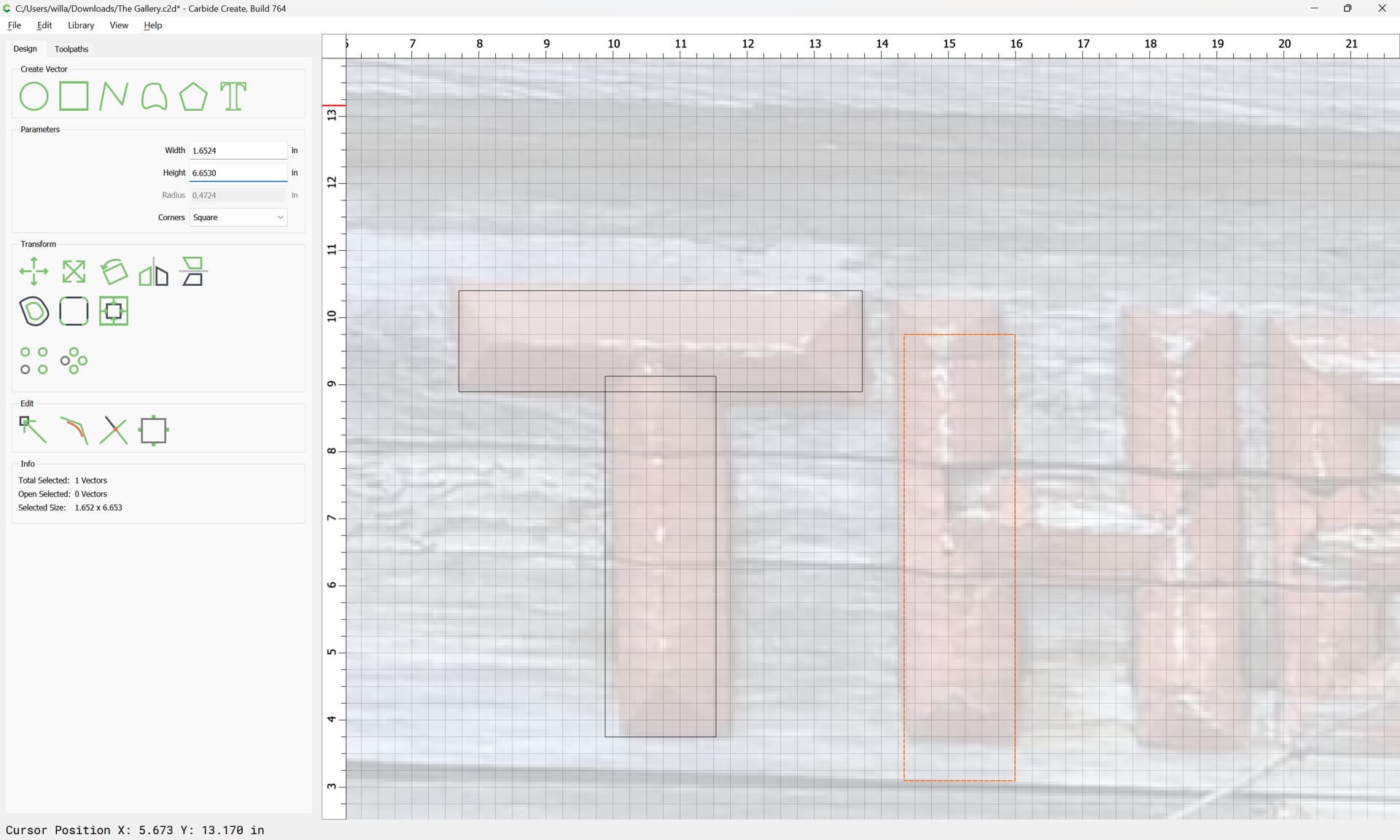
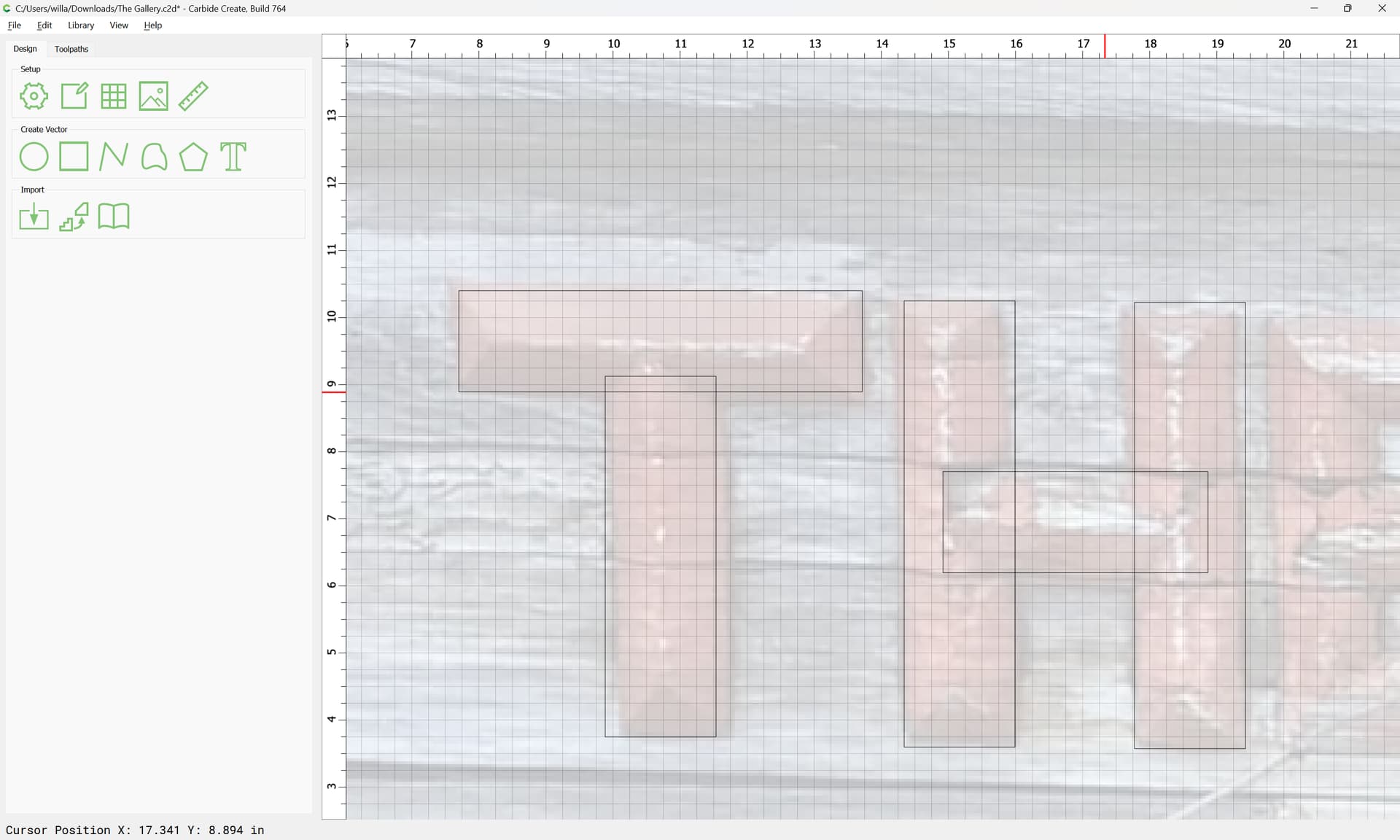
and we zoom in and draw each letter, adjusting as need be.
1 Like
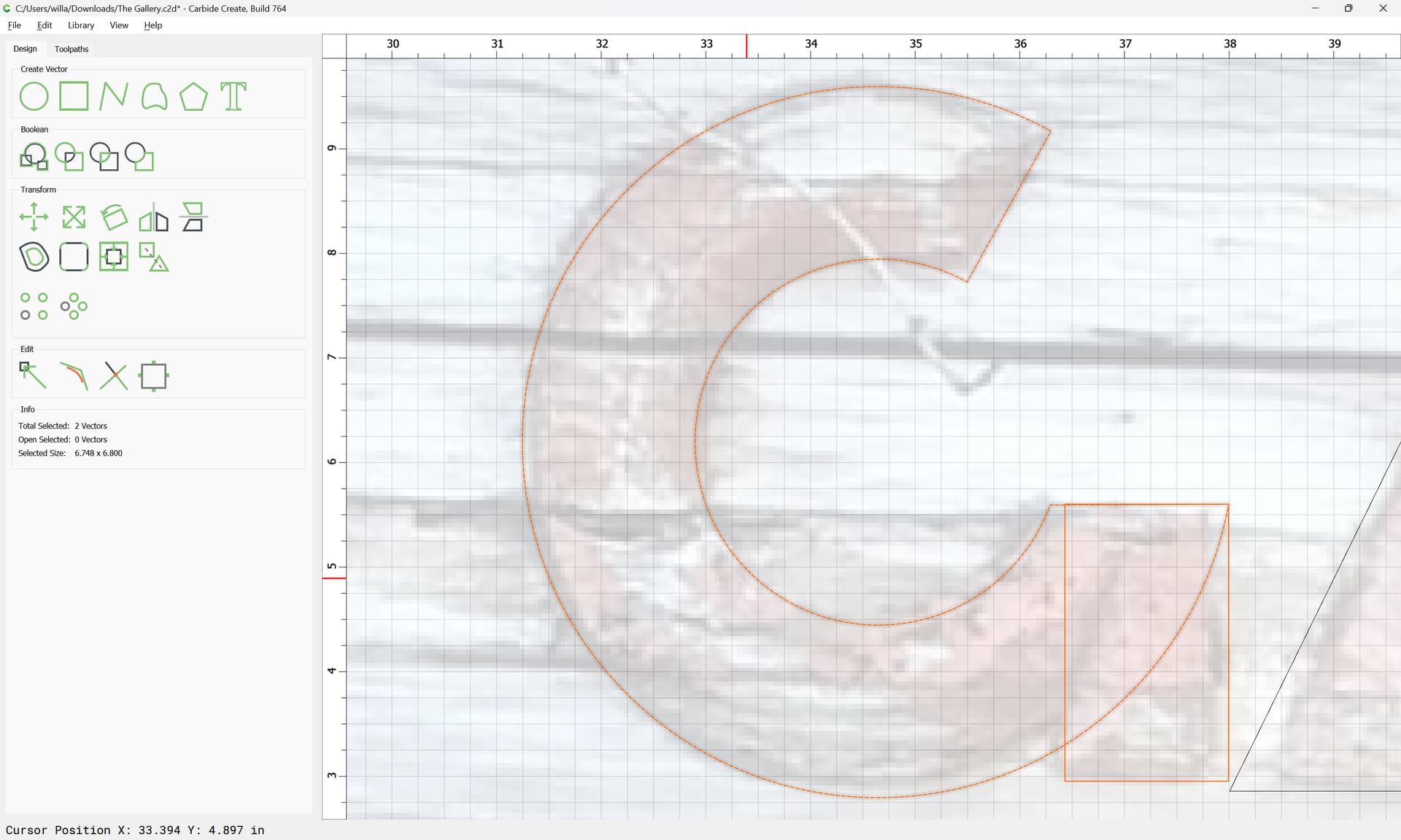
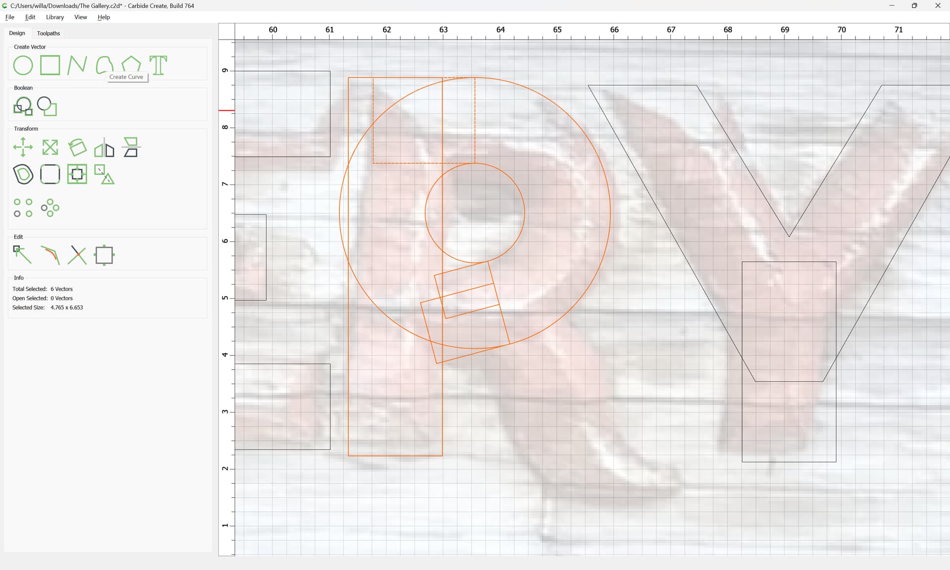
There are two possible approaches for this redrawing:
- use the polyline (or curve tool) to re-draw
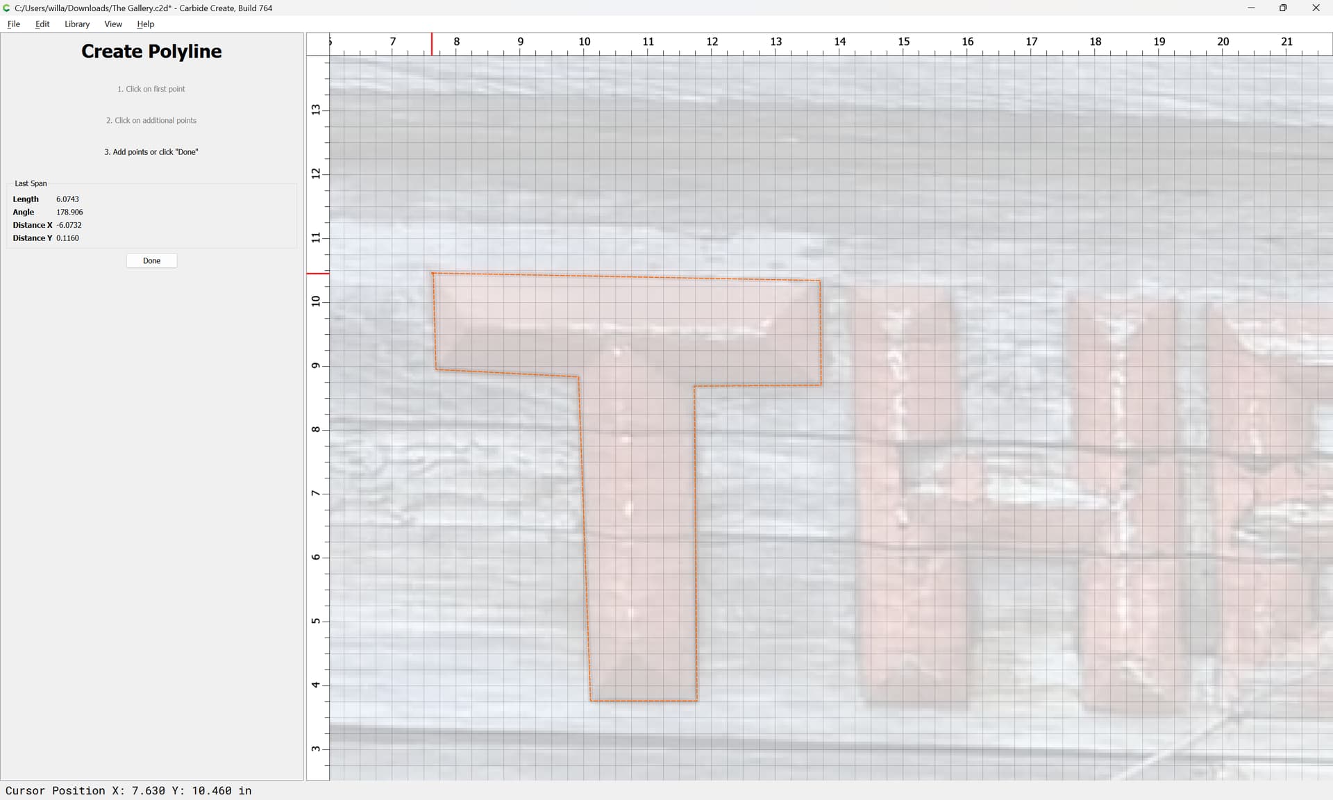
- redraw using geometric constructs, averaging out the placement so that things are square/plumb
The latter, where possible is the better approach since it will yield a more even and regular result:
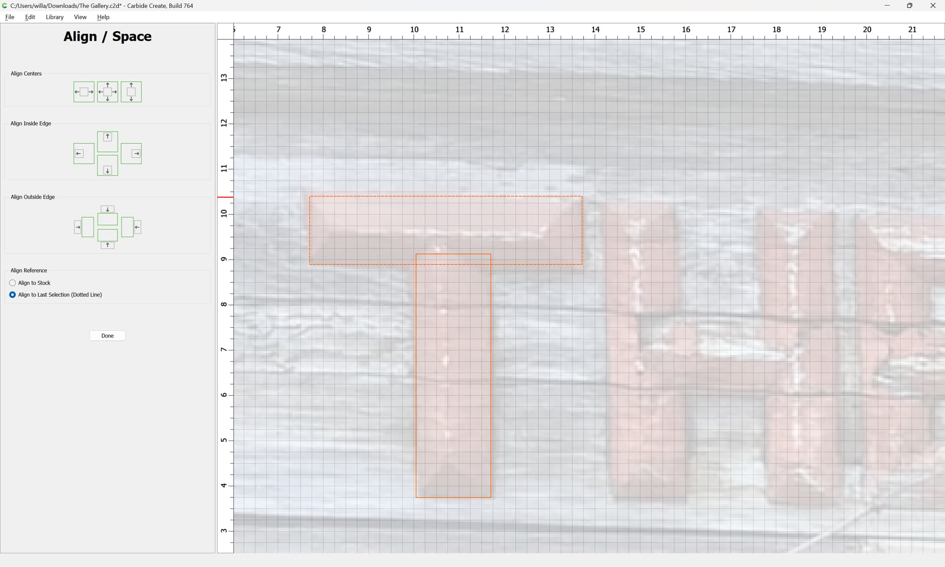
Note that you can use the Align command:

to force symmetry where appropriate:
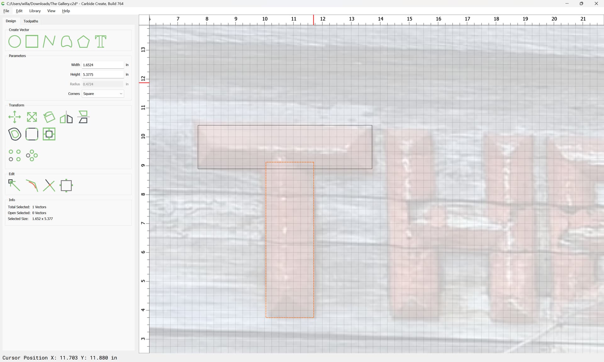
and once one has one element, it can be copy-pasted:
adjusted:
which one can quickly repeat for the letters made up of straight horizontal/vertical lines:
Other letters may have elements rotated:
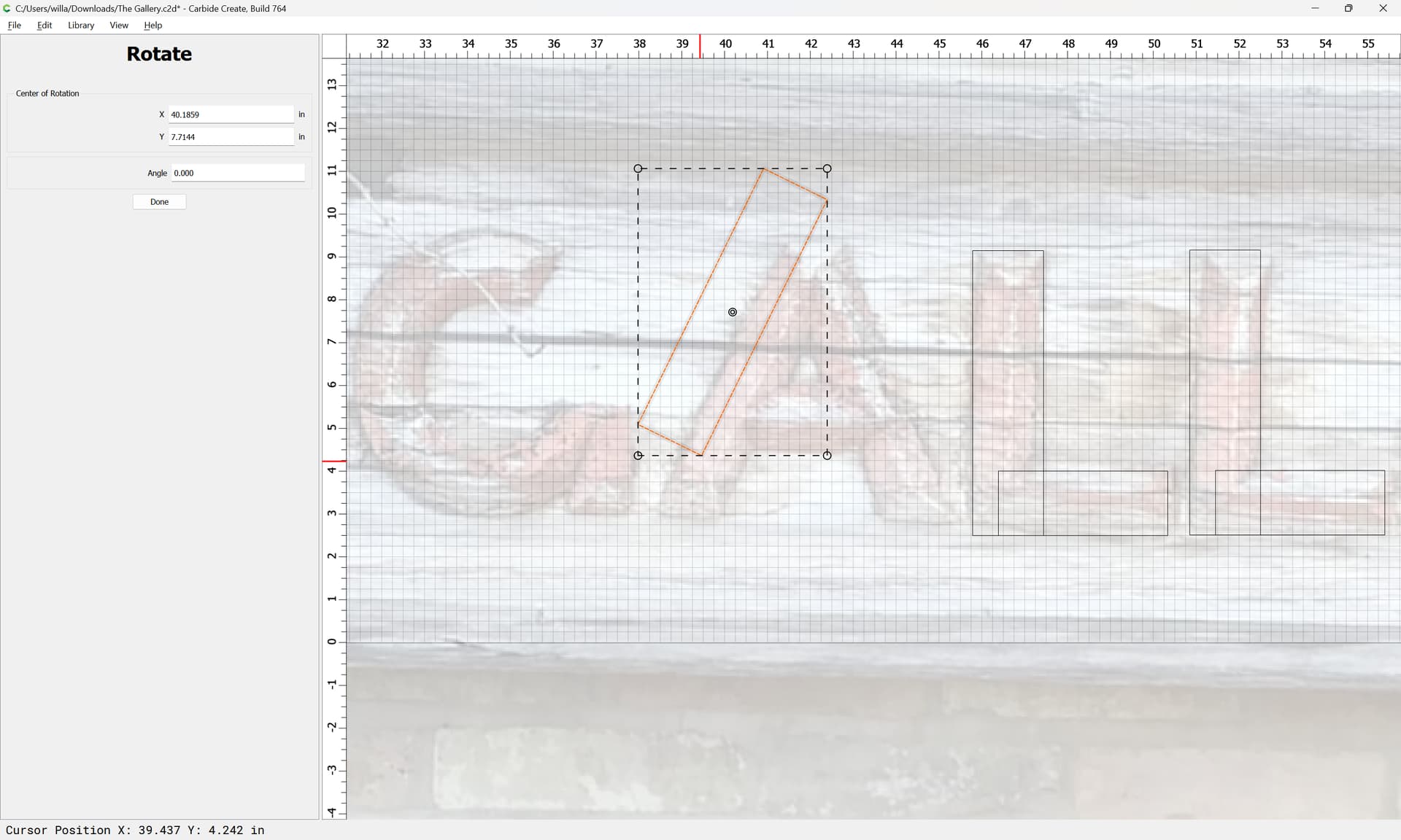
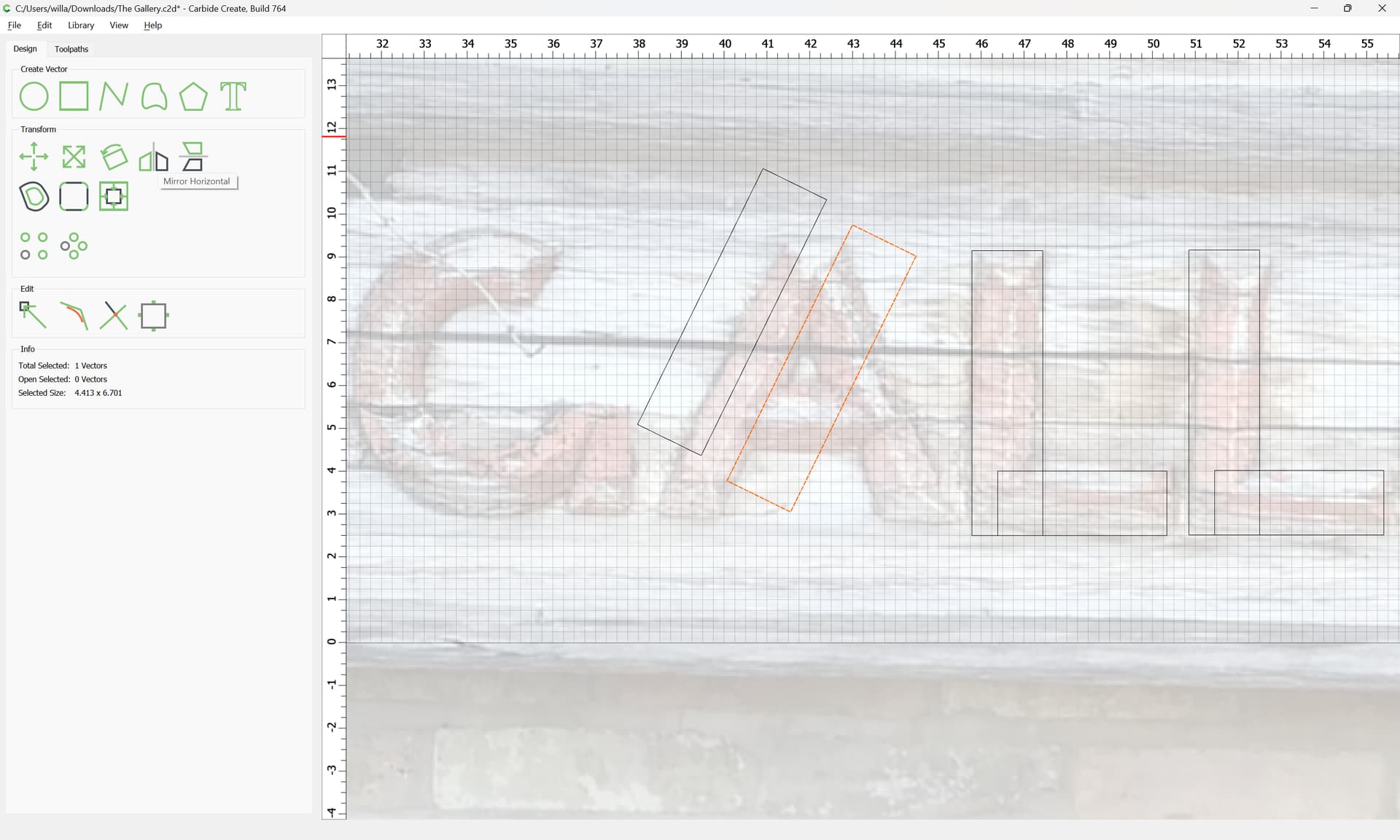
and then mirrored:
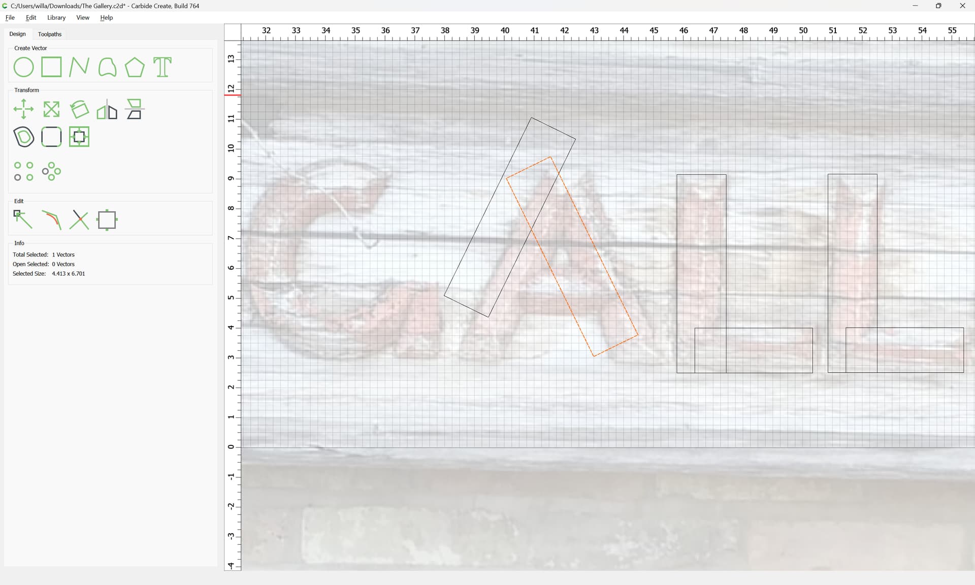
and rotated elements extended by copies at need:
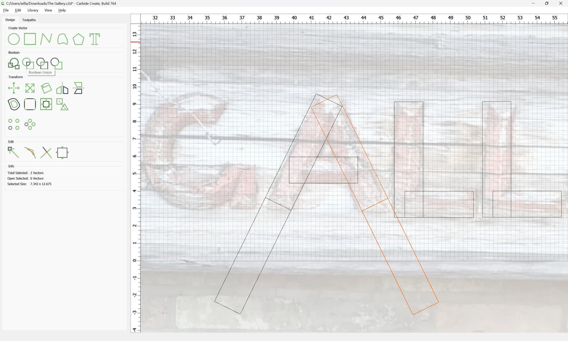
which may then be Unioned:

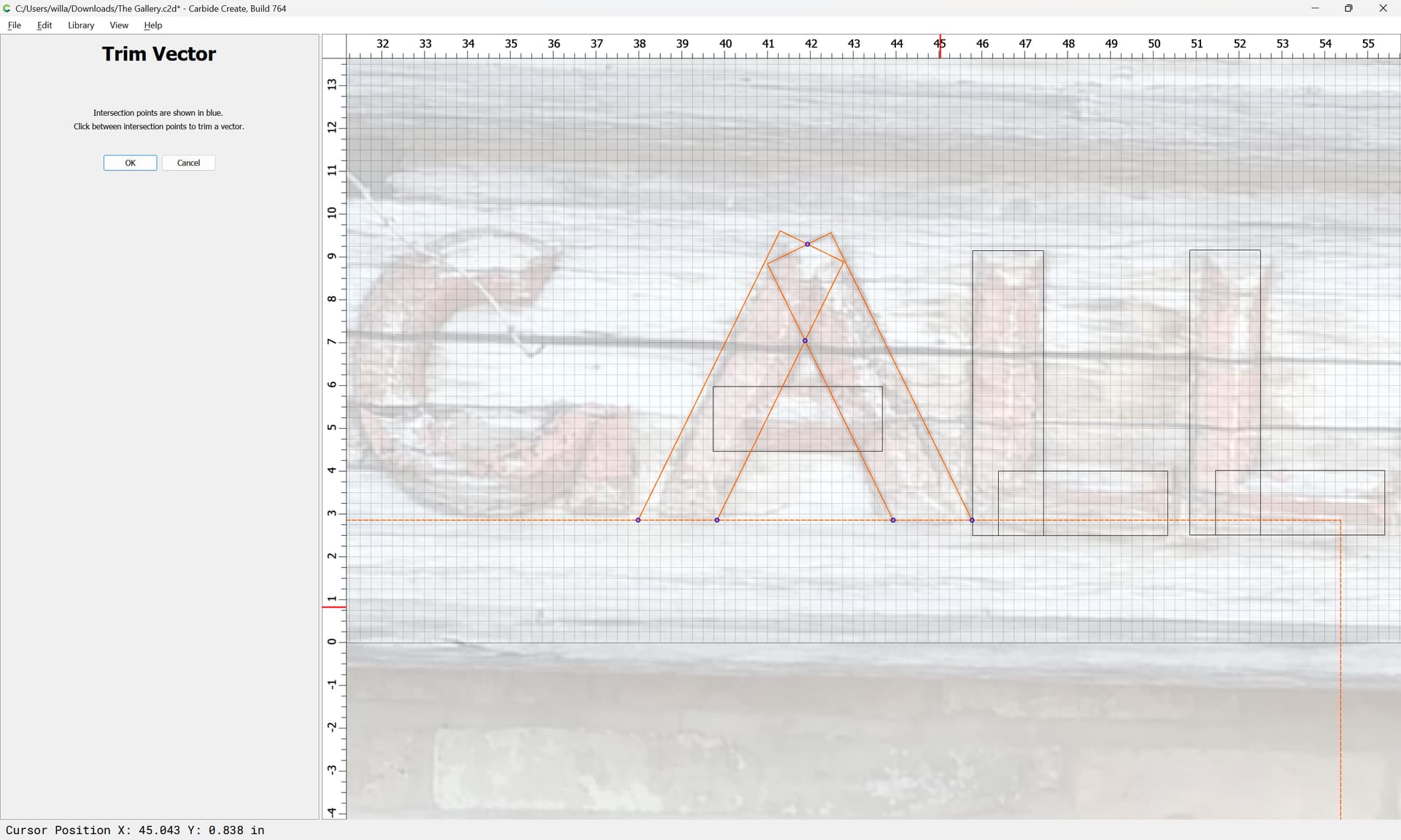
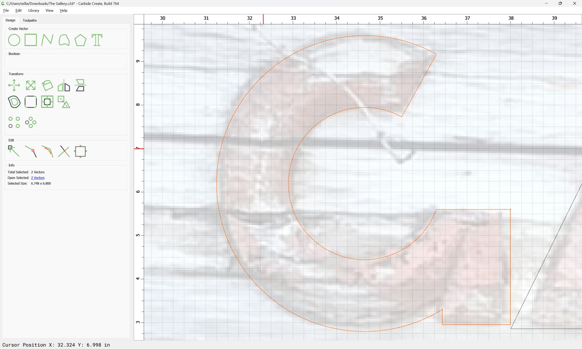
and trimmed off:
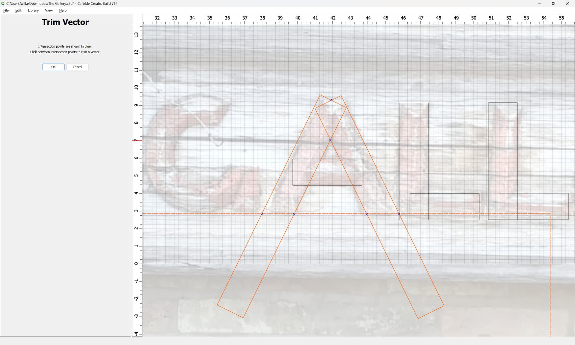
and lines drawn in if need be:
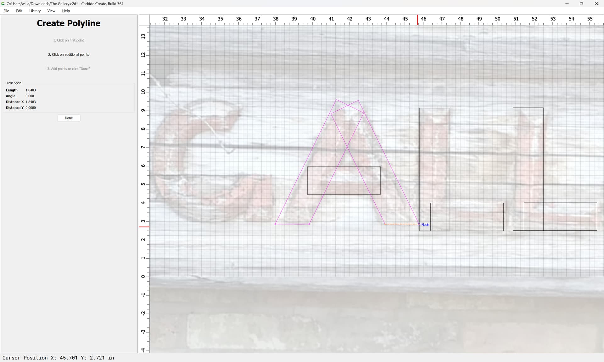
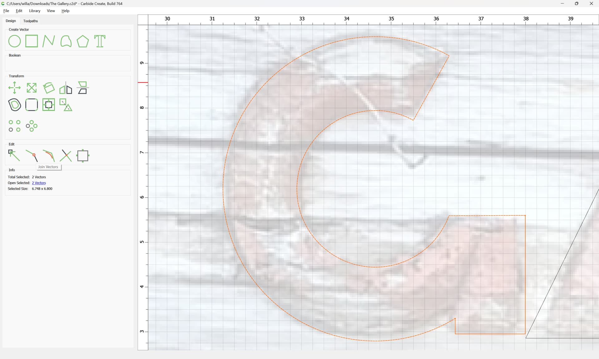
and things put back together

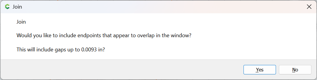
using Join Vectors
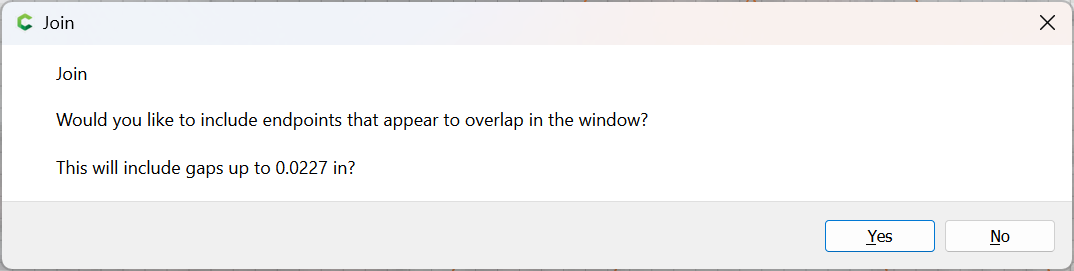
Yes

and unioned:
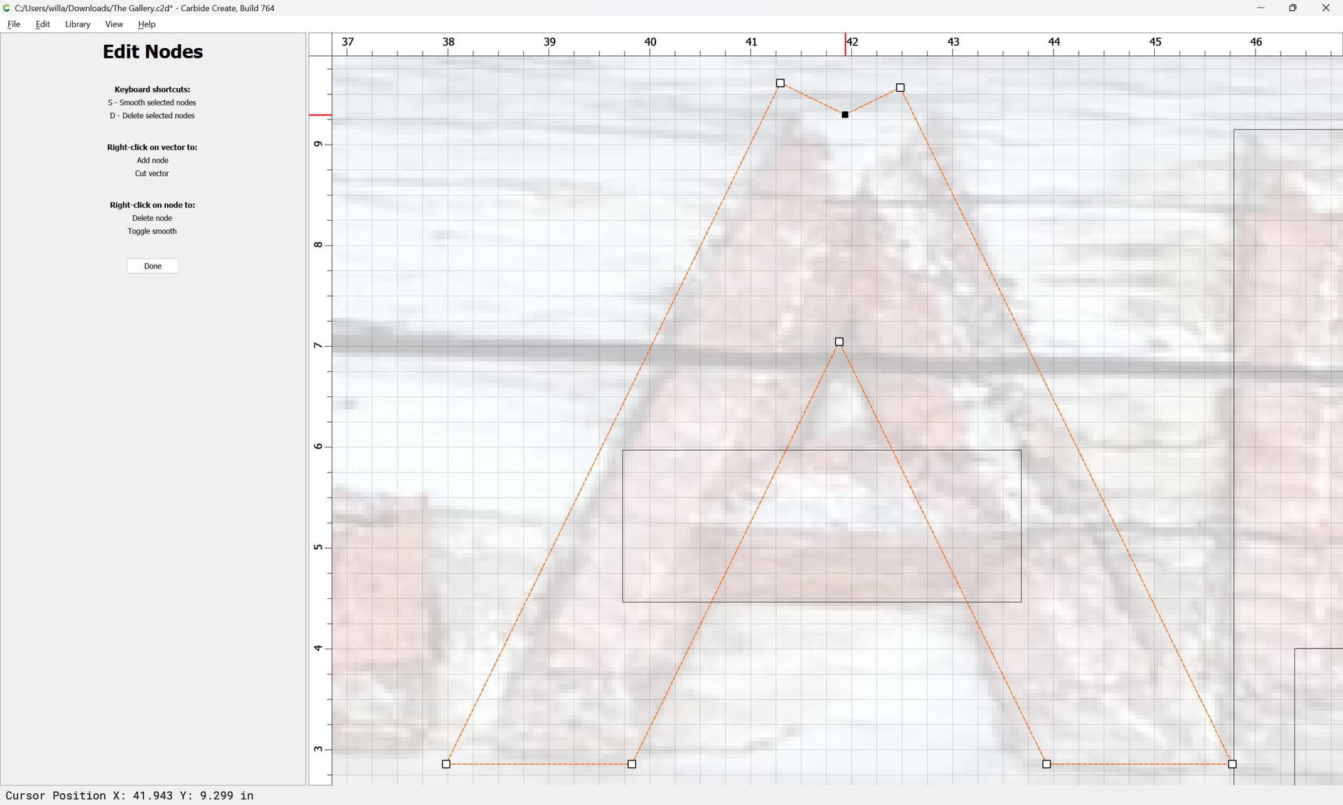
and then Node Edited:


Done
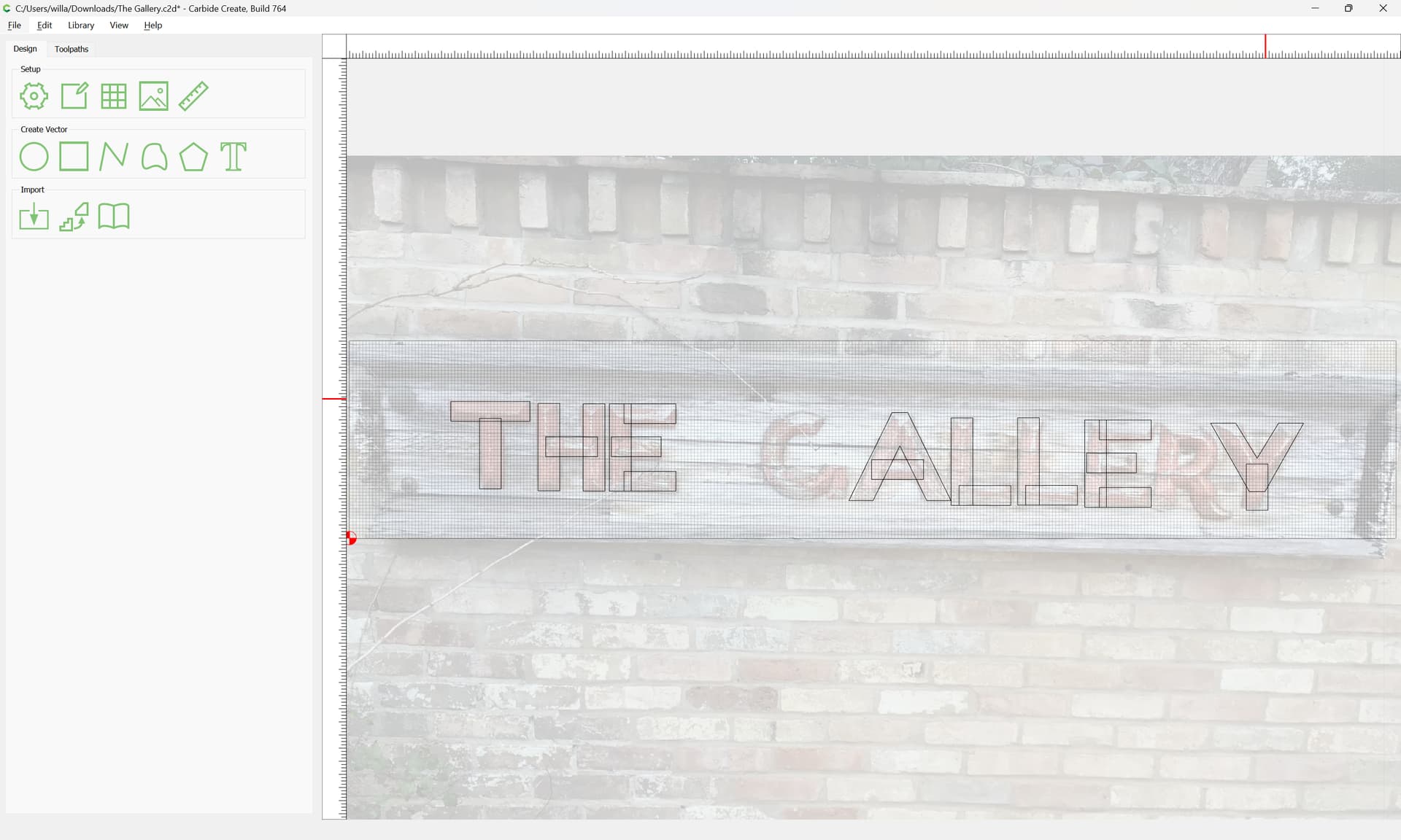
Eventually arriving at:
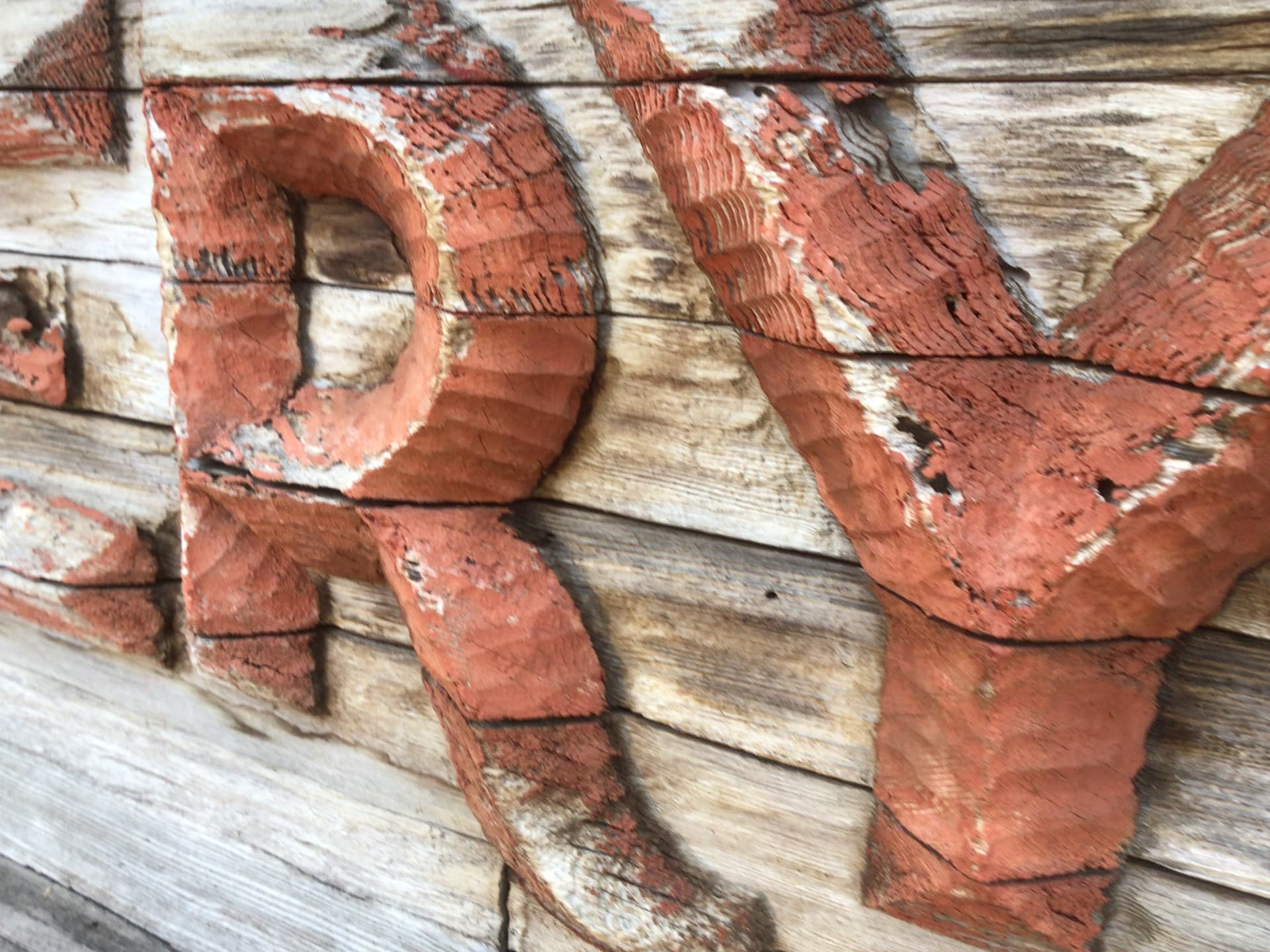
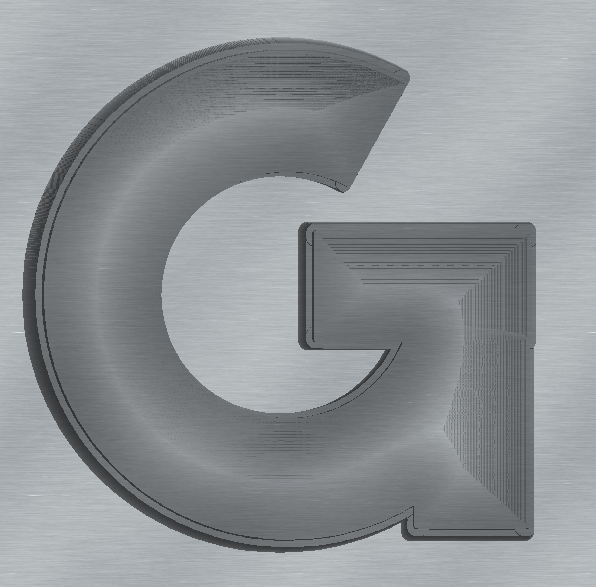
which just leaves G and R to compleat things.
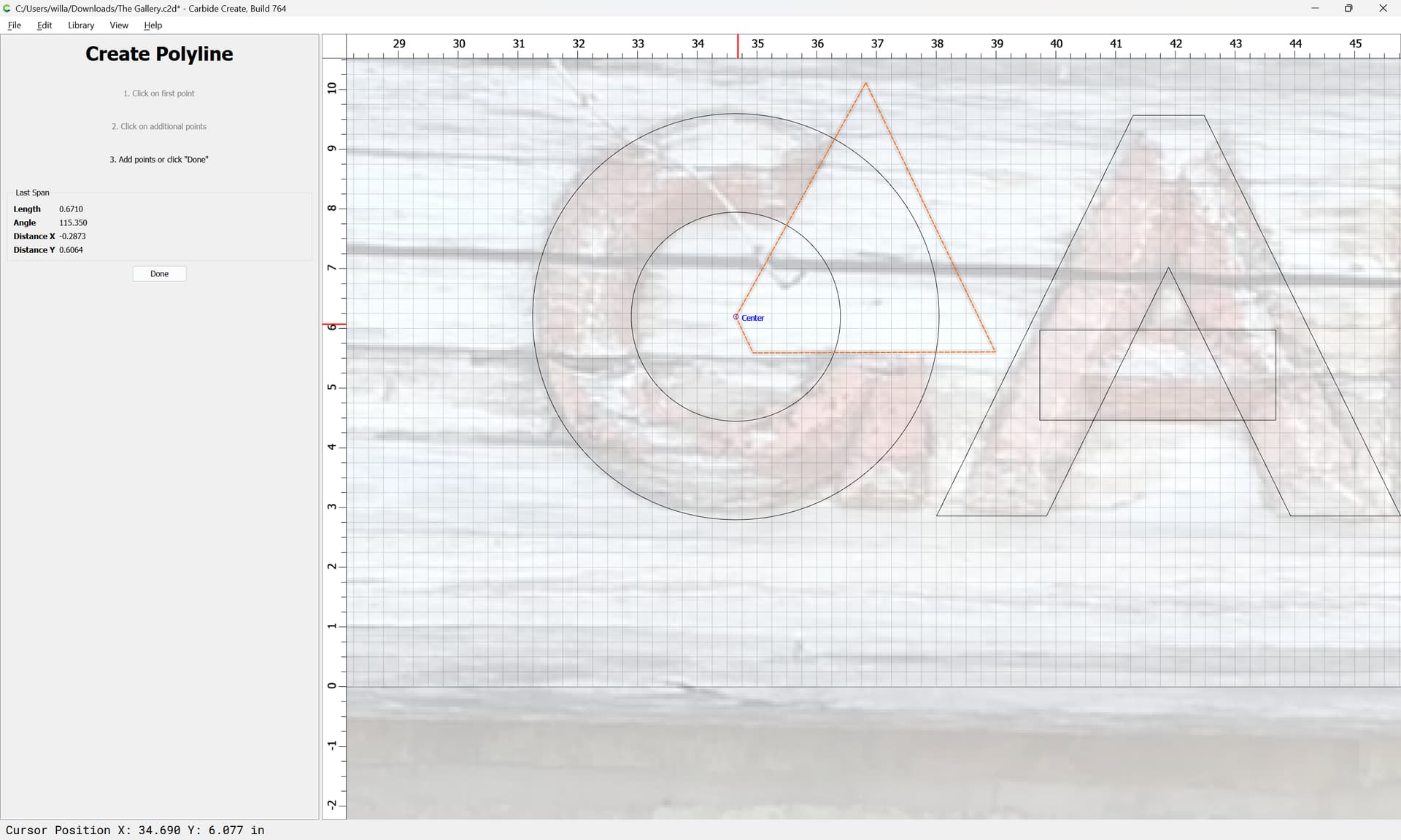
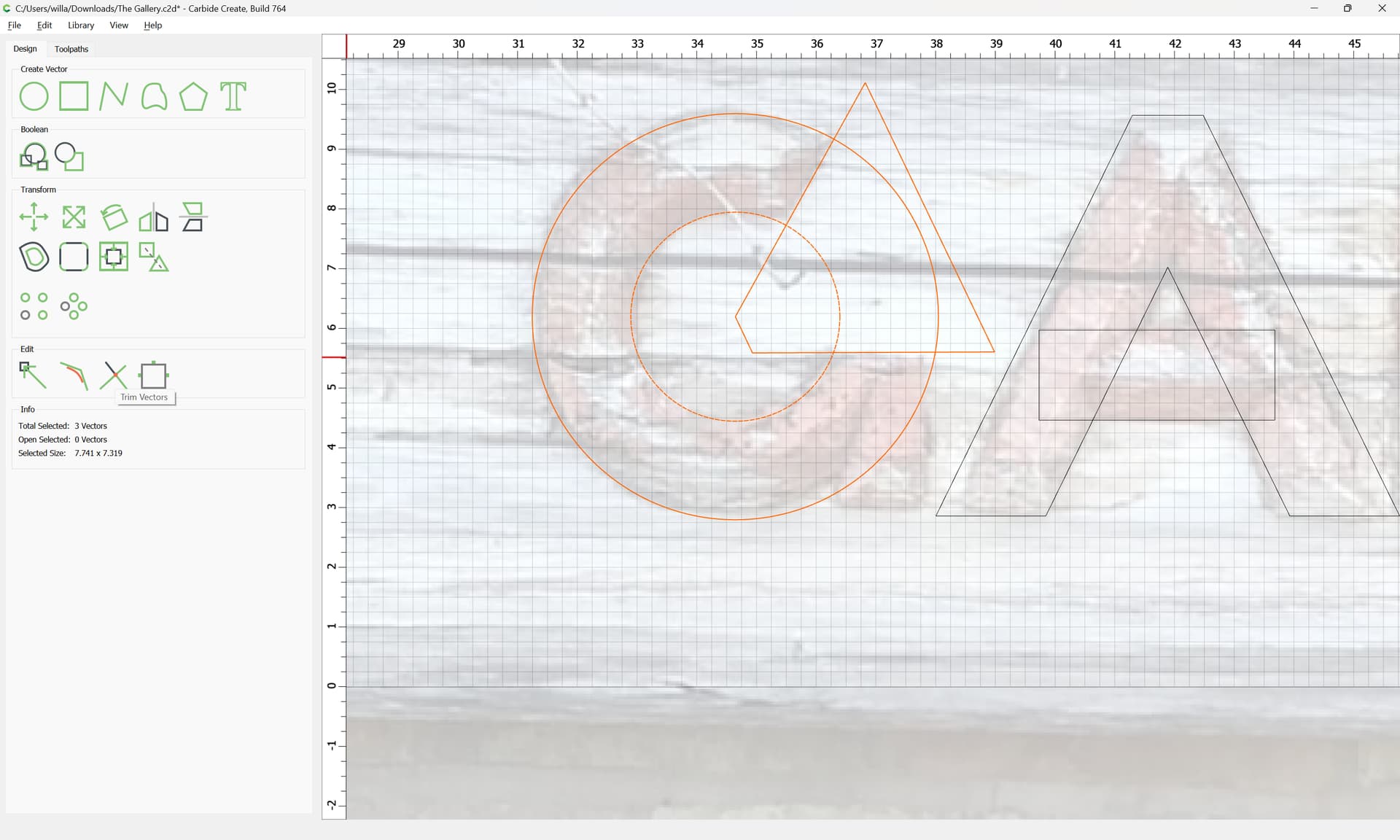
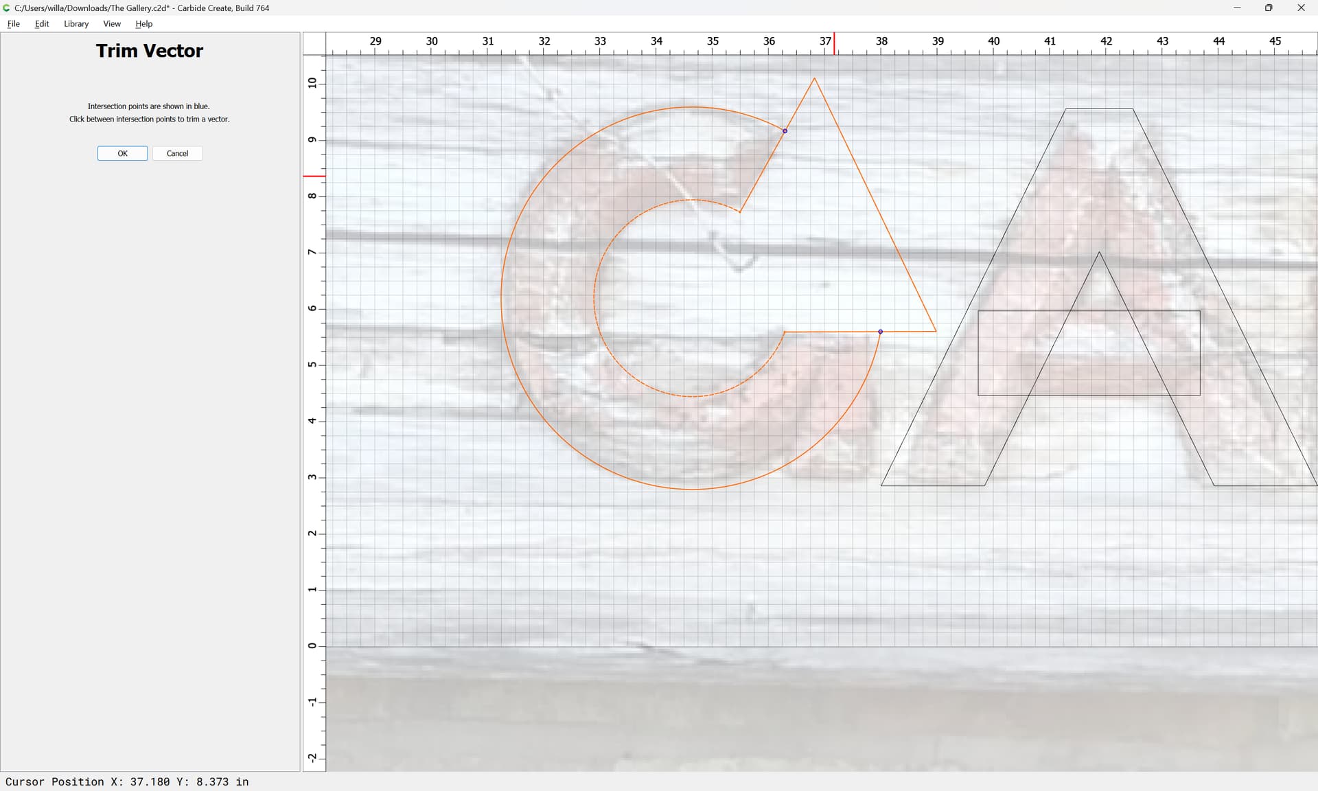
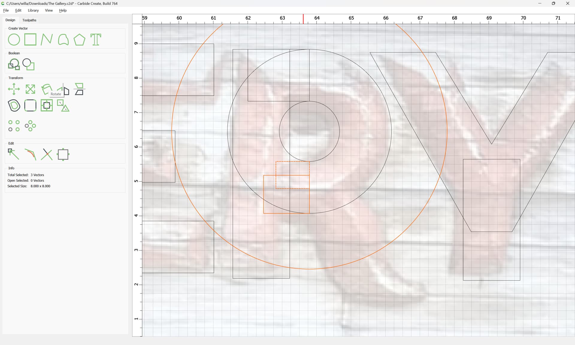
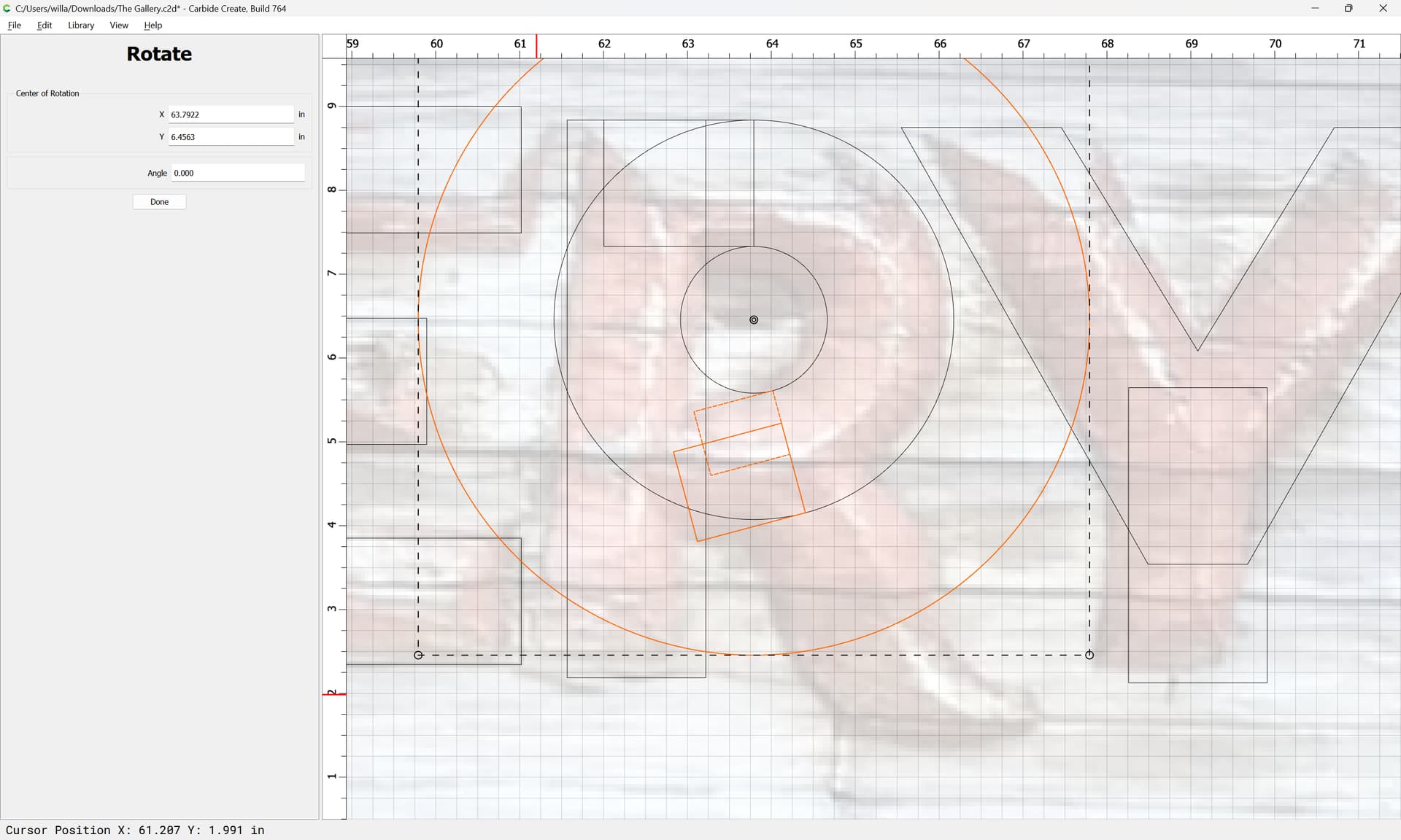
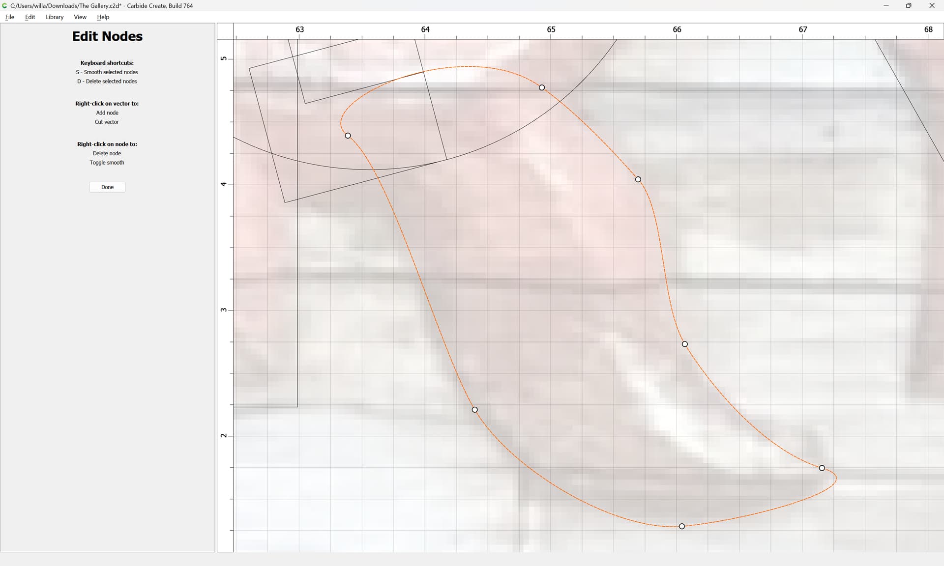
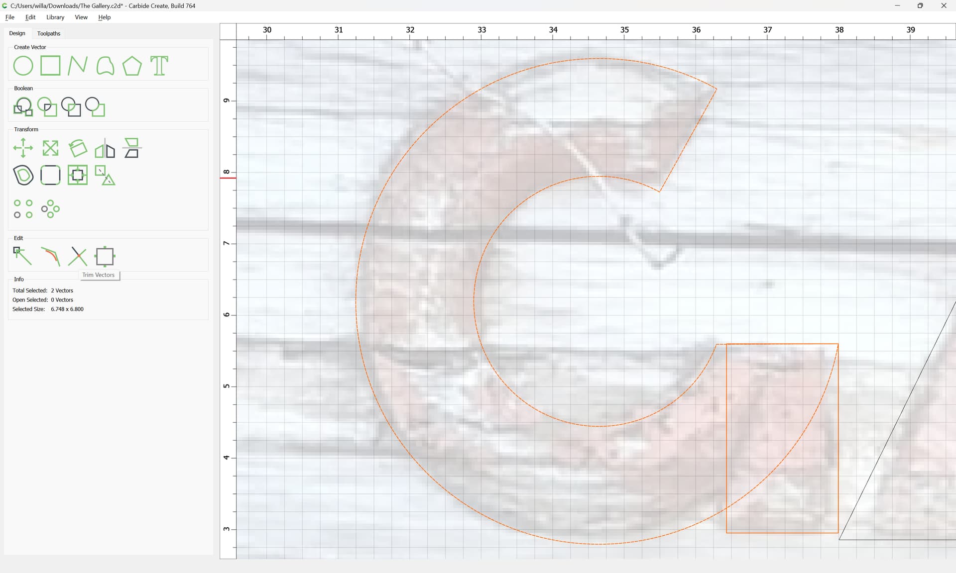
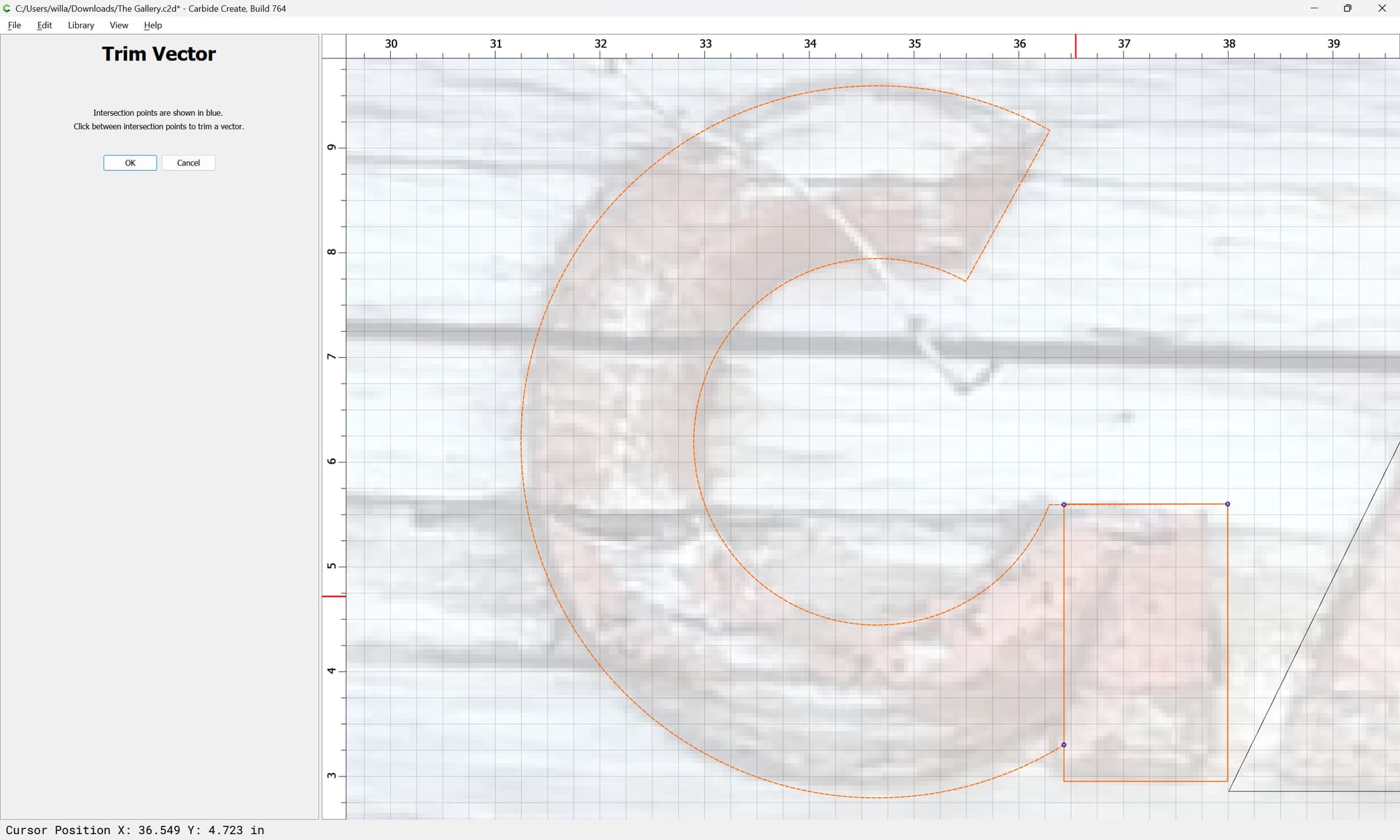
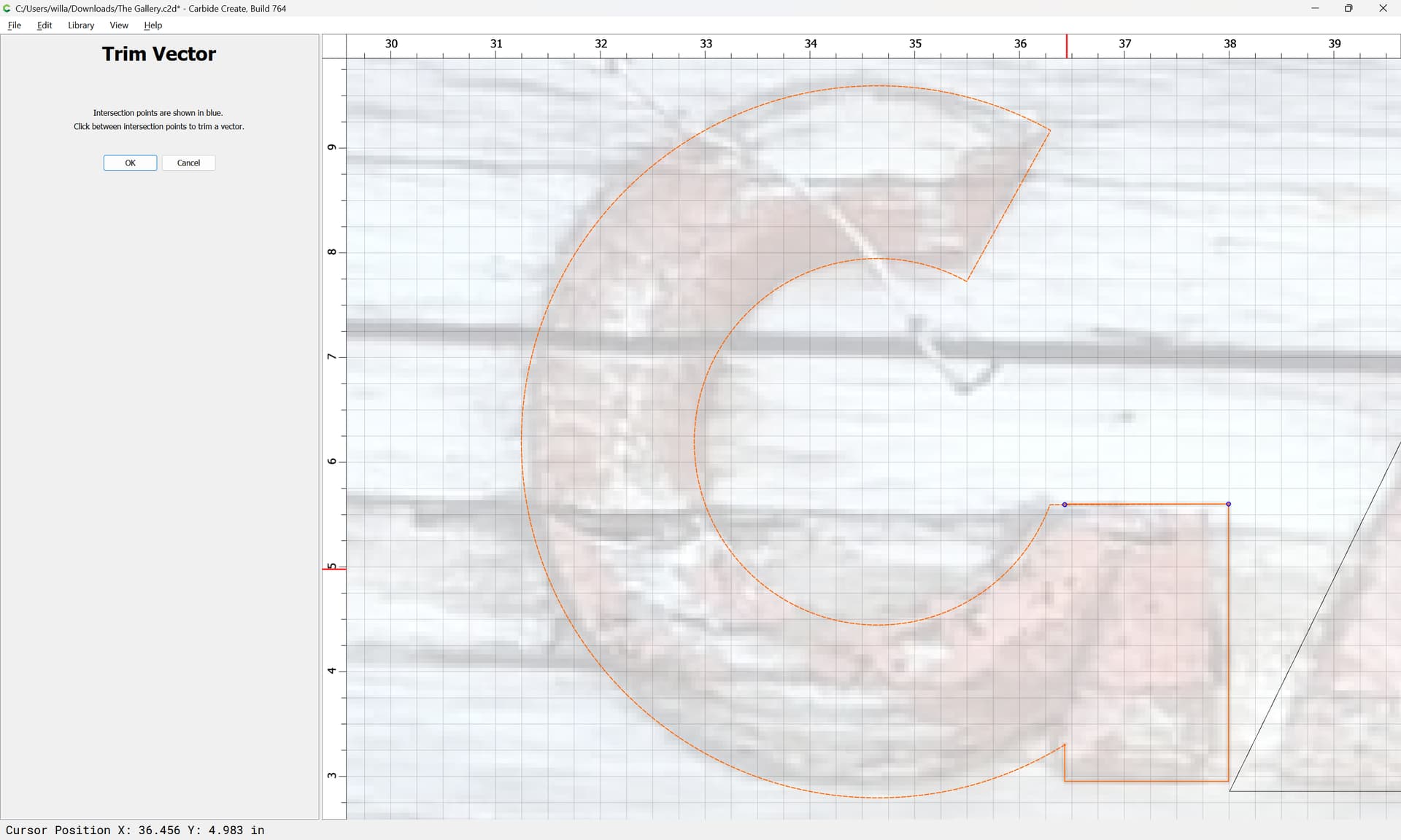
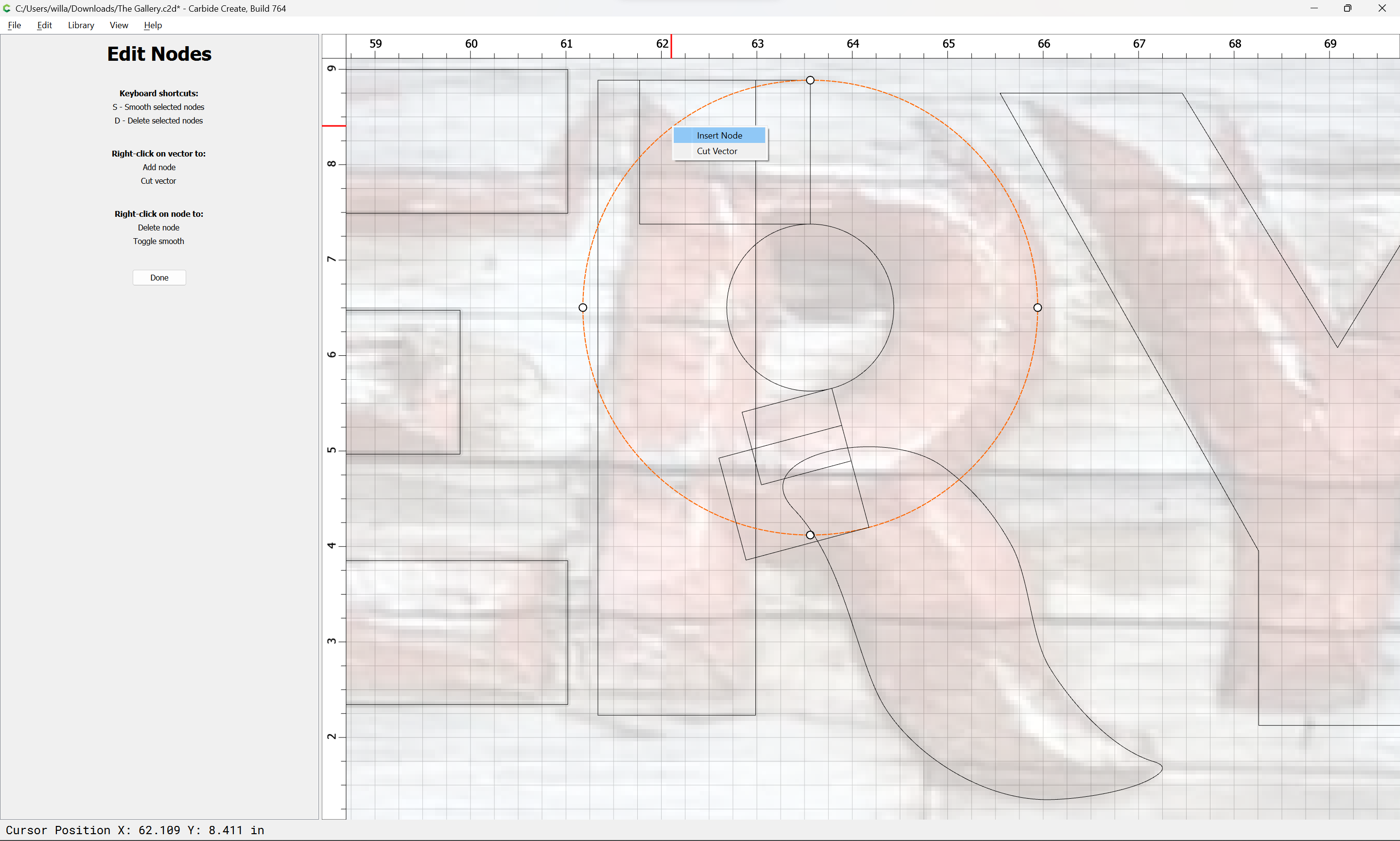
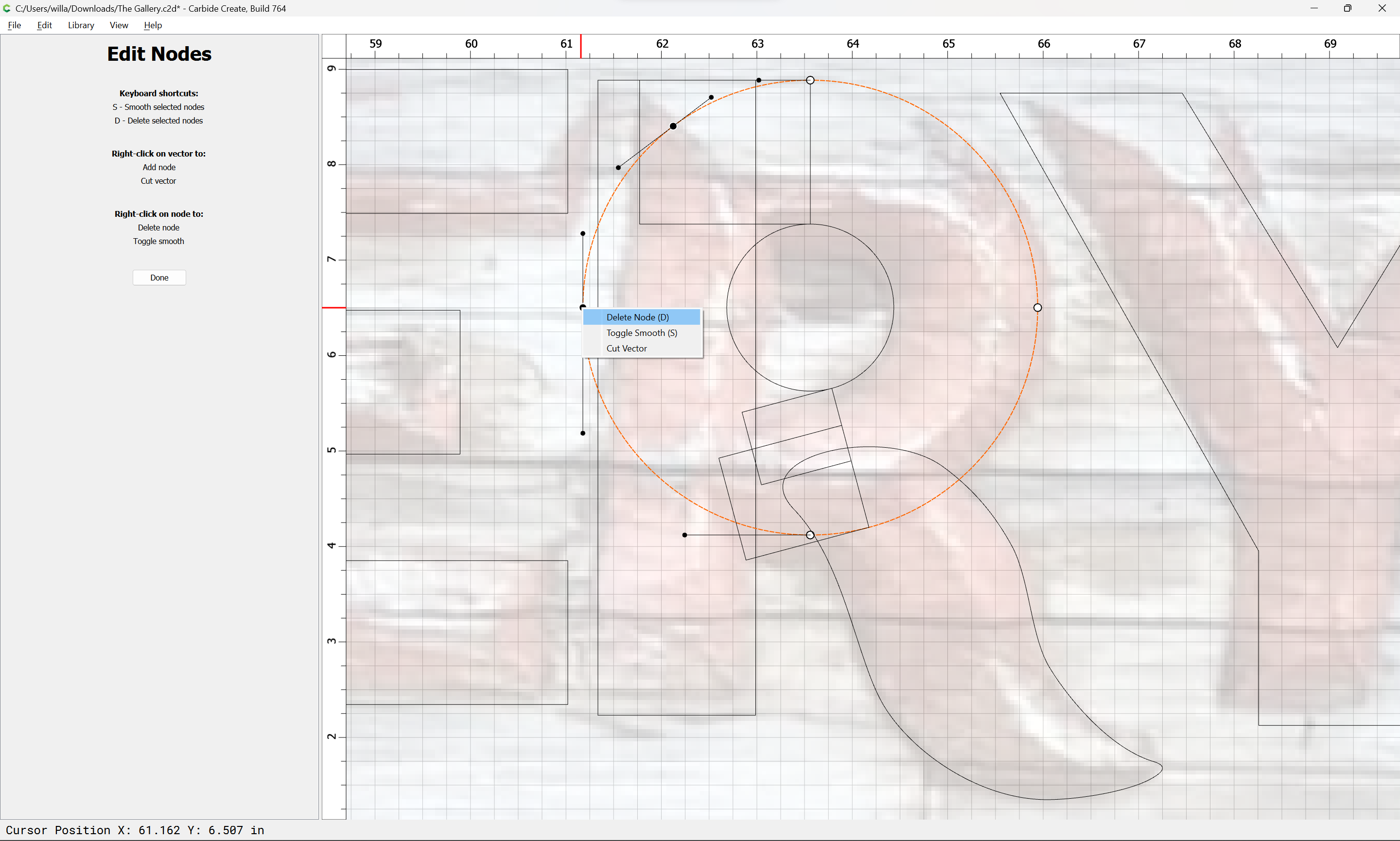
Symmetrical curved forms can be replicated using circles:
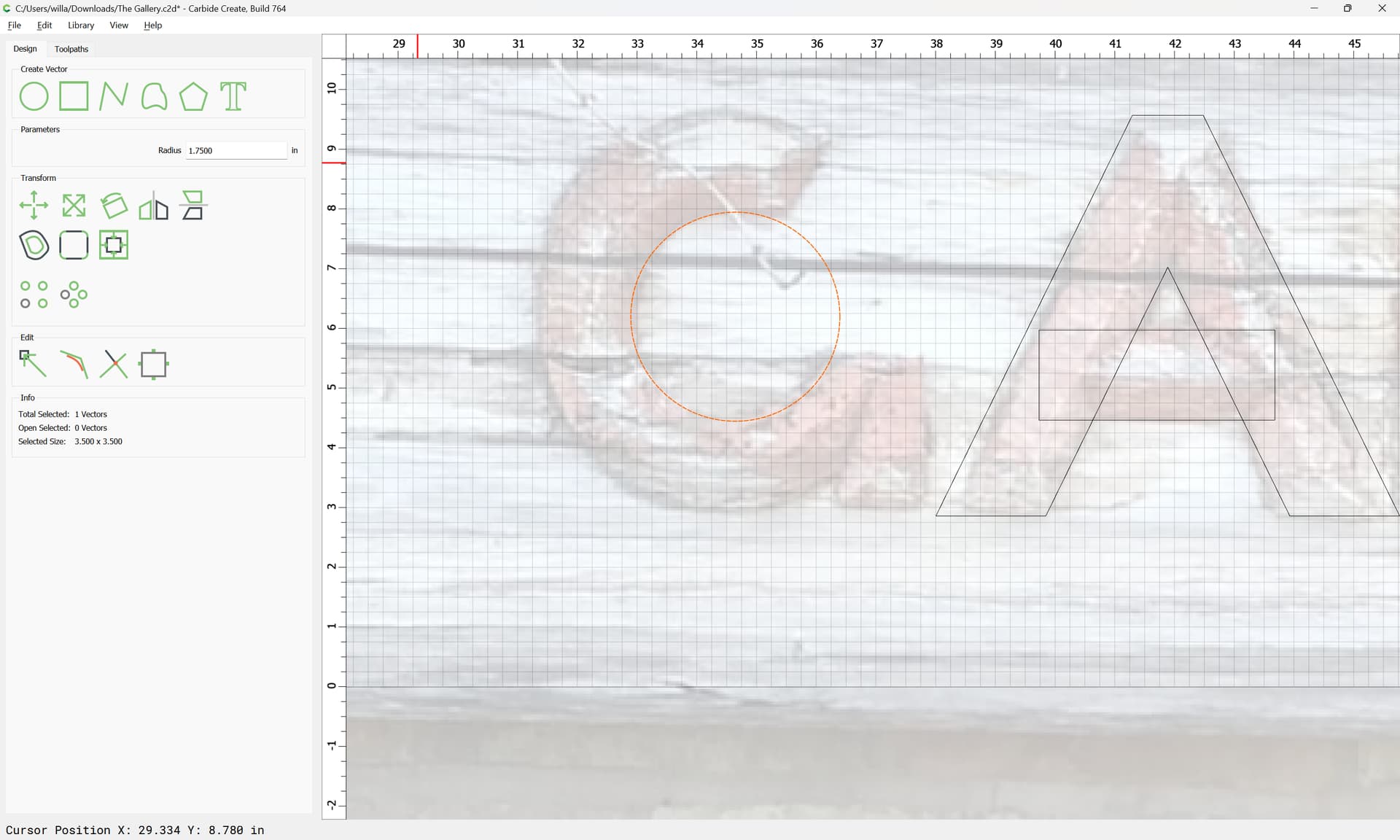
and then cut up as need be using a polyline:
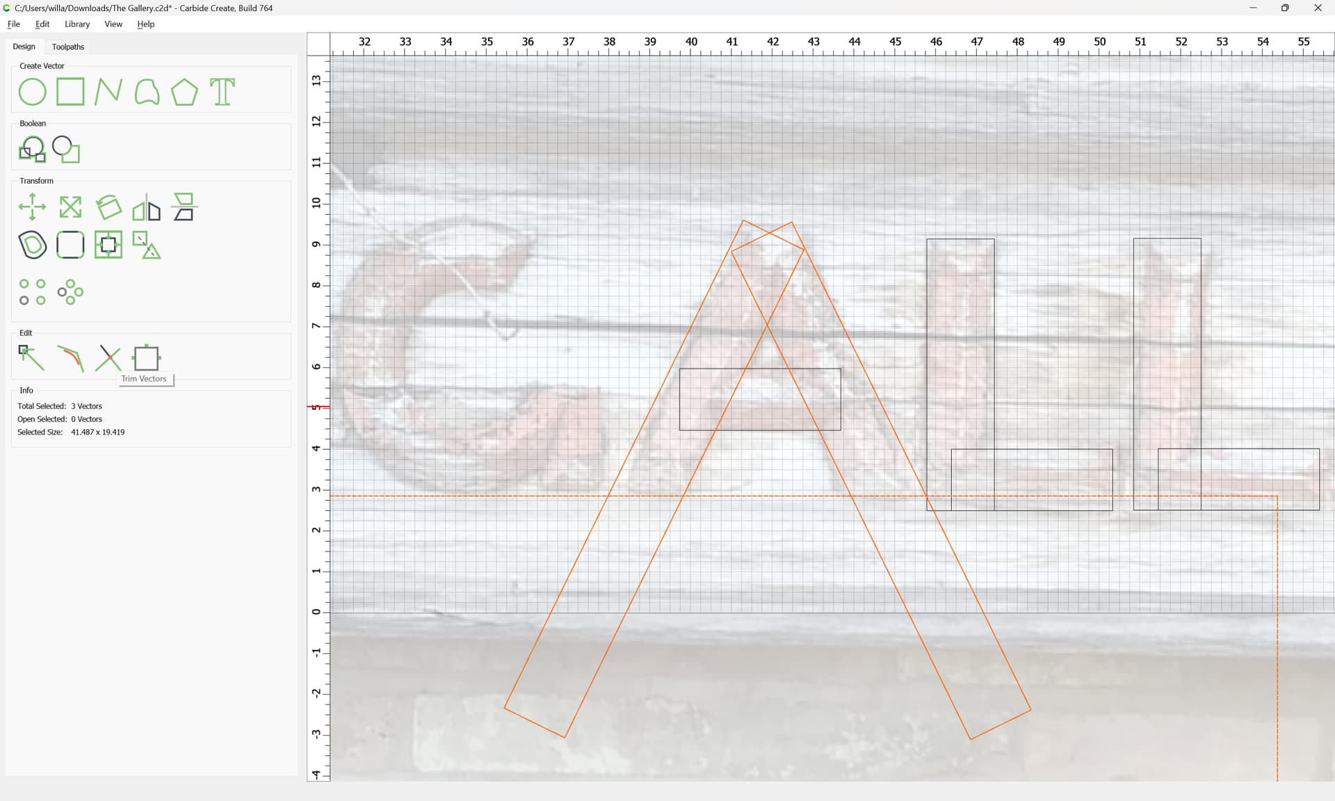
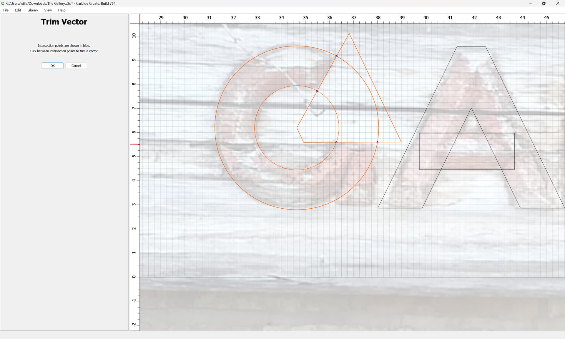
and Trim Vectors
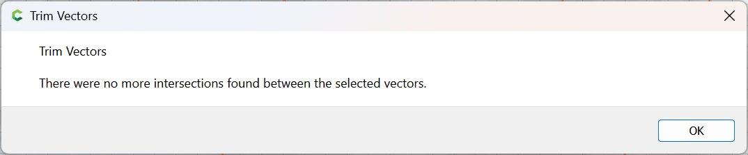
OK
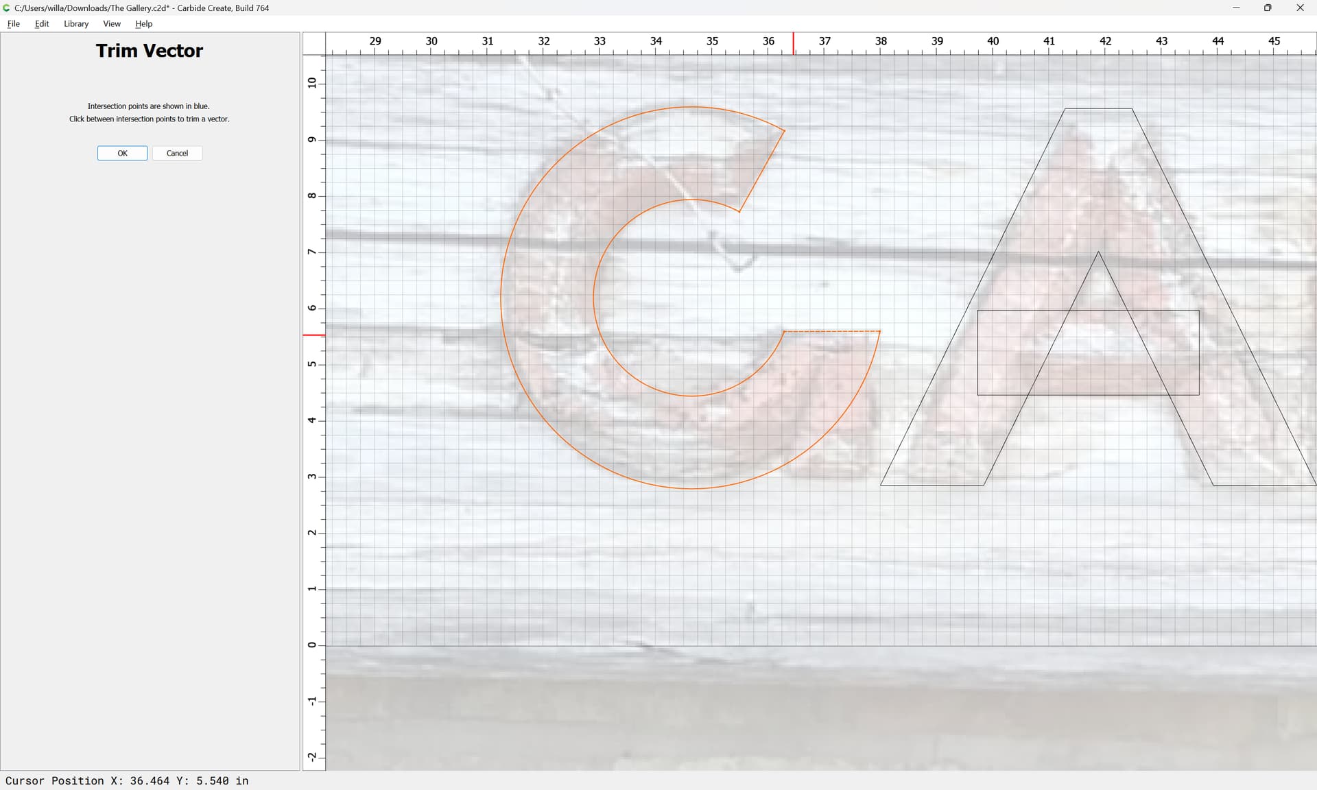
OK

Join Vectors
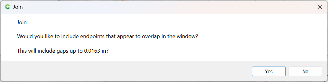
Yes

and draw in a rectangle to finish the G:
1 Like
The R is more of the same, with the added need to have a tangent to a circle, where the most expedient thing to do is to add a larger surrounding circle:
Then rotate the selection:
Done
then remove the circle:
Lastly, things are positioned so that the leg of the R can be drawn using the Curve tool:
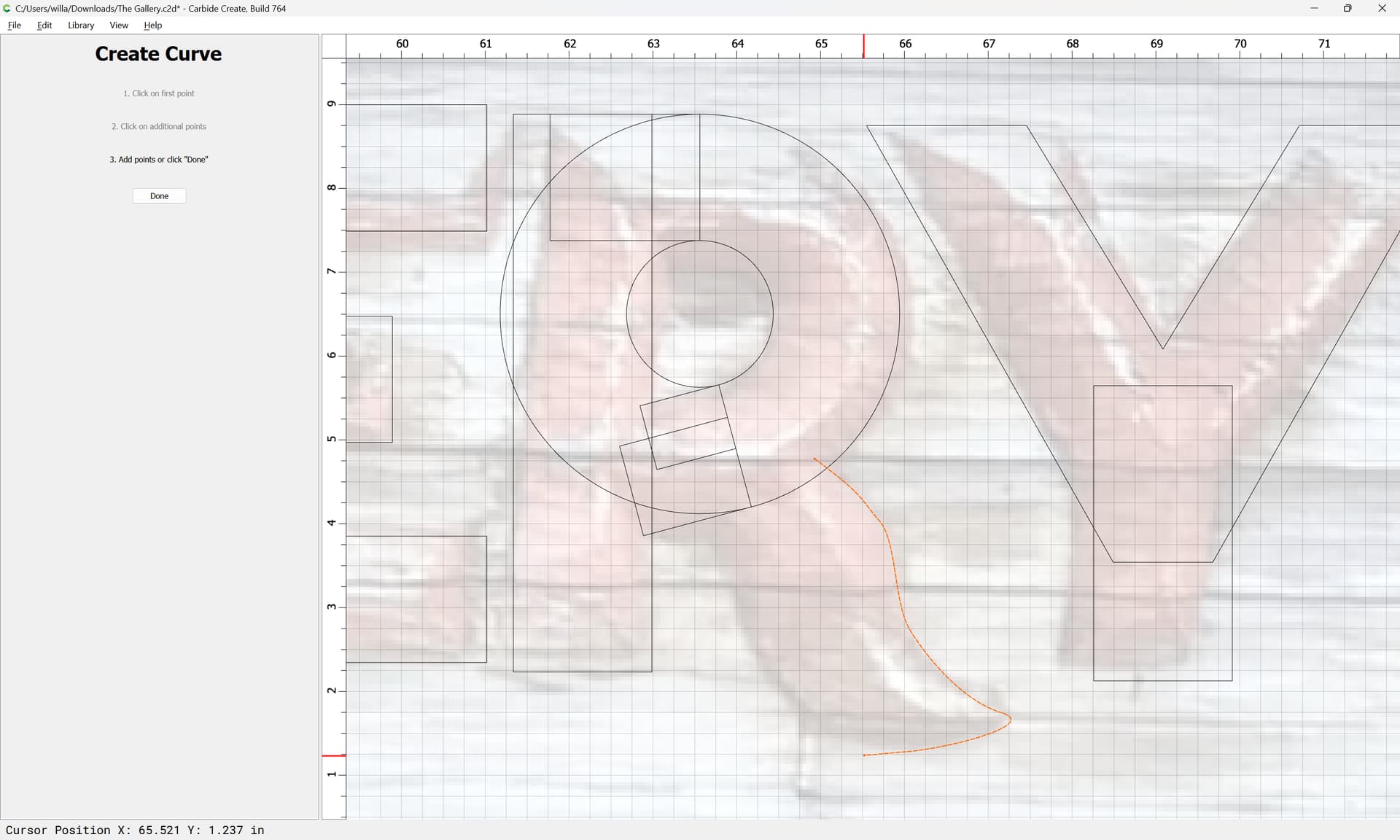
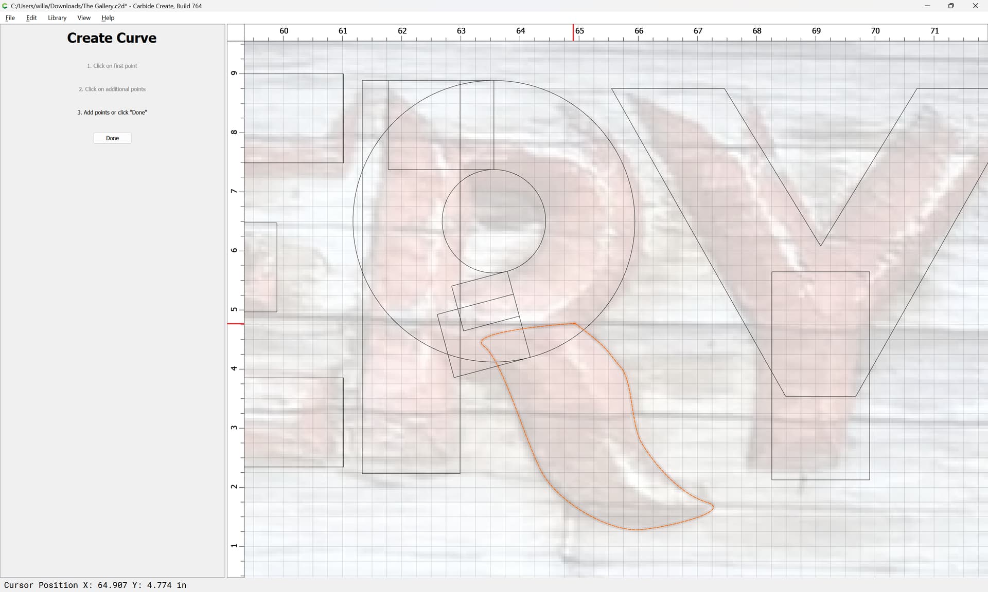
Done
Then go into Node Edit mode to adjust things:


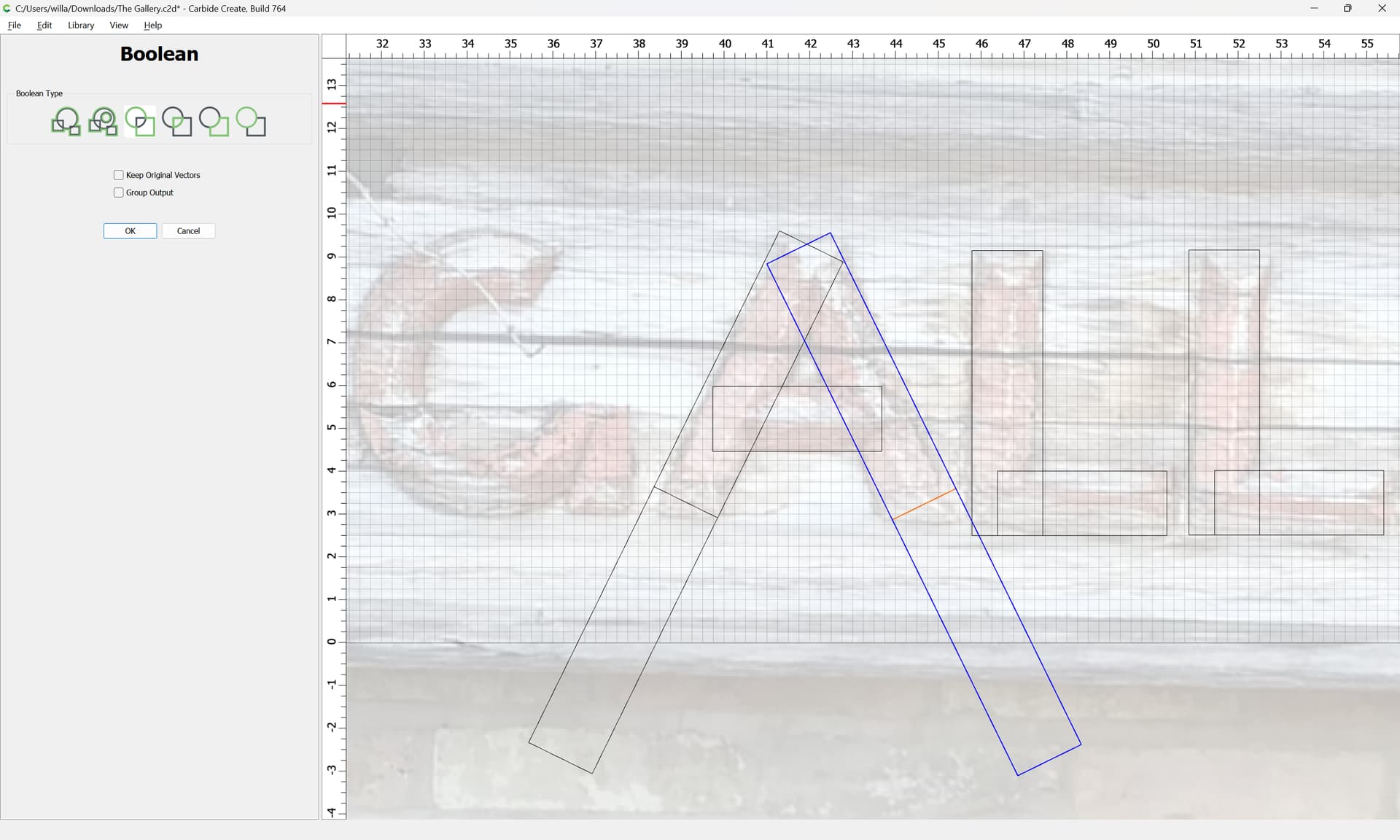
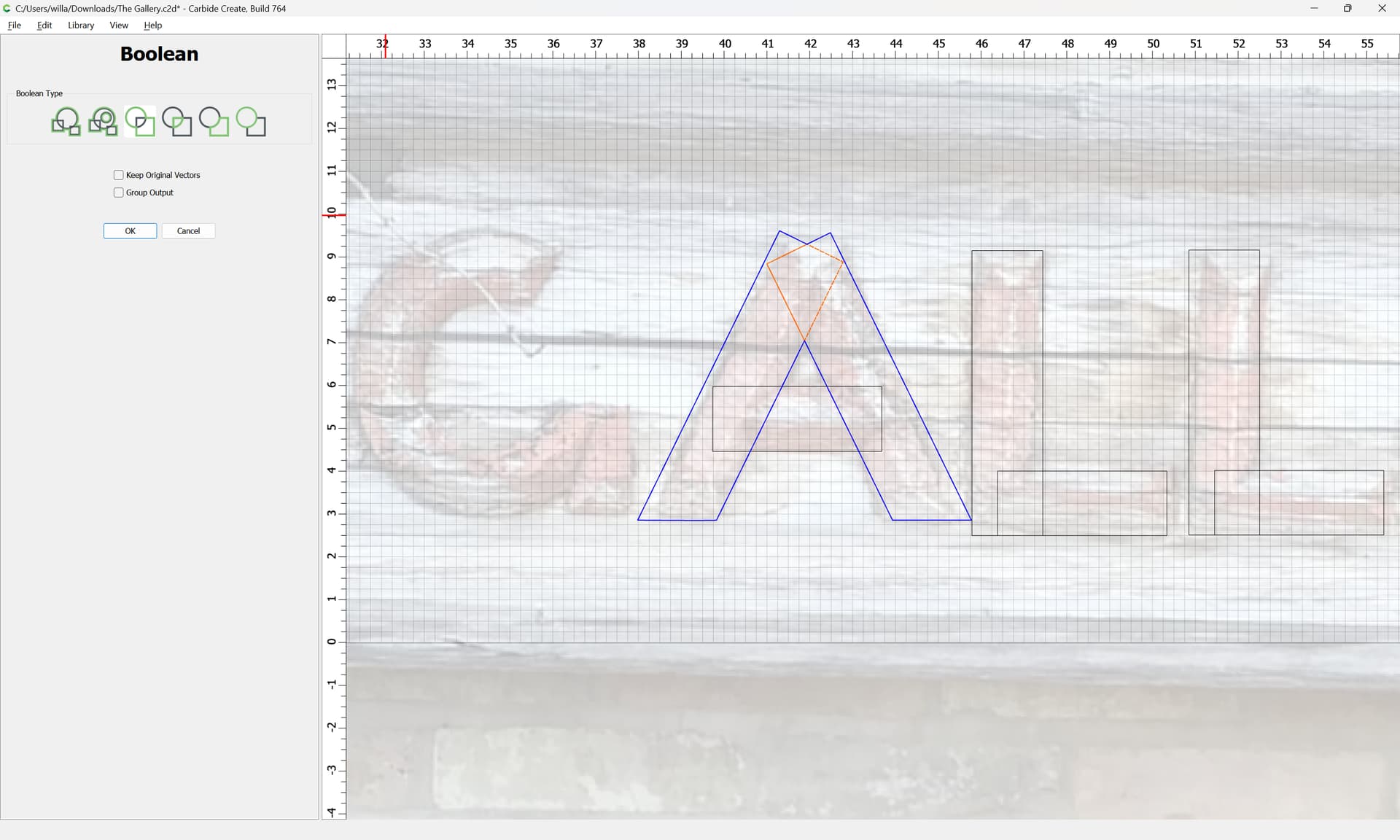
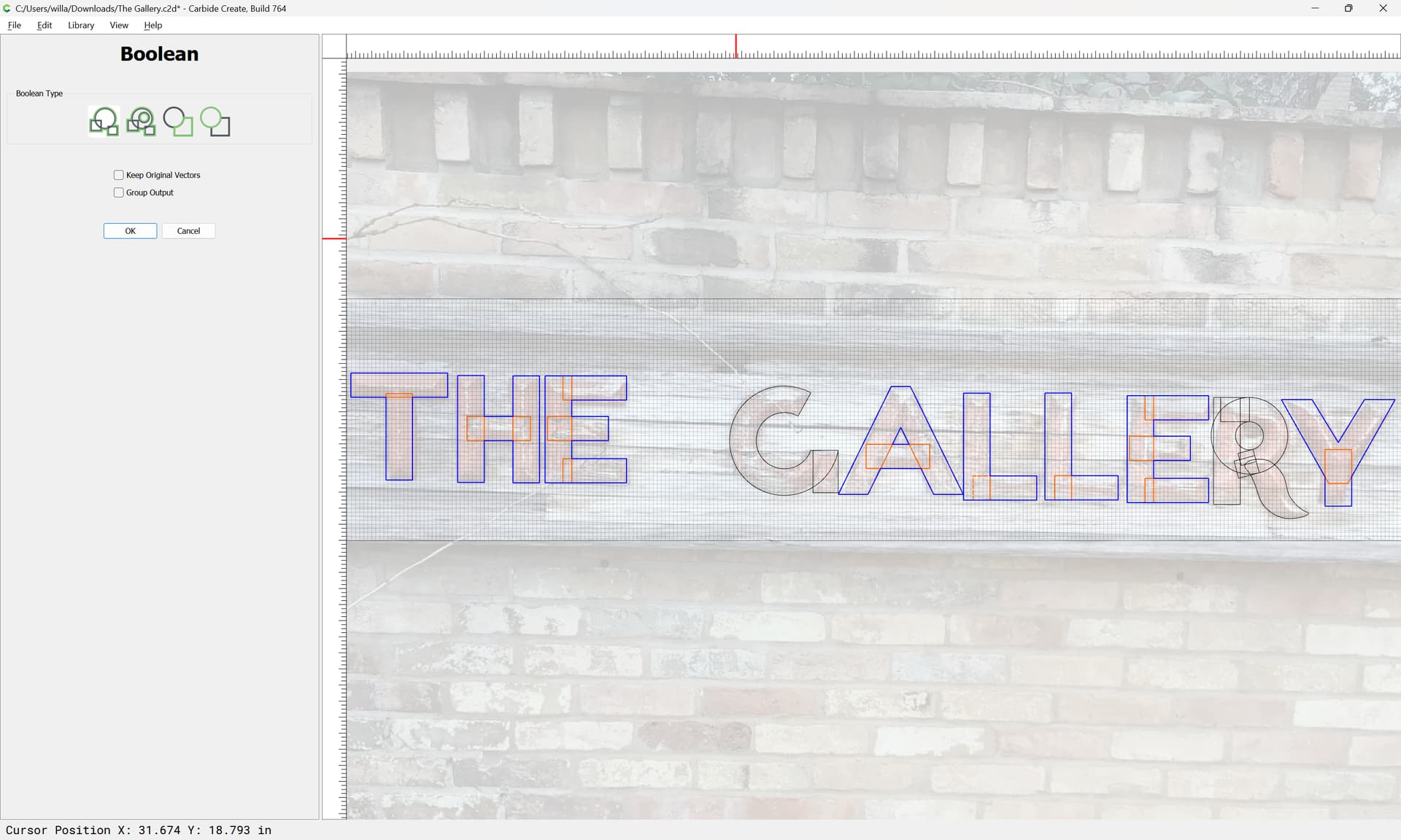
Then, the rectilinear designs may be Boolean Unioned to close them up:
OK
and the curvilinear letters may be done using judicious node editing and Trim Vectors:
OK
Join Vectors
Yes
until one arrives at:
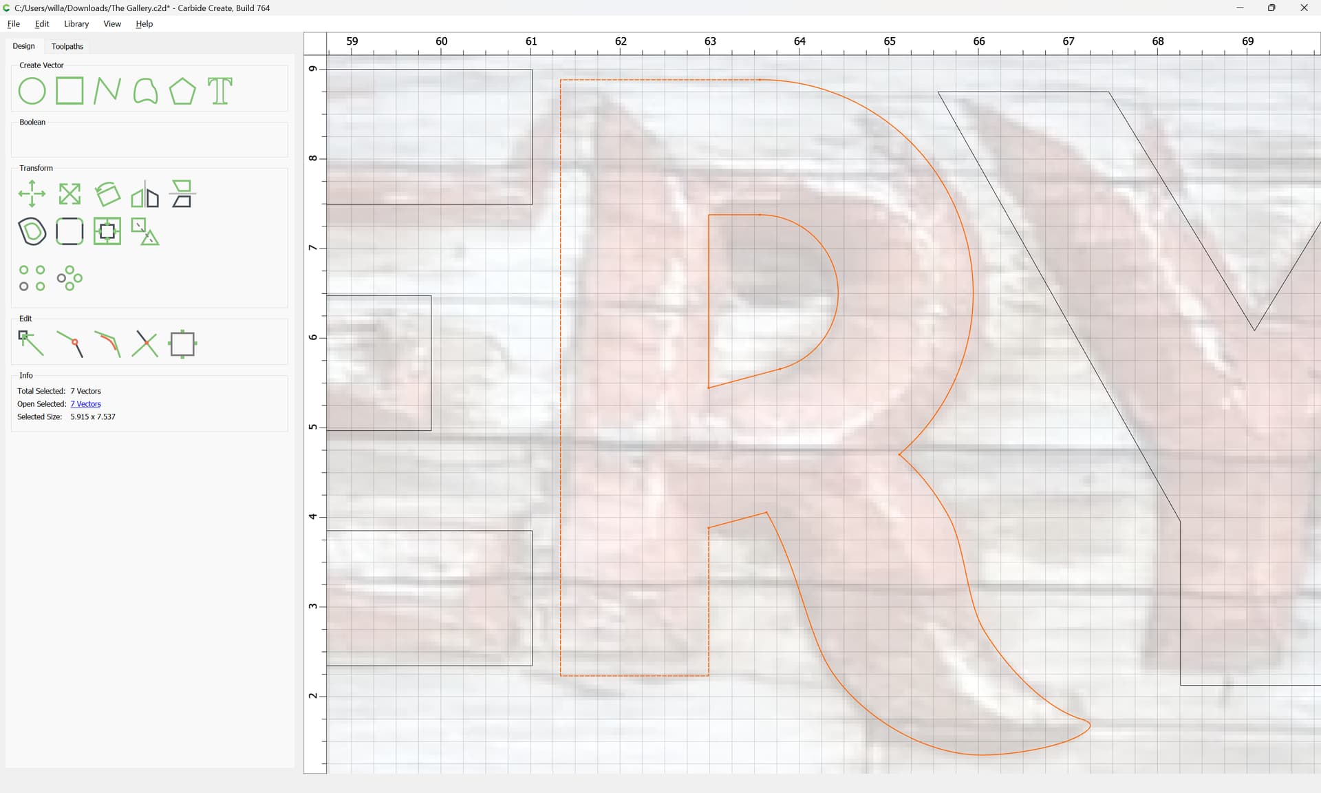
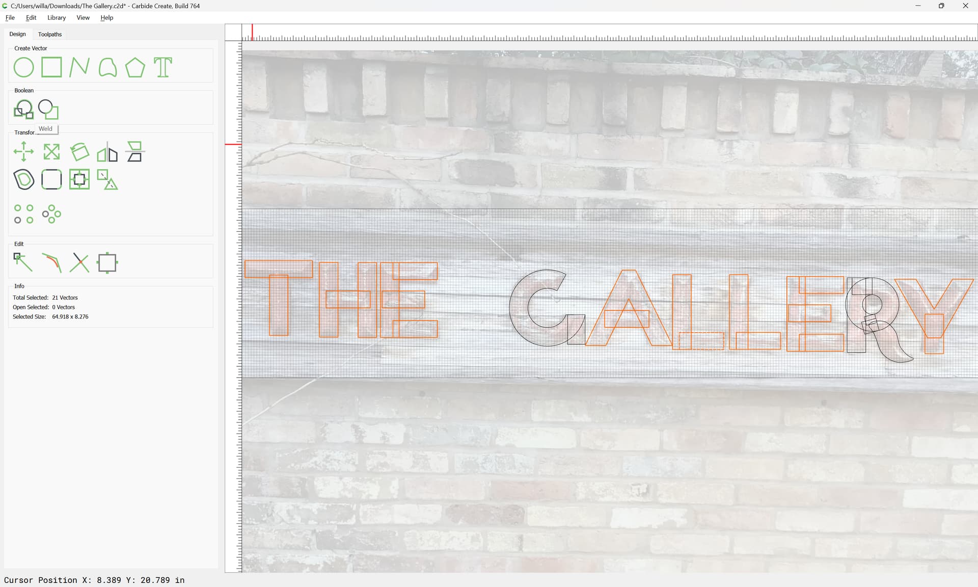
Align, arrange and space everything nicely:
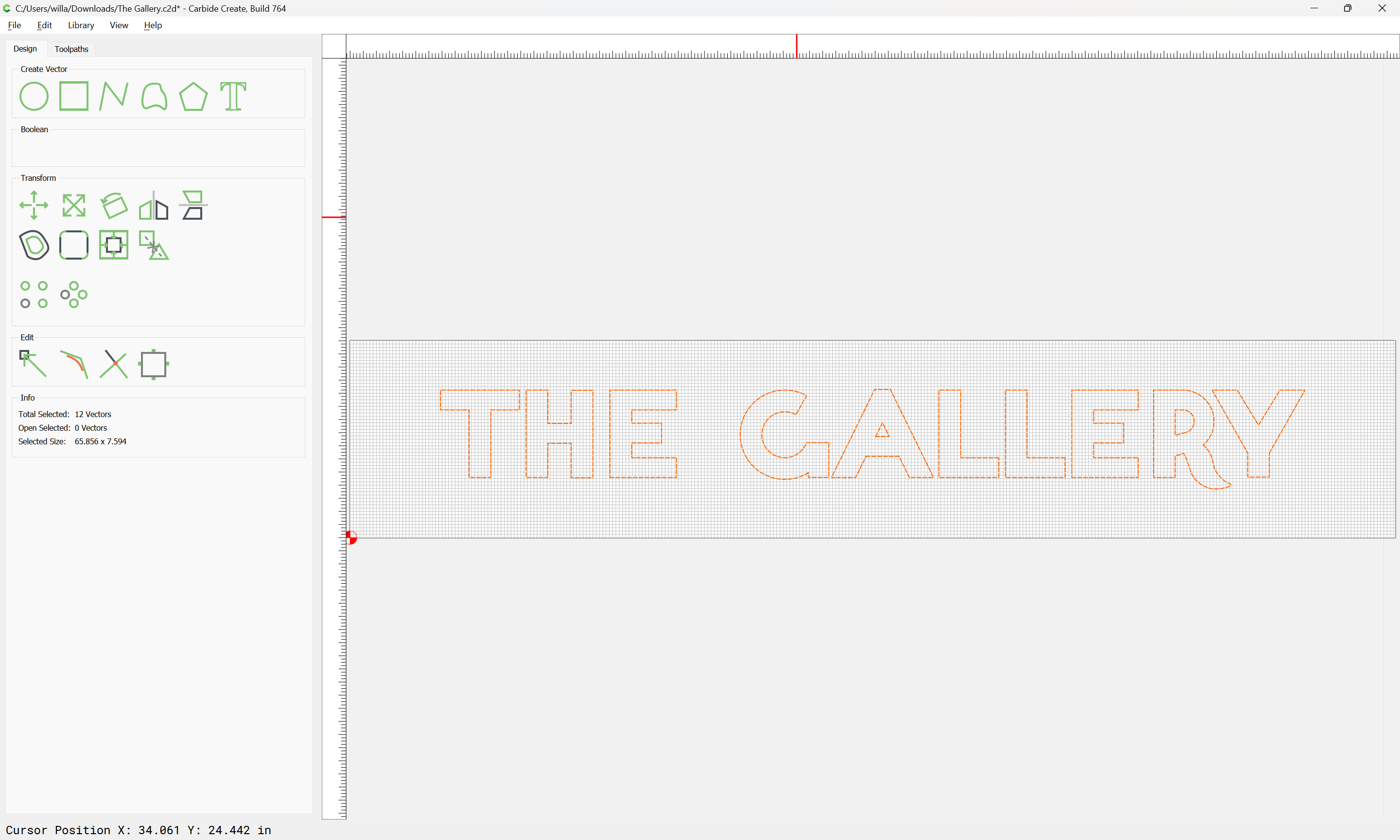
Attached as a v7 file.
The Gallery.c2d (3.4 MB)
3 Likes
Absolutely phenomenal! Now I will have to figure how to carve them.
1 Like
For cutting them, you have a couple of options:
- cut out the letters individually, affix to the surface
- set up an Advanced V carve and cut them out in a tiled cut
and, you can either model them in 3D and draw in additional elements to add texture, or cut them as a pristine Advanced V carving.
Play around with the options and do some test cuts and see what works well — depending on the local and cardinal orientation you may have strong shadow lines to make use of.
3D looks like a good bet, but I’ll be experimenting. Thank you so much, this would have taken me weeks. If I could figure it out at all!
For more on drawing with Carbide Create see:
and for toolpath options see:
and for the basics of 3D in Carbide Create Pro:
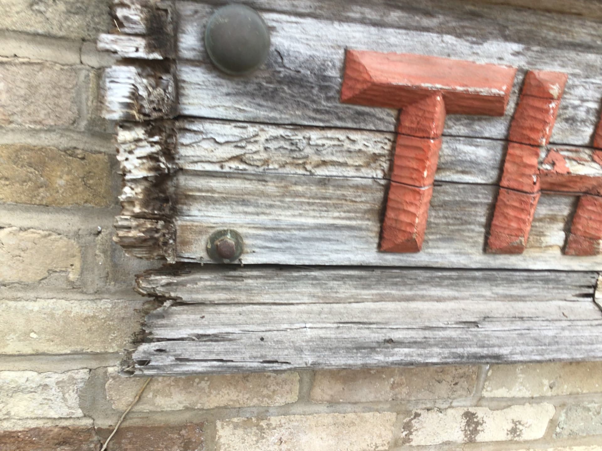
If no-one’s mentioned it already, Look closely at the G. From the pic it looks like there’s an old nail hole where a horizontal piece went. At first I just assumed it was built that way but it just looks off, and upon closer inspection I noticed the nail hole. Simple enough to recreate the missing piece using the same technique though. EDIT: second guessing myself I could be wrong, the horizontal section of the H looks really flat underneath like it was nailed on but other sections look like a monolithic carving. You might see if you can find an old pic to confirm before having to re-cut it.
1 Like
Fots are easly obtained form Pinterst or esty in formats that can bbe used to make g code. Looks like a bit of work that is needed if the presetn letters are to be duplicated due to the depth of the letters . Good luck