@MarkE Nice job Mark! The letters look crisp and straight and that makes them stand out sooo good.
1 Like
Me too Vevor, i show it here. https://youtu.be/8e09C0yRkJU?si=_leRbCgHtTdOGyS9
LOL. I think this video is where I got the idea. lol…
1 Like
What font did you use for the name at the top (Andrew)?
That looks to be Zapf Chancery, Lucida Calligraphy, or Monotype Corsiva.
The cool font to use for that is of course Robert Slimbach’s Poetica based on Ludovico degli Arrighi’s chancery hand:
1 Like
Downloaded the Poetica std., and while it looks pretty good, I think I like the Lucida C. better. Eye of the beholder I guess. THANKS
Kris Holmes is an eminently skilled calligrapher (she was an instructor at R.I.T. when my daughter was a student there and I had occasion to meet her at a conference).
Lucida Calligraphy is now available in a wide range of weights:
That said, Poetica is a lot more fun when one sets it in a tool which affords access to its OpenType features and alternates.
2 Likes
Not my best effort, but learned something.
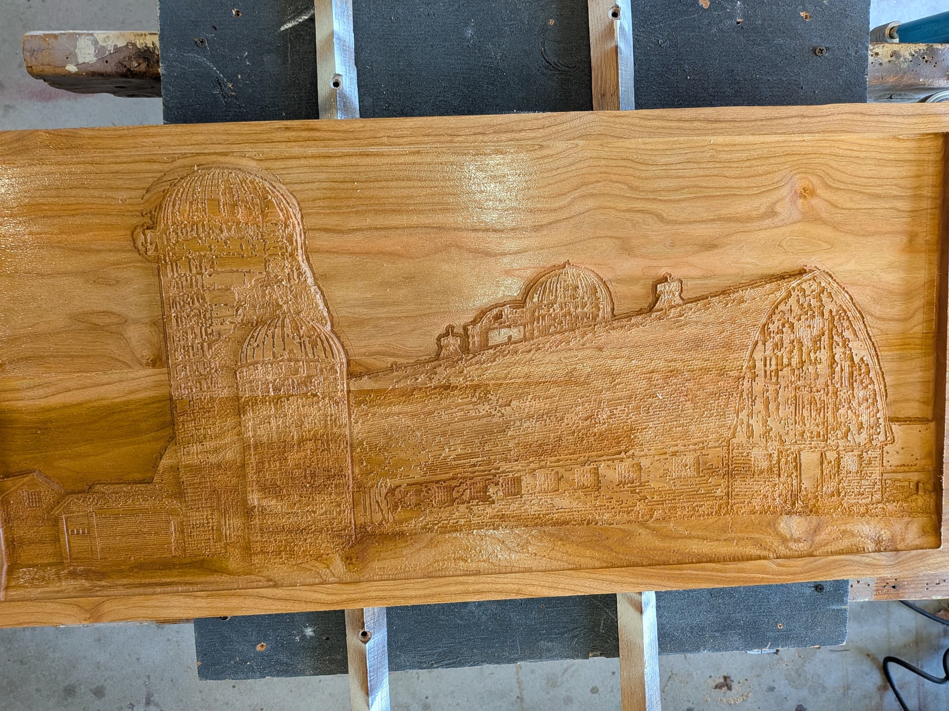
I skipped from 1/4 to 1/16 ball end mill
I should have used an 1/8
11 Likes
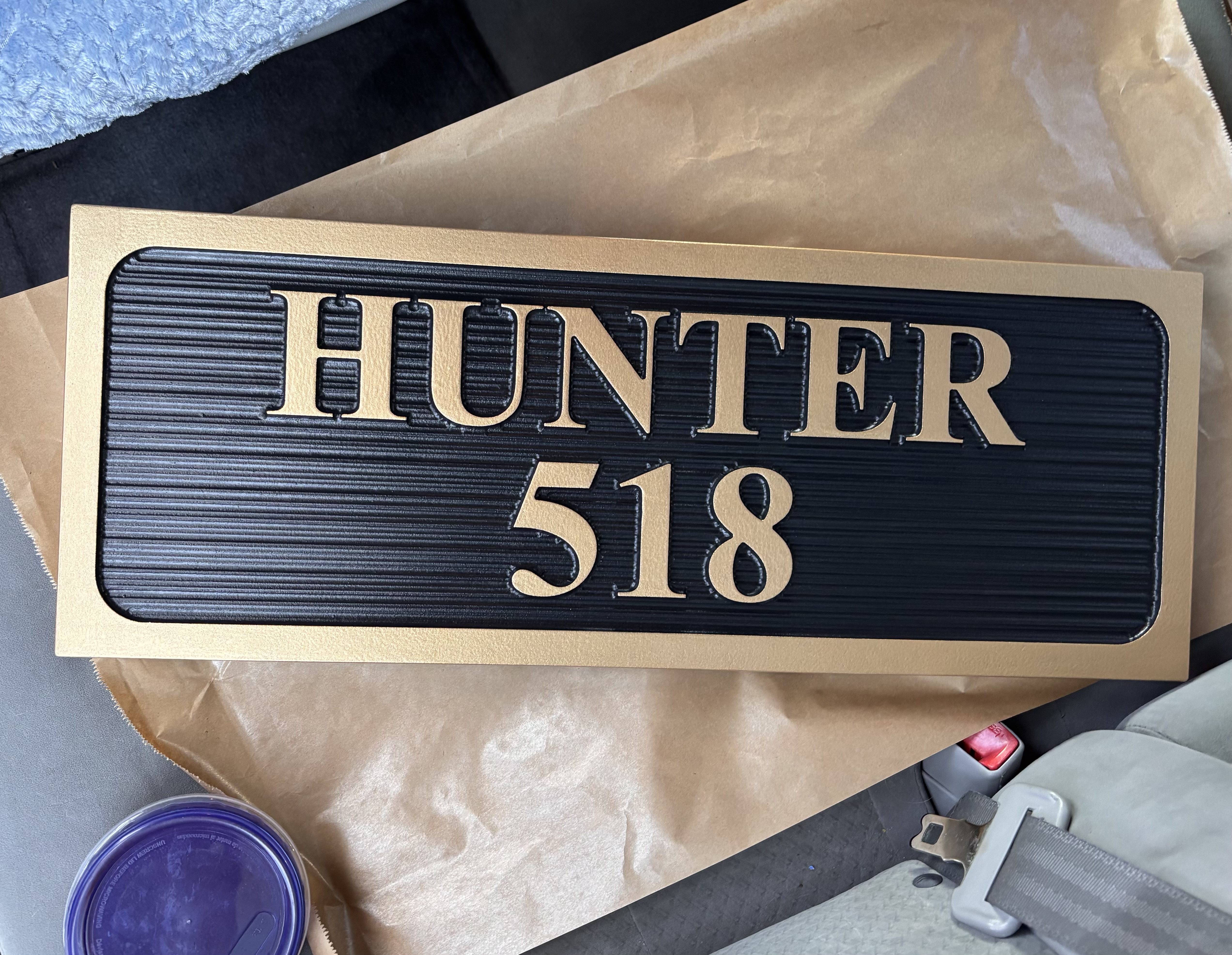
New community signage. The first. Gave this one to them as a sample and immediately got 4 more. Good day.
17 Likes
Is there anything you don’t know! I am always impressed by you breadth and depth of “things”. Really appreciate all you do to support us with our designs. THANK YOU, for being the supportive individual you are.
6 Likes
Lucinda Calligraphy
Just grabbed anything that looked wedding-y.
2 Likes
That’s what I settled on also. I’m using Walnut and having to keep increasing the size of the letters to keep from some of them breaking out. Using a 1/32, but still having challenges at 3/4 inch high letters.
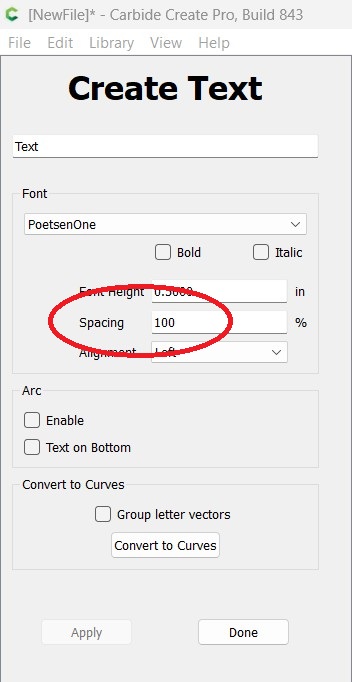
Appreciate that. I do usually space the char. out between 110 and 130 based on what I’m doing. The problem is, I think, that my 1/32" bit is only about 3/16" long on a 1/8" shank. As such, trying to have up to .75" high letters, causes the top section of the bit (1/8") starts rubbing on the letters as the bit goes deeper. I could use/do a 60 degree bit, but don’t prefer that look on this project.
I guess I need to search for a 1/32" bit with a longer cutter section.
If anyone has any other ideas, I’d certainly be open to listen.
Thanks
How about a 30º V bit or even a tapered ball nose?
2 Likes
The 1/32" bits are very delicate. That is likely the reason they are so short. I have broken one in 7 years but it happened at a critical time. Things never go wrong when convenient.
I have replaced some 1/8" bits with a 1/4" shaft. For some reason I hate to replace the collet. It is not hard but I just hate it when the 1/8" collet is required. Also I think a 1/4" shaft makes a stronger bit.
1 Like
The 30° Vee is exactly what I’ve settled on for those sharp corners. Works great!!
2 Likes
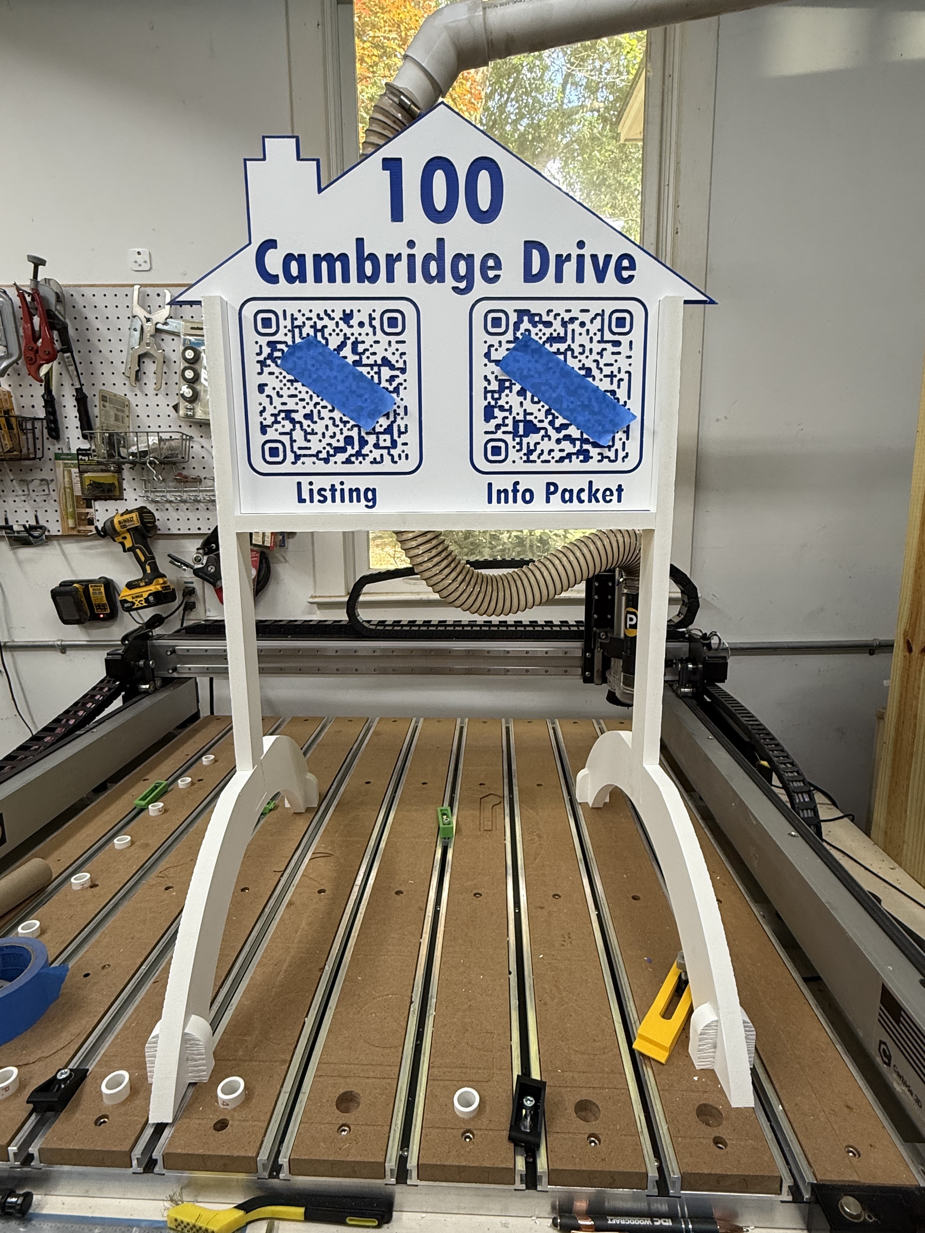
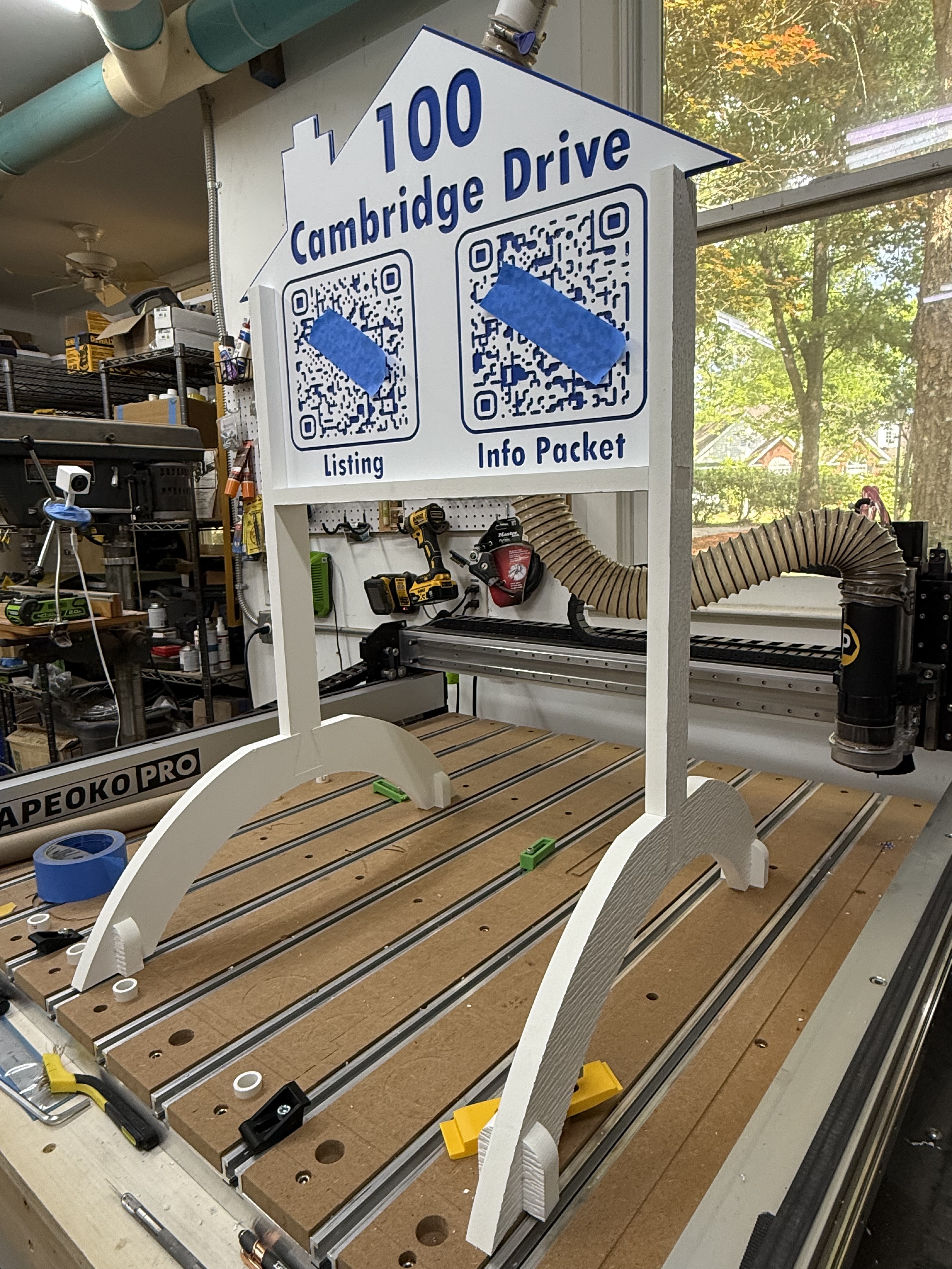
We have been trying to sell our house for a while so that I can have a proper shop. Today I made a sign with QR codes to direct people driving by to our listing and to an info packet that I prepared.
It’s 1/4” ColorCore for the sign and pvc for the stand. I carved both sides of the ColorCore to get them coming and going. The QR code is obscured in the photos but it does work. I didn’t get all the fuzzies cleaned up but since it works and it’s for me not a customer I let it ride.
16 Likes
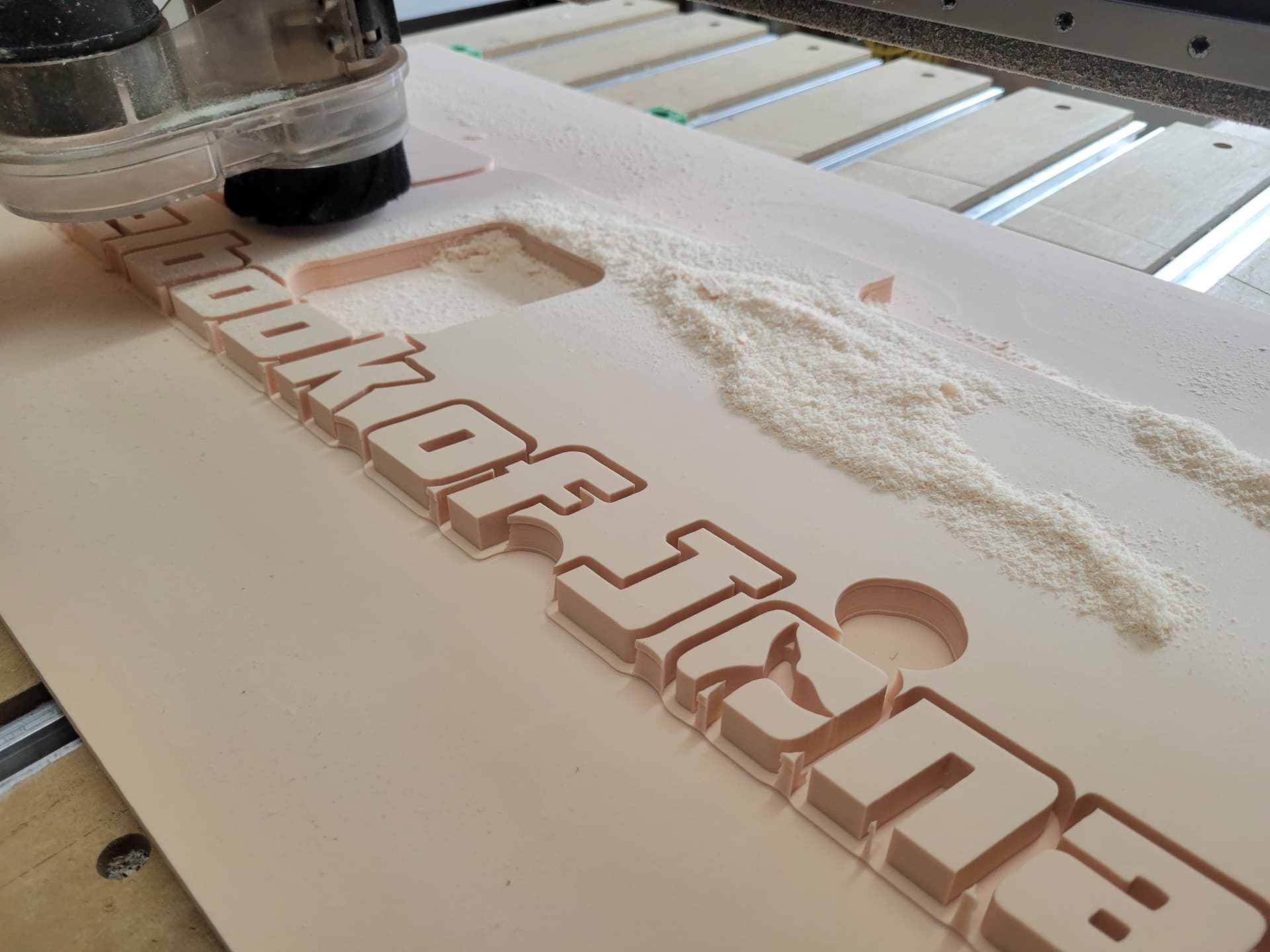
I’ll cut the whole height with an 1/8th bit and then cut it with smaller bits only at the max depth of each tool. You can barely tell if you look hard and it never seems to me to look like cheating.
Your eye follows the sharp edges of the letters that the smaller bits create and kinda just summarizes the rest of the shape in your brain to match.
I’m traveling at the moment but you can see what I mean a little in the whale tale of this pic.
11 Likes
I like the idea of cutting short with the 1/32 on a final pass to square up the top edges. I will give it a try. THANKS
1 Like