I’m not sure this is a feature request as such, but as a new user it would be really nice if the apps (both Create and Motion) adhere to common UI design principles.
I’m thinking about captions on buttons that open new dialogs should end with three ellipses (ie. “Select…”)
It’s really confusing learning a new UI when you can’t infer which buttons open dialogs and which are commands that does stuff. Especially when those commands might actually start movement on a machine sitting next to you.
Agreed. It would be amazing if Carbide Motion was open source [I certainly understand why Create isn’t], so that those members of the community with relevant skills had a chance to offer concrete suggestions via pull requests.
Of course someone could create something from scratch, but why start over when CM has so many small opportunities for UX improvements.
Honestly as a software architect, that sounds like a nightmare for a product company. Managing software projects is tough enough without members of the community throwing random pull requests into the mix. Then you have to manage planning around them, tactfully rejecting the bad stuff, random code ending up in your repo, and other processes. Given this is is mission critical software for the org I completely understand why they aren’t interested in doing this.
From one software architect to another, I don’t disagree that it could turn out that way.
But let’s face it, this isn’t the Windows NT codebase, and there aren’t thousands of developers attempting to put their fingers in the pie like Facebook encounters with an open source project like React.
When the alternative is a poor UX/UI, a company that seems strapped on software resources, and dozens of folks running into issues weekly that could be solved with a little bit of community effort here to improve the UX/UI, I think the result would be a much better piece of software that results in a lot less frustration.
I don’t disagree that this is a pie in the sky idea and unlikely to ever happen, but what we’re left with is often disappointing.
Like Will suggested, I bet you could have easy impact on this if you wrote a one-pager email to Rob explaining your ideal UX improvements. Especially if they are mostly copy changes.
You are replying to my post as if I suggested Carbide3d should not take feedback, that is not the case. My only assertion was that the suggestion of open sourcing their software was off the mark and unlikely.
The thing is, Adobe software isn’t all that well designed — Illustrator in particular is execrable, and Byzantine in its complexity and it allows users to create files which are wrongly constructed all-too-easily (I want back all of that portion of my life which I’ve spent fixing files folks have made in AI) — the focus of Carbide Create is to be as simple as possible, and to enable new users to be successful.
I’ve written a bit about learning to use it at:
Any suggestions on either Carbide Create’s usage or learning it and what is written there would be welcome.
Carbide Motion similarly strives for simplicity and consistency and accessibility to new users — any observations on how it can be improved to meet those goals would be welcome.
I agree with this entirely. I get lost when trying to use Adobe products because, at least for me, their design language is not like any other program I have in the same space.
My view is that there are as many design languages as natural languages, and familiarity with them mirrors familiarity with your mother tongue.
The sweet spot between them and everything else, at least for me in this particular space, is Affinity Designer… I find it half way between Inkscape, which I speak, and Illustrator, which is Greek to me.
Coming back to the subject of better C3D user experiences: Carbide Create does do things I totally dislike, like moving or hiding controls based on context which annoys me as much as if my screwdriver disappeared from my workbench unless I was holding a screw An option to leave the controls in place but disabled when not usable would be superb. Put that on the list
I suspect for many people, right now the magnifying glass means “Search” and looks odd there. Personally I’ve never used it and I expect the mouse wheel to zoom in every application.
Not being contrary - just saying that these things might not be universal.
I agree about the CC icon for rescaling being pretty much “maximize window” in other paradigms.
Icons for abstract concepts is hard, and we’re trying to balance the number of icons shown against the functionality of the program — having the single Align Vectors icon which then reveals a pane full of discrete options is a good example of that — the developers would have to speak to the specifics of how each icon was arrived at.
For specific difficulties, please send the files in to support@carbide3d.com and we’ll do our best to look into each case.
Carbide Create 6 represents the third UI/toolkit which we have used for Carbide Create, and hopefully this one will stick for a bit, and will allow new features, and UI improvements — glad of feedback and constructive criticism, but please consider the purpose of the program: It has to meet the needs of new users who have never used any drawing program at all and allow them to be successful with minimal effort and chance for error.
To get back to the original post — yes, ellipsis to indicate panes are a good idea (at least on the surface at first glance) but I don’t know if the developers will agree, or if they will be seen as unnecessary visual clutter — an enumeration of all the places where they would be needed would help in that evaluation.
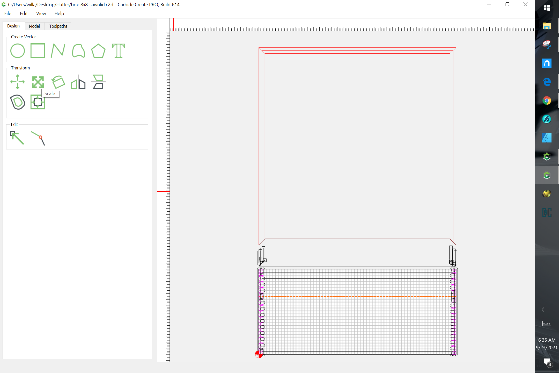
For Carbide Create it’s quite a list:
Job Setup
Set Grid
Set Background
Import
Trace Image
Move
Scale
Rotate
Import
Offset Vectors
Text, but arguably not the other drawing interfaces
— if one allows the drawing tools, then that’s pretty much everything and the ellipses are meaningless — if one can’t use ellipses in CC, but does implement them in CM, then there’s an inconsistency which some folks would find confusing or irritating.
Agreed. It was to demonstrate that overt keenness to find problems can result in presenting non-issues as issues.
I’m not sure where this proposition came from. But if it is indeed stated somewhere, I find this easy to accept. Like Windows coming with Paint and WordPad and not PhotoShop and Office…
I’ve been trying to influence change in this area for a couple of years now…with very minimal success, frustratingly.
My concern isn’t so much open source, or even usage of standard symbols…
How about just consistent UX from dialog to dialog? Why is right click available on some objects but not on others? Why do some menu items have shortcuts and others don’t? Why is there a cancel button on some dialogs but not on others?
I can understand differences with old dialogs, or dialogs with a lot of difficult calculation code running behind it (where you might be hesitant to take the time to change it), but the NEW Layers dialog is a complete diversion from all of the other dialogs in the product! It looks like it was written by a completely different (and less-skilled) development team: Sub menus off of buttons instead of right-click, reliance on difficult to see color variations (which violates accessibility standards), no right-click support, no accelerator support…no drag and drop support…the list just goes on. And that’s perhaps the simplest dialog in the code!
This is not ‘pile on Rob’ time. I don’t blame Rob for putting these types of “cosmetic” changes on the back-burner. He’s got his hands full releasing new and exciting products, trying to overhaul the graphical underpinnings of a lot of CC, and running a growing company. The man has a lot on his plate.
What bothers me most is that the introduction of the pro version of CC diverts the precious resources available to make these changes - making resolution to these real problems seem even further away. I don’t have a crystal ball. If Pro is a financial success for Carbide, I’ll be thrilled…but also disappointed that these types of issues will linger longer. If it’s not, perhaps a decision to invest in UX improvements to warrant the cost will happen. We’ll see.
If Carbide wants the code closed, great. But then they are the ones who need to expand it, fix it, and make it a good experience…and be responsive to that. This takes resources and commitment.
I’m completely new to the cnc the XXL is my first anything with cnc. Love the machine and the software is amazing when it comes to the basics. That being said I’ve been around autodesk products sense college back in 04. A few upgrades to cc i would like to see is a way to turn on and off the snap settings. Similar to Autocad where you can control what you snap to whether it be a quad on a circle end point on polylines mid point so on and so forth. It gets frustrating when I’m picking tabs on a design to be cut and the tab is placed on the grid and no where close to the desired location. Not sure if there’s a way to simply delete the 1 or2 wrongly place tab markers. If there isn’t that would be a huge time saver. Also the ability to pull measurements between 2 point or objects to check part size would be amazing, rather than relying on grid settings and counting. Just my 2 cents worth on cc and as a company I get not investing a pile of time and resources into software thats free. Same with cm although 1 thing that I believe would help tremendously would be a screen that shows what have been cut and builds as the machine works its way along. On my very first project cut I made a simple mistake (didn’t get the bit tigh enough in the collet) and about 25% of the way through the process the bit walked out. Had to stop the machine and reset and re start. After watching the machine basically cut air as it was making passes before the crash I thought to myself man it sure would be nice if there was a screen that popped up showing the already cut path with the ability to pick a point on the screen and have the machine start there instead of reverting clear back to the beginning of the code.
 An option to leave the controls in place but disabled when not usable would be superb. Put that on the list