Community Challenge #27: Letter cut-outs (and so long)

Good evening,
This is an entry of one of the most challenging project that I have ever completed, not through the challenge of the design but due to the plethora of first times involved. It was my first time carving aluminum, first time polishing aluminum, first time tapping holes, and my first time cutting acrylic. This was a sign I created last year for the news organization at my school, The Talon. I did some mockups in Fusion, and foolishly I sent them one with an aluminum background. Unsurprisingly, this is the design they selected. Essentially, the design is carved pockets for the letters with matching letters to go in these slots to create a popped look. Here is the final product before I do a deep dive.

After everything was confirmed, I decided to do a mockup in wood to make sure that the design and tolerances were correct. Here are photos of that.

Around that time the aluminum arrived, and I began what I deemed to be the most challenging aspect of this project, polishing the aluminum from a rough state to a polished state. It arrived like this.

I still have no real sound process for this, but essentially, I worked up the grits slowly using a product called Alumicut to lubricate and minimize build-up of aluminum on the sandpaper. I started at around 80 grit and worked my way up to 2000 grit with an orbital sander, I then switched to 3M ScotBrite pads. After this I applied Mothers Mag Aluminum Polish with some foam pads on the orbital sander and then wiped it off by hand. I believe I did this a few times, and in the end it looked spectacular. This took multiple weeks of trial and error to get acceptable results, and in the end, I still wasn’t completely happy. Reaching a mirror finish is very challenging, something that someday I hope to reach myself. This process is by no way a perfect system, and I would love to hear input if anybody has had good success reaching a perfect mirror finish on aluminum. For now, though, I think that in the future I will set my sights on brushed finishes, which seem easier to obtain. Here is a picture of the finish it is quite close to a mirror, the later one is even better though.

I did all the CAD in Fusion, I did it nearly entirely with adaptive clearing toolpaths. I began using a Zirconium Nitride coated eight inch endmill for the pockets, this was working quite well until it crashed.

I still have no idea what caused this error. It suddenly rammed into the side of the work piece and careened until the depth of cut and speed was too much, at which point the endmill snapped. I sent the entire GCode for all the letters as one program through Carbide Motion, and with the relatively small step over due to the smaller endmill, this produced a huge file. I was monitoring this as it went, unfortunately I was too late to prevent the error, but it happened once Carbide Motion claimed the program had reached 100%, which was only halfway through the program in reality. Is there a limit on the number of lines of Gcode that can be sent through a single program? Later I had another issue, which left a cut across the center of the “O”, therefore from this point on I treated this version as practice. Despite how disappointed I was about having wasted so much effort, this proved very valuable. After this I transitioned to using 6 mm single flute carbide endmills, which were much more effective for hogging out the central material. I then tried to use a 1/16th in endmill to profile around the edge to make the radius tighter and to create the pocket for the bird to be painted. This while initially successful, proved to be unnecessary and quite fragile. The 16th endmill ended up snapping when profiling one of the letters. As the endmills aren’t cheap, I decided that two breaks were enough and transitioned to using 1/8th inch standard carbide endmills for any of the detail work. Minor sacrifice in radius, but worth it for my peace of mind. After completing the sign, I decided that the painted birds didn’t look great, and they had the potential to ruin the finish if the Oramask 813 was ineffective. Here is the version one prototype.


Not long after that I received a new piece of aluminum that arrived in a similar state of disrepair. I followed a similar procedure to that mentioned above, but as it was my second shot at a reflective finish, I believe that the result looks much better. It is a lot closer to the mirror look that I was hoping for.

This time, I began by carving out the wooden letters so that I could slowly near a perfect fit when carving the aluminum. They were profiled in poplar, then the “Talon” portion was stained black and finished with a matte clear coat and the “The” portion was painted red. I then proceeded to use my revised procedure for version two for the carving of the aluminum. I hogged most of the aluminum with the 6mm single flute, although I sent each letter one at a time to minimize the risk of the aforementioned issue with files size. After all the letters had been mostly pocketed, I then used a two flute 1/8th in endmill to slowly near the perfect fit tolerance. I wanted the letters to be a friction fit so that they could be easily replaceable, I even thought that they could be replaced based on the seasons, maybe have Halloween themed colors.


I decided that for the birds, I would try to carve them out of acrylic, I used a similar strategy for the future “El Campo” sign. Although in this case, as there was only one area that would allow for a pin, I used square slots, to force them to be in the right location and orientation. I first 3D printed them to confirm the look and pocket alignment system. I then carved the acrylic from the back to create the pins and then profiled them, after some trial and error and careful sanding this produced similarly protruding jet black and glossy birds.

After a final test fit of all the letters, it was time to move onto the hanging hardware. As this was a very heavy sign, and it was going to be hung in a school building, it had to be incredibly secure. This was one of the factors I felt was most important. I wanted it to be flush mount which proved quite challenging. I ended up deciding to use aluminum z-clips which are essentially French cleats. To achieve the flush mount, I carved pockets to perfectly fit the thickness of the stacked clips, as well as providing room for easy installation. I followed the aforementioned procedure for carving the letter to carve the back. While I was carving the back, I used a drag engraver to engrave the names of all the current people on staff, which I thought was a very neat and personal touch, that is a huge benefit to the CNC process.

After this I had to drill and tap holes for these hangers which proved incredibly challenging, as I had never done any hand tapping. Although incredibly nerve-wracking (as one false move so late in the process, could have been devastating), it managed to go successfully. I screwed them into the back and the piece was essentially complete. After many photographs had been taken, I wrote up some installation instructions for the maintenance team, as neither student or faculty are allowed to make permanent installs in the hallways, and it was ready for delivery.


Although I was initially reluctant to work with aluminum, I learned an incredible amount from this project. And although it was completed after months of trial and error, and way beyond budget, it was all worth the final product.
As I can see the sign every day, (It was hung prominently so that it can be seen at the very beginning of the major hallway in the school) I get a unique perspective to see how it wears over time. Thus far there has only been one issue. I decided not to glue in the letters, as I wanted to be able to replace the letters or change them depending on the season, this wasn’t sensible. As I had predicted there would be some complications with the unequal expansion and contraction rates of the two material types, as well as the typical expansion throughout the seasons. As a result, on a couple of occasions the letters have fallen out, I ended up super gluing them in place which has solved that issue.

Thank you all so much for reading, and I want to once again thank Carbide 3D and Julien for hosting these competitions.

22 Likes

Well I’m a little late to the party and sad to see the contests coming to an end! I got my SO4 a couple months ago, and the previous contests are an amazing source of inspiration, so I knew I had to at least give one of these a go! I’ve been wanting to play around with topographic carving and have been trying to learn F360, so I decided to see if I could integrate that into this contest.

The idea was to overlay a topo of the San Juan mountains in SW Colorado onto script lettering of our name for a mountain themed mantle decoration. Unfortunately we no longer live in the area, but those mountains are a source of many fond memories. The cutout script lettering would then be overlaid onto a layered mountain range.

Two mountain ranges were first cutout from 3/4" walnut. A shallow pocket for the script lettering to register in was cutout into the outer layer of mountains. A combination of 1/8 and 1/16 end mills were used to get into all the areas.

A group of trees was v-carved with a 60 degree bit and then cutout with a 1/16 endmill from cherry.

A topo of the San Juan mountains north of Durango, CO was brought into F360 using the Image2Surface add-in and then used to split extruded bodies of the script lettering. Due to the small detail in the lettering, I was limited to a 1/16 endmill for the profile operations, which only had a 3/16" cutting length. In order to maximize the height of the topo scaling, I decided to profile from both sides. First, the backside was profiled to 3/16" depth in a piece of 3/8" maple, and then the stock was flipped using pins on either side to register position. Then, the topo was carved into the front side with a 3d adaptive roughing and parallel finishing with 1/8" flat and ball end mills. This resulted in the scripting being a variable thickness from 0.1" to 0.35".

After completion of the topo carving, the remaining stock was removed to a 3/16 depth by a profiling pass with a 1/16 end mill.

Snow capped mountains were a late addition per the wifes request with small maple inlays on the three tallest mountains.

The layers were then glued together and finished with spray poly to get into all the detail areas.

This was certainly my most challenging project to date and stretched me to learn numerous techniques. Thanks again for all of your inspiration and I look forward to continuing to learn and grow with the community.

Note: Additional pictures to follow since my newby status only allows one embedded image on this post.

11 Likes

6 Likes

And unfortunately this is the limit…

9 Likes

I don’t believe the contests are coming to an end, just that there will be a hiatus while we recalibrate a bit in terms of prizes and frequency and so forth.

5 Likes

My Entry:

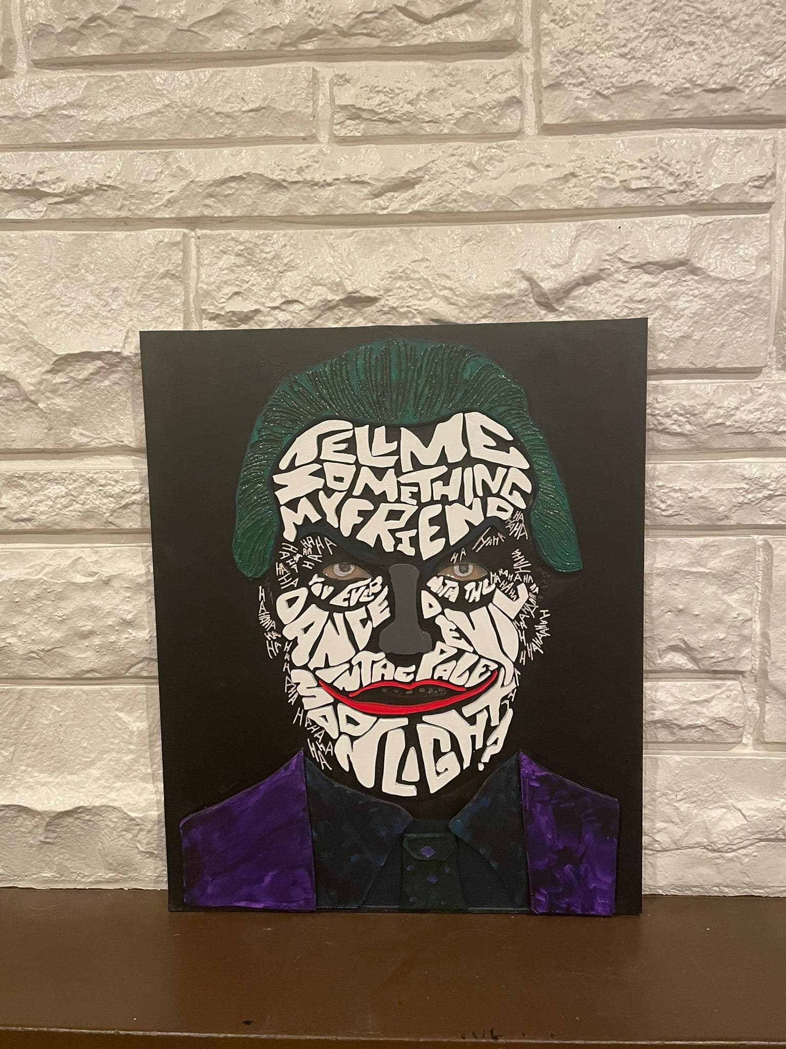
The Joker - Tell me something my friend, You ever dance with the devil in the pale of the moonlight

For those unaware of the movie reference, here it is

The process
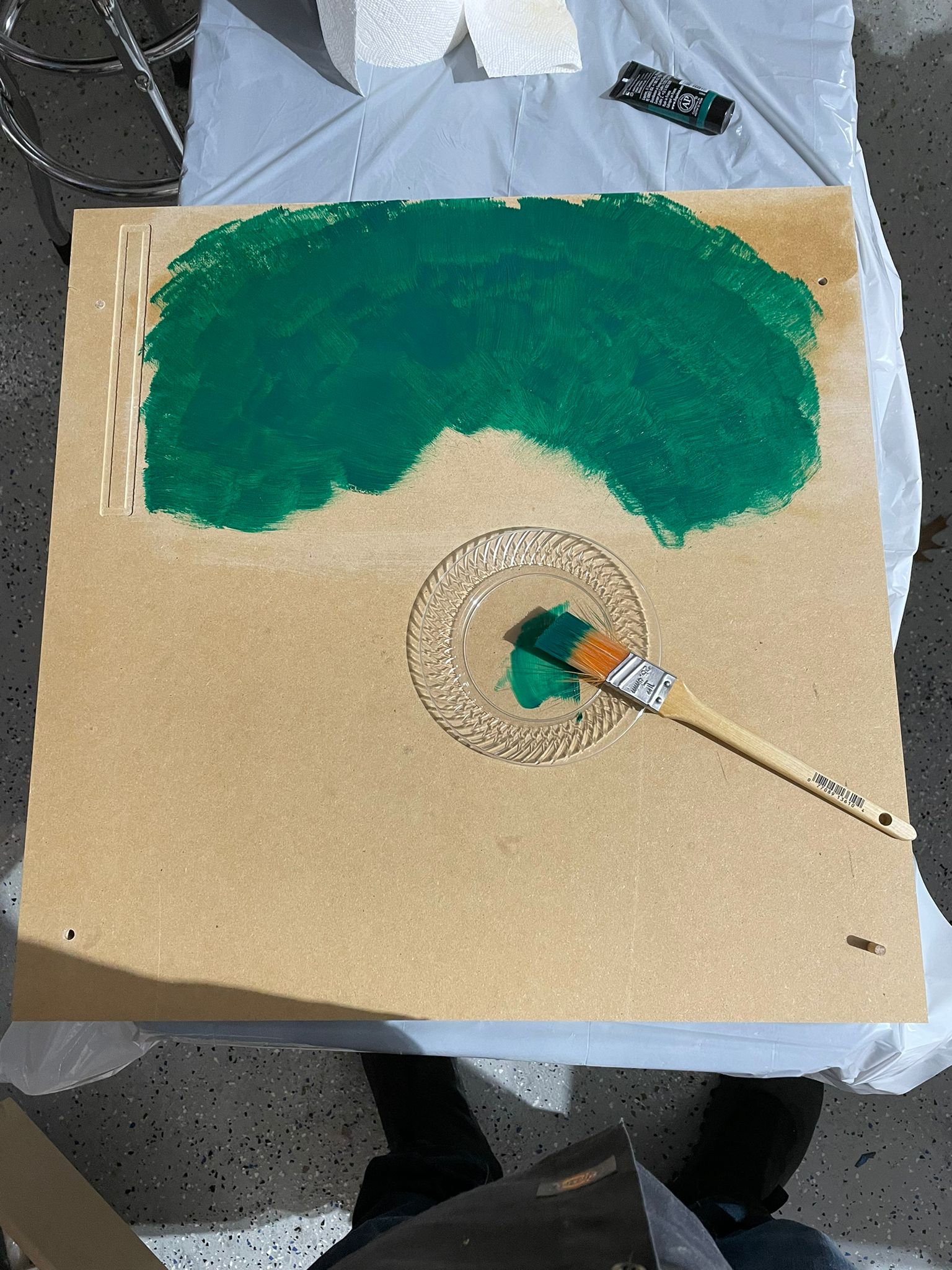
Step 1. Took a 3/4 piece of MDF scrap (22x22 inches) and painted Green where the hair was to go (FYI - prior to painting, I made a small square profile pass on the top right, that helped me see where I needed to paint green)

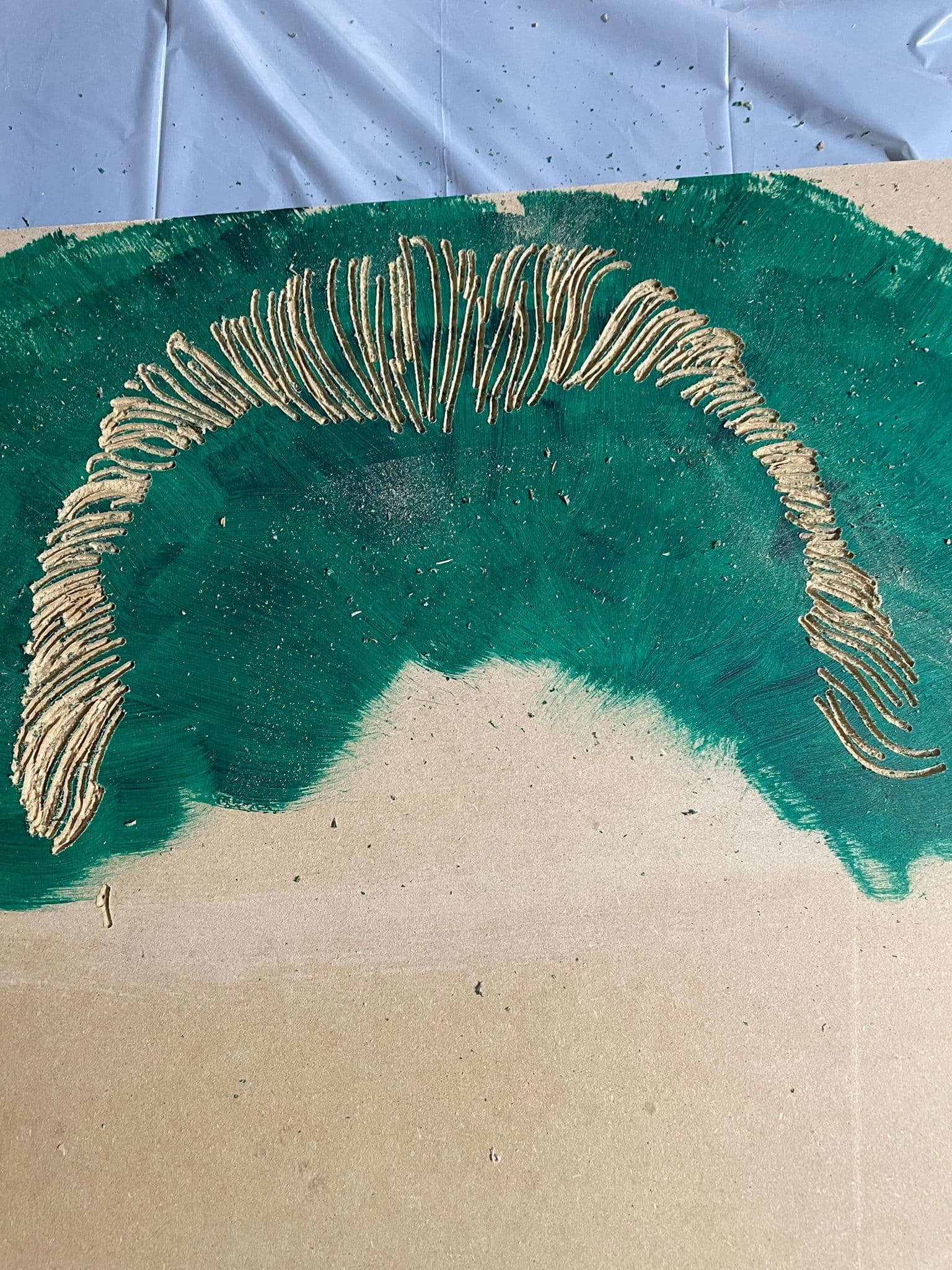
Step 2. Vcarved the hair. This was filled in with green mica metallic epoxy to give it that Joker Luster I felt the piece would need.

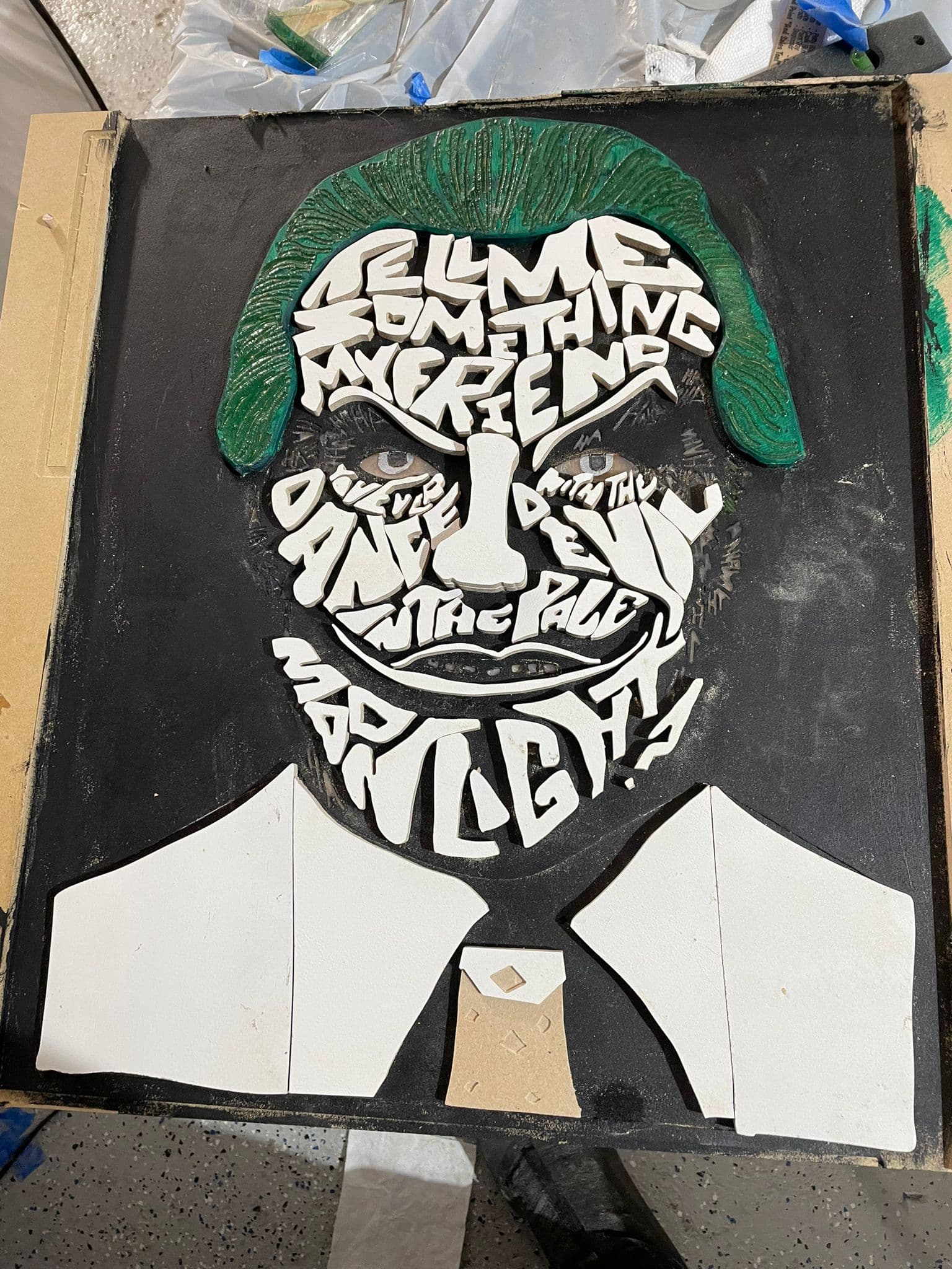
Step 3: Surfaced everywhere but the hair 0.25 inch. Then surfaced an additional 0.05 inches for where the suit would sit, as I wanted the face pieces to extend a little further than the suit.

I also vcarved an area for the teeth and small HAHAHA, as these were too small to cut out individually on the Shapeoko and get the fine definition I wanted.

For the eyes, these were actually done in two parts. After the 0.25 surface, I pocketed an extra 0.05. I then painted the recess with some “silver rub n buff paint” that I purchased based on the results @tomh and others had with the Aztec calendars. I then vcarved/pocketed an additional 0.05 around the eye, excluding the iris. This got rid of the silver on the white of eye (think the technical name is sclera), which I then filled in with a whitish epoxy. (If you scroll all the way to the top you can see those scary eyes just pop at you.

Step 4 I then epoxyed the white HAHA. The challenge with this step, was that it just wasn’t popping off the wood. So I ended up painting black over it and adjusting with micro letters (see Step 7)

Step 5. To conform to the rules, each of the white large letters, nose, lips, suit jacket, tie, shirt, were individually cut pieces on my Shapeoko Pro on 1/4 inch MDF which I pre-primed

Step 6 Which were dry fitted on to my wooden canvas

Step 7 I went to my local library that has an awesome Epilog Laser. I imported my HAHAHA from vcarve into CorelDraw and did manipulation to cut them out on a very thin piece of 4x4inch plywood that the library supplied me.

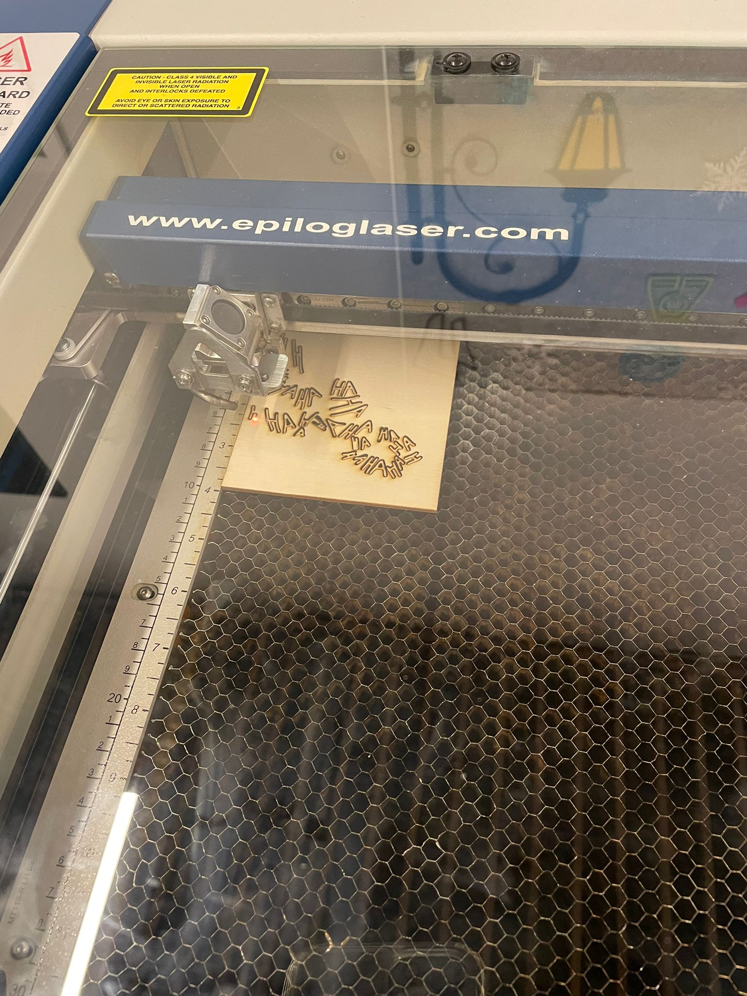
Step 8 Painting all those tiny, and I mean tiny HAHA white. Also, I had to paint both sides, because once they are all individual pieces, you have no idea which is the front or the back.

Then I had to take each piece and try to determine which of the micro-grooves it fit in (this was why it had to be painted on the correct side). In the image below, you can see me working away, as I figure out which H and A, fits in which slot (2 hours of my life was destroyed by this).

Once complete, I had to remove all of the small letters, as the big letters needed to go on first (the main attraction). I used envelopes to group the letters, so that the arduous task of putting them back on was shorter.

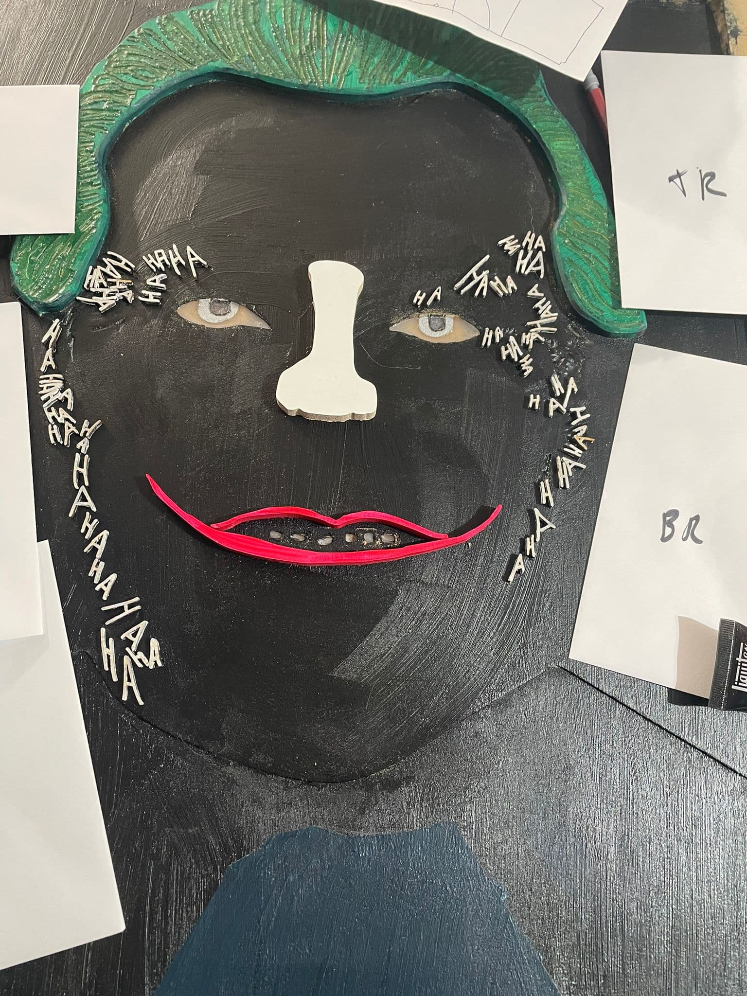
Step 9. Painting all eyebrows, lips, nose, letters (which were pre-primed, but I wanted to paint the tops again and the sides of the pieces. Also, I poured purple metallic epoxy into the squares of Joker’s Tie. I also sanded the shirt collar down a fraction so that the suit jacket was higher, and makes the tie pop more at the bottom.

Step 10. Gluing all the pieces onto my canvas (FYI - that included running to Home Depot to buy two tubes of Loctite Super Glue Gel)

Step 11 Cut off the excess, where I had holding pins with the band saw and then a huge, clean up

So what new skills did I learn:

  1. Procreate to trace the initial image that I thought I could take into Adobe Illustrator only to learn that it creates a raster vs vector, and so then I had to go through image tracing and the like in Adobe Illustrator to convert to a vector. This should have been easy, but my procreate image did not conform.
  2. Locating Pins. With this job, I had to put the main body back in and out of the CNC machine. So I peck drilled 1 inch deep holes into my 3/4inch material and created dowels from a 3ft dowel I picked up at Home Depot.
  3. I’m not sure why, but when I cut the large letters and face pieces out of the 1/4 inch MDF, it did not cut all the way through (0.24 vs 0.25). I then just sanded the back of the MDF to free all the individual pieces (normally, I’d just go bandsaw, but there were so many pieces). FYI - I also consequently had to learn how to create the ‘cheap but effective air filter for my garage’ - box fan and Merv 13 filters) - https://www.youtube.com/watch?v=aw7fUMhNov8
  4. Laser - Surprised at how fine it can cut, and will definitely be added to my workflow in the future. Plus I finally got to use CorelDraw.
  5. Using Mica Powders vs using paint tints in epoxy resin. I was hesitant about using Mica Powder as everyone talks about having to mix it really well, but it seemed just as easy as the tint.

Parting comments:

  1. Don’t pause these competitions. It is truly inspirational to watch all my fellow artisans create mind-boggling entries, month after month.
  2. The next challenge could be lamp/light fixture design, as I am sure that my fellow members have all been inspired by @Julien journey Tips on making this wall light? - #123 by Julien

Lastly, here is a link to the Aztec Calendars I was referring too

12 Likes

Will put it the right way (that the words of my imperfect English in the original post failed to convey). Call it a pause to recalibrate on our side, and extra time to hone various CNC skills on yours. In the meantime…already a lot of great entries in this contest, keep them coming !

7 Likes

The contests will continue — I’ll note that the best way to encourage them to continue is to participate: put in entries, and vote.

8 Likes

Can’t enter yet as I don’t have my Shapeoko until the 15th (picking up a used 3XXL from someone upgrading to a new Pro XXL!) but I can’t wait to participate in future constests! I had no idea these went on so now that I do I’ll be checking back for the next contest once I get everything set up and configured! Thanks for all y’all do!

1 Like

Unfortunately I don’t have as many photos of this, as I only learnt mid-fall this year that Google Hangouts doesn’t save the actual picture to my phone when I take the picture inside the app, it just sends it in the message.

I wanted a fairly good sized portable score board for my sports. There’s tiny options, flip chart style ones, or completely jumbo stadium ones available. There’s also the option of using various LED panels that are available, but they are rather pricey to build something this size. And not quite protected from the elements (eg a stray soccer ball) Plus it would be a fun project.

Aluminum extrusions seemed like a nice, easy, modular way to fake my way through knowing how to design some sort of enclosure :slight_smile: Going back now to get screenshots for this post is… painful :slight_smile: Basically the CNC work is the white digits with tabs, cutout of the black as a “negative”. They bolt to the extrusions with t-nuts using M5 bolts.


I don’t have any pictures of machining. The digits are acrylic, the black is ABS panels. The white is known as “sign white acrylic” in the industry and is very standard. Cutting it in a strip let me use less actual material for the digits. Both are terrible to cut - a bit smelly, but a massive static-cling nightmare that gets everywhere. Feeds and speeds are fairly punishing when you get them wrong.

I can’t remember my recipe to be honest. It was rather frustrating, but I think in the end using roughing passes in F360 was the trick as it reduces rubbing. Gives it a bit of sidewall clearance. Also I think I used too small an end mill. My newbie thought was like, smaller kerf is better, right? But I think for this, it leads to less rigidity, which is more rubbing? I dunno. For wood now I sure am in love with 1/4" 3-flutes, and I just received my first 8mm 2-flute to try out in my elaire collet.

Test fit - you can see the screwss in place here as well, looks kind of nice.

I used E6000 to hold them in place. The bond was… mediocre. Good enough. You can see where the tabs were. but since it’s not visible from the outside I didn’t bother doing a great job cleaning them up. The acrylic snapped on me trying to clean up one so I then was hesitant. You can also see here that I pocketed out some material. I wanted some diffusion of the LED’s, but I was worried the thickness would get rid of too much brightness and on sunny days it would be hard to tell.

This is a whiff of the nightmare that is ABS machining. Your sweepy brushes have never been so sad. You will find tiny black shreds for months.

The first plan was to use LED strips. I lightly traced out the the layout. But, this was a pain in the butt. I scrapped the idea.

I exported the shapes from CAD and used KiCad to custom create circuit boards that would be used instead. I used the same wood shown above, and just drilled some holes by hand to bolt them in the right position. The wooden panel is 3mm and slides in the extrusions.

I’ll skip over the actual electronics since that’s not quite the scope of this and it’s already long, but it’s Arduino-based. Drilled some holes for the 3 top switches to increment scores for the teams and customize colors and change brightness. It runs off USB-C and power delivery. Should last for hours even at max brightness. Each team can customize their color.

Fun story - I took it to my first game, and there was software bugs preventing the buttons from working nicely. I fixed those. I brought it to the next game, very excited to finally show it off. Just before the game started I brought folks over to show how to use it (short press of button increments, but a 1 second hold will decrement in case someone adds an extra point by accident). I touched the metal extrusions, static zapped it, the whole thing died. So now I need to replace the board and add ESD protection - the outside metal part of the buttons threads into the extrusions. :frowning:

My neighbor and I joke, it’s the world’s most expensive score board. But it was a fun build and one of a kind, so when it eventually works again… it will be great :slight_smile:

15 Likes

This challenge came at a good time. My niece is getting married in May. My wife and children got me a 90-degree engraving bit for Christmas and I recently retired. What better time than now to create!
Sat down with the computer and started. I came up with a design with the monogram “M” and the words incorporated. Then I found the svg with a heart and couple in it. Figured a way to add it in to the design. Then when I had the programs figured out, it was time to cut.
I had an old stereo cabinet door so I used that to cut for the initial design, sanded and clear coated it. Used .08 plexiglass for the engraving.


Put it together and thought that it would be better with a backing, so I decided to cut an old coffee table a ¼ deep to fit my cut out. After a little more time on the computer, I had another program to cut. Back to the Shapeoko I went. Once that was cut and the practice fit worked, it was on to the sanding and staining. I decided to paint the inside of the heart black to show off the engraving. Then gave everything a couple of clear coats. I got it glued together and installed the plexiglass heart.

I was very pleased with the end result. This process of cutting out the script and embedding it in wood, then adding some engraving, was a fun, and challenging project and I learned a lot about figuring out the programs. Thanks for the challenge. Hope you enjoy the pictures.

Chuck Smith

20 Likes

Got a metal art with my last name for Christmas a few years back, but couldn’t keep it up after getting married and changing my last name. Figured it was about time the Butler name was represented on the wall! This challenge was the prefect motivation to actually finish it :blush: pretty simple, but I’m happy with how it turned out!

There was supposed to also be an “Est. 2019” toward the top, but my doggo decided the wood would better serve as a chew toy than on the sign…


18 Likes

Hello All. For this community challenged we were inspired to build a custom nursery wall art for a special couple who after years of difficulty, followed by several years of doctors visits, finally had biology play fair and are now looking forward to bringing their first little bundle of joy into 2022. The design was motivated by they own childhood joy for Winnie the Pooh.

The piece is 30x40” and we look forward to it being displayed shortly.

I cut out the letters from 1/4" thick walnut, and ended up recutting about 9 of the letters due to the grain pattern and apparently having “too strong” of double-sided tape underneath holding the board down. My wife was kind enough to volunteer to layout and glue down all the letters. The oak tree and branch pieces were cut out in a similar manner.

Wanted Winnie the Pooh and Piglet to appear like an old-fashioned black and white image so we laser engraved them into the baltic birch plywood backing. The image was larger than our Ortur laser so we had to do it in multiple set-ups to get it all in.

We cut some 3/4" yellowhart pieces on the bandsaw for the beehive and ordered some bees from Amazon to add some whimsical depth and tactile features for the little one to enjoy.

The pieces was finished with a 1x1.5” walnut frame. I was planning to spray finish it in the garage but with the outside temperature at -26 Celsius, the space heater wasn’t going cut it so we brushed on a clear finish in the basement today to get it done in time to submit for our entry.

Thanks for reading, looks like we have some stiff competition going on in this challenge, best of luck everyone!

12 Likes

Final day before the deadline, fantastic entries so far, let’s see the last minute ones !

2 Likes

Hi there,

so i thought i`d give it a go with a family name sign.

I used 19mm black MDF and added a light wire in the bottom.


I intend to fill the letters with epoxy to enhance the “glow” as the light wire is a little dull.

Let me know what you think.

Cheers from Germany
Alexander

15 Likes

I want to echo what others have said: I really enjoy these challenges and hope that they don’t go on hiatus for too long. Big thanks to everyone involved in organising them, I find the entries to be a huge inspiration and the breakdowns and workflows of other people’s projects are always enjoyable to read and very informative.

Every year all the band and choir students at a local high school put on a big fund-raising concert and dinner they call Cabaret. It’s a chance for the kids to show off their hard work on a real stage and a chance for the parents to enjoy the music and a nice meal while maybe having a little too much to drink and embarrassing their kids. For the several years I’ve volunteered filming the event but thought that we could kick it up a notch by combining CNC and projector mapping.

I used my Shapeoko XXL to cut out the letters from a 2’x8’x1” piece of white Polystyrene insulation. I wanted to make the biggest sign I could possible make from the 8’ piece so I drew box the size of the foam in Fusion360 and fiddled with the font size until it fit the stock. The same thing can also be easily done with Carbide Create.

Each letter became its own setup in Fusion and exported individually so I could slide the foam panel, cut a letter then slide it into position for the next one. I did two passes at 2000mm/min, 15mm doc, 17000RPM with a 3 flute .25” endmill. I’m sure I could’ve done it in a single pass, the foam put up basically no resistance. For workholding it was simple clamps and tabs. Even with the dust collection going full blast, it made a huge mess and I’m still finding foam pieces stuck to things.


The foam letters are attached to each other with dowels and then gaffed taped to the trusses. The alignment of the letters is a little wonky because I let the student technicians assemble it, but the show is as much of an event for the stage crew as it is for the performers, and I hoped to instill the same curiosity and experimentation that was inspired in me from my mentors when I was an audio-visual tech in high school.

For the projector mapping itself, I used a Lightform LF1 but you can get the same results with opensource solutions like https://mapmapteam.github.io/ it just requires a bit more setup because the Lightform provides a depth map of the scene you’re projecting on to. As a quick aside, the way it creates the depth map is quite clever. By projecting a series of known patterns, it uses a camera to detect how much the projected pattern diverges from the known pattern and uses that displacement to create a point cloud representing the scene.

I initially thought that we’d stack two projectors to make the image twice as bright but quickly realised that only works with a single focal point. Since both the letters and the rear screen are on different planes, there was ghosting due to parallax on the plane that’s not in focus, like taking your 3D glasses off in a movie. It turned out one project was bright enough anyway.

In the software you mask out the areas that you want to project on to, in this case the letters, and it creates layers allowing you to project different graphics on the letters and the background. I have an example below, notice how the letters are animated but the background is white projecting “cabaret” with the shadows of the letters. The animations were variations on the presets and I tried to have unique animations for each set but in the future it would be fun to get the set list beforehand and have a custom animation for each song.

The end results looked great, the parents and students loved it with many comments about how they hoped it’d return for the next Cabaret. The goal was to elevate an already special night for the students and make them feel like rock stars and I think it succeeded.

This relatively simple setup has my imagination going in all sorts of directions and maybe I’ll get around to doing something more complicated than just letters. It would also be great to see what other people can do too.

20 Likes

Long time lurker, first time poster. I have gathered a lot of inspiration from these forums.
(Looks like I can only submit 1 photo per post, please see post below for more pictures)

This project is a Christmas gift for my brother-in-law who recently opened a brewery in Delaware. I asked my sister to share the best graphic she had of their logo and went from there.

I wanted to use as much of their logo design as possible. To start I used GIMP2 to grab all the individual letters rotate them and align them vertically and create two svg files.

Used Fusion to build the model of the tap handle and import the svg files. When I dug into the Jakl and hops in the center I had to do a lot of geometry clean up and close open profiles. The original graphic was not symmetric, so I ended up cleaning up one side and then mirroring it. I def bit off more than I could chew being that this was my first fusion CAD from scratch.

The lettering was features were pretty tight in areas, so I used a combination of sketches and modified heights to drive the tool paths for the “S” and “W”.

I did a two-piece design so I could avoid flipping the part. I then glued the two halves and did some light sanding.

Drilled and installed the threaded insert.

Hand painting all those little details. Now is not the time to mess up.

This was a great project that challenged me and pushed me to learn all kinds of new skills and techniques. Please see my reply below with more photos.

9 Likes

Sorry looks like I can only post one photo per post so here is a collage of the work.

6 Likes

checks date, Jan 16th… fewf made it!

A raised letter mdf sign for a friends new boxing gym he’s opening up.

lets hop back to the beginning.

I cut all the bits (nearly 70 in total) on the shapeoko pro. 1/4" bit for pretty well everything.

Got a little “ambitious” with the nesting, and created a nightmare for myself where I had to keep pausing and move clamps around… there wasnt much support material left


I cut out the tabs with a little saw and then did lots of sanding (this was terrible, better way shown below in a bit)
a couple pieces got mangled and had to be remade but learning experience

The gloves I used a bit of the carbide create modeling to give it a nice rounded look for the edges.
This is part way through the roughing pass.

Time to take over the laundry room for paint curing time (it was -30C here for a few weeks straight)

Paint consisted of an automotive filler primer, spray paint and top coat
image

so inbetween painting I cut many more parts. In addition to this sign I made them a larger “HUMBLE” sign. This time I used some snips, and a round over bit like a flush trim bit. for this to work I just mirrored the letters before generating the gcode so the bottom was the front… makes sense right?


ezgif-2-c69e7e328a

The backer however being 4’ wide was too big for the xxl.
so back to the old process of tiled paper printouts and a jigsaw


Assembly time!


lots of measuring in inkscape and marking the edges with blue tape

Also shims were invaluable
image
image
glue was starbond thick. worked really well.

Bonus sign 4’ across as well

will edit cutrocket link once its approved.
edit: add cutrocket link. The gloves turned out really well, anyone can feel free to repurpose those for yourselves. svg files are there as well.

13 Likes

So this project started out as a gift for my mother in law in memory of my father in-law who past away nearly 1 year ago after suffering from dementia for many years . Shortly after his passing a cardinal started visiting us in our back yard which made us think of a popular saying “When cardinals appear, angels are near” and thus the cardinal became very symbolic to our family. Therefore when my wife asked me to make a gift for her mother all we knew was that we wanted something with a Cardinal. I looked at a few models available on the Internet and did not find what I was looking for therefore I decided to dive right in and learn how to use Blender as I figured this tool would be handy to have in the toolbox of software to work on 3D projects. All I will say is that many hours where spent trying to improve on the model and many YouTube videos were watched but alas I finally got something I was happy with.

From here I imported the model into Fusion 360 as .obj meshes which was about when I learned of the latest theme for the community challenge which contributed to the idea of spanning the cardinal on the branch across the word “RemembrancE”.

As the theme is about Letter cut-outs I’ll go a little more into detail about this part of the project. Basically once I got the text into a sketch in Fusion 360 I offset the face (curve) of the sketch to create the outline. I then extruded the text itself and split the body with a mesh which I created using an image of leaves by converting it’s grayscale version to provide the texture pattern. I then extruded the text outline leaving the textured portion recessed into the project.

Once this part came off the Shapeoko I found there was not enough contrast and the texture/pattern was not easy to see on it’s own. I then experimented with a technique by coloring the texture with a black pencil and use the toothbrush to spread it around.

And then I used some sand paper to remove the high spots of the texture to expose the woods natural color.

Finally there was the cardinal… As this was my first 3D carving I was a little concerned about messing this part up so I thought things through and took my time (a lot of time) to get this done. Anyhow many toolpaths involved the Cardinal was carved out from 4 faces (top, bottom, left and right)

I made sure to mark up the stock with the face and the origin where to zero and labeled the matching .nc files with descriptors like (top, bottom…), tool number to use, and zero locations like SWT (South, West, Top) as messing up the stock setup or using the wrong file would have ruined many hours of work. You’ll notice I also decided to put my tabs where the wings are on the cardinal. In blender I modeled the wings separate from the bird and used a boolean operation to match the contact point between the body and the wing.

Here are the parts off the Shapeoko ready for assembling and finishing.

And now a closeup of the cardinal from the top.

The funniest thing about this project was the fact I was working on the 3D model on a 34" computer screen so everything looked big/dense. Then once I started milling it on the CNC is when I realized the actual scale and how fragile these parts were which led to high stress milling moments. That said I survived and now have significantly more experience under my belt with my CNC machine, software to create models and toolpath strategies.

I will admit I do have a bit more work to do on the finishing touches like applying more coats of stain, paint and a clear finish. I also plan on making some sort of bracket to lift it off the table and provide a bit more stability as I’d hate for it to tip over and break off that tail. This will also allow me to incorporate the quote “When cardinal appear, Angels are near” in smaller lettering under the word remembrance. Some may have also noticed that the cardinal currently has no legs, this is because they ended up being too flimsy/skinny and didn’t feel confident with it supporting the cardinal long term. Instead I’m thinking of maybe using some hanger wire to make legs which I can drill into the bird to insert them and secure them into the letter ‘b’.

Anyhow that is my entry for this community challenge amongst many other great entries and looking forward to seeing these challenges again in the future when they start up again.

31 Likes