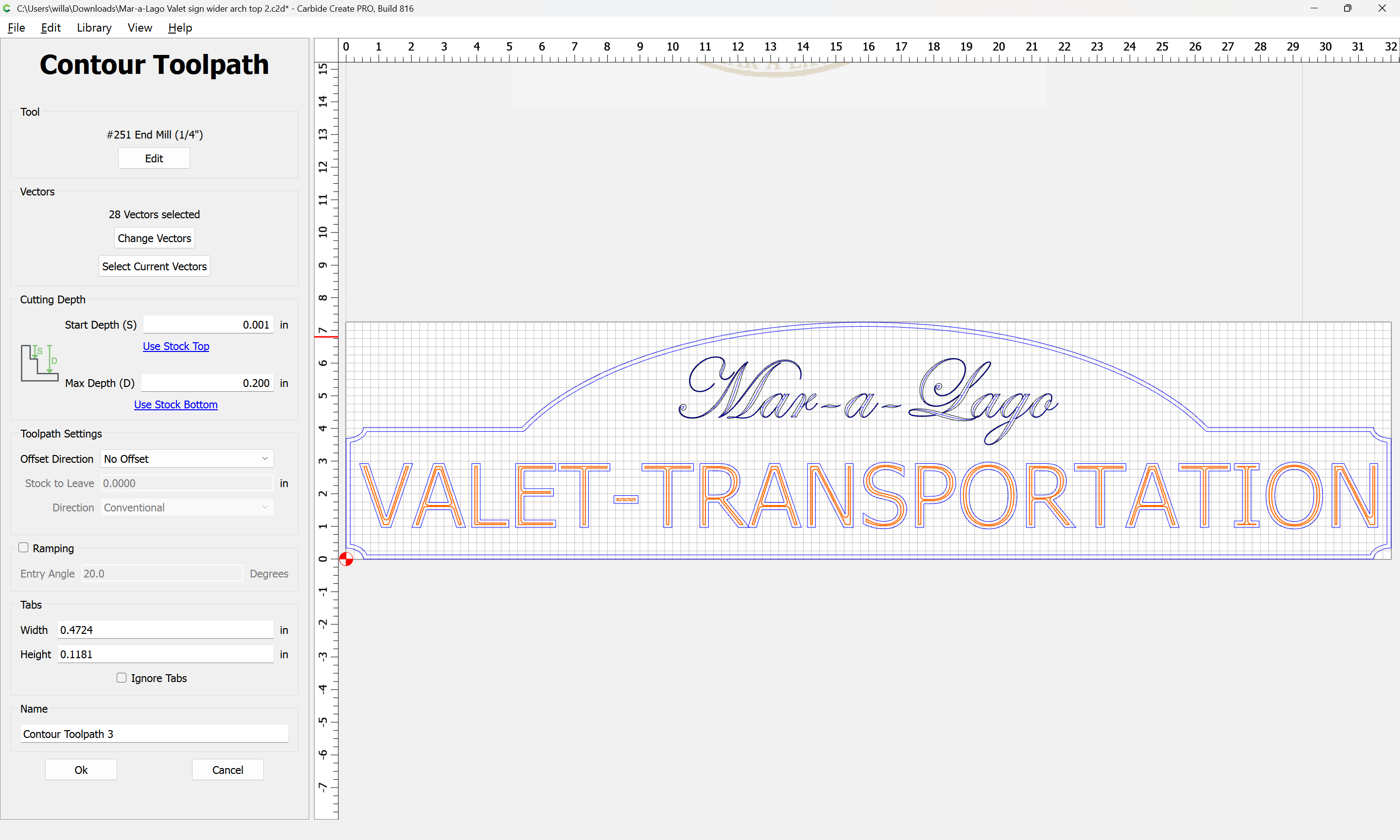
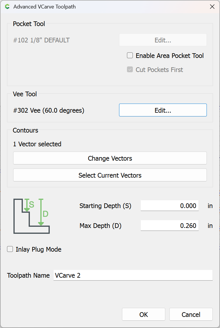
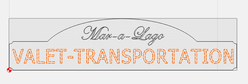
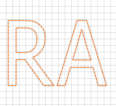
I am doing another sign, using the same toolpaths and bits as a very similar sign.
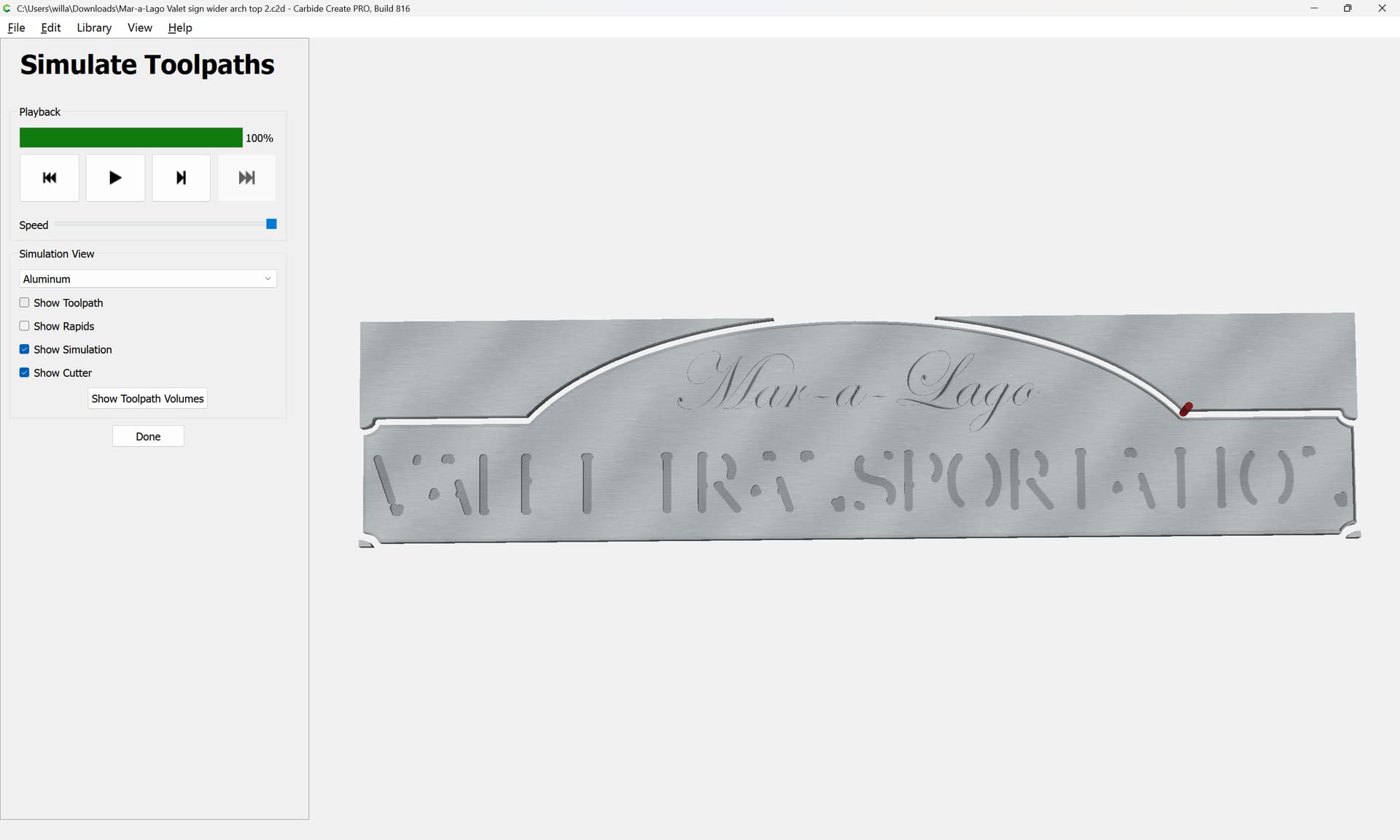
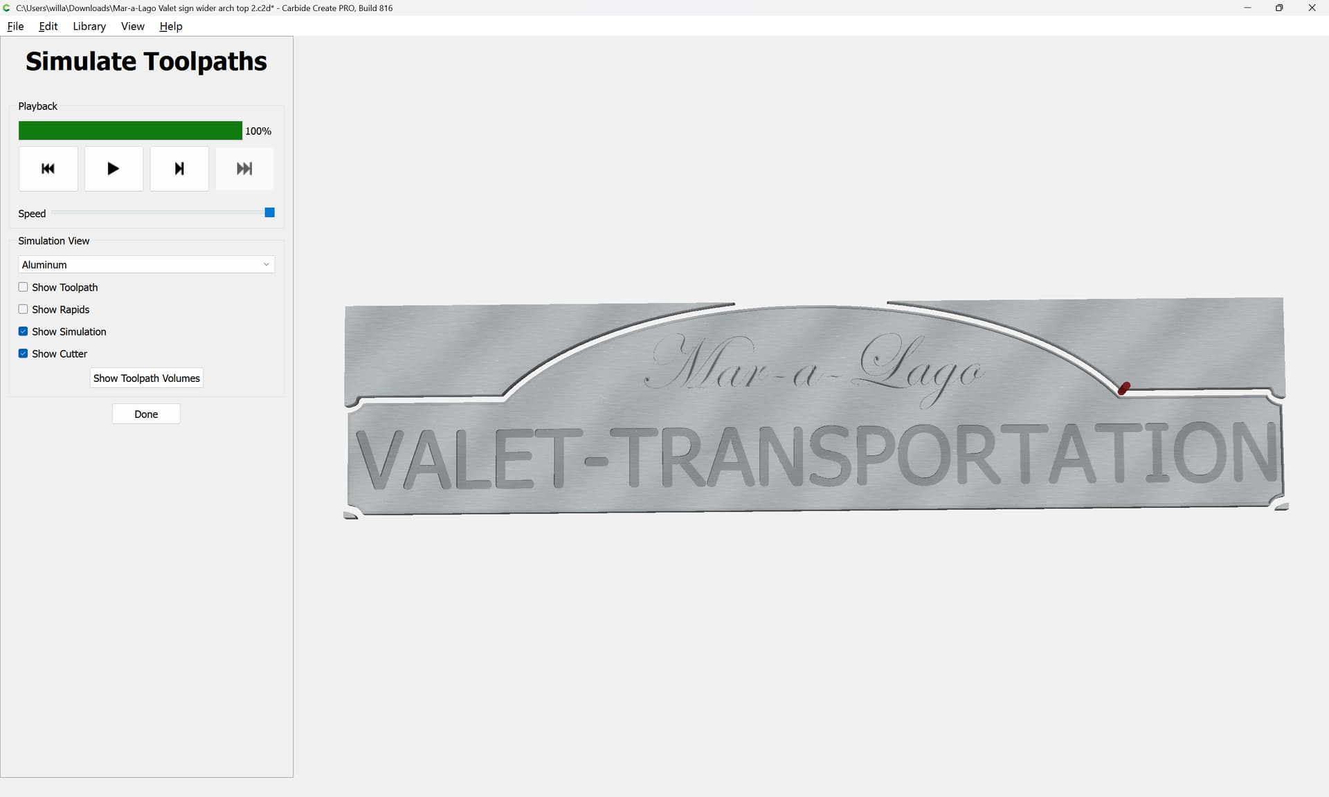
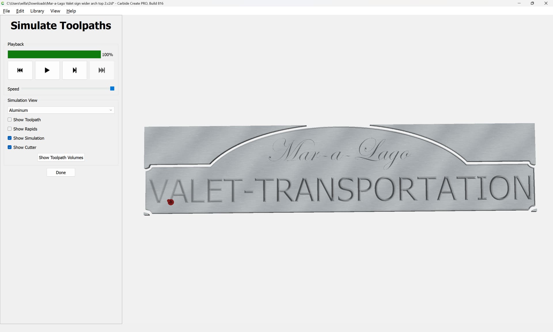
When I run the simulation, the letters are not fully cut out, it skips parts of the letters that don’t make sense (to me).
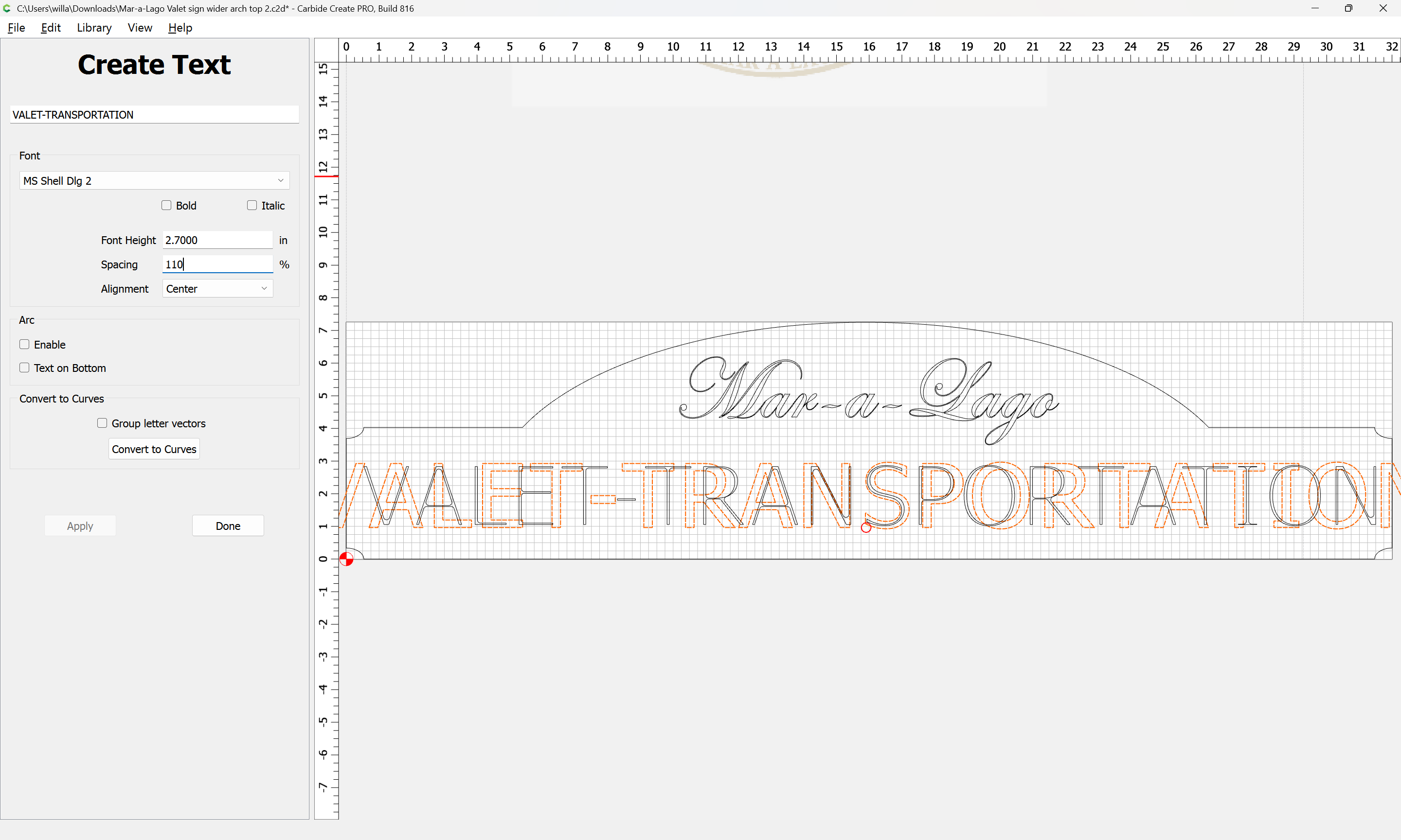
I did change the font size (smaller) than the previous sign and I am afraid that might be the issue. But I need the full letters to cut out… obviously.
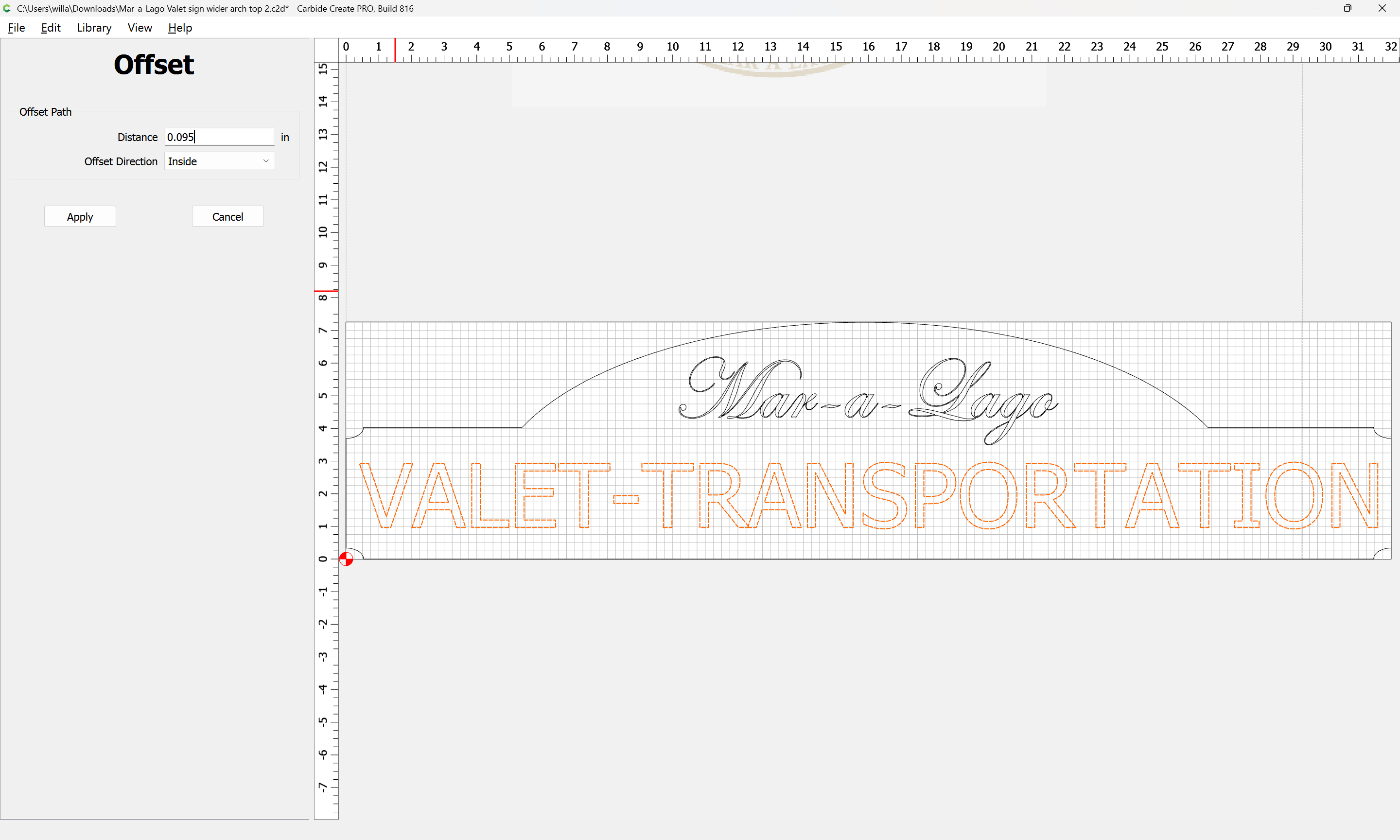
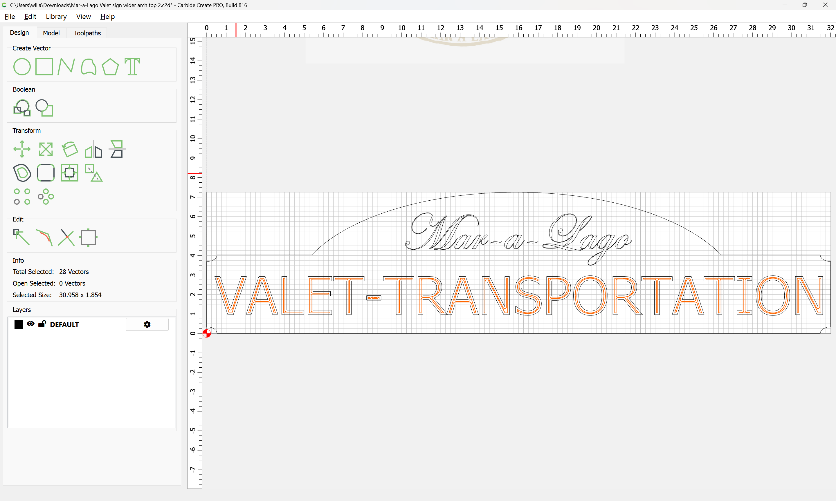
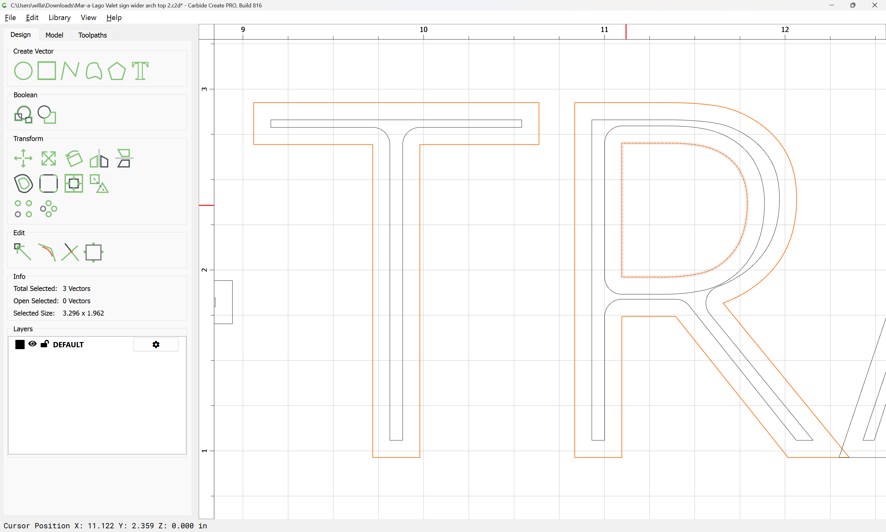
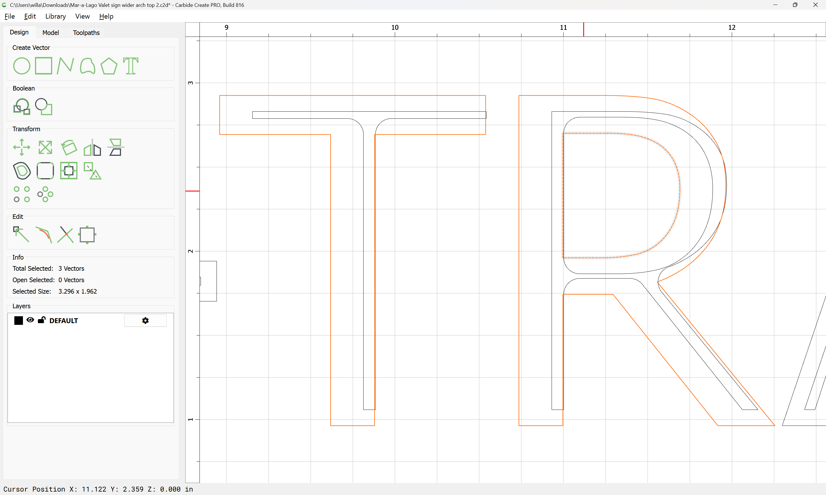
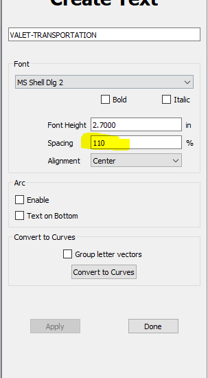
Would you personally use the V carving, or the single-line? I tried setting it up with V carving, but couldn’t get it to look right. Also, is there a way to put a tiny bit of space between the R and A so that they don’t overlap?
Appearance is an aesthetic consideration and a matter of taste for which each person will need to be guided by their own sense and conscience.
The “correct” way to get spacing there would be to set the type in a tool which allows discrete control over that — any decent drawing/page layout tool would allow that, then convert to curves and save as an SVG and import. Alternately, you could select a font which spaces that pair by default as you want it to appear (probably Helvetica would not touch).
Good call. Thank you for the advice. I was stuck trying to match the other signs, but they had less wording, so it wasn’t as busy. With all of these words, it looks too busy in the same style.
Yeah, definitely going this route. 1 less tool change. About 4 minutes more in time (no big deal) once I changed the plunge depth to 1/2 the .260 max depth.
Thank you again.
On a side note, I got my CNC out of storage last week and moved it in to my new garage. So I can start back up on projects after loosing my warehouse in December. God is good!