I’ve been experimenting trying to make small text, 1/8" using a 1/16" end mill without any real luck. Anyone have any guidelines or experience to share on how to make small text? Size of text, best font types, and tooling types/sizes, thanks in advance.
Pete
Please see:
Why is a V carving not an option?
Will, thank you very much for the help. I will give it a try, I’ve tried Vcarve without much success on small font, but I’ll retry.
Again, thanks much.
How did the attempt at V carving turn out?
What material were you cutting?
Photo?
You can also use smaller bits. I have used bits as small as 0.0120" on my SO3 XXL, but I typically try to use 0.0150" since I tend to break the 0.0120" bits. A lot.
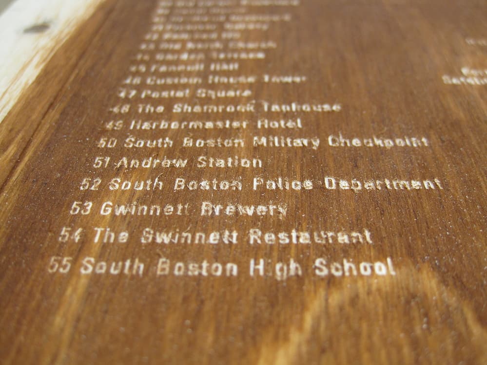
I’ve had good luck cutting 5mm letters at either 1mm or .5mm depth, 110 spacing using a 90° Vee bit.
I use a 0.015" end mill (like MadHatter) to make my small wood inlays on the Nomad. A V-carve isn’t applicable for my inlays so I have tried many fonts to make tiny text elements that can fit within my ~ 0.135" diameter design circle. Two of my favorite fonts are Cronus Round, which I used in the keychain design I am including in this post, and the second is October Compressed Tamil. Cronus Round lets me make tall thin letters that are easy to read, but it has an odd style. October Tamil is a “more traditional” font and is easy to node-edit in my inlay process; I can get about 30 characters to arc inside a 0135" diameter circle (as illustrated in the attached file). The 0.015" is slow…as you can see in the file toolpaths.
Retire Keychain with FONT examples.c2d (2.0 MB)
1 Like
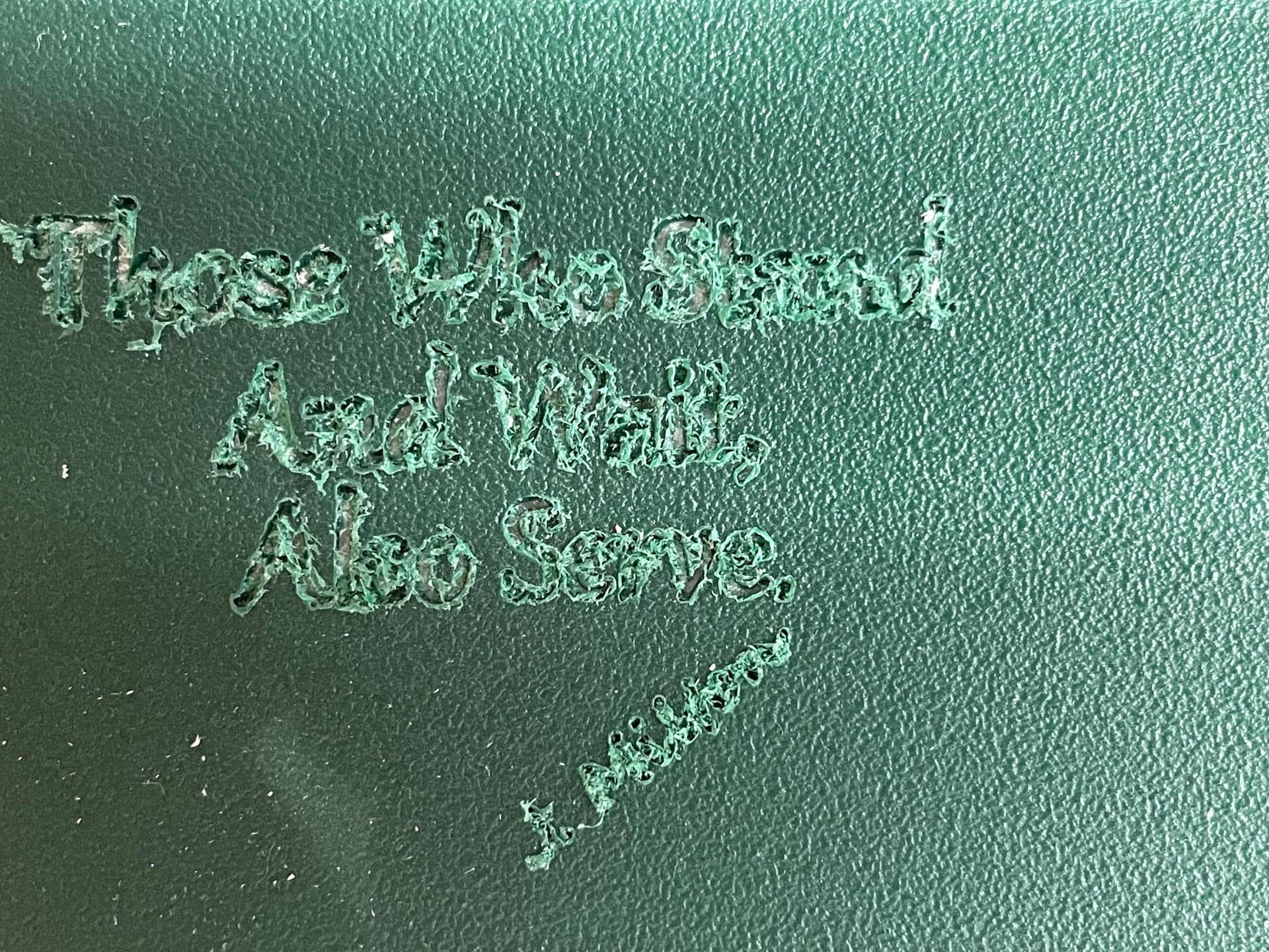
Here are some cut and pastes from a previous post (below)…
…smallest 17 degree v bit was used to barely scratch the stained surface of the text … the uppercase letters are 2mm tall…
With very small things, measurements need to be precise and the material needs to be (very) flat. The CNC will perfectly alter the bit height as instructed, but if you bit is going up and down 1/32 of an inch yet there is about the same variation in your material thickness the result is going to be frustrating.
1 Like
Did you try starting at below “0”? This has worked for me. 0.2mm start depth gives me better results when font is too small or thin.
2 Likes
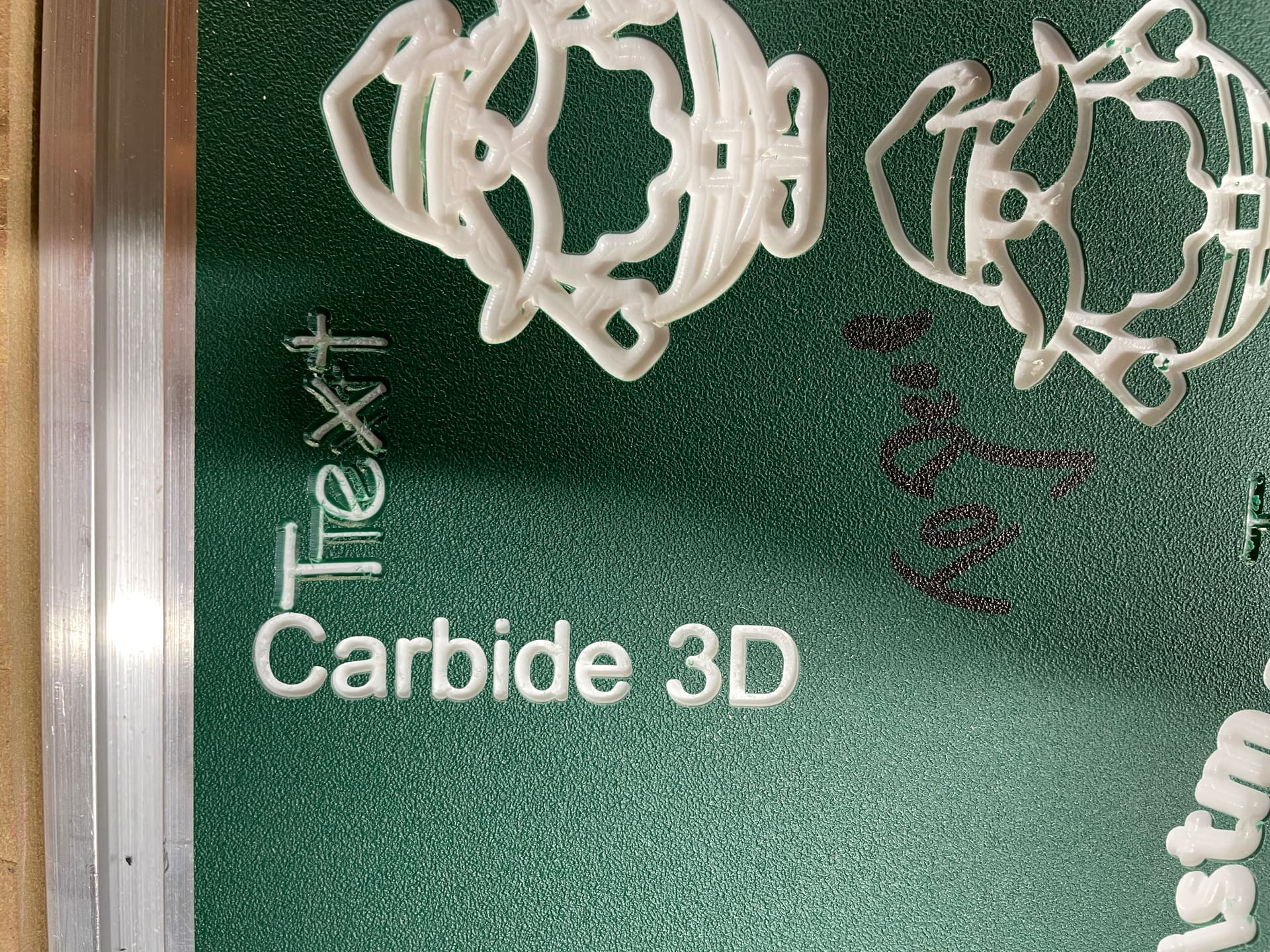
Thanks to all for the help, really appreciated. I should have said up front I am trying to make 1/8", or so, letters in King ColorCore plastic material. I have not tried wood yet. 1st image shows what I am after but also the very poor clear out of the letters. I’ve tried Vbits afterwards to clean up fuzz but no luck. Planning on trying slight offset as a 2nd run to see if that works in eliminating fuzz.
Will, 2nd image (Carbide 3D) is your file that looks great but letters much too big. I tried making my own file using your input but hanging up on "Draw in geometry at the narrowest point: And then inset: [[image]] Apply [[image]] " Not sure what you mean by drawing in geometry, inset and apply.
Again, thanks to all for feedback.
Draw in a circle which stands as a proxy for the tool you are using, so as to get a feel for how the tool size relates to the text size and then adjust its size (or the size of a duplicate) to get a feel for how much you can inset at the narrowest point.
Try the inset, and if it is fragmentary/non-continuous, undo or delete and try again with a smaller value — or increase the inset if it’s not tight enough at the narrowest points.
thanks will give it a try.
I have not had much luck with V Bits on ColorCore. I stick with O flute bits. Typically I use 1/4, 1/8, 1/16 Amana O flute bits and then transition to a set of tiny bits I picked up from Amazon that go all the way down to 1mm if I need more precision.
1 Like
This topic was automatically closed 30 days after the last reply. New replies are no longer allowed.