Carve letters depth

When I set the V carving depth for text, it does not respond to my settings. It seems to only accept a default depth setting. In other words, I want to carve the V text deeper.
Thanks!
Don

With V-Carve, it varies the depth of the cut by the width of the letter. You cannot change the depth of cut. I’ve had this issue too, and have tried doing different cutters (60 degree, 90 degree) to try and get wider letters with limited success.

Something I have shamefully done is set the zero LOWER than the stock (with zero point to the side of the stock) and increase the retract height. This has worked, but I will admit I don’t know what other consequences there might be for doing so.

Hopefully someone else can chime in on the proper way to get a deeper cut (other than attempting to make the lettering more bold or larger)

5 Likes

This is exactly what I suspected, but I am so new at this I thought it had to be me!
Thank you so much!
Don

If you want deeper letters when V-carving, using a steeper angled V-bit.

1 Like

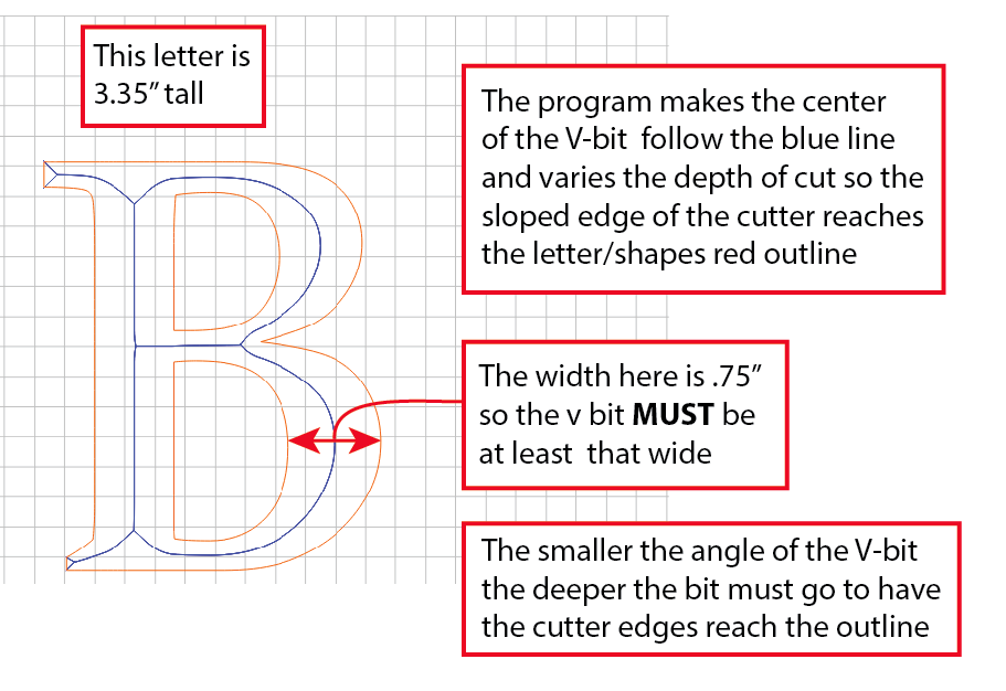
Here’s a sketch that might help understanding V carving.

9 Likes

Hi Will, I understand what Jared is saying below, but why can’t I override the default if I choose?
Thanks!
Don

Thanks Jared… I guess I was hoping there could be a way to override this default.
Don

Uh, it’s not physically possible for a given V-bit to go deeper w/o cutting wider than the initial design — the opposite feature, depth limiting hasn’t been implemented yet — it’s been asked for. I believe the free app F-Engrave does have a depth limit setting.

EDIT: This depth limiting was added to Carbide Create and is available in current versions.

3 Likes

You can artificially set your zero below the top of your work piece if you want it deeper. If you had a single-stroke font, you could engrave it and spec the cutting depth…

Are you using vectric v carve?? If so you can set the start depth to a setting lower than the top i.e. set start depth to .025 and it will make them deeper but do so slowly or you may end up making it look kind of funky.

1 Like

Chad… I think I’m just doing a basic V carve. Please explain vectric.
Thanks!
Don

Vectric V-carve is a very popular CAM package. One of the better ones for wood working, or art.

Jim,
I was about ready to try tweaking the Z setting , but it was suggested that F-Engrave might be a better approach?
Have you used it?
Thanks!
Don

F engrave is easy to use, and pretty nice to have in your tool box.
I used to use it a lot, but it gave me some weird toolpaths sometimes.
It’s nice tho, and free and simple.

1 Like

Yes F-engrave does work well but CC does a good job also. It’s important to understand what’s going on with any V carving program and operation. Here’s another sketch to consider. It’s snowing here today so I’m on a drawing roll rather than working :slight_smile:

11 Likes

Jared, fortunate (for me) that it is snowing there today!

Thank you for the detailed explanation of the V carving logic and I do understand. Putting conventional logic aside, I think there will be times when I would like to just push a little further into the material to create bolder and deeper text without having to revisit my original art file. I also understand that if I push too deep, the text grow too much and letters could touch.

I know it obvious I am a beginner, but I am trying hard to lose that distinction!

Thanks again for your help.

Don

3 Likes

Thanks Jerry… I’m going to check out this program.
Don

Don -

Looks like you have plenty of options and info from others here… as you mention,pushing a little further into your material is easy to do by offsetting your Z zero depth, just ensure you don’t overload you cutter. I have F-engrave bookmarked but I’ve not used it yet.

1 Like

2 things to keep in mind, you CAN do it any ways simply by offsetting Z down a bit (Make 0 below the top surface) but doing this make sure the Clearance Z height is enough to get OVER the material between paths.

Also, the text WILL distort fairly quickly. I have tried and found it’s better to find a better bolder font or make the text larger or change the bit, then it is to move the Z offset lower. When you do move the Z lower what happens almost immediately is sharp corners no longer look like flat corners. Take the letter i for instance the top period(dot) becomes an X and the solid bar becomes funny looking also the corners start becoming protruding lines sticking out.

4 Likes

Thanks Roger, I have been in the graphics business for many years, including engraving that started with a manual pantograph to a computer engraver. Those systems used multi-line fonts to create beautiful carvings with crisp corners and edges. I am guessing the software to do this with a CNC V bit would be very pricey, if even possible?
Thanks.
Don